Create an atmospheric filmic black and white image with this software technique
Introduce some monochrome drama with this quick and easy black and white conversion process
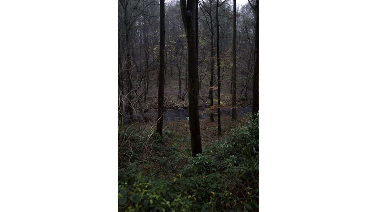
Some days just aren't meant for drama. The light is flat, the sky overcast and colors are anything but impactful. That doesn't mean you can still get usable images though and a clever monochrome conversion can save the day!
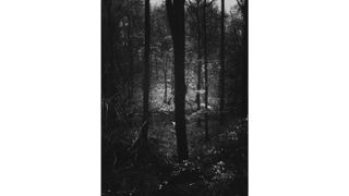
Don't misunderstand - black and white is not a get-out-of-jail free card - it can't miraculously save any photo. There has to be some though put into the creation of the frame in the field. In this image I liked the arrangement of the trees and foreground leaves, so shot this frame in portrait format. This conveyed the height of the trees and created a looming feel to the forest environment.
This processing technique doesn't directly re-create a film style - it is a blend of new and old. The 4:3 format is not a traditional film dimension, but the overall effect is dramatic and feels timeless.
1- Contrasty conversion
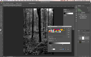
A quick way to convert an image to monochrome and to add some contrast is to use a Gradient Map. In Photoshop, hit the D key to set default Foreground and Background colours then click on the Gradient Map Layer icon.
2- Adjust detail
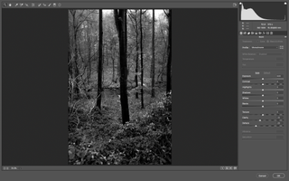
Duplicate the Background and open the Camera Raw Filter. Adjust the Clarity slider to control midtone contrast. In this case the slider was moved to the left to soften the high frequency detail in the frame, for a more relaxing image, with fewer distractions.
3- Customise curves
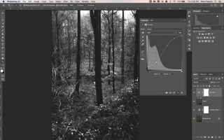
Add a Curves Adjustment Layer, then play with the shadows and highlights in the image. Since there was already mist in the air in this shot the blacks were lifted slightly and then the shadows deepened for contrast - a modified standard S-curve.
4- Dodge and Burn
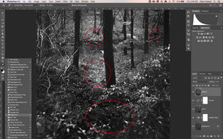
For some localised control use the Dodge Tool to subtly brighten the upper midtones and highlights, to make the image glo. Add back some of the deeper shadows lost during the Curves adjustment using the Burn Tool, for a fuller range, but on a less global scale.
5- Crop to taste
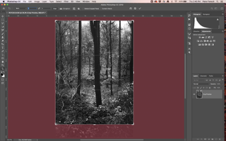
While the taller frame fitted the subject here there was a bit too much foreground, so the decision was made to crop to 3:4 from the native 2:3 ratio. This concentrated the attention on the upward direction of the composition.
Read more
Joss Whedon Justice League controversy shows the power of video editing
The 12 highest resolution cameras you can buy today: ultimate pro cameras
City photography secrets: create distraction-free location shots
Get the Digital Camera World Newsletter
The best camera deals, reviews, product advice, and unmissable photography news, direct to your inbox!
As the Editor for Digital Photographer magazine, Peter is a specialist in camera tutorials and creative projects to help you get the most out of your camera, lens, tripod, filters, gimbal, lighting and other imaging equipment.
After cutting his teeth working in retail for camera specialists like Jessops, he has spent 11 years as a photography journalist and freelance writer – and he is a Getty Images-registered photographer, to boot.
No matter what you want to shoot, Peter can help you sharpen your skills and elevate your ability, whether it’s taking portraits, capturing landscapes, shooting architecture, creating macro and still life, photographing action… he can help you learn and improve.
