Ten steps to amazing black and white photography!
Get more from the simplicity of light and shadow to produce images with depth and intrigue
Introduction
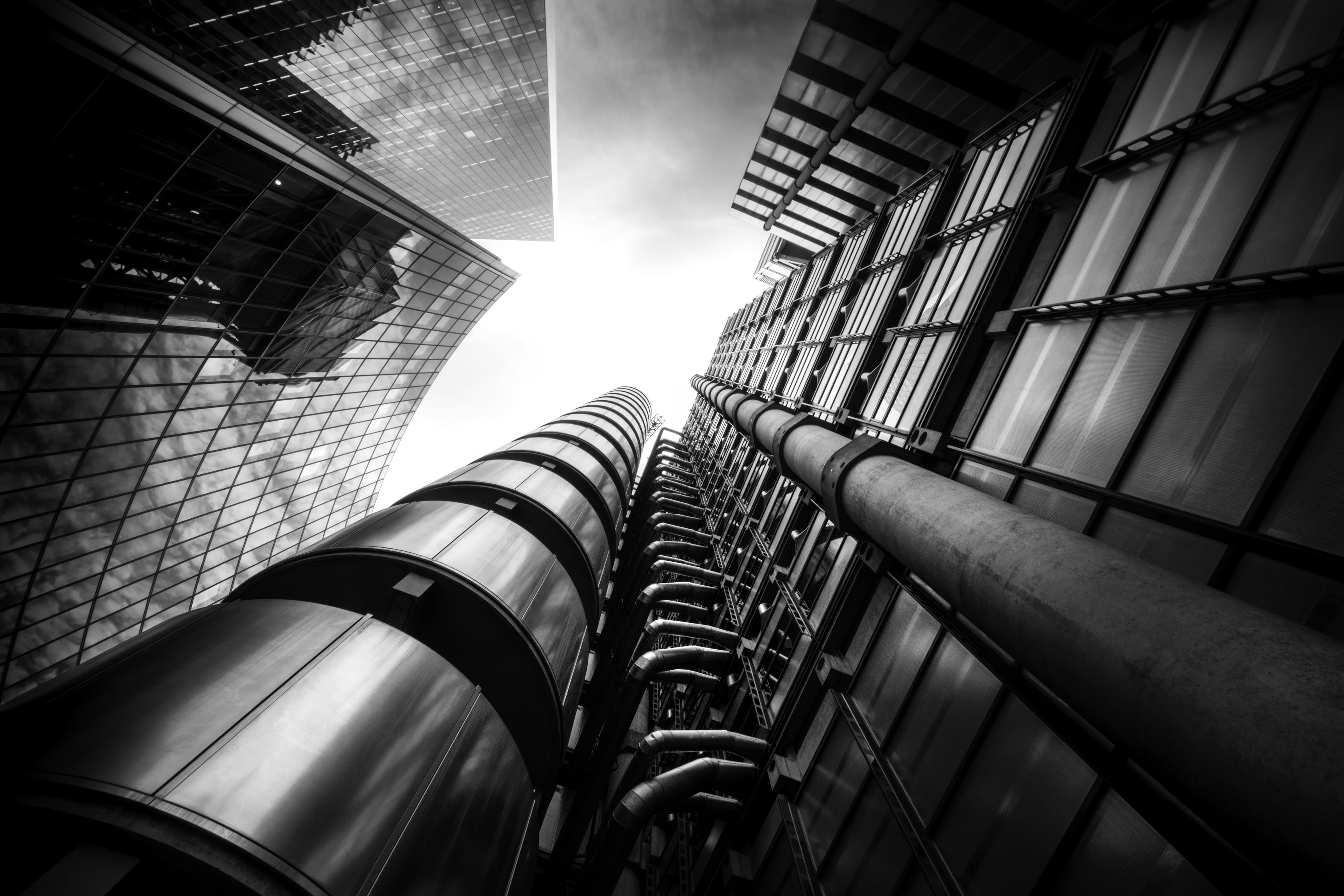
Black and white photography remains one of the most popular genres of the medium. Here at Digital Photographer magazine we receive a huge number of monochrome images from photographers around the world, demonstrating a universal appreciation for the power of simplicity, and the fundamental components of a photograph - light and shadow. While color imaging can produce a life-like recreation of the world around us, black and white is able to transcend the natural or the accurate as essential elements of a scene and produce a unique, visceral representation of what our senses encountered in the field.
This may be due in part to the fact that, whether you are using a camera to study a scene or your own eyes, you are effectively seeing in monochrome. Both imaging devices only ‘see’ light and shade - bright and dark. The sensor in a digital camera and the retina of your eye work by detecting differences in light intensity, gathering this information into a luminosity map - an arrangement of points of varying brightness. A black and white image.
More: How to see in black and white
All of the color information has to be added later, albeit seemingly instantly from our perspective, via the use of chemical pigments in the human visual system or the image processor of a digital camera. Monochrome photography therefore offers the truest reproduction of detail and allows us to explore shape and form in a way that would be difficult with the interference of color.
Our brains are tuned to notice color first, so where present we have to take extra care to eliminate distracting hues, or those which clash in unattractive ways. Black and white is arguably a simpler medium and can free us to examine contrasts of shape.
Here we take a look at some of the pro methods for using monochrome to the max, for images which stand out and demand multiple views.
1- See in monochrome
The most important thing to remember about black and white photography is that lack of color is not a reason in itself to shoot an image. Yes monochrome can be viewed as a novelty, helped in no small part by the abundance of photo filters in mobile apps such as Instagram, but conversion is not a cheap trick or a get out of jail free card. You need to have enough about a scene to provide interest in the first place.
Get the Digital Camera World Newsletter
The best camera deals, reviews, product advice, and unmissable photography news, direct to your inbox!
If you are going to present the world without color you need to work extra hard to hold the viewer’s eye. When setting up a shot look at the colors present and understand how these will work together as mere shades. A blue sky will provide a contrasty backdrop when a red filter is applied for example which will also make flowers stand out against green foliage. Look for colors which will contrast in brightness to guarantee dramatic final mono images.
2- Shoot for the edit
For digital photographers it is almost a certainty that black and white conversion will happen at the editing stage rather than in-camera. Since most pro photographers will be using RAW mode, black and white presets will not be applied, so must be added later in software. Therefore it helps to have in mind an idea of how you plan to process your image, for dramatic effect.
Once you know what style of image you want as a final product you can tailor your shooting to match. If you want to create a high key image then you will adjust your exposure accordingly. If you want to have a strong sky presence, then bracketing your shots or using a hardware ND Grad filter will mean your file is already halfway towards the finished image. Trying to apply opposing edits to the shooting style will always create difficulties and less impactful shots.
3- Contrasts of texture
Colour and brightness contrasts are a big part of photography and many people choose to focus on these to introduce depth to their images. Out of these two parameters, in black and white photography, you’re left only with the luminosity, which can be a great source of drama.
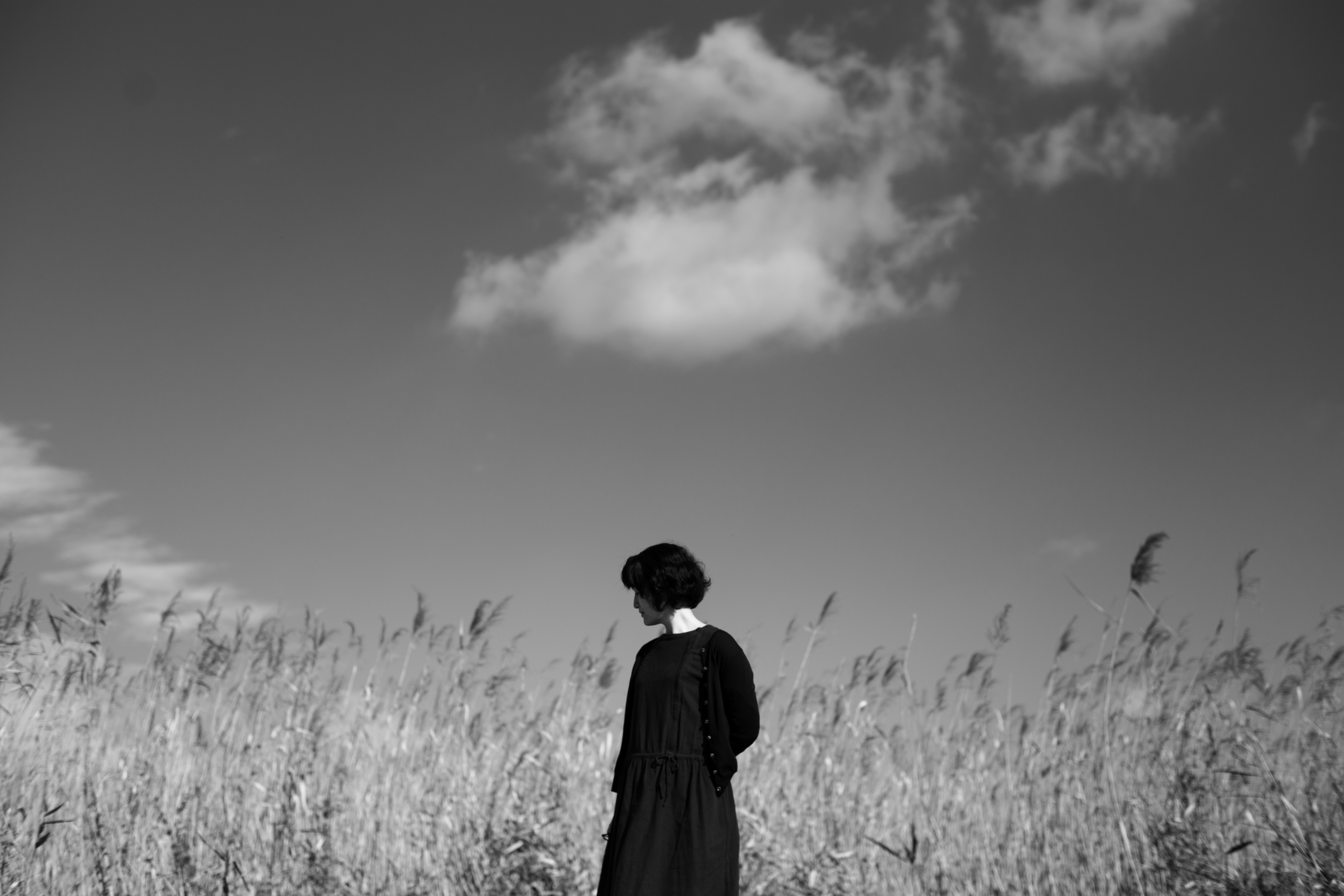
However you can reintroduce a secondary dimension and visual counterpoint by using contrasting textures. Lengthen the exposure to blur moving elements, such as water, to provide a smooth counterbalance to sharp rocks or trees in the surrounding environment, for example. If shooting a stone wall, using shutter speed to add motion blur to a swaying tree will add back the energy lost through the colour removal.
4- Fill the range
In the digital age we can become preoccupied with keeping the tones in our images within the histogram scale. Digital capture can be quite unforgiving of highlight detail in particular, with clipping occurring easily if we don’t keep an eye on the exposure. However this can lead to the inverse problem - a lack of contrast.
We need to make sure we see true blacks and whites in our images, to produce natural and dramatic tonality. While we might want to avoid 255 white and a blacks value of 0 - indicating solid, featureless areas - be certain not to allow overexposure of shadows or whites to turn grey.
5- Use graphic power
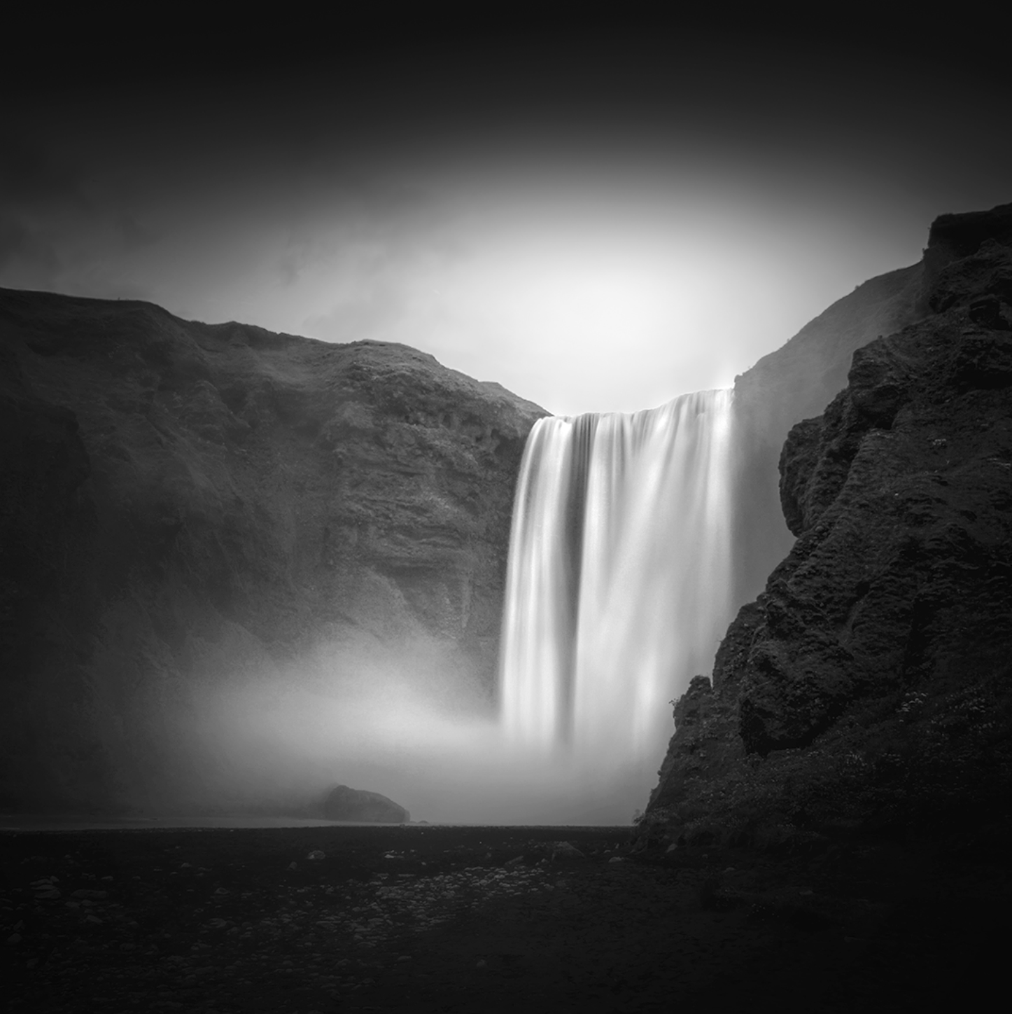
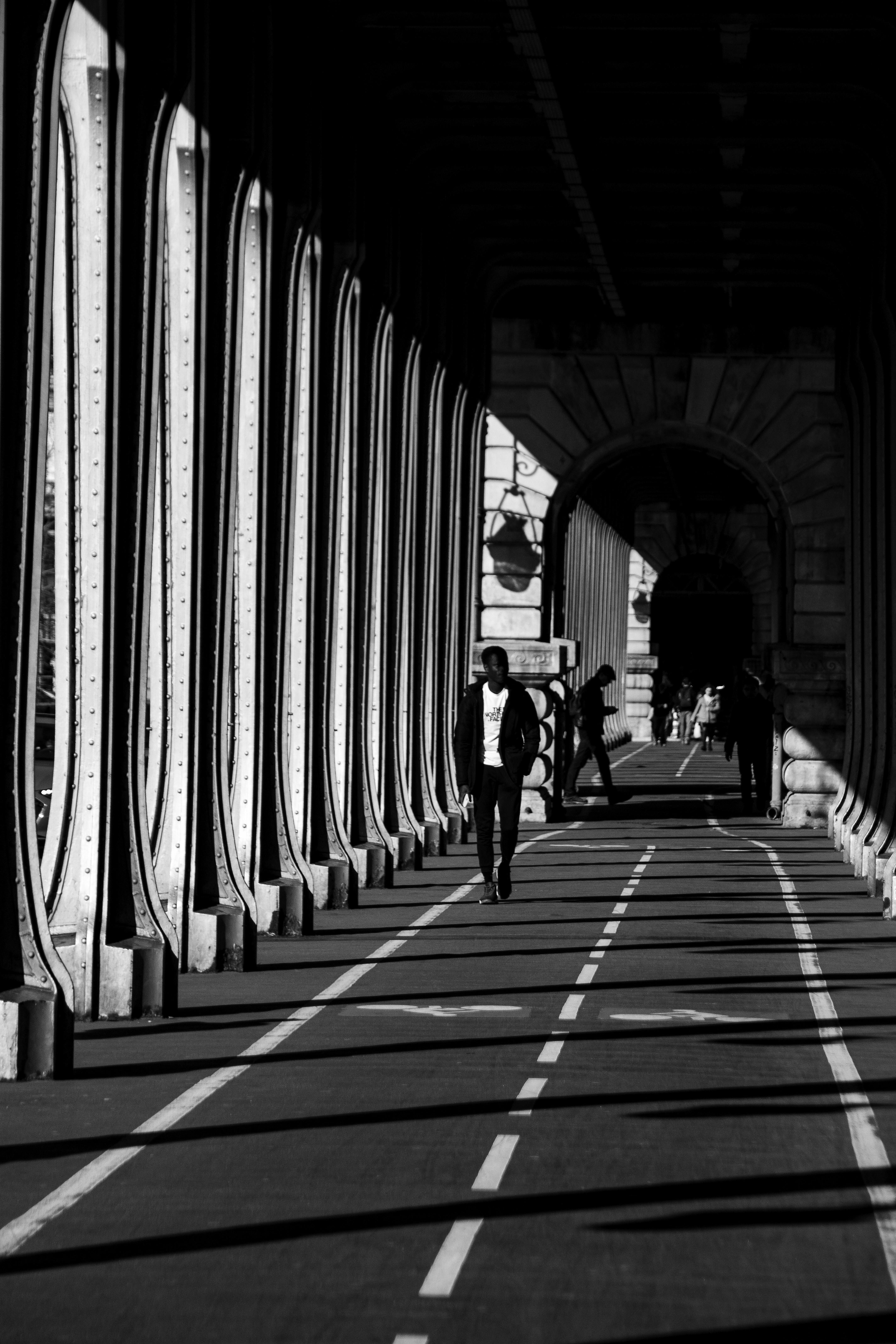
With the removal of color, our eyes will automatically start to pay closer attention to shape and form. Color is a dominating characteristic, such that we can fail to notice the harmony or dissonance between shapes in a scene, when looking at a colour image. For dramatic black and white look for lines and curves to subtly (or sometimes not so subtly) divide up your frame. A common pro trick is to contrast right angles with soft arcs - greatly useful in architecture shots - or intersecting lines, to create strong boundaries of tonality. A bright area quickly transitioning to near black is a magnetic visual tool and can create some wonderful minimalist studies.
6- Use light gradients
As well as the usual compositional tools, such as leading lines, black and white images benefit from clear variation of light. In a monochrome image the gradient from a bright area to a dark zone is far more recognisable and can be the source of direction within the frame. Be on the lookout for light sources which can be positioned to set up a path for the eye to follow, which will always be from dark to light. If you need your viewer to scan along a street then place a light source near the area of importance, which will ensure your audience homes in on the subject, while also taking mental note of the secondary details in the frame.
7- Control the frame
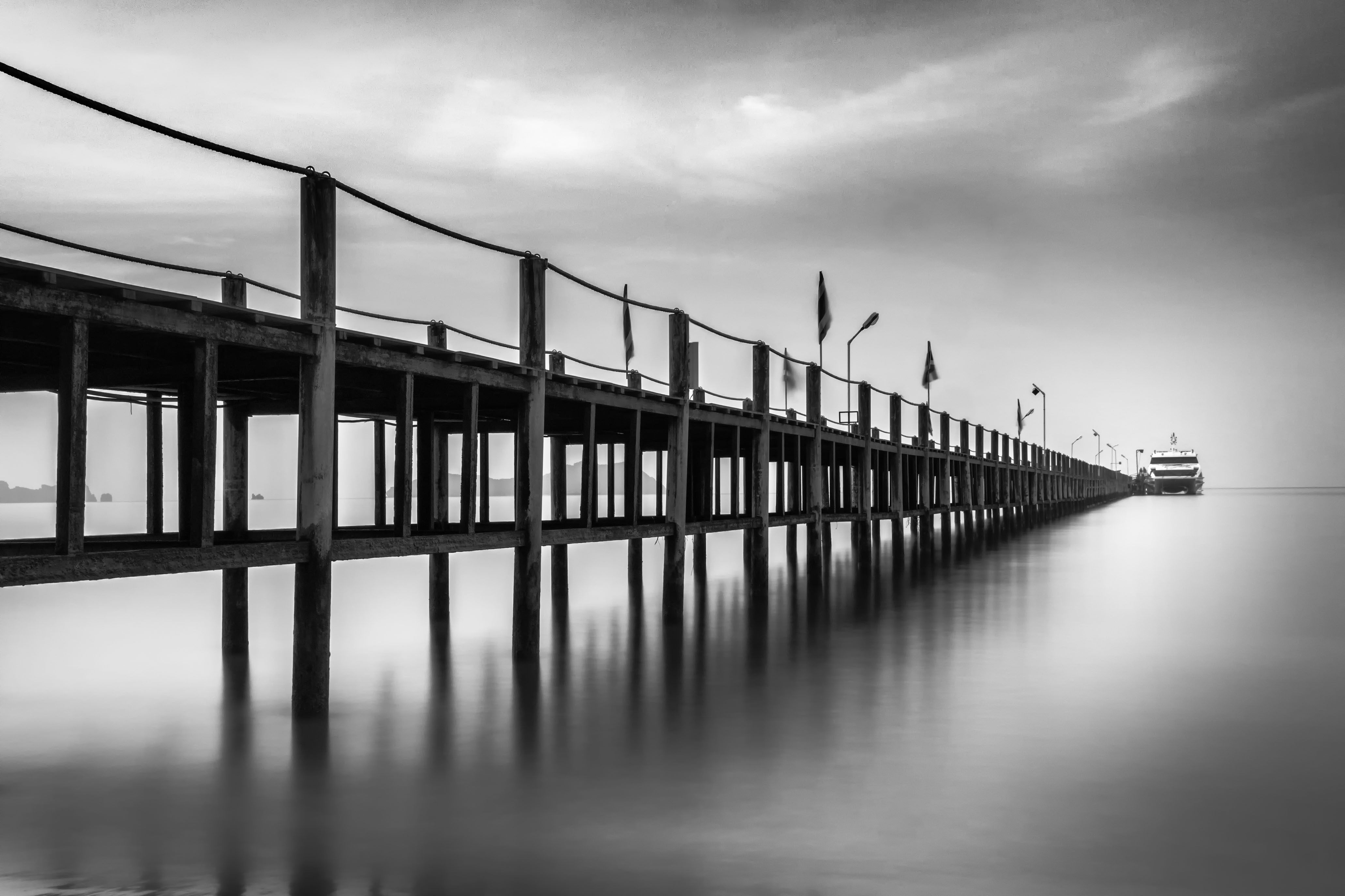
A photograph is a portal to the scene captured within it. The sides of the frame isolate the content visible in the viewfinder and assign it a new context. It is therefore important to choose the dimensions of this frame, which can vastly alter how the subject is depicted. For simple scenes we need to ensure any minimalist intent is clear, which involves regulating how much negative space is present. This is why square images work well for these kinds of compositions.
Where you want to focus on the differences between texture and light in the foreground and background a 3:2 portrait format shot will be ideal. Meanwhile, try using 4:3 or 5:4 where you already have a good balance of interest in all areas of the scene, and want to show foreground and background in relatively equal measure.
8- Commit to the process
Digital editing techniques make it easier than ever to apply special effects, colour toning and chroma-based selections to our work. However this often leads to photographers forgetting the real reason they wanted to make a monochrome image in the first place.
While these special effects can add an extra dimension and make images less predictable, they can easily begin to make the creator look indecisive. Colour splash effects rarely add narrative and often look cheap. The eye will be instantly drawn to the coloured area, missing any other detail you might want the viewer to see and the unnatural contrast will likely be unpleasant. Either make your shot colour or black and white, not both!
9- The reveal
Yet another way of adding contrasts to your monochrome shots and setting up a feeling of depth is to hide and reveal sharp detail. This can of course be done using shallow depth-of-field but, where available, mist, fog and even heat haze can be used to set up a texture gradient. More detail will be visible in the foreground and then will gradually reduce, moving deeper into the picture. The perfect example of this is a forest path fading into a misty background. It’s a common technique but one that works well in the absence of colour, to lead the eye.
10- Use side-lighting
When an image is devoid of different colour to separate discrete objects these can easily blend into each other if care is not taken with exposure. Where two areas are similar in terms of tonal value they can be difficult to distinguish from one another, but where there is a colour difference the contrast is more obvious. In order to reintroduce this separation look for side or edge lighting to highlight the boundaries between objects and avoid areas of seemingly empty space. This is particularly relevant in low key scenes, where there is a prevalence of dark tones. Use low sunlight or an off camera flash to control lighting and maintain shape and form.
Read more
DxO PureRAW can improve your raw files BEFORE you process them!
Canon EOS R3 announced: shoot at 30fps and move AF points with your EYES!
Create an atmospheric filmic black and white image with this software technique
Digital Photographer is the ultimate monthly photography magazine for enthusiasts and pros in today’s digital marketplace.
Every issue readers are treated to interviews with leading expert photographers, cutting-edge imagery, practical shooting advice and the very latest high-end digital news and equipment reviews. The team includes seasoned journalists and passionate photographers such as the Editor Peter Fenech, who are well positioned to bring you authoritative reviews and tutorials on cameras, lenses, lighting, gimbals and more.
Whether you’re a part-time amateur or a full-time pro, Digital Photographer aims to challenge, motivate and inspire you to take your best shot and get the most out of your kit, whether you’re a hobbyist or a seasoned shooter.

