Clean up your food with Affinity Photo

Usually associated with high-end portrait retouching, frequency separation is a technique that separates images into high and low frequencies. As such, it’s useful for retouching faces without damaging skin textures. But frequency separation has other, less known uses too – it can work wonders in food photography.
Most high-end retouchers would carry out their frequency separation workflow in Photoshop just because it’s the industry standard software. However, Affinity Photo has a tool that’s arguably better than what’s on offer in Photoshop.
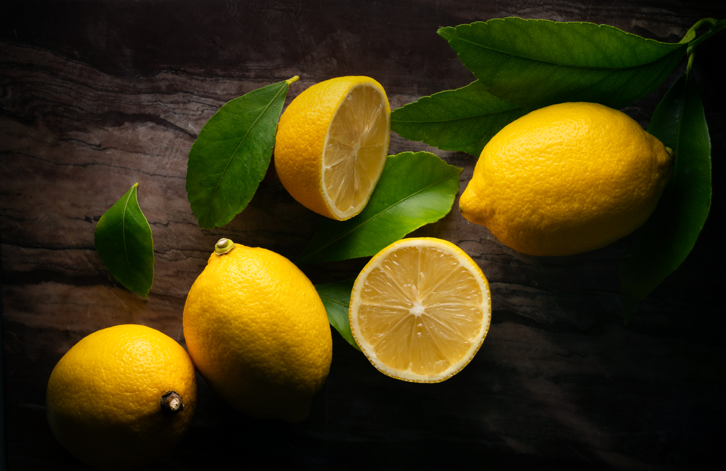
Frequency separation splits details into separate layers. ‘High frequency’ is fine detail, like the texture on the lemons and leaves here; ‘low frequency’ is the wider spread of tones, like the yellow and green colours. By separating them, you can edit each independently, smoothing out rough patches or fixing distracting textures while keeping the image looking natural.
With Affinity Photo’s dedicated Frequency Separation tool, it’s easier than you might think, and it’s likely to become a go-to tool for all kinds of retouching tasks…
Frequency separation in Affinity Photo

1. Start separating frequencies
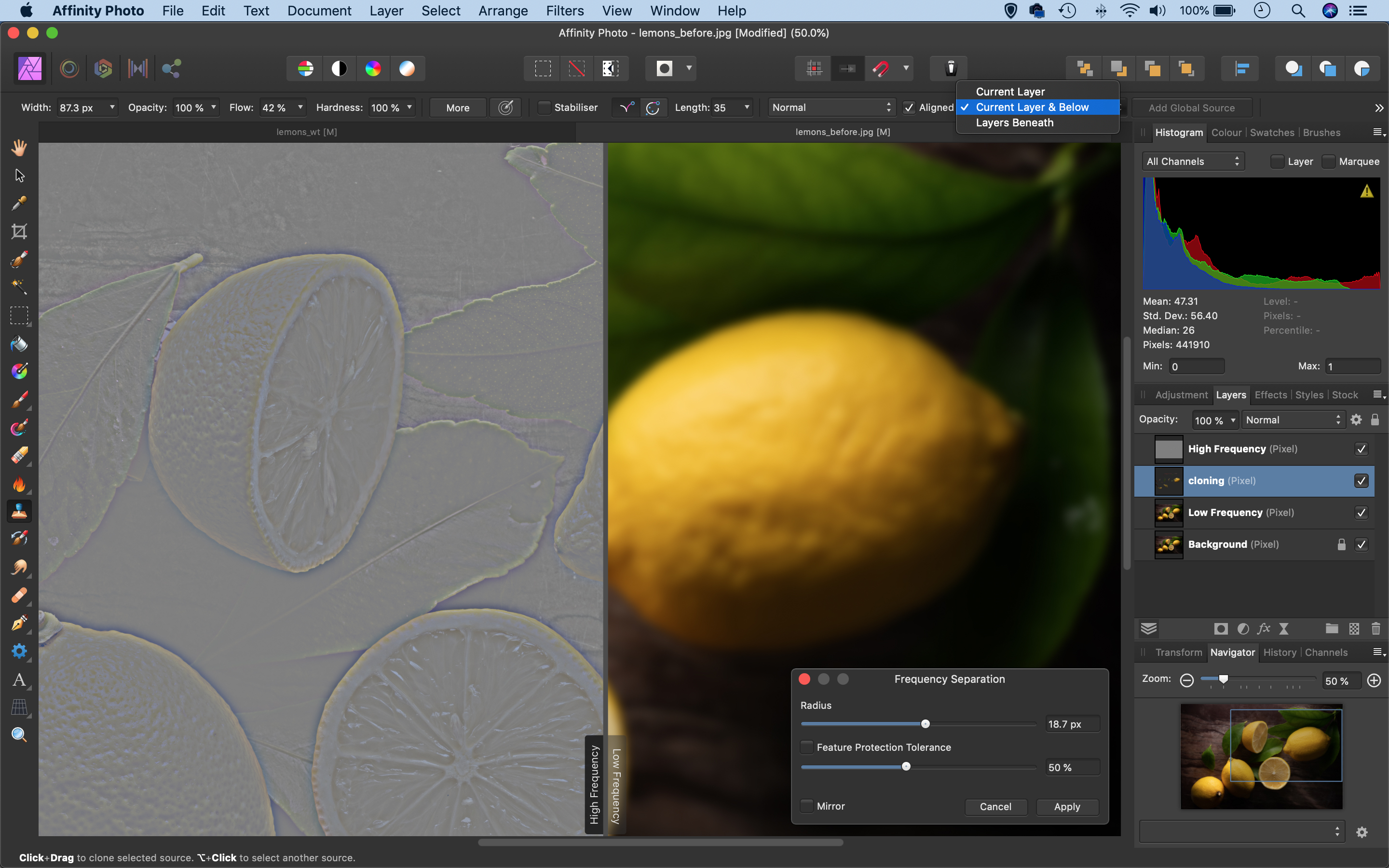
Duplicate your original layer, then go to Filter > Frequency Separation. High‑frequency details will be separated from low-frequency tones and colours. A draggable split-screen shows how the split works. By separating the image, you have more control over retouching rough patches and blemishes without affecting the delicate textures in the objects.
2. Set Radius
You can control what is considered as high frequency either by using Radius, or by dragging left and right over the image. Set Radius so the texture in the fruit is visible in the grey image, while the details are blurred on the low-frequency version. It might take a little time to find the right balance. Some retouchers like
to make several passes with different Radius values.
3. High and Low frequency layers
Once the command is made, the image looks the same but you’ll see two new layers appear in your Layers Panel. The High Frequency layer is set to the Linear Light Blending Mode, which knocks out the grey areas so only the fine detail is visible. You can now grab the Clone Tool and start smoothing out the tones on the lower layer without altering the delicate textures.
4. Fix the textures
To retouch detail and textures, target the High Frequency layer. A good tool for this is the Healing Brush (make sure it’s set to sample ‘Current Layer’). As with the Clone Tool, Alt-click to sample a nearby source then paint over problem areas. Set the brush hardness to 100% to prevent smudginess around the edges of the healing. The tool lets you perfect the skin of the lemon here and remove distracting wrinkles.
5. Where to clone
Part of the learning process with frequency separation is in getting a feel for where to clone and heal, and which frequency to target. In the lemon, bumps and marks can be removed by cloning the low-frequency detail, without damaging the fine texture of the lemon skin. If we wanted to fix finer distractions, like scratches on the surface of the board, we’d target the High Frequency layer with the Healing Tool instead.
6. Make a cloning layer
One of the best tools for tidying up the Low Frequency layer is the Clone Tool. Use it to smooth out rough tonal areas and blemishes in the image. You can edit the layer directly or, for greater control, make a new pixel layer above it, then set the tool to sample ‘Current and Below’ in the tool options. This keeps things non-destructive and allows you to erase any areas that go wrong.

Get started with food photography
Food photography is a genre that seems tailor made to take advantage of Affinity Photo's editing tools – but first you need to capture an image that's worth editing! Here are some top tips to create fantastic food photography…
CONTROL THE LIGHT
Shooting near a window enables you to make the most of natural light. Bright, overcast days will deliver a soft illumination that lowers contrast, and makes it easier to capture tasty details in both the shadows and highlights. If you’re working with light that’s not quite so complimentary to the subject, consider taping some tracing paper or baking parchment to the glass.
A reflector placed on the side opposite to your light source will bounce light into the shadows for more balanced results. It can be a pain to keep a circular, collapsible reflector propped up in the right position, though. We tend to grab the nearest sheet of white card or paper (or even an envelope) then simply fold it in half and stand it in place. If you want to add more contrast and definition, use something black instead.
Crumpled kitchen foil makes for a brighter, crisper look that can suit fruit and other subjects that you want to add a feeling of freshness to.

PLAY WITH THE DEPTH OF FIELD
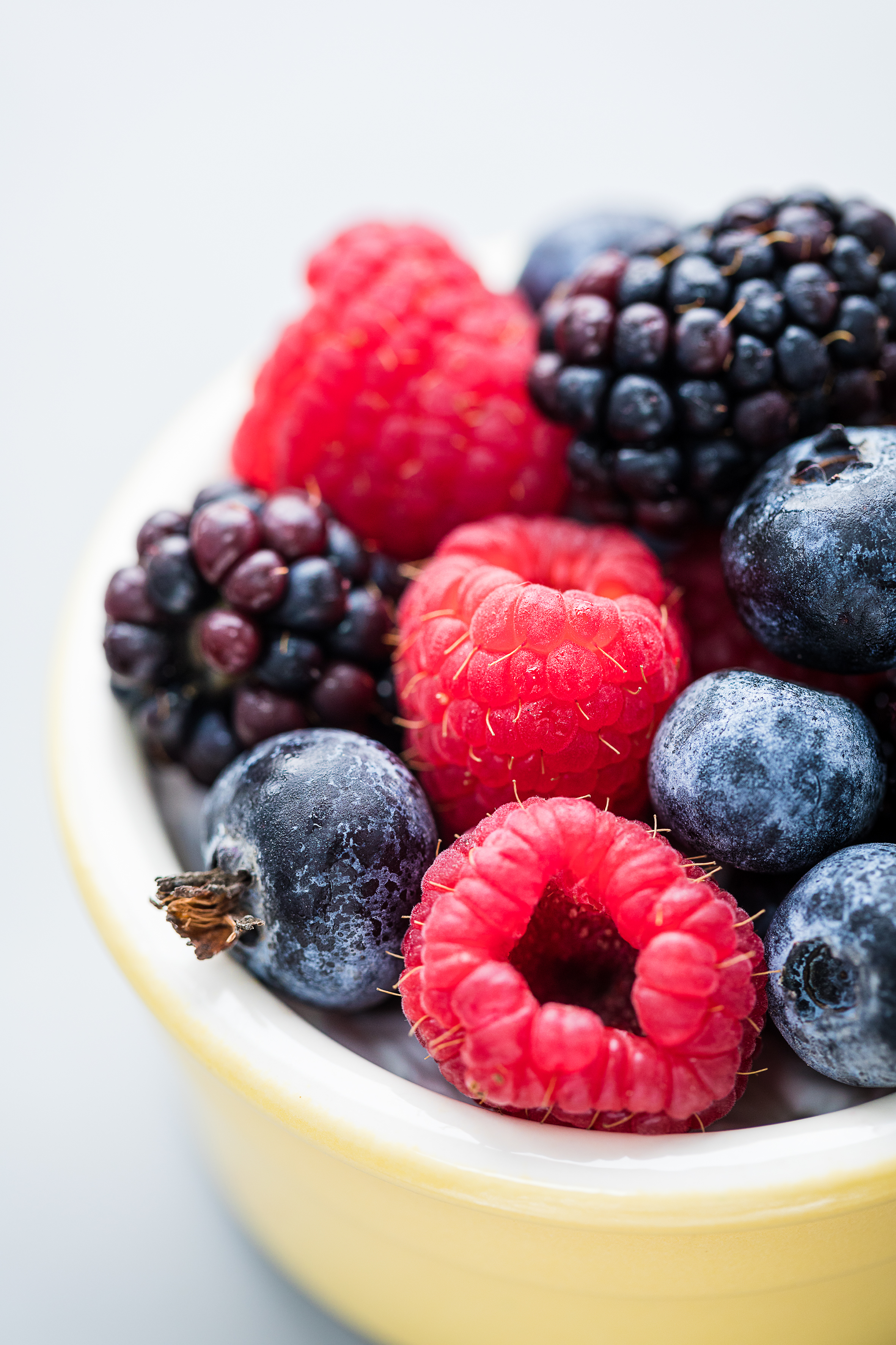
When you’re shooting close-ups, the depth of field – the amount of front-to-back sharpness – will be relatively thin. You can increase it by using a small aperture (a high f-number, such as f/16), but using a lower f-number such as f/2.8 or f/4 will reduce the depth of field to a mere sliver. The margarine-smooth blur can make food look more ‘dreamy’ and a bit less ‘scientific’.
You can also employ aperture bracketing – taking a series of pictures at different apertures, to give you more choice when it comes to editing. As a minimum, take shots at three apertures: one wide, one narrow and one mid-range.
CHOOSE A BACKGROUND
Your choice of backdrop can make or break any photograph, but when it comes to shots of food, you don’t always need to include a lot of it in the frame. In fact, you might not even need a backdrop at all if you’re shooting a dish from directly above.
The background you choose largely depends on the look you’re going for. A vibrant piece of paper or card can suit a bright, colourful subject, but if you’re shooting ‘serious’ food, a more sombre backdrop that doesn’t compete with the subject may be a better selection.
We recommend that you build up a collection of portable backgrounds – card, wood, distressed baking trays – so that you can quickly erect them in spots around your house that give you the best light. We’ve even supported a plate on a cardboard box in the bath, just so I could take advantage of some particular tiles in the background.
If you don’t want the texture of the background to show through, place it some distance from the subject and choose a relatively wide aperture (a low f-number, such as f/4 or f/5.6).

COMPOSE YOUR SHOTS
Structuring your food shots is a bit like cooking: start with a few simple ingredients and put them together in the right order. Strip your image back to basics, and think of it in terms of fitting shapes and lines together in a satisfying way. This is easier if you’re shooting from directly overhead, where a circular or square plate will provide a natural frame.
Not all food benefits from being shot from above. Cakes, burgers and other layered dishes with a bit of height often look better when they’re photographed from a lower angle, although this may bring a background into the frame.
An odd number of elements – three or five – can help to bring balance to a shot, and it’s better to stick with just a few visual ingredients so that each one has room to breathe. Use cutlery to create lines that draw the eye into an image and provide a visual straight-edged contrast to the curves of plates and food. You’ll need to watch out for your own reflection in shiny utensils, though. They’ll also catch the light, which can fool the camera into underexposing the image.
IT'S ALL IN THE DETAILS
Professional food photographers often work with food stylists on commercial shoots. Food styling, which ranges from sourcing ingredients to cooking food and arranging everything on the plate (as well as choosing the plate itself), is a full-time job. Like photography, it takes dedication and experience to get the best results. But there are lots of small aspects that you can tweak to improve your own shots.
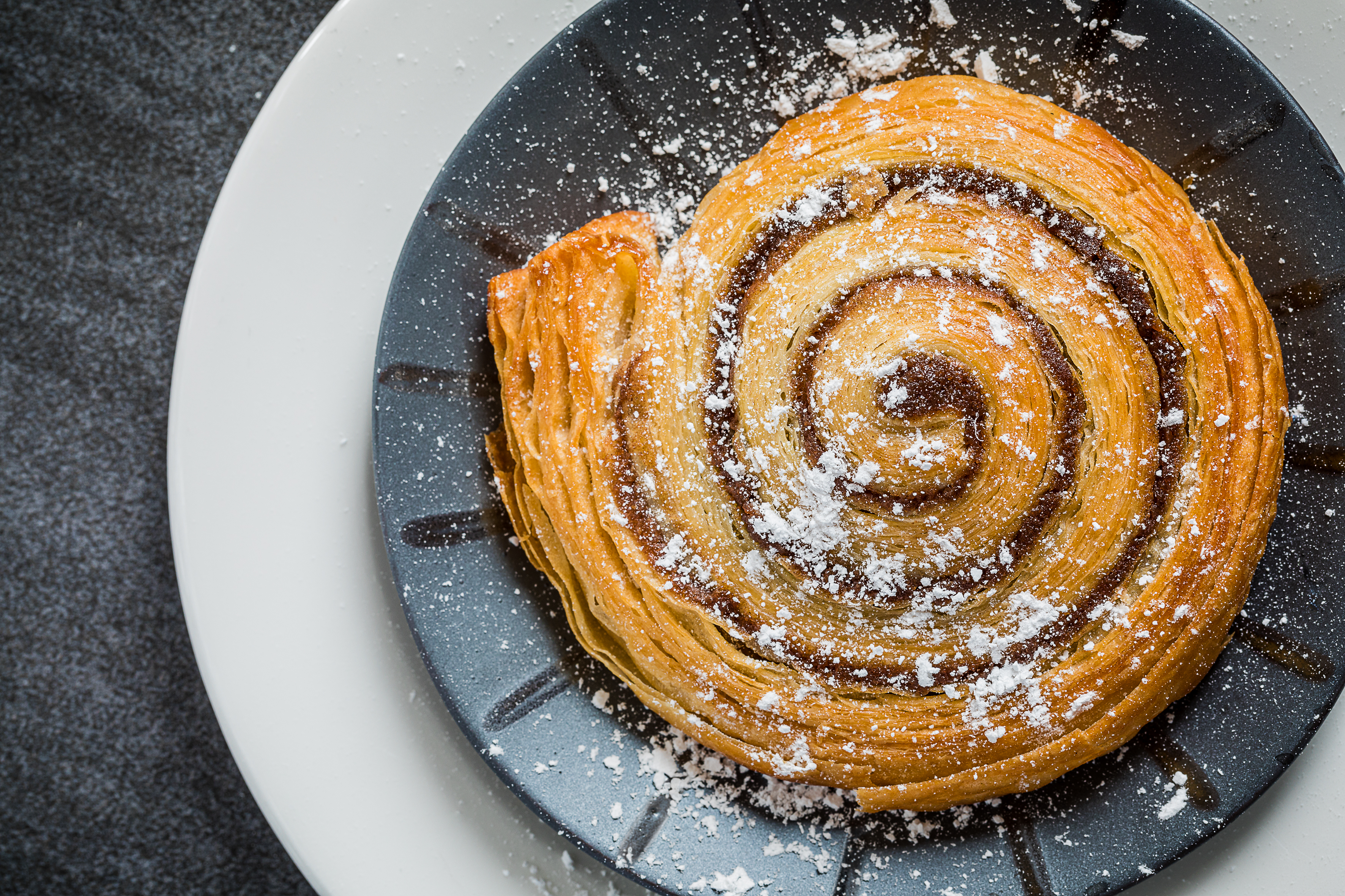
A sprinkling of bright green herbs or chopped red chillies will give brown and beige dishes a visual lift, for example, while a dusting of icing sugar can add lightness and freshness to puddings and other sweet treats. And, of course, droplets of water from a spray bottle or even simply flicked from your fingers can make fruit look juicier. If you want the drops to be longer lasting, add some glycerin to the water first. It’s small details like these that can make the subjects of your food photos look more appetising.

Food photography top tips
1. Lock your camera on a tripod
This will give you the opportunity to assess your composition carefully and make tiny adjustments to the elements of your shot. It also means you can keep the ISO at a low setting for high-quality results. Fire the shutter using the self-timer, so you can hold a reflector in position.
2. Use fewer ingredients
Avoid loading up dishes with food; rather than being a feast for the eyes it will be overwhelming. A few elements will look more elegant and be easier to digest visually.
3. Accessorise
Build up a collection of interesting tableware you can use to bring variety to your photos. You don’t have to buy an entire dinner service – individual plates, knives and forks will allow you to add variety to a whole range of shots. Choose unfussy designs to ensure that the food is the star.
4. Clean up
Give your props a clean before shooting, especially if you’re shooting a close-up with a macro lens. That thumbprint on the handle of a knife or the dishcloth lint on a plate might not look distracting to the naked eye, but it will be magnified in the shot.
5. Crop creatively
You don’t have to show the entire plate of food. Cropping part of the dish out of the shot can help give the impression that what viewers are looking at is part of a bigger spread, when it isn’t.
Reader challenge: Food
Enter our latest photo challenge and win a copy of Affinity Photo! This month we’re looking for your hottest (or coldest) food shots. It’s a great time of the year to try your hand at the subject, as the festive and New Year period offers a feast of food photography opportunities.
We’re looking for pictures that really capture the essence of the food, whether that’s through careful lighting, biting texture, creative composition or careful editing in software to selectively boost colours and sharpness. As with last month’s challenge, we’re looking for artistic interpretation as much as we are good technique, so the overall look and feel that your picture captures is more important than anything else.
Don’t be put off if you don’t own a macro lens, flashgun or tripod – work with what you’ve got. Whether you’re shooting fresh ingredients, a slap-up dinner or a microwave meal for one, there's a host of creative techniques that you can use to elevate your images. How about experimenting with multiple exposures or making a panoramic image to create a food landscape? Perhaps go minimalist, or try a black-and-white treatment? The food photography world is indeed your oyster.
To enter your tastiest food shot (one per reader, please) email your entry to digitalcamera@futurenet.com, putting ‘Food photography’ in the subject line; or go to our Facebook page at www.facebook.com/digitalcameraworld, look for the ‘Food photography’ post and upload your entry into the feed.
By entering your image into this competition, you confirm that you own the copyright to the image, and agree that Digital Camera can publish your image in relation to the ‘Food photography’ competition. You retain full copyright of your image and will be credited if published. The closing date is 08 January 2021. The winner will receive a copy of Affinity Photo for Windows or macOS. Good luck!
Get the Digital Camera World Newsletter
The best camera deals, reviews, product advice, and unmissable photography news, direct to your inbox!
Digital Camera World is one of the leading authorities on camera and photography news, reviews, techniques, tutorials, comparisons, deals and industry analysis. The site doesn't just specialize in cameras, but all aspects of photography, videography and imaging – including camera phones, gimbals, lenses, lighting, editing software, filters, tripods, laptops, printers, photo books, desks, binoculars and more.
Whether you're using, looking to buy or trying to get the most out of a compact camera, action camera, camera drone, cinema camera, beginner camera or professional camera, Digital Camera World has a roster of experts with combined experience of over 100 years when it comes to cameras, photography and imaging.

