Create the perfect homepage for your photography website
Maximize the immediate impact of your photography website by designing a brand-enhancing first page

When operating a high street studio, the photographer is directly relying on passers by for business. Therefore it is easy to see that the appearance of the studio itself - the decor, interior design and the images chosen as display samples - is of critical importance for attracting their attention. In the online marketplace we have a far greater potential customer base, yet it is also more challenging to get yourself noticed.
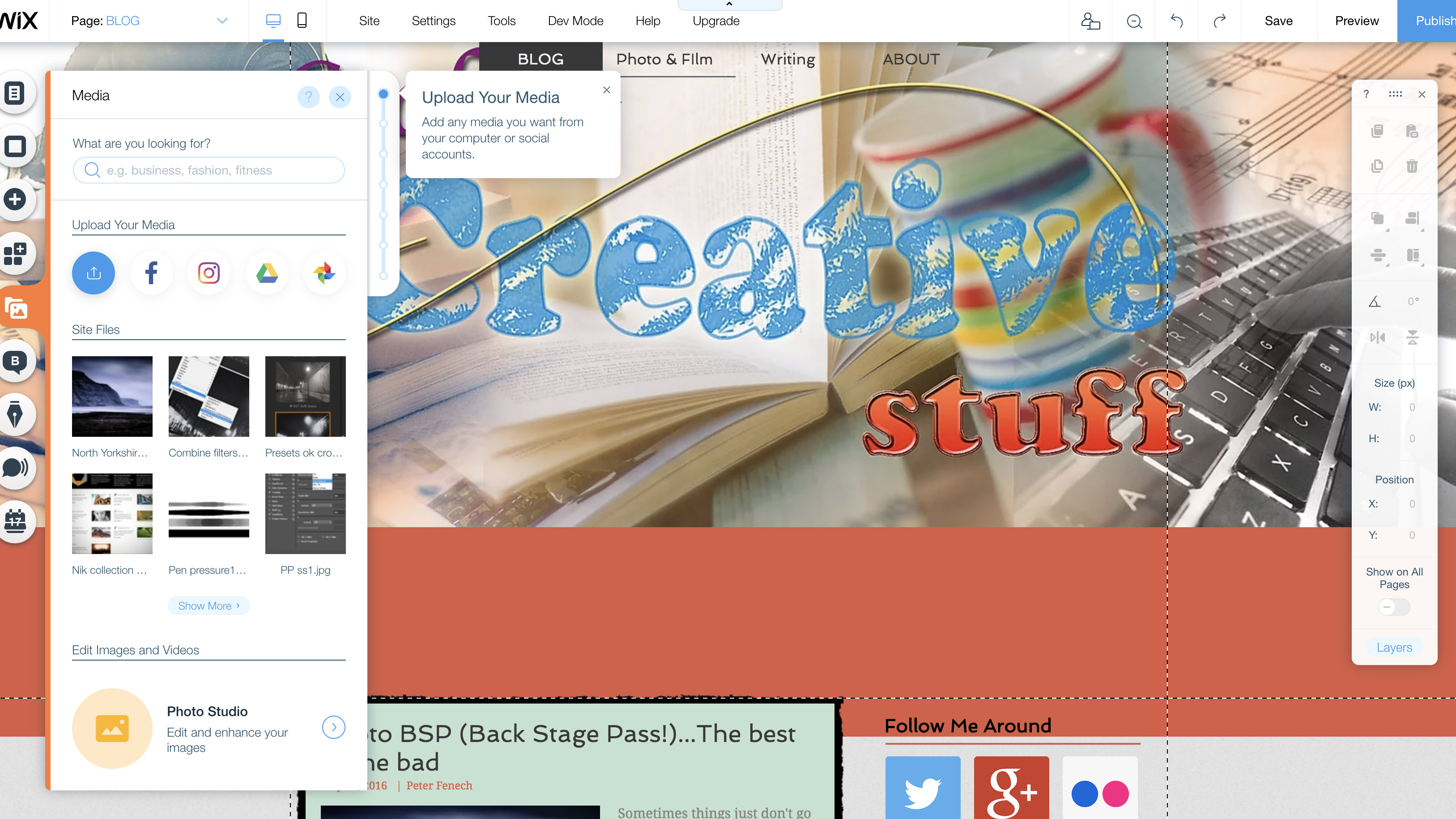
For this reason a website homepage is by far the most important page in your network of online portfolios and social media platforms. The homepage is essentially your online shop front - it is likely the first page viewers see when they navigate to your website and is responsible for their following browsing behavior. A badly designed page can instantly cause viewers to lose interest and ‘bounce’ from the site, whereas a strong page can convert web hits into image sales and commissions.
• The best website builders for photographers
1. Color scheme
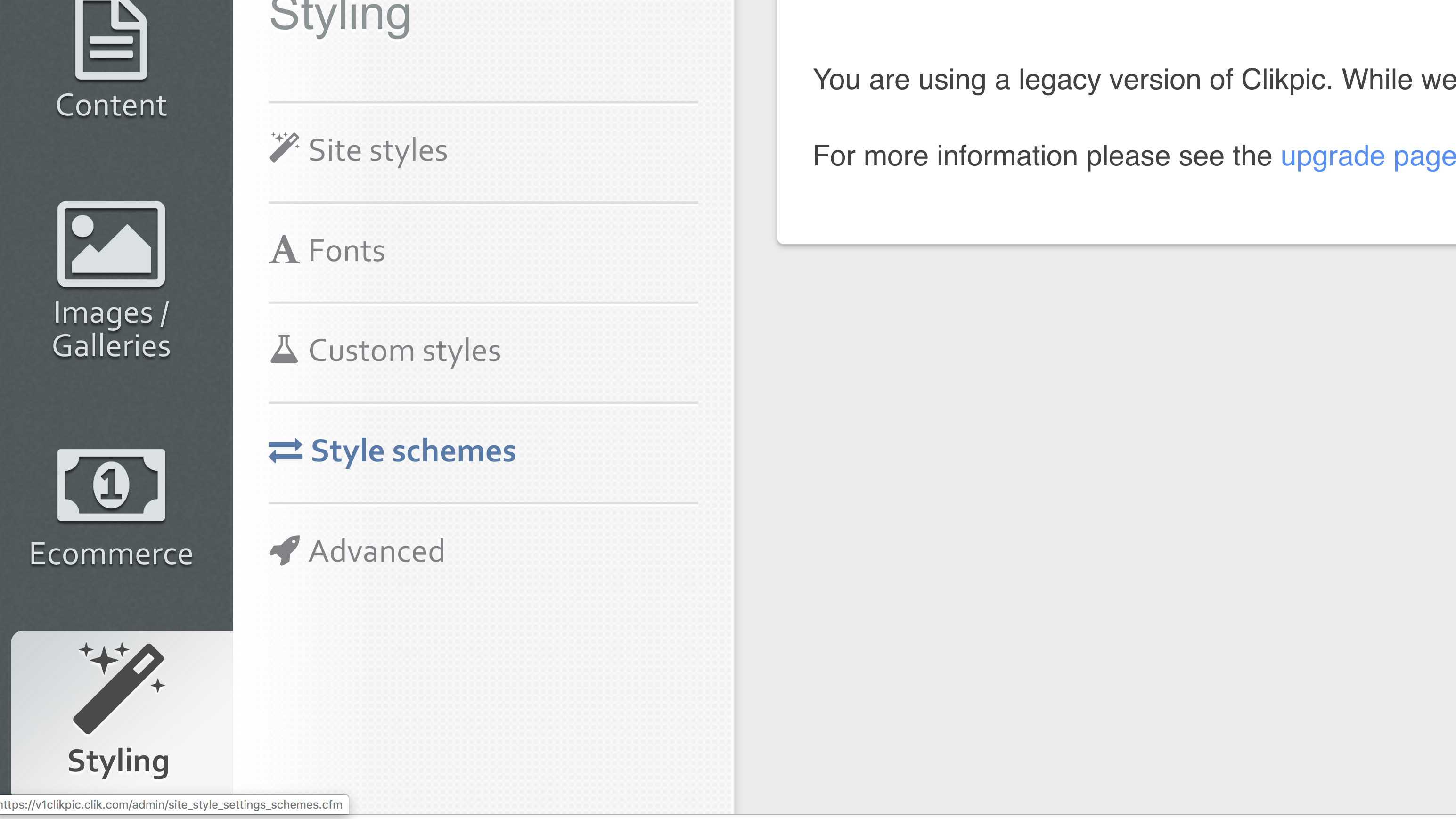
The choice of main colors for the design of your homepage, and indeed the rest of the website, is central to presenting your images at their best. Make sure there are no obvious color clashes with the hues present in the image themselves so that the page is easy on the eye and the images are able to speak from themselves. A good strategy is use a neutral, universal scheme, to fit any photographs which may be featured as you update your portfolio over the years.
• Best website hosting sites for photographers
2. Image choice
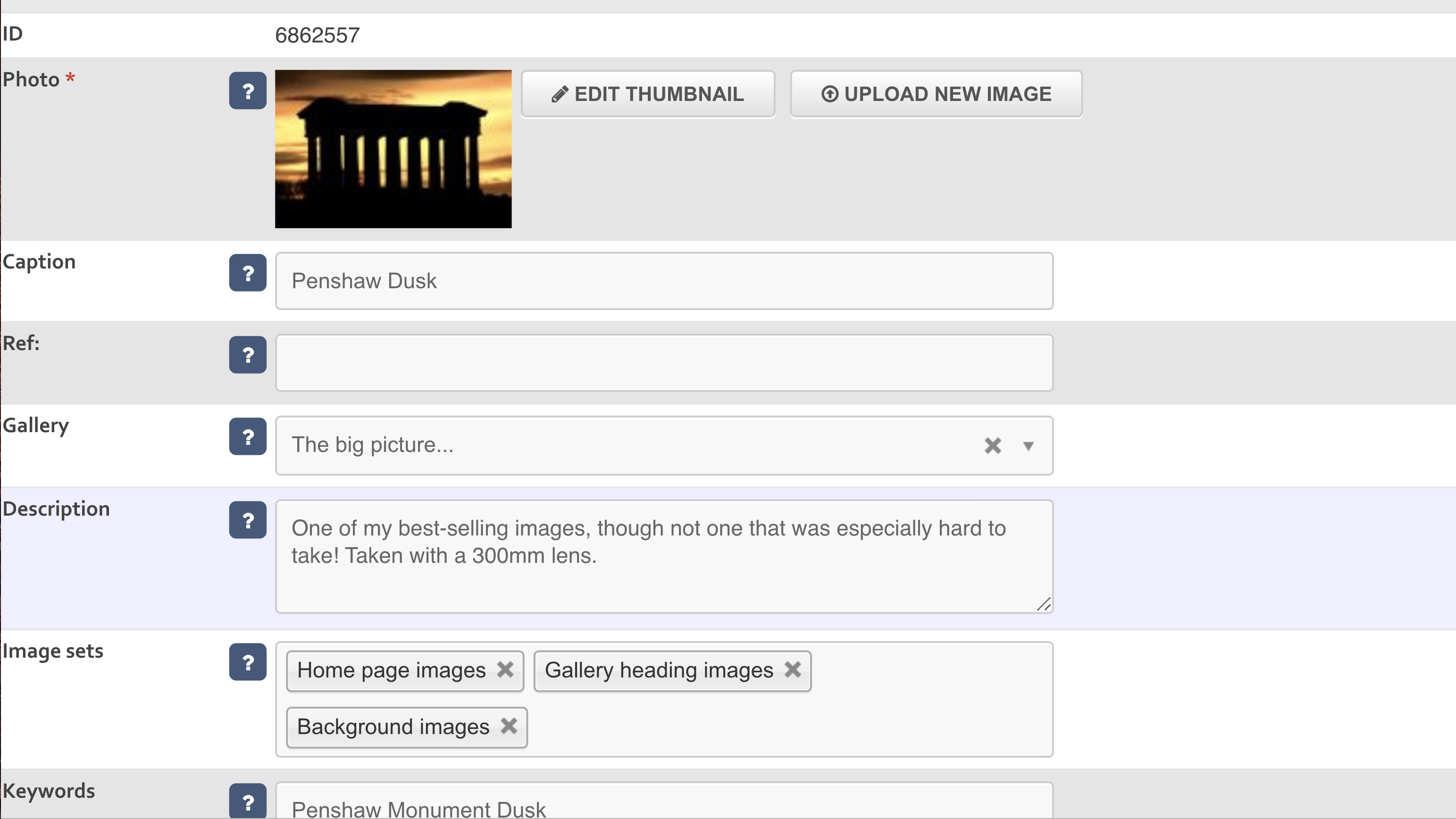
Just as the choice of images you display in the public areas of a studio matters, so does your selection of images to appear in the homepage. Image carousels are common but sometimes you may choose a limited number of shots to represent your entire database of images. It is vital that you choose carefully and pick a sample which is representative of both the quality and style of your common work.
3. Image aspect
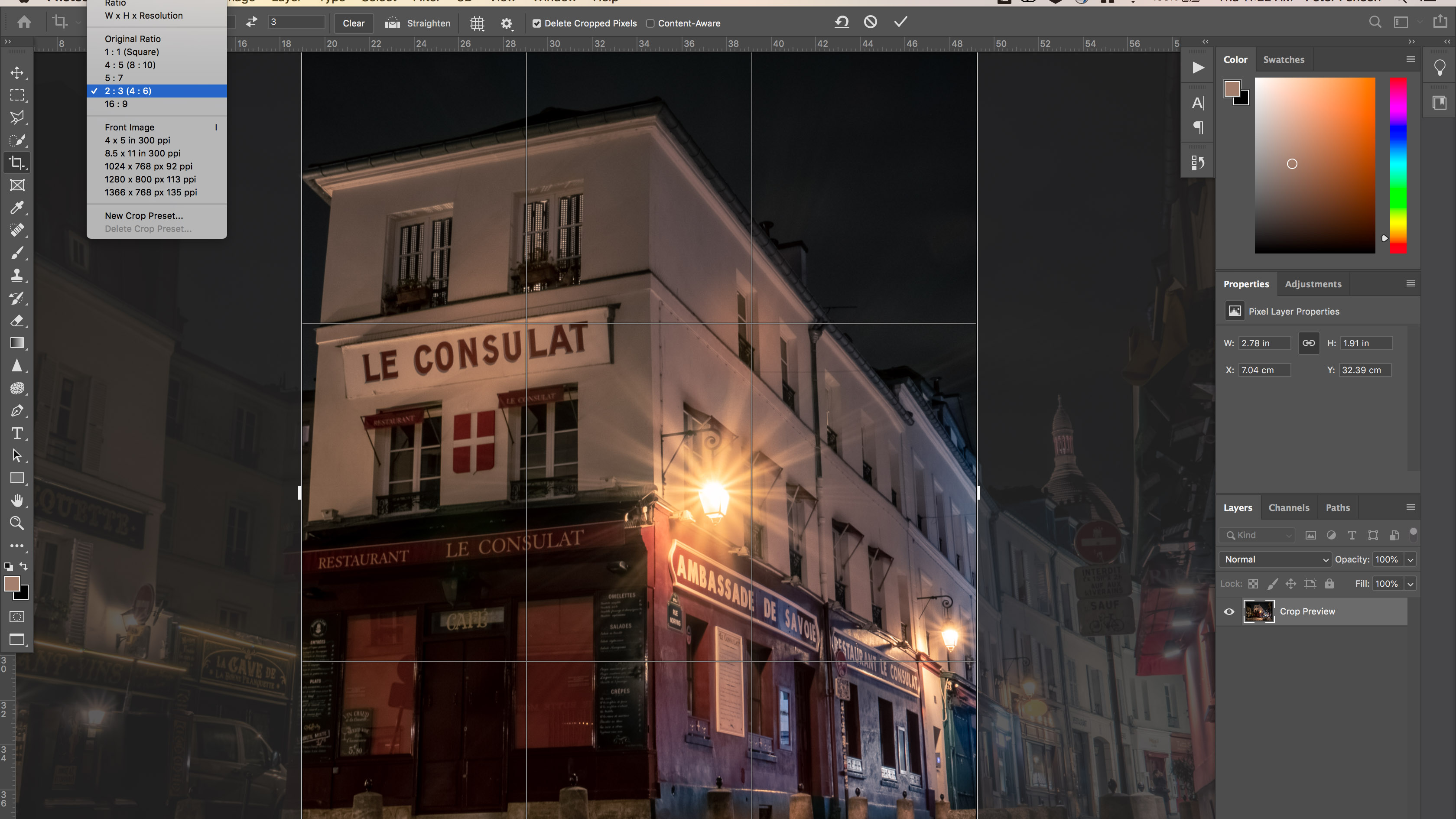
If you shoot multiple subjects, with several different camera formats, it is likely you will have images files with different aspect ratios. However, where possible, minimise regular changes in frame shape in your homepage carousels. Having images continuously alternating between landscape, portrait, 3:2, 4:3 and 1:1 formats can distract from image content.
Get the Digital Camera World Newsletter
The best camera deals, reviews, product advice, and unmissable photography news, direct to your inbox!
• The best monitors for photo editing
4. Text style
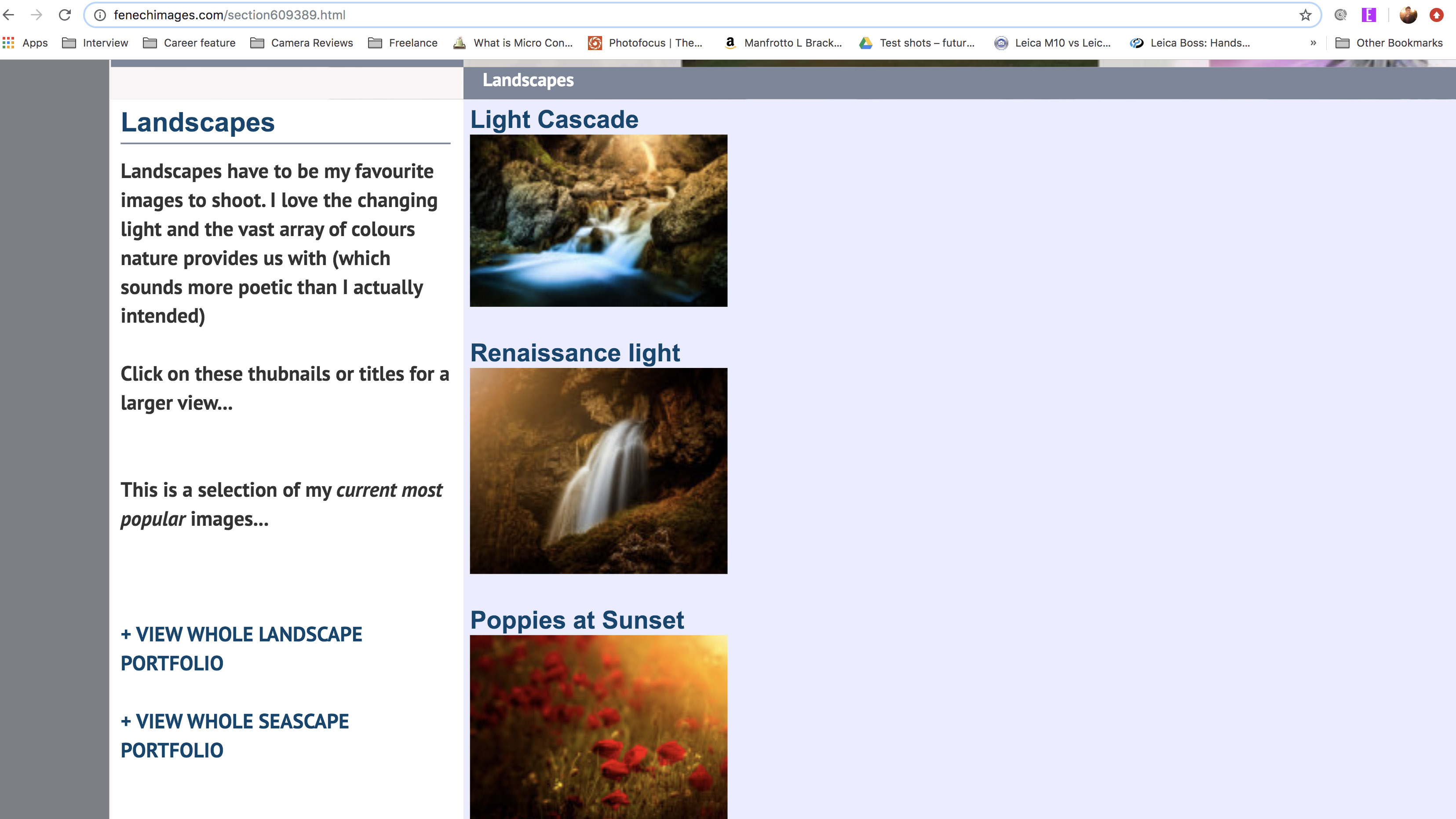
On any photography website the total amount of text should be kept to a minimum, to give the images the space to be appreciated. Some copy is necessary to convey important information such as pricing and your bio however, so ensure the font and colour of all text is in keeping with the website scheme and fits your photographic style. Minimalist imagery may be dominated by bold text for example.
5. Discrete galleries
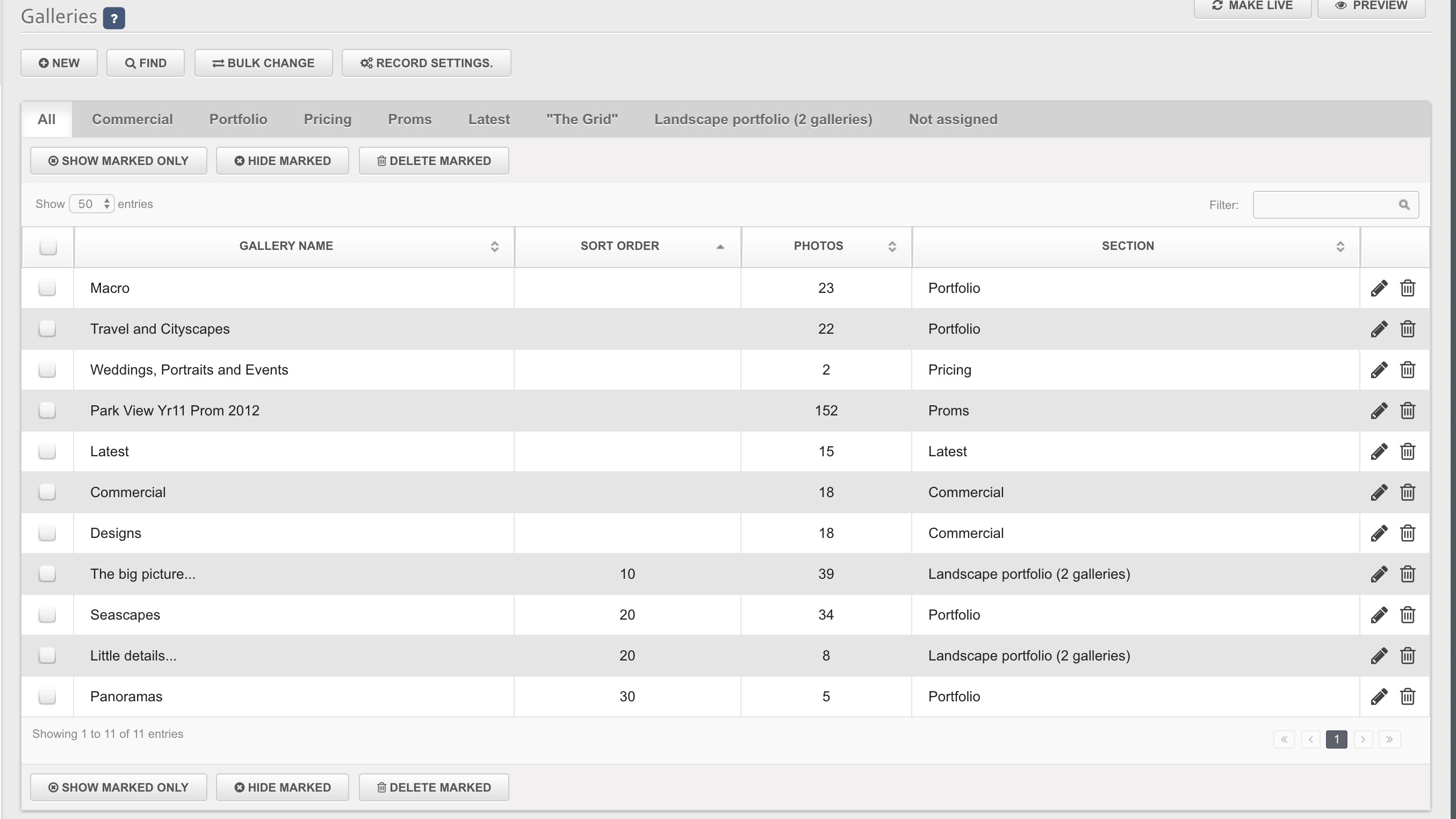
Make browsing your site as easy as possible to maximise the contact between your viewers and your image content. All galleries should ideally be accessible from the homepage and be clearly identifiable. “Gallery 1” is not informative whereas “Landscapes” tells readers exactly where to find certain images.
• The best webcam for home working
6. Space distribution
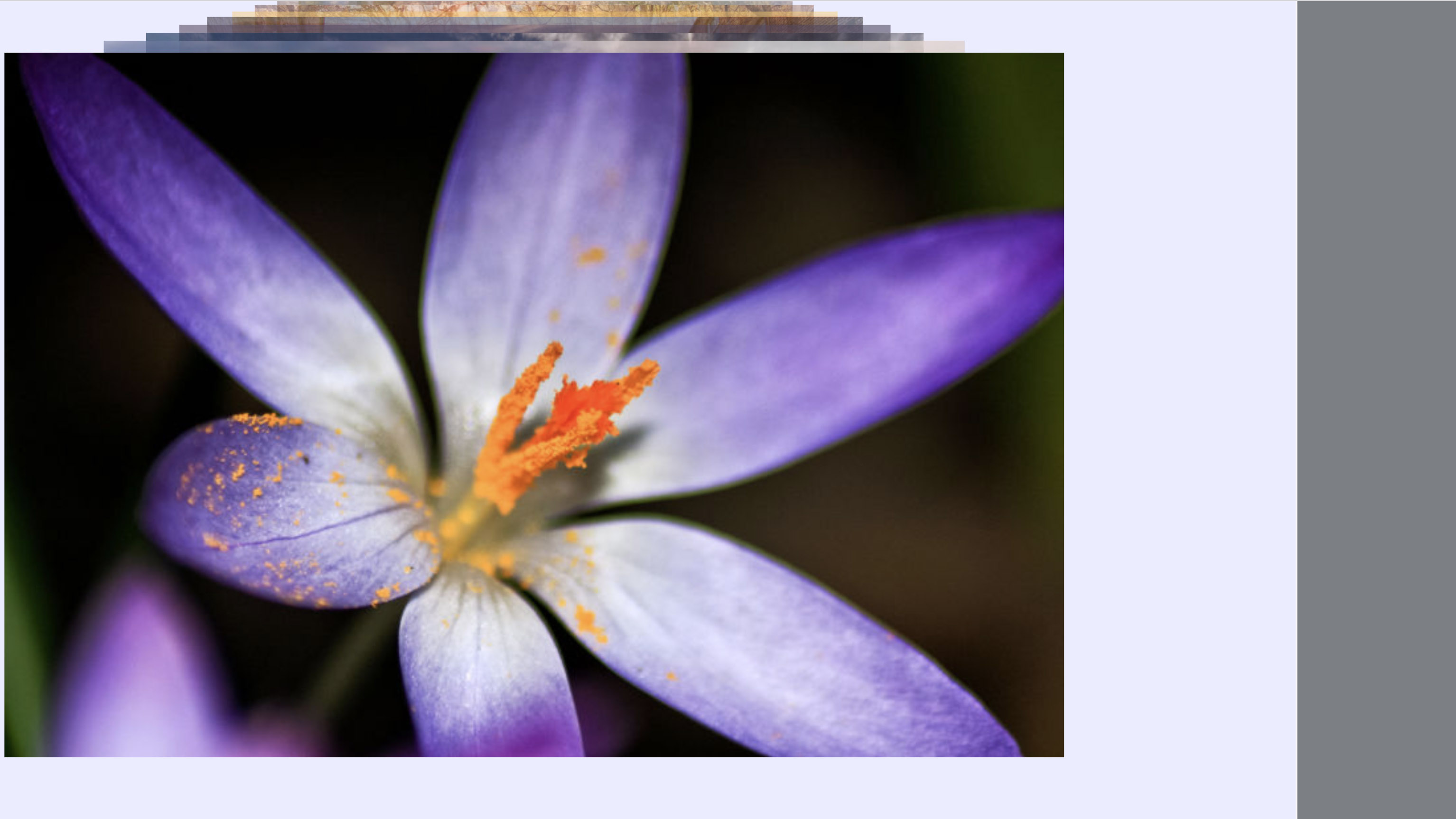
The arrangement of items on your homepage is especially important for a photo website. Many templates feature adjustable ‘padding’ for images which physically separate photographs from ‘functional’ content such as buttons, introductory text or menus. This is a good option if your images regularly feature dense levels of detail. For minimalist compositions consider full page background images with limited overlaying text, filling the negative space.
7. Conclusion
The purpose of a homepage is not just to attract visitors, but to tell clients that you can provide the services they require. It is critical to say something about your style, to guarantee you will be able to form a constructive working relationship with prospective customers.
Read more:
Free eBook and lens glossary with Digital Photographer Magazine Issue 228!
Get six issues of a top photo magazine for £9.99 with this amazing subscription deal!
The best photo-editing laptops in 2020: top laptops for photographers
As the Editor for Digital Photographer magazine, Peter is a specialist in camera tutorials and creative projects to help you get the most out of your camera, lens, tripod, filters, gimbal, lighting and other imaging equipment.
After cutting his teeth working in retail for camera specialists like Jessops, he has spent 11 years as a photography journalist and freelance writer – and he is a Getty Images-registered photographer, to boot.
No matter what you want to shoot, Peter can help you sharpen your skills and elevate your ability, whether it’s taking portraits, capturing landscapes, shooting architecture, creating macro and still life, photographing action… he can help you learn and improve.
