Get a fresh perspective with Affinity Photo 2
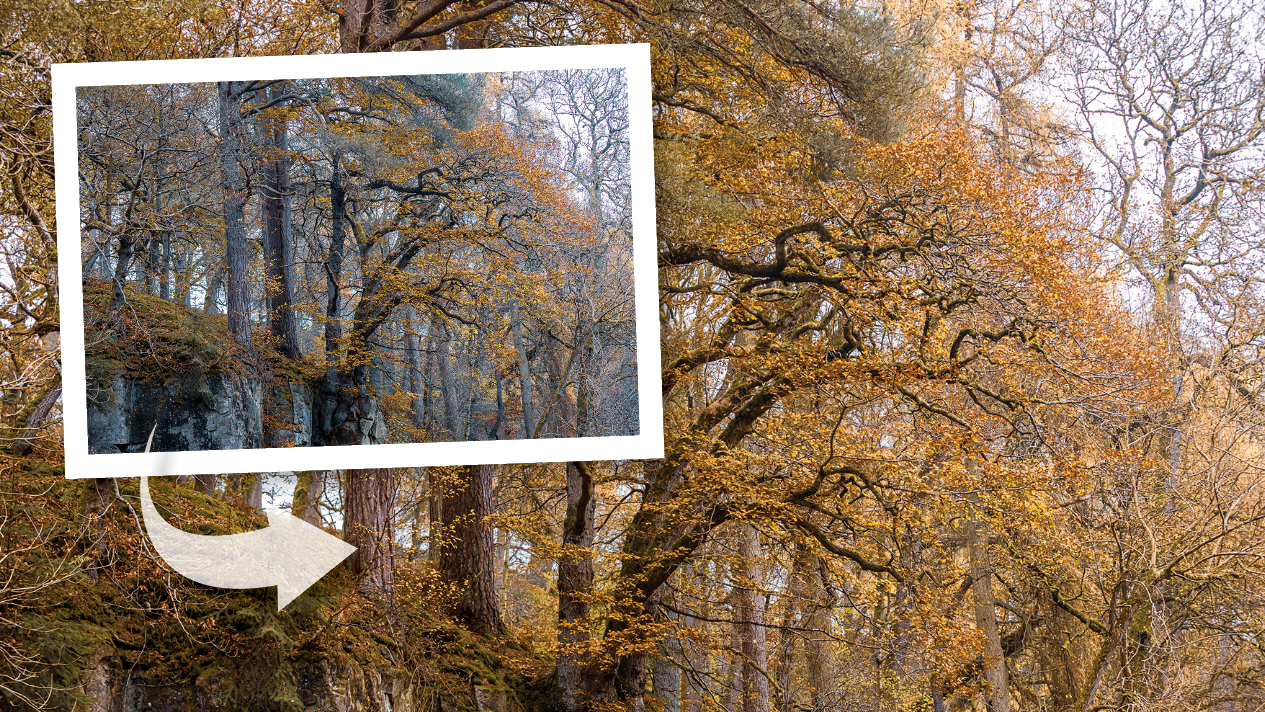
Autumn is the most wonderful time of the year (for shooting and editing stunning scenes). Here’s how to make the most of it.
Unlike in the summer, the light from the sun is low and full of character – and you don’t tend to have the extremes of weather and battery-sapping temperatures that can put an end to winter photography. Unless you’re gunning for wildlife or extreme close-ups, then you don’t need any specialist kit either.
The key to capturing the seasonal hues at their best is waiting for the right light. Autumn leaves can look spectacular when lit from behind on a sunny day, as a blue sky can provide a complementary background to yellow and orange foliage. Overcast days are perfect for when you want to record fine detail in a close-up of a leaf or other small-scale scene, or when you’re shooting in a forest, where the high-contrast lighting on a clear and sunny day would make it challenging to capture everything in a single exposure.
Shooting raw files will give you the most flexibility when it comes to processing your autumn pictures. It will allow you to fine-tune the exposure or change the white balance to add more autumn warmth in RAW software like Affinity Photo 2.
Editing autumn pictures in Affinity Photo 2

Take a light touch to image processing to achieve natural-looking results. This RAW shot of an Acer, taken against a pale sky, had hints of a Japanese painting that I wanted to accentuate. It didn’t require a lot of work, but a boost to the exposure to make the sky pure white, an adjustment to the black level to make the branches near black, and then, later, some colour adjustments to shift the green hue of some of the leaves towards yellow helped to create a more consistent aesthetic.
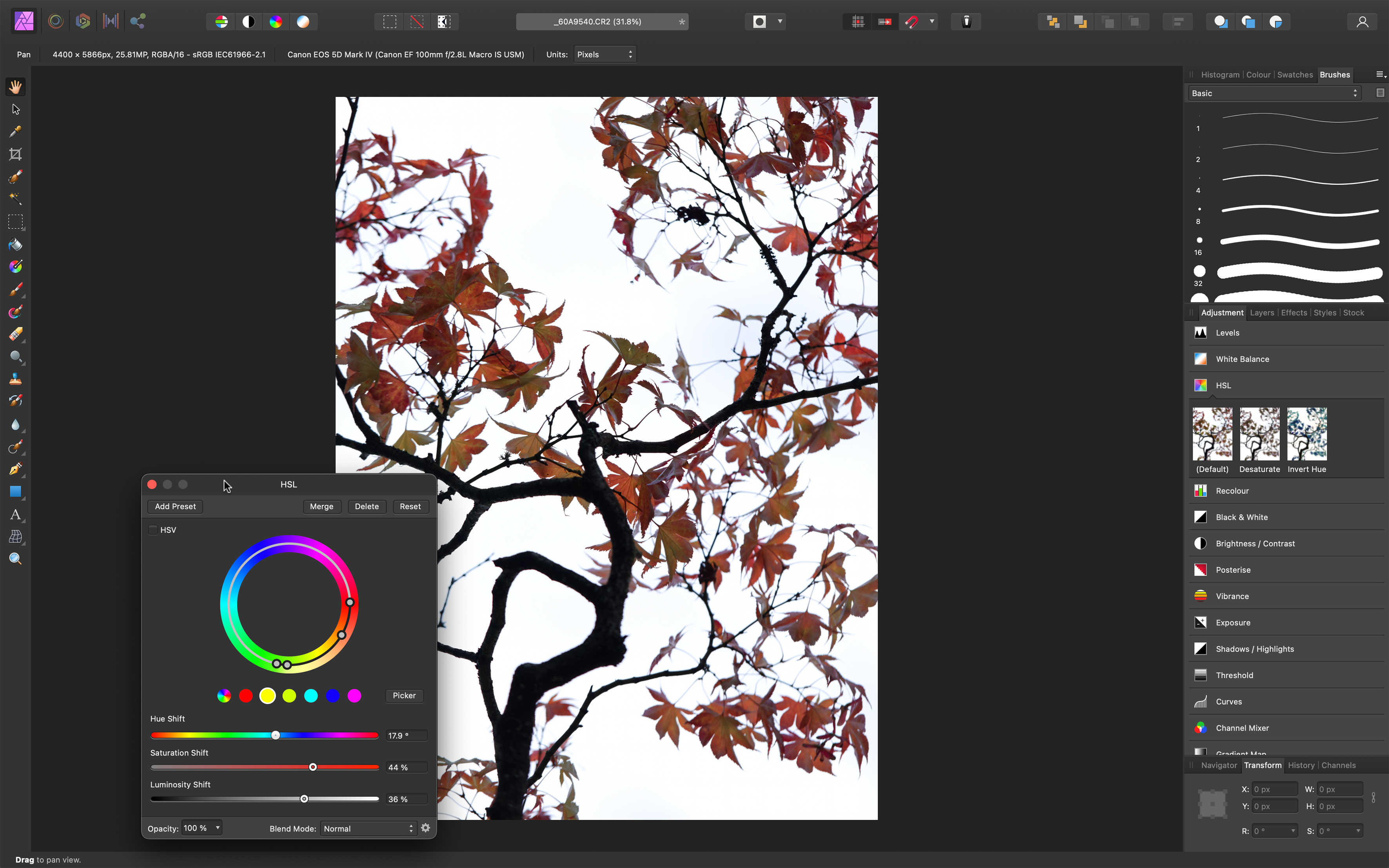
When shooting high-contrast subjects like this, magnify the image and check the edges of the object (in this case, the branches) for ‘fringing’ (blue, green, red, or purple halos). This can easily be removed automatically.
The initial adjustments made to the original image (left) were to apply automatic lens corrections and then crop to create a tighter, cleaner image.
5 autumn photography tips

Out now, Affinity Photo 2 is the brand-new version of the only fully-loaded photo editor integrated across macOS, Windows and iPad. The first choice of millions of creative and photography professionals around the world who love its speed, power and precision, Affinity Photo 2 has everything you need to edit and retouch images, create multi-layered compositions, beautiful raster paintings and so much more. It's also equipped with hundreds of timesaving tools and a completely redesigned UI to make your editing experience more seamless than ever. Affinity Photo 2 is available for a one-off payment with no subscription, or try the 30-day free trial.
1) Embrace changeable weather
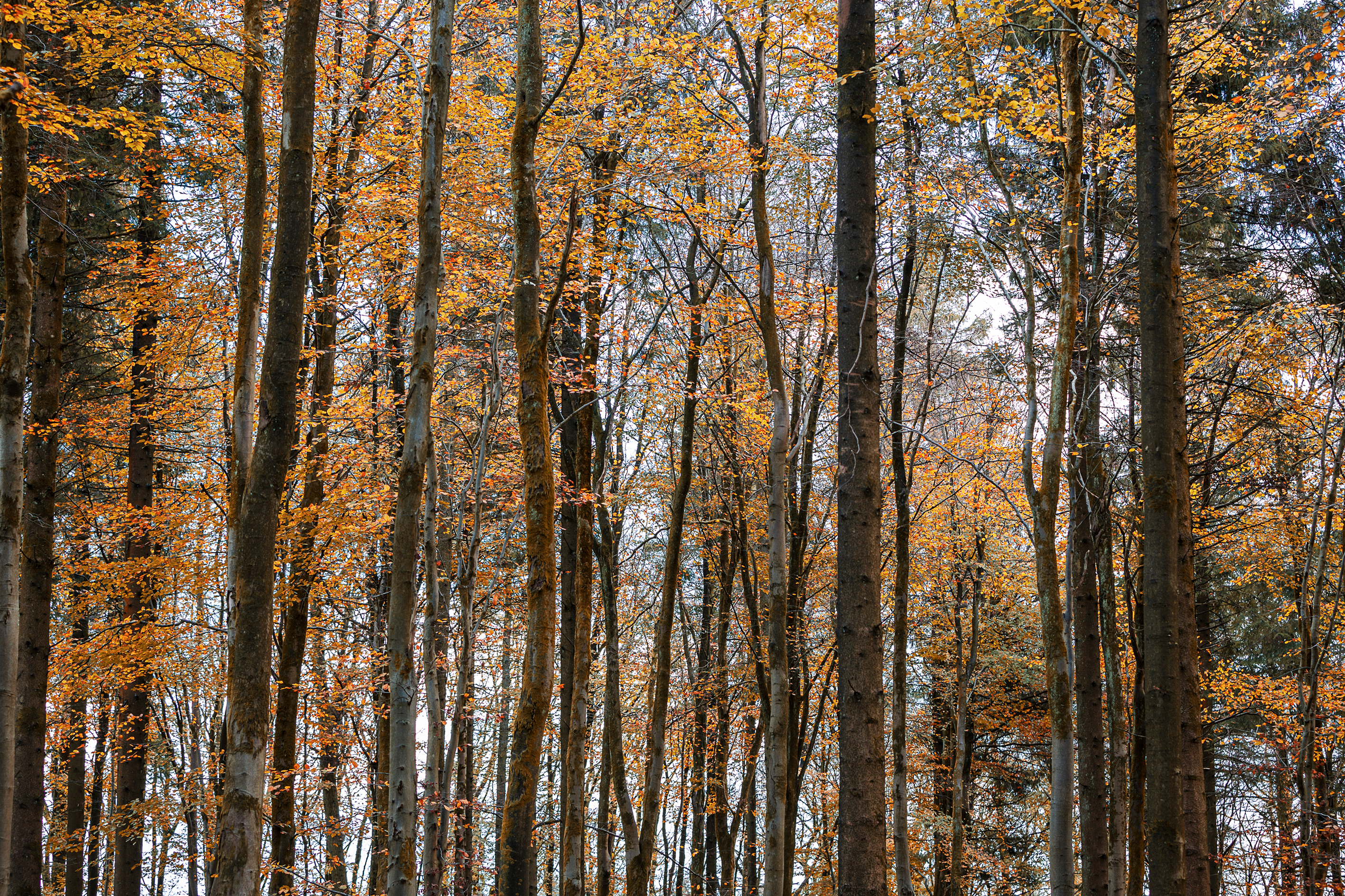
While clear blue skies can provide a complementary backdrop to yellow and orange foliage, overcast conditions can create softer lighting that allows you to capture the subtleties in close-ups and woodland shots.
2) Get creative with colour
Use the Cloudy and Shade white balance presets to add additional warmth to autumn foliage and shots taken at sunset and sunrise. Experiment with your camera’s picture style options, too – although avoid the most saturated settings to keep things accurate. Shooting raw files will give you the opportunity to adjust these settings later.
3) Make the most of mist
When mist is forecast, head out early to grab some evocative shots. Be prepared to increase the exposure to keep misty scenes bright rather than dirty grey.
4) Use a circular polariser
Not only will this type of filter allow you to remove glare from damp foliage and boost the saturation of the autumn colours, it cuts the light coming into the camera, allowing you to experiment with creative motion blur effects.
5) Capture the full range
Start shooting early in the season so that you can capture the transition of leaves from green to vivid autumn hues. Consider shooting a scene from the same spot at different times so that you can record the changes in the season.
Editing architecture with Affinity Photo 2
Converging verticals often occur when the camera tilts up to include the top of a building. The vertical lines will collapse towards the centre. This is exacerbated by using a wide-angle lens, which exaggerates perspective.
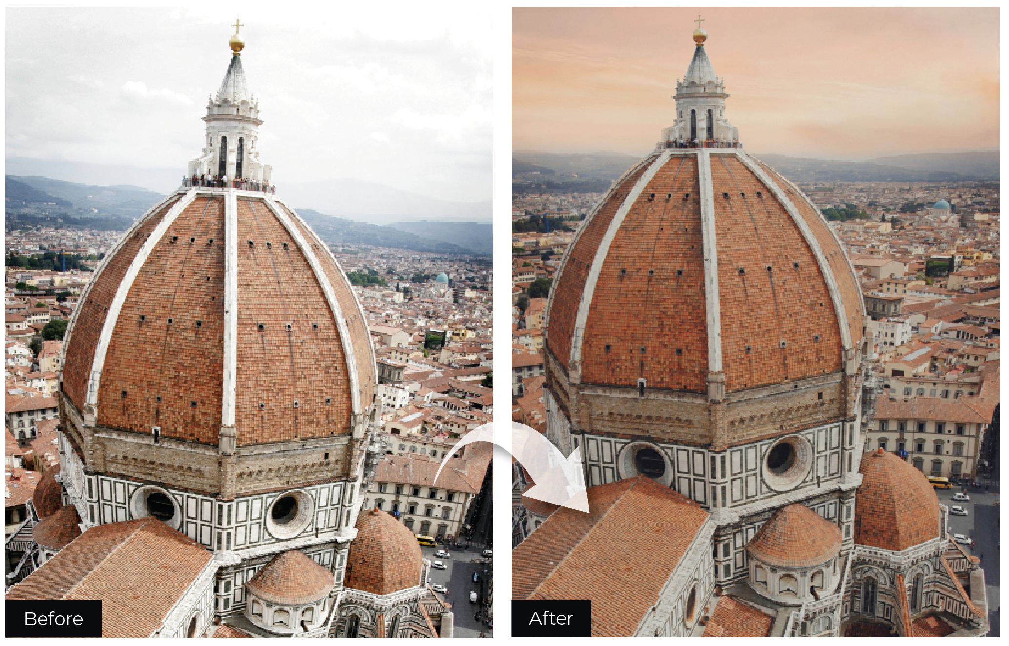
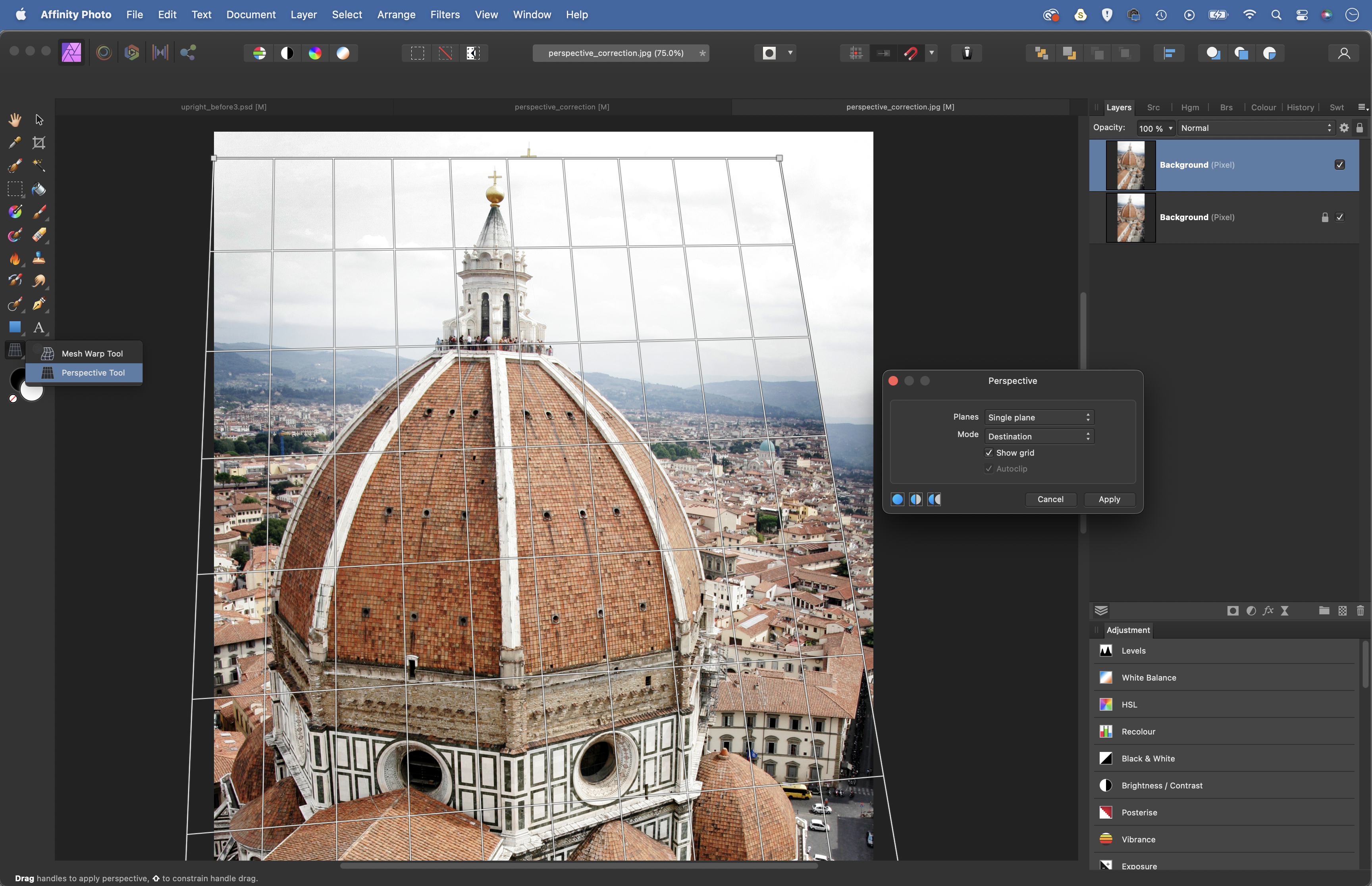
A similar issue can occur when the camera is tilted downwards from a high vantage point, as in this image of Florence. The downwards tilt has caused the vertical lines in the cathedral to taper inwards towards the bottom, and as such the building initially looks distorted and top-heavy.
Affinity Photo 2 offers several tools for correcting verticals and adjusting perspective. First, there’s Perspective, which lets you move the frame into position, and there are the Lens tools. However, perspective corrections can leave the scene looking squashed or stretched. What’s more, you often need to pull in the top or bottom of the frame, resulting in empty corners. A crop can fix this, but what if the original framing doesn’t leave room for cropping? Here’s how to tweak perspective and correct other problems…
Found under Layer > Live Projection > Perspective Projection, this handy feature allows you to work with perspective planes in an image as if they were flat, 2D images. For example, if you’d like to clone along a wall or floor that recedes into the distance, you can do so in perspective by first plotting a projection over the surface, then editing a flat version of it. After initiating the command, drag the corners of the grid so that they match up with a plane in the image, then grab the Clone tool (or any other tool) and you’ll see a flat version of the plane appear, ready for cloning. Once done, grab the Move tool and choose Edit Live Projection, then go to Layer > Projection > Remove Projection.
1) Perspective tool
Found in the Affinity Photo toolbar, the Perspective tool allows you to reshape your image by skewing it along the horizontal or vertical (you’ll also find identical controls in the Perspective filter > Filter > Distort > Perspective). Grab the tool and hit Cmd/Ctrl+J to make a new copy of your layer, then drag the corners of the box to skew the layer. Hold Shift to snap a grid handle horizontally or vertically as you drag it.
2) Single and double pane
The Perspective panel pops up when using the Perspective tool. There are several options here. As well as Single Plane – which lets you drag the four corner points of the layer – there’s Dual Plane, which splits the image in half centrally with two places of perspective. You can also choose between Destination, which shows changes in real-time, and Source, which only shows results once you hit Apply.
3) Mesh tool
Mesh lets you warp your image. Grab the tool, double-click over parts of the image to add anchor points, then drag the anchor points to warp the image. You can make multiple points either to anchor things in place or move them around and shift several points at once by dragging a box over them. Here, it enables us to shift the proportions of the dome with the rest of the building.
4) Fill missing corners
Our perspective fixes have left us with missing corners, the tight framing making it hard to crop. Instead, we can edit the background to fill the gaps. If it’s a plain area then try the Inpainting tool to make new pixels. For detailed backdrops, we can stretch existing details. Here, we made a selection of the city in the background, copied to a new layer, then used Mesh Warp to stretch it to the edges.
5) Try a new sky
To balance out the proportions of the dome with the rest of the building, we’ve squashed the height slightly, but this has left us with an empty space at the top. We could stretch out the sky to fill it, but as it’s a dull sky, we’ve dropped in a new one instead. Select the sky with the Selection Brush, copy in a new sky image and click the Add Mask button to mask it to the original sky.
6) Try raw lens tools
As well as the perspective tools in the Photo Persona, you’ll find lens correction tools in the Develop Persona. Click on the Develop Persona at the top left, then go to the Lens panel. Here, you’ll find Horizontal and Vertical sliders to shift perspective and fix converging verticals. Also, a distortion control can help to correct barrel distortion.
Get the Digital Camera World Newsletter
The best camera deals, reviews, product advice, and unmissable photography news, direct to your inbox!
Digital Camera World is one of the leading authorities on camera and photography news, reviews, techniques, tutorials, comparisons, deals and industry analysis. The site doesn't just specialize in cameras, but all aspects of photography, videography and imaging – including camera phones, gimbals, lenses, lighting, editing software, filters, tripods, laptops, printers, photo books, desks, binoculars and more.
Whether you're using, looking to buy or trying to get the most out of a compact camera, action camera, camera drone, cinema camera, beginner camera or professional camera, Digital Camera World has a roster of experts with combined experience of over 100 years when it comes to cameras, photography and imaging.

