Have you ever made a photobook? You really should. Here’s how to do it right
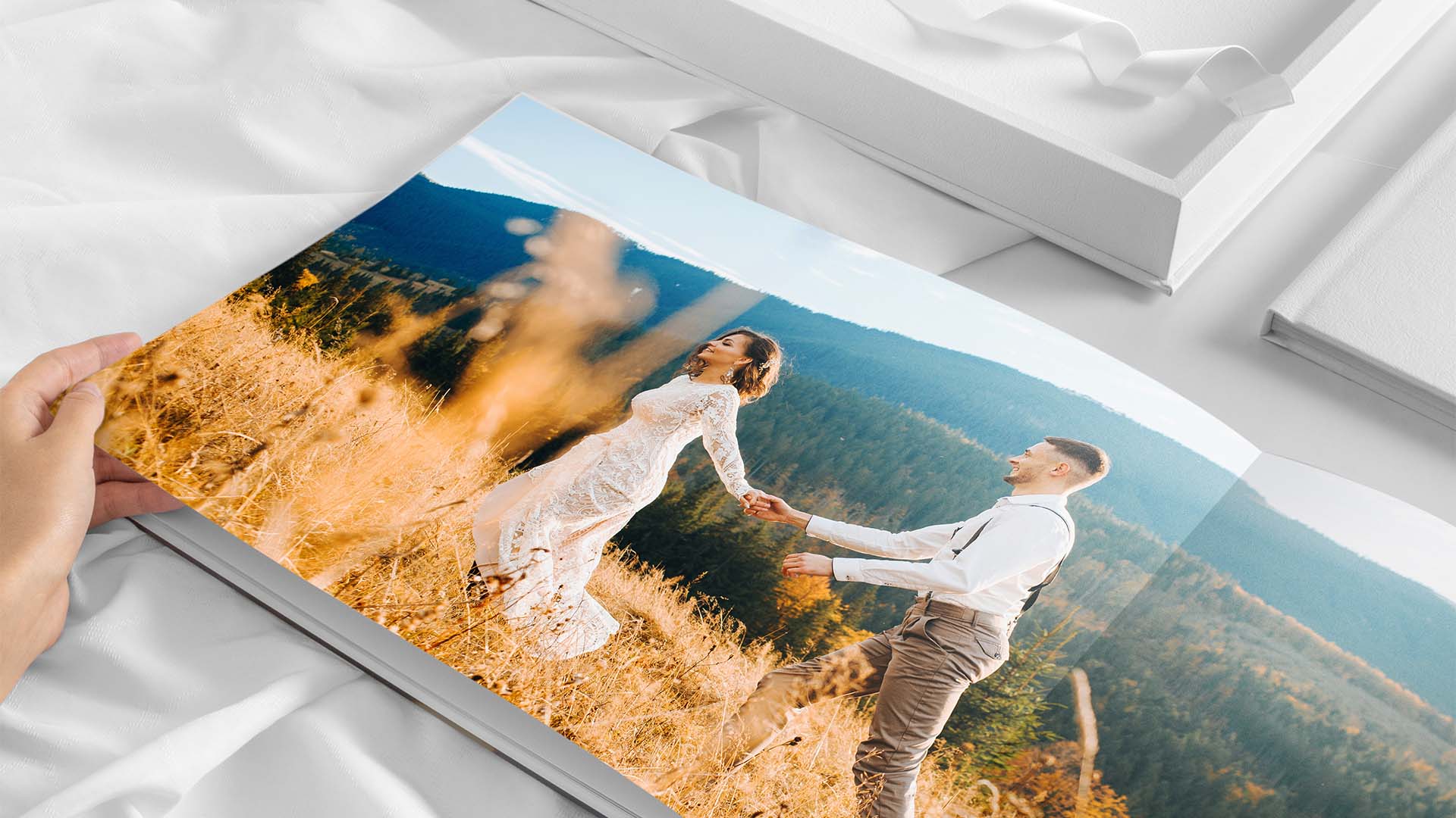
The process of printing photographs is just as involved and important as the process of taking them. Yet, so often, printing is the part that gets the least time and consideration. We’re too eager to just send our images to whoever is cheapest, or first on Google – and then, when we see the results, we get grumpy because the results aren’t what we expected.
When you take your photographs, you are micromanaging so many variables. Focal length, focal point, composition, compositional interest, depth of field, color temperature, perspective… so why would the printing of your images be any less involved? Taking your shots isn’t a one-click process, and neither is presenting them in print. This is especially true when it comes to printing a photobook; just like taking or editing the photos themselves, this is a process that demands thought and deliberation.
There are no rules, per se, but ultimately these are your images, this is your art, this is your story. And creating a photobook with Saal Digital gives you all the tools, techniques and tricks to tell your story exactly the way it deserves to be told.
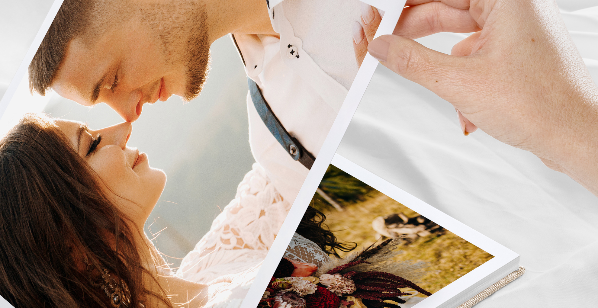
Don’t just slap in the right number of images to fill up the pages you’ve paid for. Whether your purpose is professional, to present your work at its finest, or personal, to preserve moments and memories, you need to ensure that you guide the viewer on a visual journey, narrating it with words, or empty space, or even clipart elements.
Saal Digital offers an incredible – and incredibly simple – design suite, accessible via its website or a dedicated app that you can use on your phone or mobile device. The intuitive interface makes it easy to add, move and manipulate your images, along with text and art elements, whether you’re using templates or going ‘fully manual’.
Here are ten tips to create the perfect photobook…
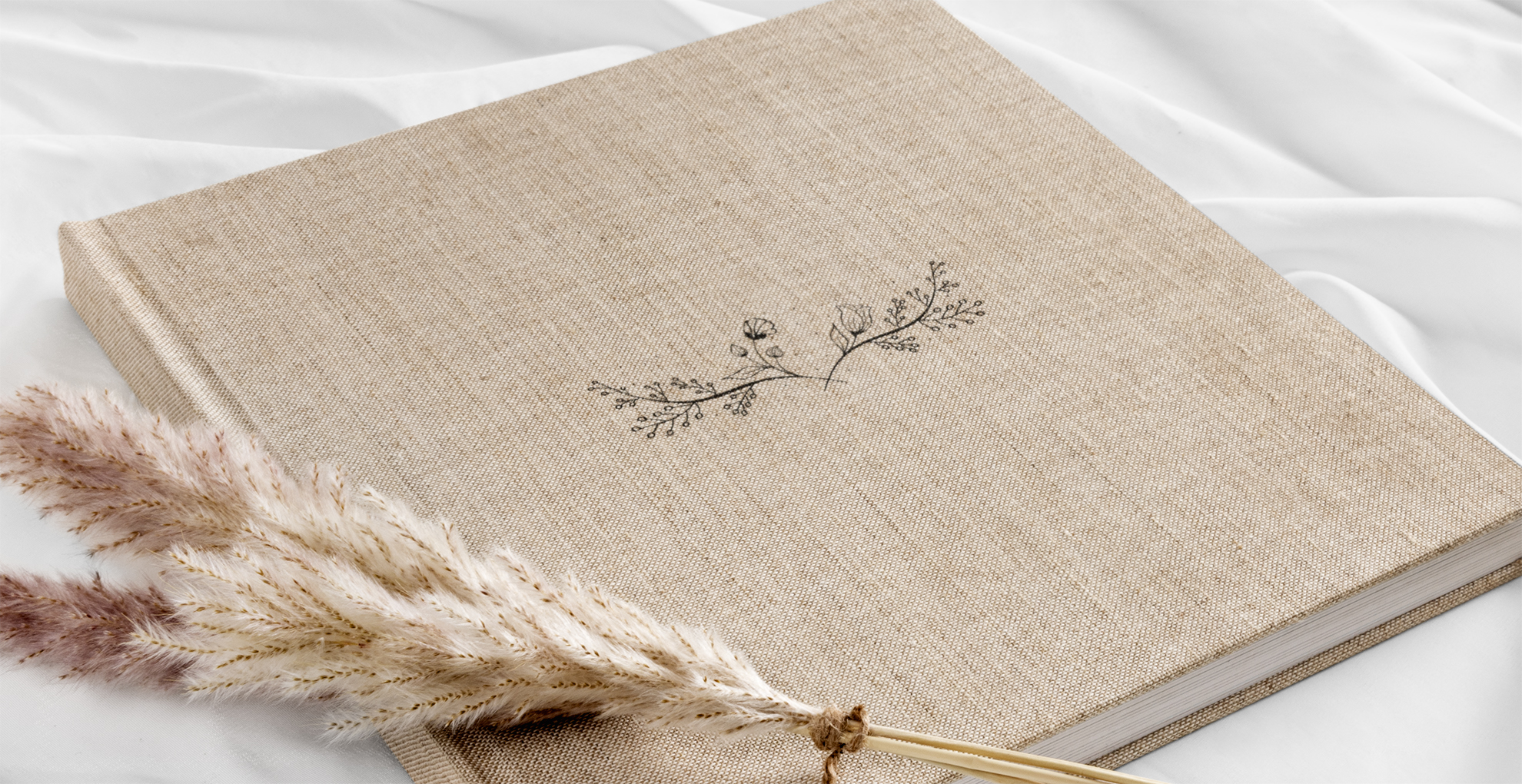
1) Choose the cover carefully
Your cover represents what lies inside, so take the time to find the most epic photograph. If you’re not able to find something that adequately expresses the content, you can opt for a classy, high-quality material finish. You can also embellish it with text and clipart.
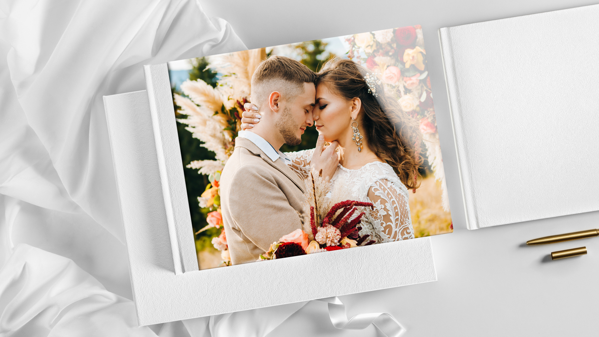
2) Consider the order
Even the most beautiful images become a hodgepodge if you aren’t careful. Try to follow a coherent order when laying out your pages, whether you’re basing it on dates, themes or places. With Saal Digital’s software you can quickly organize images based on different factors to help you maintain attention and interest.
3) Set the stage
Start your story with a suitable introduction, to lay the groundwork for what the viewer is going to see. Customizable inside front covers can be used to write something appropriate, or you can make the most of Saal Digital’s layflat binding to start with a dramatic “wow” moment as soon as the cover is opened.
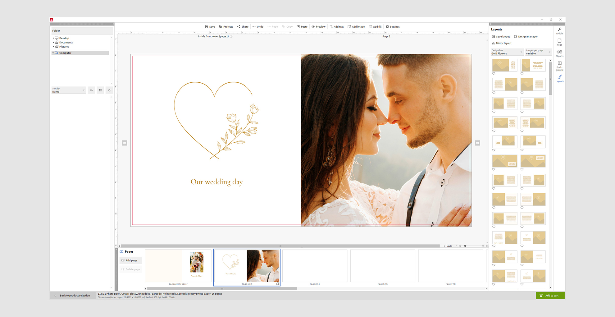
4) Keep your priorities
The most important photos should be given priority, in terms of size and positioning, while less relevant shots should be kept smaller. Think how magazines use 'money shots' on a page, with scene-setting shots to support or lead up to them. Just bear in mind that wide-angle shots require more space than close-ups, but the ready made layouts will ensure that every element is placed properly.
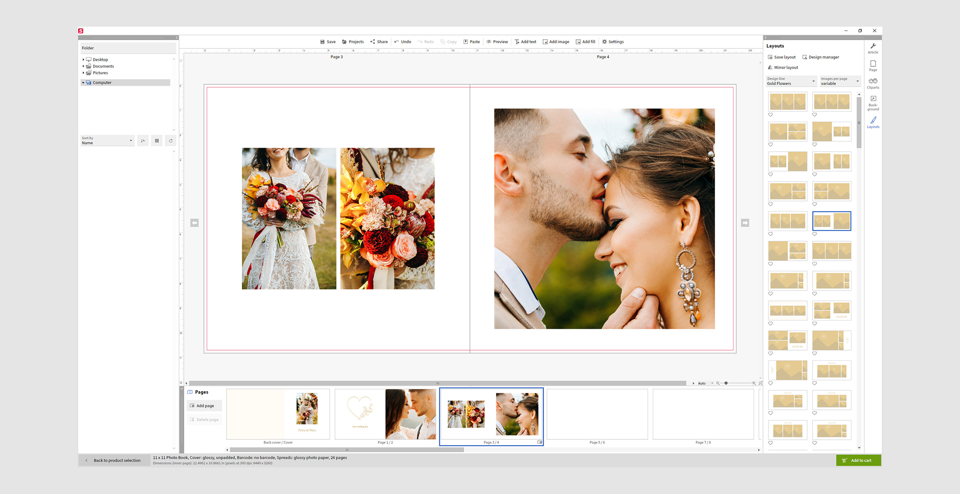
5) Don’t be afraid of space
It can be important to leave margins between your photos. White spaces give the eye and the page room to breathe, as the viewer’s gaze moves from image to image, and they also help create a hierarchy between shots. In addition to templates, Saal Digital offers an auto layout function to help with this.
6) Use elements sympathetically
Photos speak for themselves, but you can give guidance, commentary or further information using backgrounds, frames and clipart. What’s crucial, though, is that your elements are harmonious and sympathetic in order to maintain the same style.
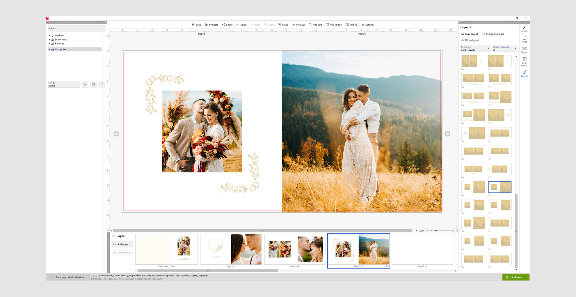
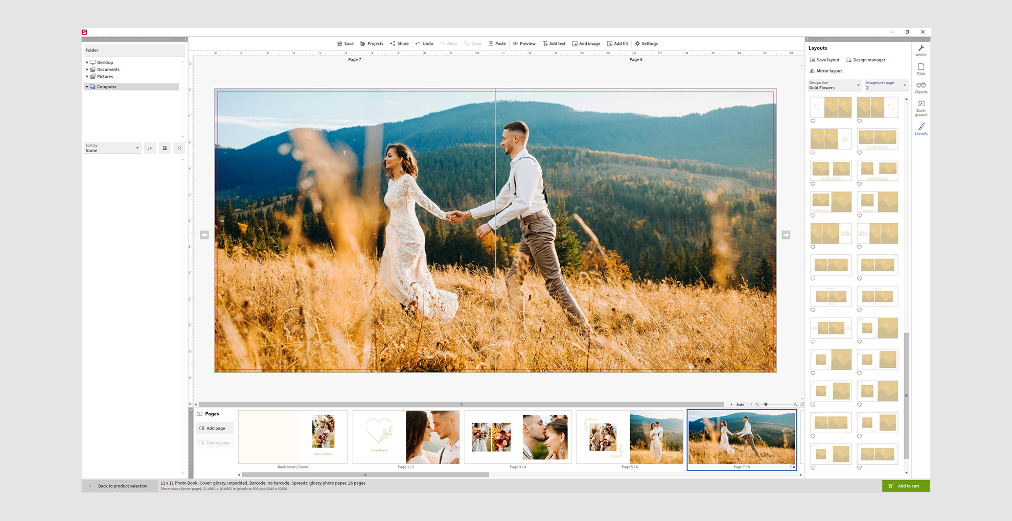
7) Showcase your showstoppers
Saal Digital’s layflat binding means that open pages are perfectly flat, giving you the opportunity to present an image across an entire double-page spread for maximum impact. Alternatively, you can use a photo as a background to support and scene-set other images or even text.
8) Keep it in the family
Don’t go overboard with fonts; try to use stick to a single font family, and exploit its variations and aspects in order to tell your story. This way you can create hierarchies within fonts, creating a subtle visual language that helps contextualize your images.
9) K.I.S.S.
Unless it’s absolutely necessary, keep it simple (stupid)! Elements need their own space and shouldn’t have to compete against each other for attention.
10) Grand finale
Just as you put a lot of thought into the front cover and inside front cover, take advantage of the inside back to capture one last message or end your story with a fitting photograph. Just like a movie, the ending really matters, so get it right whether you’re using words (or a single word), images (or a single image!) or other elements.
Visit Saal Digital for more information and to get started creating the perfect photobook.
Get the Digital Camera World Newsletter
The best camera deals, reviews, product advice, and unmissable photography news, direct to your inbox!
Digital Camera World is one of the leading authorities on camera and photography news, reviews, techniques, tutorials, comparisons, deals and industry analysis. The site doesn't just specialize in cameras, but all aspects of photography, videography and imaging – including camera phones, gimbals, lenses, lighting, editing software, filters, tripods, laptops, printers, photo books, desks, binoculars and more.
Whether you're using, looking to buy or trying to get the most out of a compact camera, action camera, camera drone, cinema camera, beginner camera or professional camera, Digital Camera World has a roster of experts with combined experience of over 100 years when it comes to cameras, photography and imaging.

