Make stunning architectural abstracts in Affinity Photo
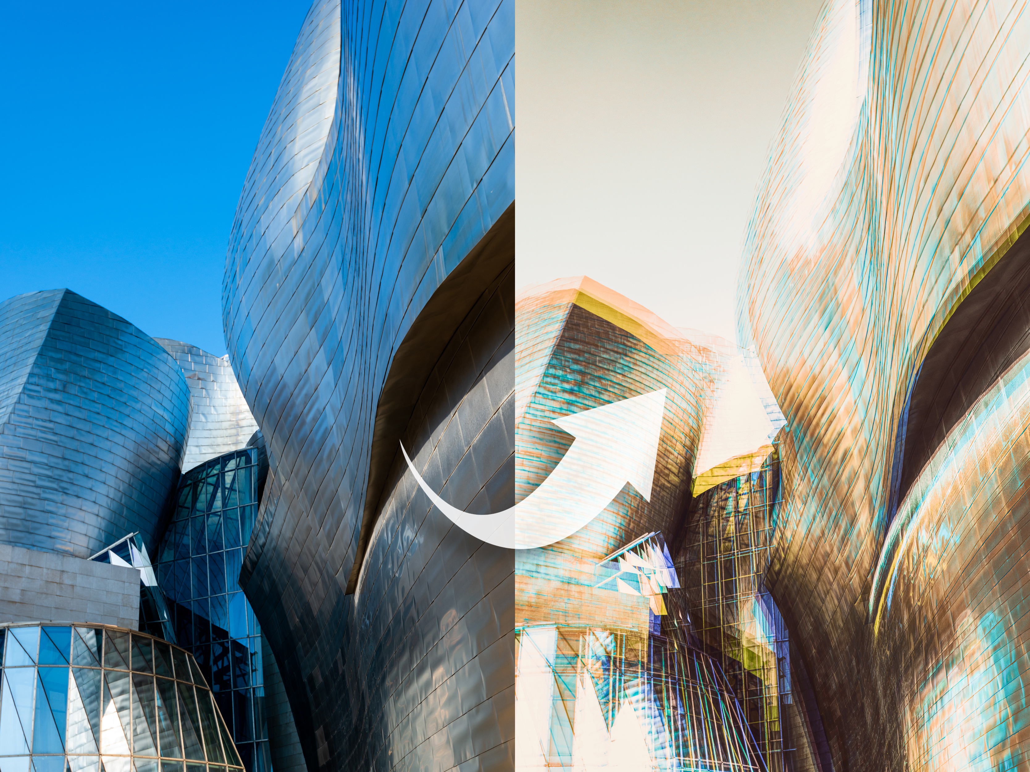
Architectural photos lend themselves particularly well to abstract effects. A beautiful building like the Guggenheim Museum in Bilbao here can be reduced to a graphic array of angular lines, sharp details and splashes of colour.
In this project we’ll look at how to create these striking abstracts in Affinity Photo. To restyle our modern, futuristic-looking subjects, we’ll make use of an age-old technique, the multiple exposure effect. But rather than combining multiple images, we’ll instead duplicate and reuse the same frame several times.
We’ll begin by duplicating our original image layer, then set the Blend Mode to Screen and offset the copy slightly to create our effect. The rest of the technique is about bringing it all together: altering colours to create more depth and vibrancy, then add a final tonal effect.
You could use any architectural photo as a base for the effect, or even go one step further and shoot a series of images of a building from slightly different angles, then combine the sequence. It’s the kind of effect you’ll want to try out on lots of different images, so we’ll also explain how to make a Macro. This way, we can repeat the process on another image in an instant.

1) Blend layers
Our abstract architecture effect is inspired by the multiple exposure technique. In the days of film, this was done by rewinding the same frame to be exposed several times. The Screen Blend mode in Affinity Photo does the same thing by combining the bright parts of one layer with the layers underneath. We can duplicate our layer, set the blend mode to Screen and reposition the duplicate.
2) Copy and reposition
Begin by duplicating the bottom layer with Cmd/Ctrl + J then go to Blend Mode in the Layers panel and change it from Normal to Screen. Next, grab the Move tool and click on the corner point of the bounding box around the layer. Drag to scale the layer, then use the arrow keys on your keyboard to nudge the position so that it’s offset from the layer below. Try recolouring the layer (see tip 3), then repeat to build up the effect.
3) Shift colours
To add variety to our abstract effect, we can alter the colours in each blended layer. When combined, these create vibrant streaks. To change colours on a layer, click the Adjustment icon and choose Recolour. Drag the Hue slider to tint the image, then control the colour’s strength with the Saturation slider. Once done, hit Cmd/Ctrl + E to merge the Adjustment layer with the pixel layer below.
4) Make a Macro
Macros enable you to speed up tasks by recording a sequence of edits that can be played back on other images. It lets you try it out on any image in seconds. Go to View > Studio > Macro and hit record to start making a Macro. Duplicate, blend scale and recolour the layer as described, before repeating the process. Hit the Stop button once done. Click the Add to Library icon to save the Macro, then open another image and click it to play.
5) Add Clarity
Clarity boosts midtone contrast, crisping up image details. It’s like sharpening, adding contrast to edges, but works on a wider scale than sharpening filters. An increase in Clarity can be effective for architectural images. We can add it as a non-destructive Live Filter layer. After merging a copy of the layers with Cmd/Ctrl + Shift + Alt + E, go to Layer > New Live Filter Layer > Sharpen > Clarity then increase the slider to enhance the details.
6) Final tonal tweaks
To offset the image being overly bright, we could darken the background layer before starting the effect. We can also add a tonal effect at the end to recover bright highlights and alter the colours. We’ve used the Tone Mapping Persona for this. First, press Cmd/Ctrl + Shift + Alt + E to merge a copy of all layers, then click the Tone Mapping Persona and experiment with the presets.
Make a triptych
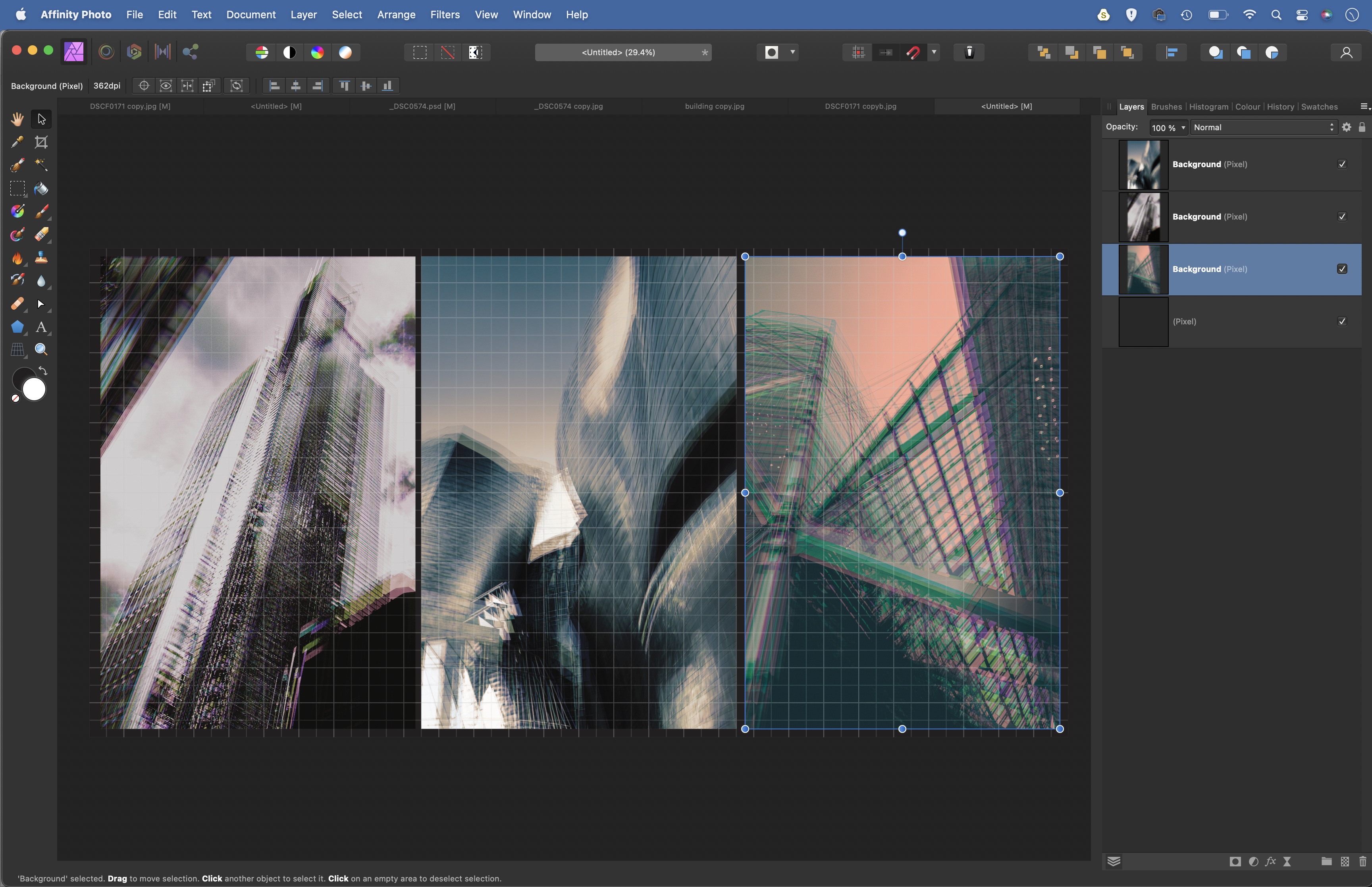
Architectural abstract images can look fantastic when grouped together as a duo or a triptych, then printed out for a wall display. We can arrange three images together in Affinity Photo with ease. After making the first image, run the Macro (see tip 4) on two others, then recolour them as you like.
Go to File > New and make a document size to fit all three images – for example, 28 x 14in. Go to View > Grid and then copy (Cmd/Ctrl + C) and paste (Cmd/Ctrl + V) each image in. Finally, use the Move tool to resize and position the three images.
• See more of our Affinity Photo tutorials
Shoot the urban landscape with your camera
Taking pictures in cities and towns can be incredibly satisfying, thanks to the architect-designed nature of the place. Clean lines, symmetry, bold colours and the contrast between the old and the new can all be used to build interesting scenics, abstracts and vignettes of urban life.
You don’t need a lot of kit, either. A standard zoom lens will give you just enough reach at either end of the scale to capture everything from wide skylines to building details. You can add an ultra-wide lens and a longer telephoto to expand your creative options, although travelling light with a single zoom will be easier on your shoulders and make it easier to be more spontaneous.
In some situations it can be a little daunting to bring your camera up to your eye if there’s a risk of security guards approaching to see what you’re up to – or even attempt to prevent you from taking pictures. If you’re on public land, then you shouldn’t have anything to worry about, but it’s worth bearing in mind that a lot of private property isn’t clearly marked. With this in mind, it pays to be cautious and courteous, but confident when you’re sure of your rights.
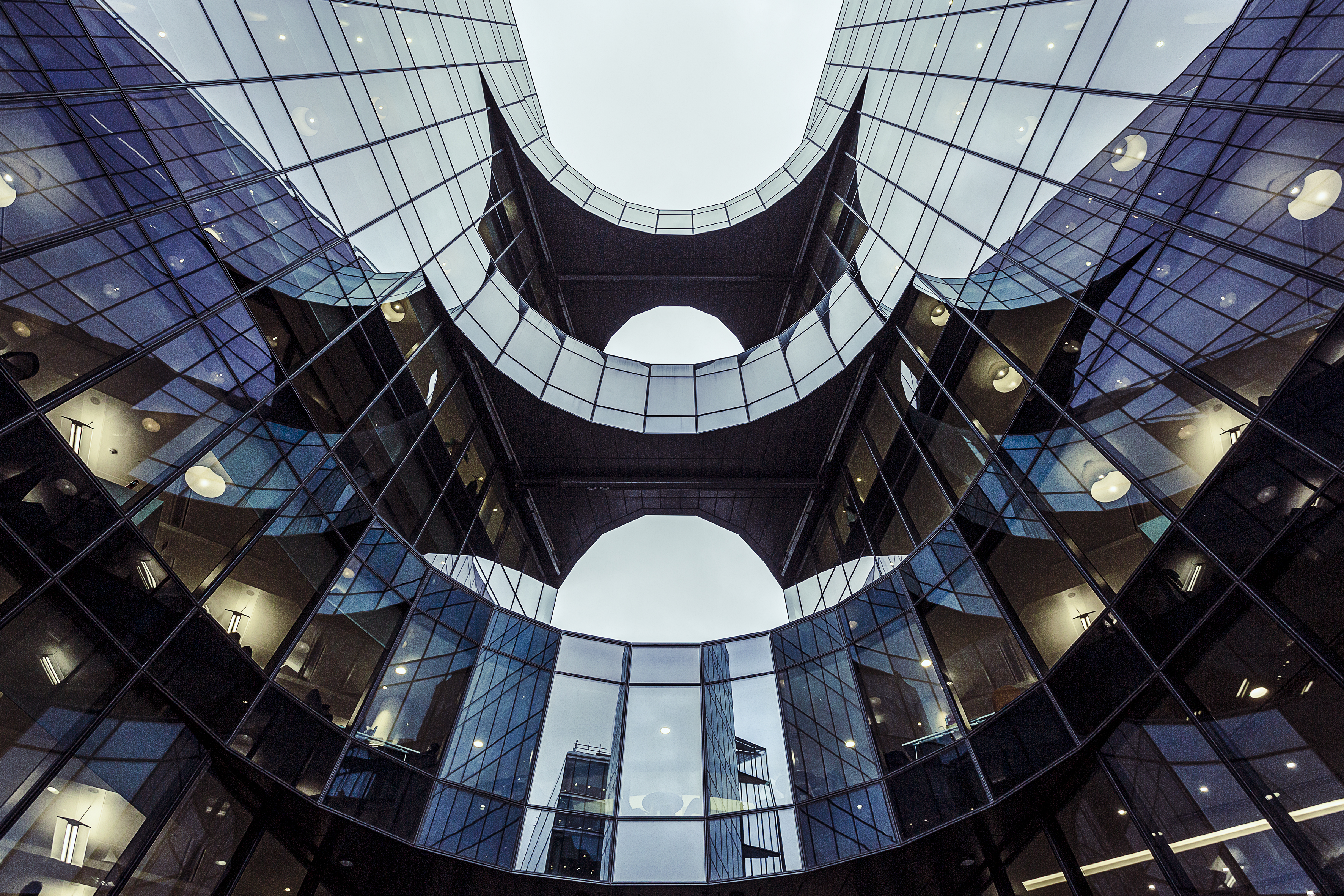
It can be challenging to know where to start when you’re faced with a bustling urban environment. I generally begin by looking for simple lines and shapes, whether that’s the negative space created by buildings against the sky, or the rigid patterns in the structures of the buildings themselves.
Shooting symmetry can also be a good starting point, although it’s not quite as straightforward as it sounds; if you’re not square to the subject, then you may have to do apply some lens corrections in software to shift the vertical and horizontal aspect. This can mean the image ends up being cropped and you lose detail at the edges.
When you’re photographing buildings, you’ll often have the camera tilted upwards, which can lead to the keystone effect – where the structure appears to narrow at the top. Converging verticals are more obvious when you’re shooting with a wide-angle lens, because you’ll typically be standing closer to a building than you are with a telephoto lens.
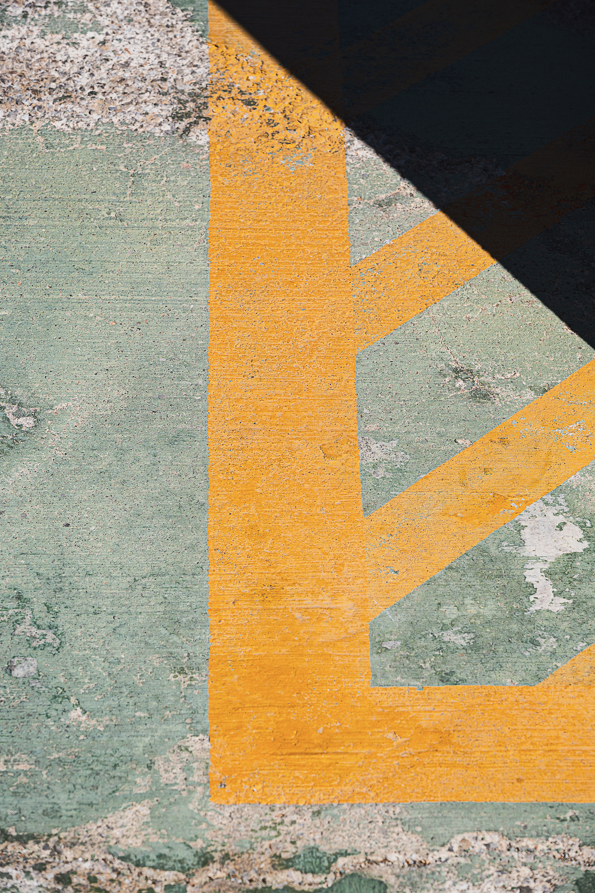
Again, you can use the lens correction tools in your editing software to push and pull the image in order to straighten the building somewhat, although this can require substantial manipulation and cropping. Besides, leaving some tilt can look more natural. If you’re serious about architecture, then investing in a tilt-shift lens, which can correct converging verticals at the shooting stage, is something to weigh up.
The time of day that you shoot is another consideration. If you’re at a location for sunrise then you’ll have more freedom when it comes to composing shots with no people or traffic in them. At other times of the day, you can use a Neutral Density filter to create a long exposure that makes moving objects essentially disappear from a scene – although you’ll need to find some way of supporting the camera when exposures run into multiple seconds.
Shooting in black and white is also a good option when you’re faced with high-contrast lighting (and even when you’re not). Shoot in raw and you’ll able to use the monochrome conversion tools of your editing software, but you can still set the picture style of your camera to black and white to get a mono preview on the camera’s rear display or in its electronic viewfinder, if it has one.
5 urban landscape tips
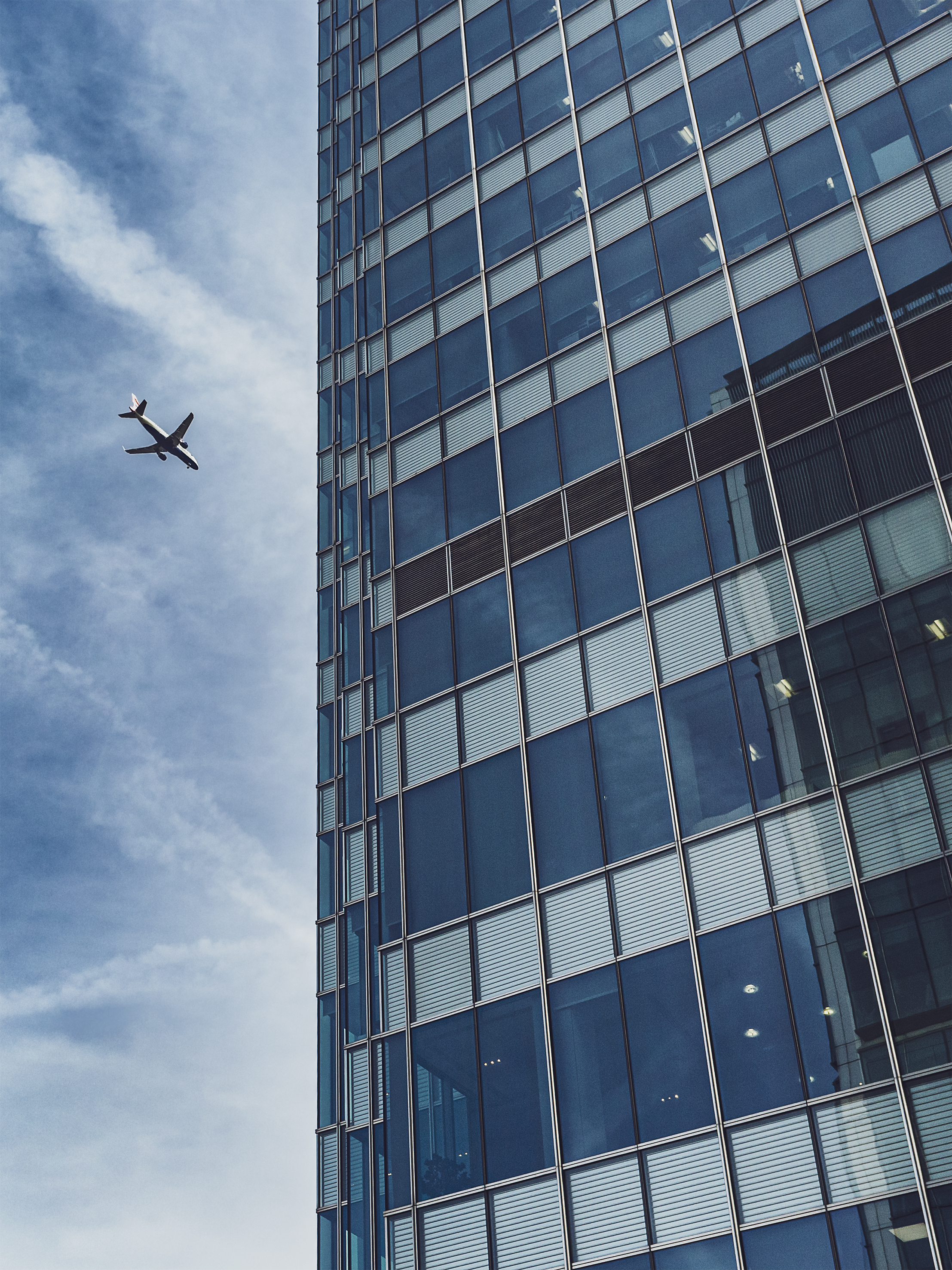
1) Check the background
It’s easy to miss distractions in the background when you’re focusing on foreground details. But a colourful car or sign can prove a real eyesore in a still photo. Red and yellow objects are the worst, as these warm colours will scream for attention.
2) Use a telephoto
Focal lengths longer than 50mm will enable you to cut the visual clutter in your city scenes and produce cleaner compositions. They can also be used to add a compression effect to images, where buildings in the background appear closer to foreground ones; this can be used to emphasise the cramped nature of an urban environment.
3) Look for your reflection
Due to the amount of glass and metal in an urban setting, it’s easy to accidentally record your own reflection. Double-check this before you take the shot.
4) Keep it level
Most of the time, you’ll want at least one edge of a building to run parallel with one of the edges of the frame. Activating your camera’s grid display can help, but you can also use the straight edges of the AF points in the viewfinder as a rough guide.
5) Zoom out a little
Avoid framing a scene too tightly if you’re going to apply lens corrections later, as removing distortion, straightening edges and reducing the keystone effect (where buildings appear to lean backwards) can lead to the image being cropped.
Reader challenge: Urban
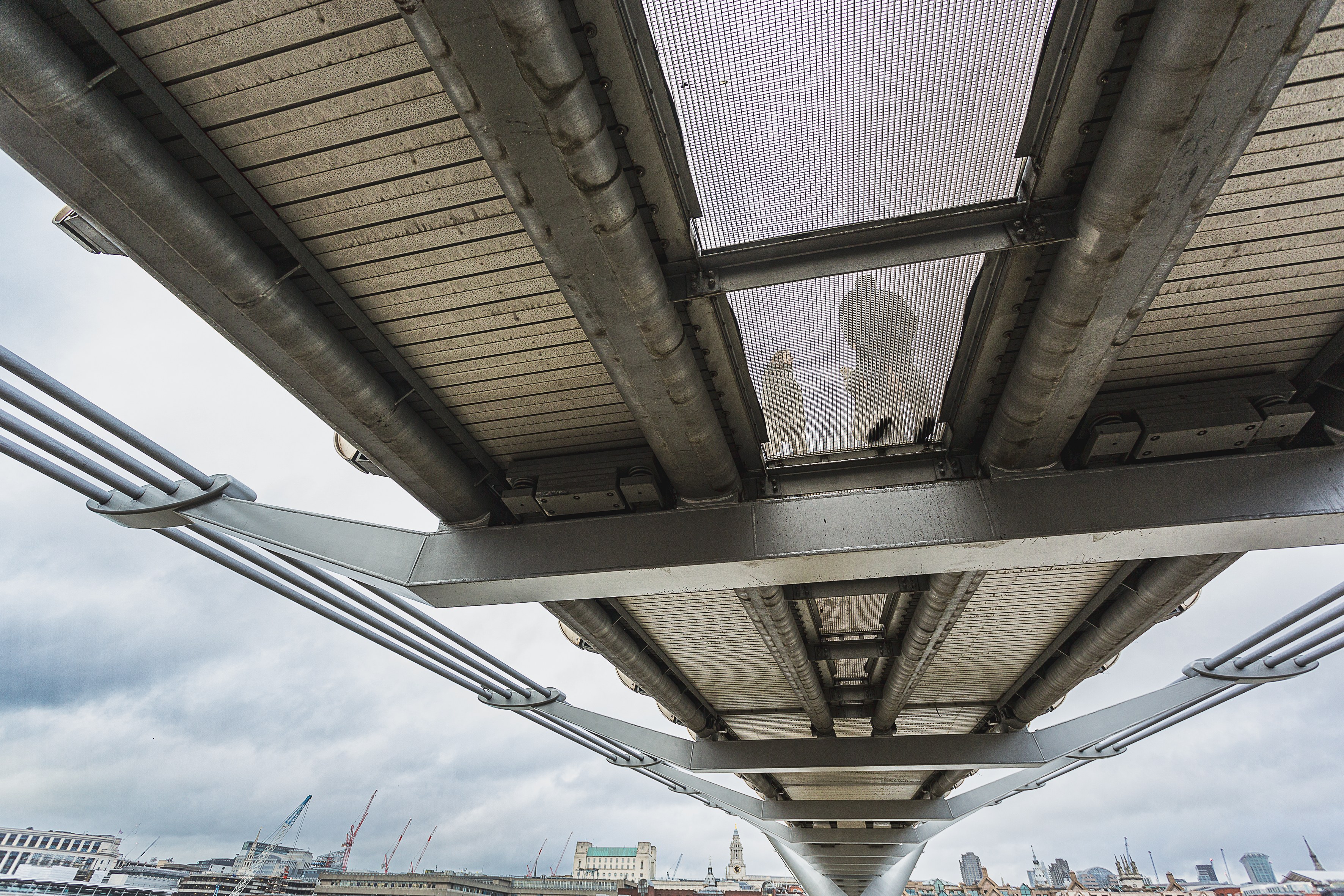
A diverse range of subjects can be entered into this month’s challenge. From expansive cityscapes to architectural details, street photography to abstracts, there’s a whole range of subjects that fall under the broad ‘urban’ theme. It should be relatively obvious that your image was taken in a built-up environment, though. There’s no restriction on the type of approach you take either. You can submit an unmanipulated, straight-from-the-camera photo or an image that has seen substantial colour grading and further digital treatments applied.
With such a wide range of possibilities to shoot in a city, it can be hard to know where to start, so give yourself some restrictions. For example, it could be something as simple as shooting with a single focal length. Or you could you choose a theme, such as the urban jungle or the colour red. Perhaps you could shoot a photo a day on your lunch break – assuming you work in a city, of course! There are so many ways you can tackle this challenge – from dark and gritty to colourful and fun. Happy shooting!
To enter, email your entry to digitalcamera@futurenet.com, putting ‘Urban Challenge’ in the subject line, or visit our Facebook page, look for the ‘Urban’ post, and upload your entry into the feed. By entering your image into this competition (one per reader, please), you confirm that you own the copyright to the image and agree that Digital Camera can publish your photo in relation to the ‘Urban’ competition. You retain full copyright of your image, and will be credited if published.
The closing date is 26 May 2022 and the winner will receive a copy of Affinity Photo for Windows or macOS. Good luck!
Get the Digital Camera World Newsletter
The best camera deals, reviews, product advice, and unmissable photography news, direct to your inbox!
Digital Camera World is one of the leading authorities on camera and photography news, reviews, techniques, tutorials, comparisons, deals and industry analysis. The site doesn't just specialize in cameras, but all aspects of photography, videography and imaging – including camera phones, gimbals, lenses, lighting, editing software, filters, tripods, laptops, printers, photo books, desks, binoculars and more.
Whether you're using, looking to buy or trying to get the most out of a compact camera, action camera, camera drone, cinema camera, beginner camera or professional camera, Digital Camera World has a roster of experts with combined experience of over 100 years when it comes to cameras, photography and imaging.

