Photo therapy: shoot how you think!
Rethink how you take images to make sure you're shooting how your viewer's brain works
In photography we often talk about focussing the viewer's attention, or directing where the viewer looks. This is usually followed by a discussion of compositional tools such leading lines, the golden ratio and the rule of thirds, which all function to tell the viewer where in the frame they should be looking. But have you ever asked why?
Why do leading lines work? Why does the golden ratio appeal? Why is directing attention in a photo necessary at all?
These are all valid questions that we often don't dwell on - we simply take it for granted that the aforementioned 'rules' of photography are effective and put them work without a seconds thought. In many cases this doesn't create any issues, but it's a point I've been thinking about recently. As beginners we are often told to do something by somebody we deem to be more experienced and assume it's going to make our images better. This is a wise approach, yet there is a great deal of value in understanding the process behind the process. What's going on in our brains when we look at an image and why do the 'rules' often work well?
Read more: Incredible landscape composition tips
The answer is really quite a simple one luckily and once you understand the underlying mechanism you not only have the power to provide your viewers with a greater experience, but you can learn to appreciate what makes you want to shoot an image yourself.
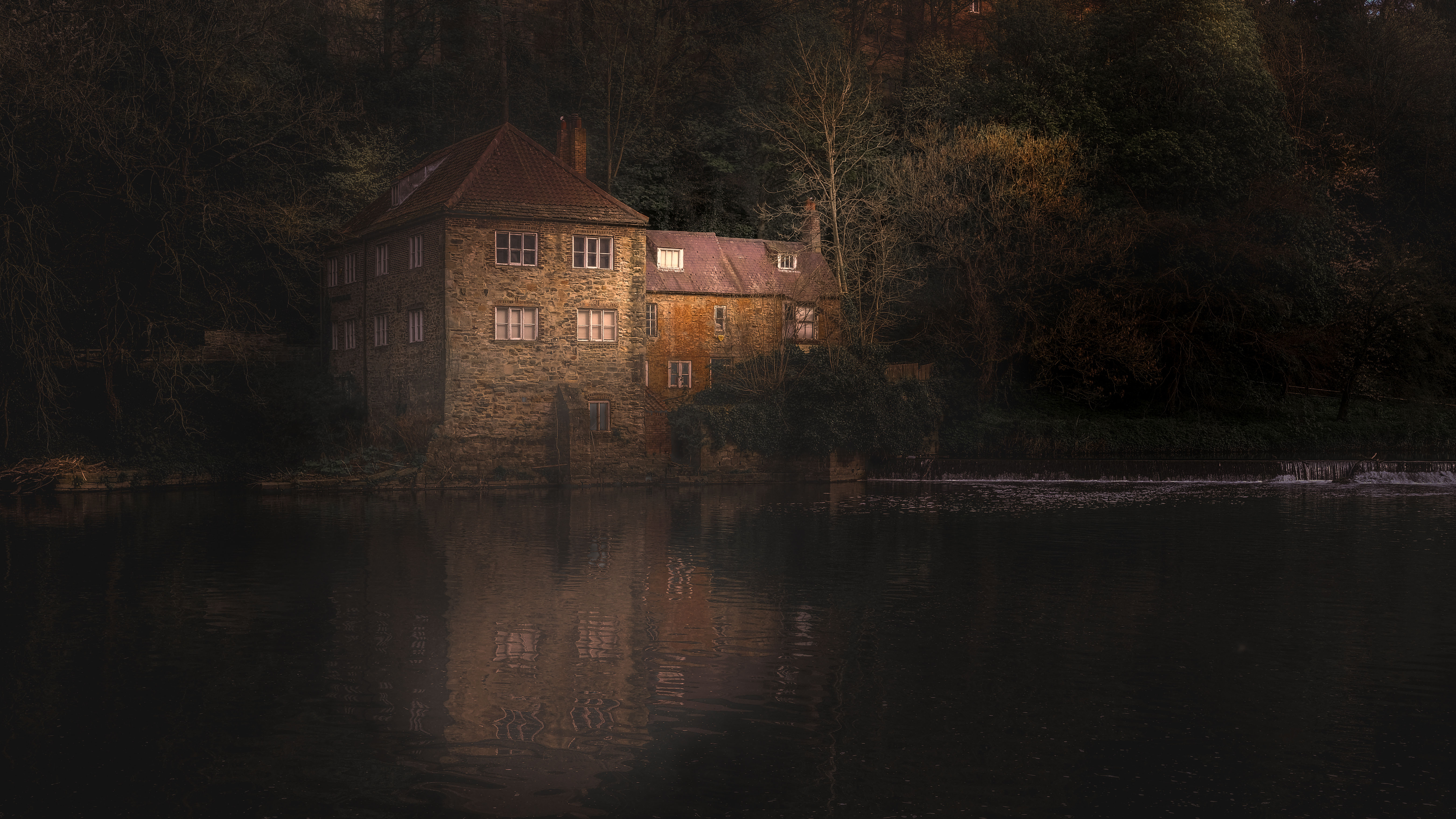
Consider the image here. I shot this recently while out for a walk. The sun was low in the sky but high enough to be casting a few rays into the shaded river valley. I knew that if I waited for a few minutes the light would fall directly on the old Fulling Mill building. I also knew this would have two effects. Firstly, it would create a nice reflection on the water and second, it would instantly highlight the building as a focal point.
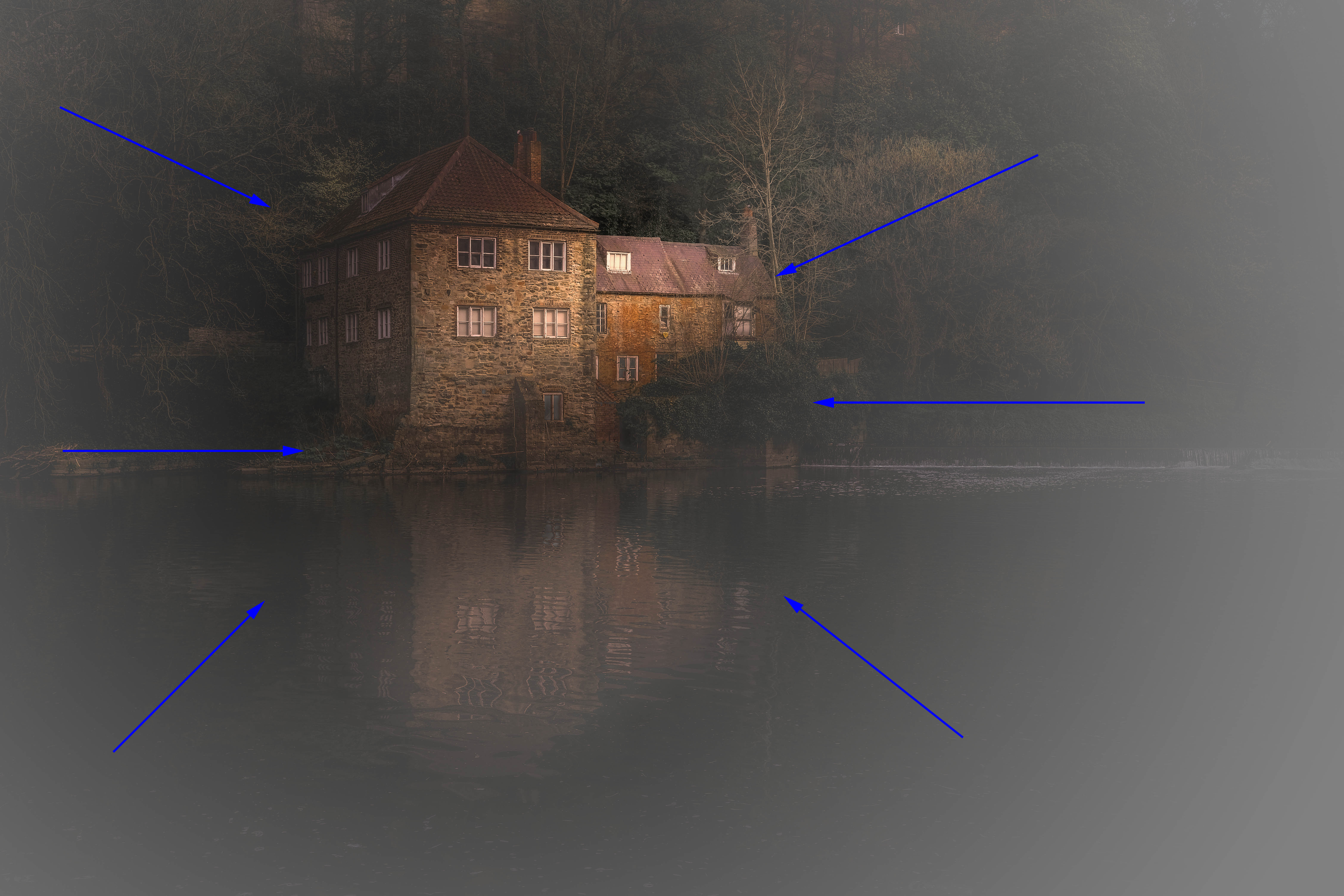
Why would that happen? Well the human brain is drawn to the brightest part of a scene first, so with the sunlight on the building, it would be like a spotlight on the area of the scene I wanted people to look. More importantly than that though, at this time of the day, the difference in tonality between the illuminated building and darker riverbanks would be pronounced, making this effect even stronger. It's not so much the total intensity of the brightness, rather the contrast between the brightest and darkest areas of the shot.
Get the Digital Camera World Newsletter
The best camera deals, reviews, product advice, and unmissable photography news, direct to your inbox!
This works as a compositional tool because it replicates how our brain perceives the world. Think about it. When you look through your eyes how much of any given scene do you focus on in a single moment? Let's be clear, the question is not how much you see, it's how much do you focus on?
The answer is, not a lot of it. Together your eyes have a generous field of view, so they physically receive light across that whole area, but your brain doesn't really take much notice of anything that isn't at the centre of that scene.
This helps us concentrate our attention on the most important aspects of what is in front of us. If something catches your eye, so to speak, you instantly switch your attention to it and filter out extraneous information, to give it your full attention.
So what implications does this have for photography? Quite a few! A photo is actually a very unrealistic way of viewing the world, since it presents a scene in its entirety, all within a small frame. Even if we limit what appears within that frame, there is an awful lot of extra detail that we are asking our brains to examine, all at once. We can of course control this with depth-of-field, which is a great way to simulate the shallow focus of our own vision, but we can also use light.
It's often stated that it's what isn't in a photo which defines it, not what is present. This is very true, as using differential exposure limits how much information we are forcing our brains to examine. The house in this shot is clearly the main event, so we're not making ourselves (or our viewers) work harder than they need to to find a place to rest.
This image represents not our vision, but our mind's eye - it plays to our perception of a scene and, just like a perfect key change in a piece of music, satisfies what we want to see. It's like placing a map at the entrance to a maze - it creates a shortcut which gives viewers an easy journey and tells them where to stop. The compositional tools all work in the same way.

This all sounds wooly and a conceptual, but it has a very real impact on our potential to create very popular photographs. When you go to take an image spend a second analyzing how you see it and what you instinctively see as the key elements. What did your brain automatically pick out as the important bits? Then think about how you can apply this information to the creation of your shot. Exclude details which you hadn't previously noticed, didn't really draw your interest.
Read more
As the Editor for Digital Photographer magazine, Peter is a specialist in camera tutorials and creative projects to help you get the most out of your camera, lens, tripod, filters, gimbal, lighting and other imaging equipment.
After cutting his teeth working in retail for camera specialists like Jessops, he has spent 11 years as a photography journalist and freelance writer – and he is a Getty Images-registered photographer, to boot.
No matter what you want to shoot, Peter can help you sharpen your skills and elevate your ability, whether it’s taking portraits, capturing landscapes, shooting architecture, creating macro and still life, photographing action… he can help you learn and improve.
