Shoot professional product photos and discover the stacking secrets of Affinity Photo 2
You don't need a large photo studio to shoot commercial shots. Here, we'll show you how to take your product photos to the next level with a few tricks of the trade, plus share stacking secrets in Affinity Photo 2 software!
If you think you’re obsessive about taking pictures now, wait until you give product photography a go. Hours will drift past as you nudge shoes, watches, candles or bottles of scent by a few millimetres here or there to get their best side, or experiment with different lighting setups in order to remove hotspots on a piece of jewellery and add them to glossy lipsticks.
Product photography might be just taking pictures of ‘stuff’, but it’s easy to become obsessed with the details. You’ll start noticing things that you never thought you’d be worried about before: micro stains on the leather of a watch strap; tiny wear marks on the lid of a perfume bottle; part of a logo that has been scratched off.
Even if you’re the cleanest photographer in the game, you’re unlikely to remove every speck or mark – particularly if glass, perspex and other shiny surfaces feature in your product photography setup. You’ll need to factor in some time to retouch your images in software later. This is especially true if you need to clone out objects that you’ve used to support your products – such as cotton thread used to suspend an object in mid air – or if you want to create a composite image based on the best bits from a series of images.
In fact, working on an image in software like Affinity Photo 2 is where a lot of the product photography magic happens, as you’ll be able to add colour treatments and tweak aspects such as contrast and clarity to give your pictures a commercial look and feel – even though you shot them in a corner of your kitchen.

Out now, Affinity Photo 2 is the brand-new version of the only fully-loaded photo editor integrated across macOS, Windows and iPad. The first choice of millions of creative and photography professionals around the world who love its speed, power and precision, Affinity Photo 2 has everything you need to edit and retouch images, create multi-layered compositions, beautiful raster paintings and so much more. It's also equipped with hundreds of time-saving tools and a completely redesigned UI to make your editing experience more seamless than ever. Affinity Photo 2 is available for a one-off payment with no subscription, or try the 30-day free trial.
As with most other types of photography, there are three stages to taking pictures of products at home: concept, camera and computer. This type of photography leans heavily on the first and final stages, and the camera work can be relatively straightforward by comparison.
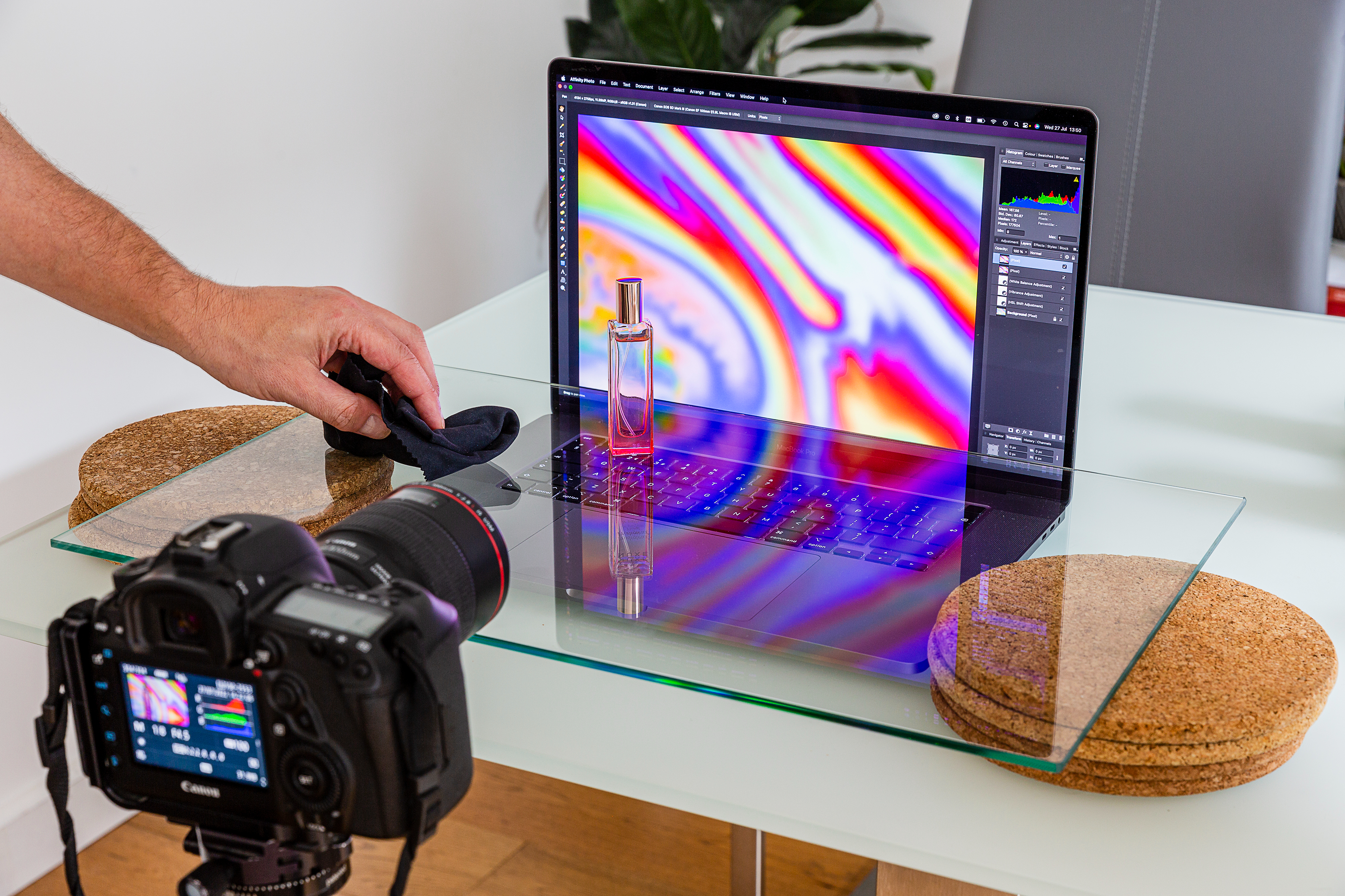
Shooting from a tripod will enable you to keep the camera locked in position while you adjust the arrangement of your product setup in front of you. If your camera has a vari-angle screen, that will make for much more comfortable viewing when the tripod is positioned at either a low or a high level.
A standard zoom lens will allow you to frame all but the smallest of objects, although a longer focal length will make it easier to isolate products against busy backdrops. Your choice of lens really comes down to how much space you have to work with, as longer focal lengths need to be used from further away. I tend to use a 100mm macro lens and a standard 28-70mm zoom on a full-frame camera for this type of work, as that gives me a close-focusing option and something a bit wider should I be working in a confined space.
Having the option to go to f/2.8 on both of the lenses means that I can reduce the depth of field to a sliver of sharpness, but it’s rare that I’d open the aperture so far for a product shot when I’m working close-up, as not enough of the object will appear sharp. Start with an aperture of f/8 and take a test shot, magnifying the image to check that all of the pertinent details are sharp. If they’re not, stop down to f/11. Do try a shot at a wider setting of f/5.6 or f/4, though, so you have some different options when it comes to the editing stage.

Control over the lighting is more important than the choice of lens. Professional photographers tend to use a number of studio lights in large softboxes in order to give them power and creative control. There might be one for the backdrop, another overhead for general illumination, and another one positioned to the left or right of the camera to add some modelling.
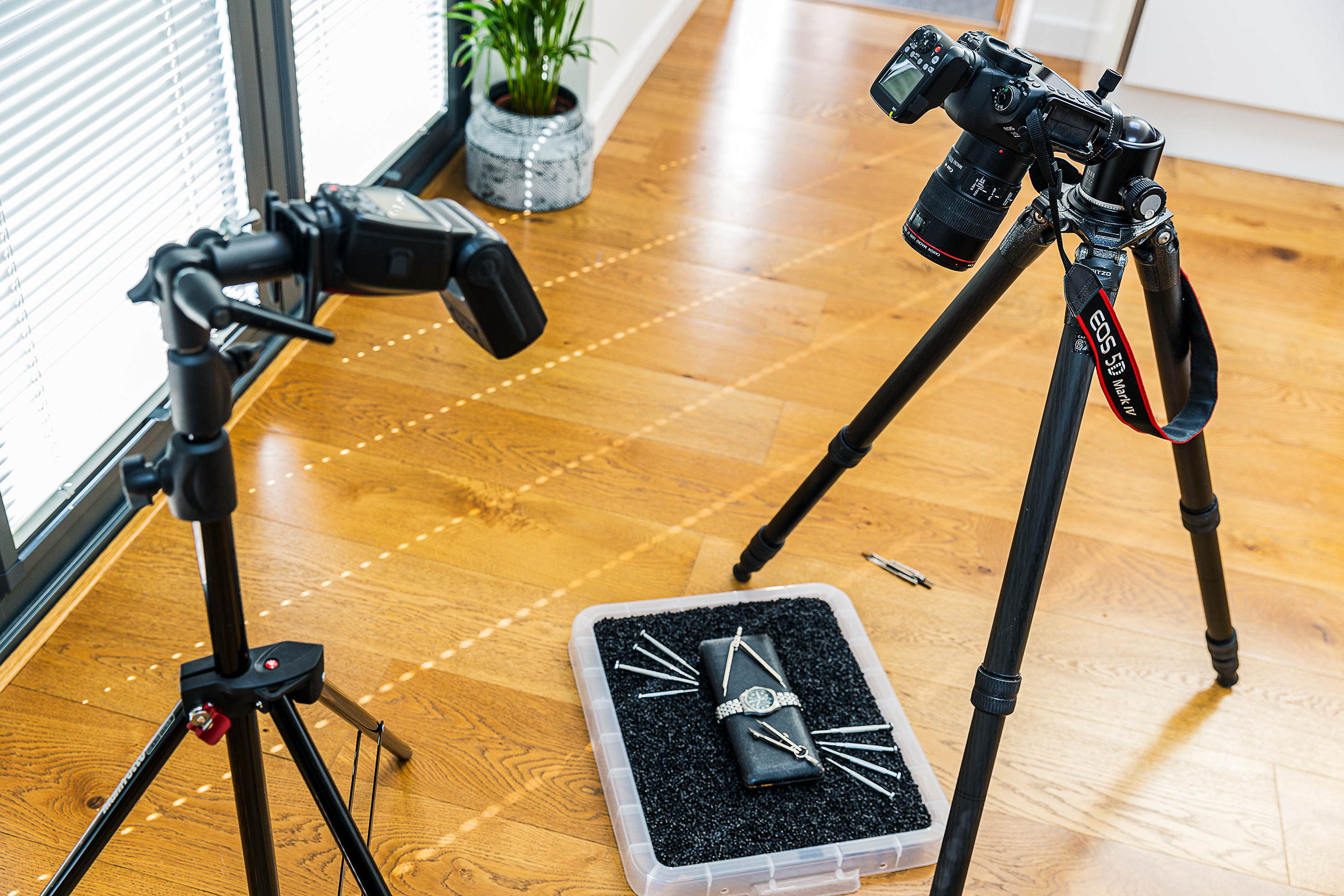
But what if you only have a single light? There are several options open to you when you’re working with one flashgun or LED light. You could make the light source bigger by using a large softbox or diffuser or bouncing the light from a flashgun off a sheet of white card. If you want to reduce the intensity of the shadows, use a reflector on the opposite side of the subject.
A silver reflector will give you a sharper quality of light, while a white reflector will give a softer result. You may not want to reduce or remove all of the shadows, though, as sometimes they can help to separate the product from the background. If you need to increase the intensity of the shadows, use a piece of black card or material.
Another option is to take a sequence of shots from the same position, but move the light source to illuminate a different area in each shot. In editing software, you can layer these images and mask out the areas that you don’t want to use from each one. This technique is a bit more time-consuming but hey, you’re obsessive about photography, right?

5 product photography tips
1) Sketch out your shot
Firming up your ideas in a thumbnail sketch is a useful exercise, as otherwise, it
can be daunting to start from scratch when you’ve set up your camera. That’s not to say that inspiration won’t strike when you’re behind the camera, but sketching helps!
2) Modify the light
Some basic modifiers will give you control over where the shadows fall and how soft they are. Use a softbox to diffuse direct light, or bounce your flash off a white card that’s angled towards the subject. Try a grid or a snoot to focus the beam onto a specific feature, and use a ring light modifier to add a ‘halo’ effect (shown in this watch shot).
3) Pick a colour
Look for a highlight colour in your subject, such as the markings on a watch face, and use that as a starting point for the colour scheme for your product shoot.
4) Use what you have to hand
While you can go out and splurge on props and accessories for your shoot, it can be rewarding to use what you have to hand and adjust them as needed. Garden slate, shredded paper, sand and iPads can all make interesting backgrounds.
5) Be prepared to retouch
Attention to detail is important when it comes to making sure products are free of blemishes and dust, but you’ll still need to be ready to touch them up in software. Experiment with colour grading to change the look and feel of your shots.

Discover stacking secrets in Affinity Photo 2
Learn how to blend a sequence of photos automatically with the powerful Stack command in Affinity Photo 2.
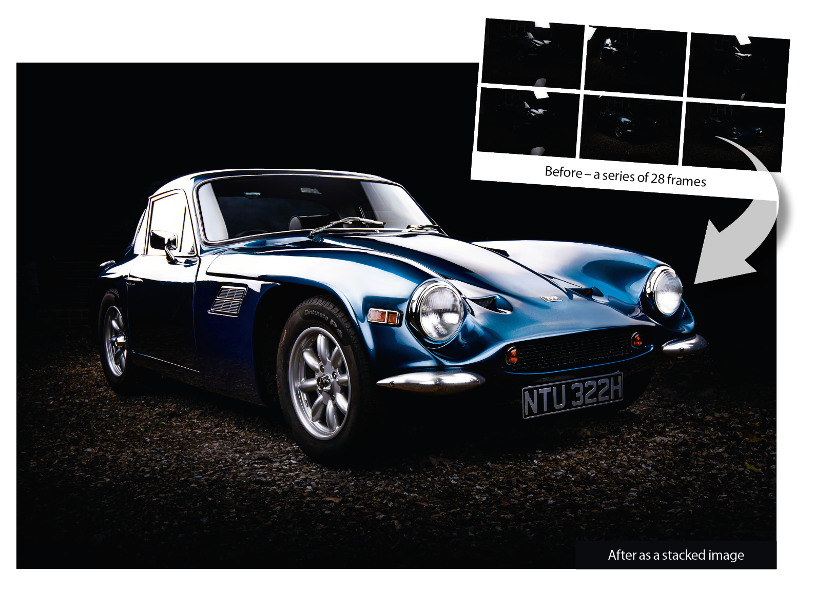
The magic of photo editing lets us create studio-quality photos of large objects like this classic 1969 TVR Tuscan without the need for a studio or bank of lights. Our car here was lit with a single softbox flash. Using a tripod to keep the camera still, we shot 28 frames while moving the softbox into different positions. By underexposing the daylight, we could keep the mundane surroundings dark and pick out the curves and lines on the car.
This fragmented approach to lighting is useful not just for cars, but all sorts of still life photography, as it allows us to highlight details without having to get everything in a single frame. Once in Affinity Photo 2, we can blend the lighting from each frame with ease.
This is where the Stack command comes in. It allows us to load a sequence of photos as a stack and offers a variety of blending methods. Our sequence of car photos comes together astonishingly quickly using the Maximum mode, which combines the highlights that reflect off the car’s bodywork. Once done, it takes just a few minutes to perfect the blend with a combination of retouching tools and tonal tricks.

As well as helping us combine different lighting on the car here, the Stacking command has plenty of other uses. If you want to remove moving people from a scene, take several frames then try stacking with the Median mode. If you want to reduce noise, combine a sequence of frames with the Mean or Median mode. The Mid-range mode can be very helpful for exposure blending. Here, it allows us to combine a bracketed set of three exposures to balance out the sky and shade. Use a mid-range aperture like f/11 and ensure your exposure stays consistent throughout.
1) Make a new stack
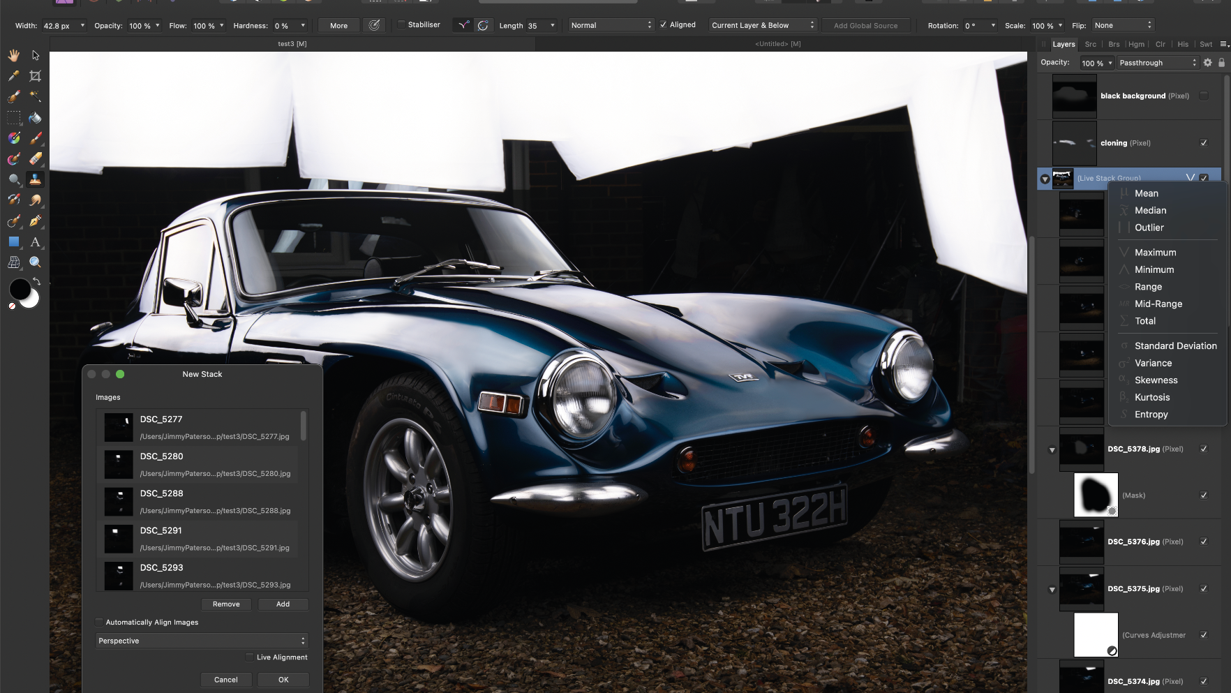
The Stack command lets you load photos as a layer stack and offers several methods for blending them. Go to File > New Stack, then navigate to your photos and load them in. This creates a new layered file for you to work with. Alternatively, create a stack from an existing layered file, highlight the layers you’d like to use, then go to Arrange > Live Stack Group to create a stack.
2) Automatically align images
This feature will attempt to align images for you. As such, it’s helpful if you shoot a sequence of frames without a tripod (although you’d still need to keep the camera steady). There are two alignment options: Perspective alignment changes the perspective to match the frames, while Scaling adjusts the size and position. If alignment isn’t perfect then you can always manually align layers afterward.
3) Maximum mode
Once loaded, go to the Layers panel and click the icon next to the ‘Live Stack Group’ to experiment with blending methods. The Maximum mode is good for scenes where the subject is brighter than the background, so it’s ideal for blending our car sequence. It brings together the brightest parts from each layer, which effectively allows us to combine all our lighting positions into one image as if we’d used 20 lights instead of just one.
4) The Stack operator
This offers 13 methods for blending the stack. Mean is for noise reduction, Outlier is for composites and Median removes discrepancies. Maximum uses the brightest pixels and Minimum the darkest. Range shows changed areas, Mid-range blends midtones and Total combines brightness from frames. Standard Deviation to Entropy are mainly for analytical use.
5) Mask layers
After choosing a blending method, go through the layers that make up the stack, turning each off and on to see how they contribute to the overall blend. Some layers may be unnecessary, so you can leave them off. Other layers may have areas that you’d rather not include. If so, you can add a layer mask (click the mask icon in the Layers panel) and paint black to hide parts of the layer, or white to reveal hidden areas.
6) Clone to tidy up
A little cloning may be required. Make a layer at the top of the layer stack (outside the stack set) then set the Clone tool to sample ‘Current Layer and Below’ in the tool options. Alt-click to sample a clean source area, then use a low-opacity brush and paint to clone over any rough patches. We’ve used a second layer and painted black to give us a dark background and gentle vignette below the car.
Get the Digital Camera World Newsletter
The best camera deals, reviews, product advice, and unmissable photography news, direct to your inbox!
Digital Camera World is one of the leading authorities on camera and photography news, reviews, techniques, tutorials, comparisons, deals and industry analysis. The site doesn't just specialize in cameras, but all aspects of photography, videography and imaging – including camera phones, gimbals, lenses, lighting, editing software, filters, tripods, laptops, printers, photo books, desks, binoculars and more.
Whether you're using, looking to buy or trying to get the most out of a compact camera, action camera, camera drone, cinema camera, beginner camera or professional camera, Digital Camera World has a roster of experts with combined experience of over 100 years when it comes to cameras, photography and imaging.

