Shoot and design a stunning photo book with Affinity Version 2
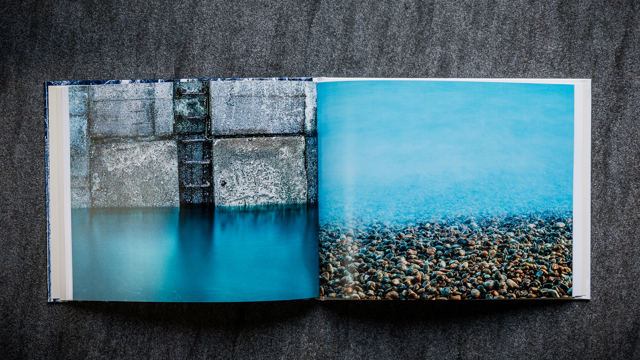
Designing your own photo book will enable you to see your pictures in a new way, but it can be hard to know where to begin. This beginner’s guide will help, and if you scroll down, we share some top tips for creating a photo book in Affinity Version 2!
Creating a photo book is a joyous thing to do. Anyone can share images online or create single prints at home, but fewer people go the extra mile to put a body of work together for a book. Seeing your images in a professionally printed and bound coffee table book is a special thing. The whole process is creatively rewarding – and yes, in parts, frustrating. But isn’t photography always that way?
You’ll need to decide on a few physical specifications for your book upfront, as this will determine not only how much you’re going to spend, but how much time you’re probably going to end up investing in curating images.
The first choice is the format and dimensions. Portrait, landscape, and square are the basic options, with a choice of small or large for each one. Smaller sizes can have a more personal quality to them, perhaps because they share similar dimensions to notebooks and diaries. Larger-format books showcase your images in a much grander fashion, but obviously, there’s a higher price tag, and you might end up paying three times as much for the largest option compared with the smallest one.
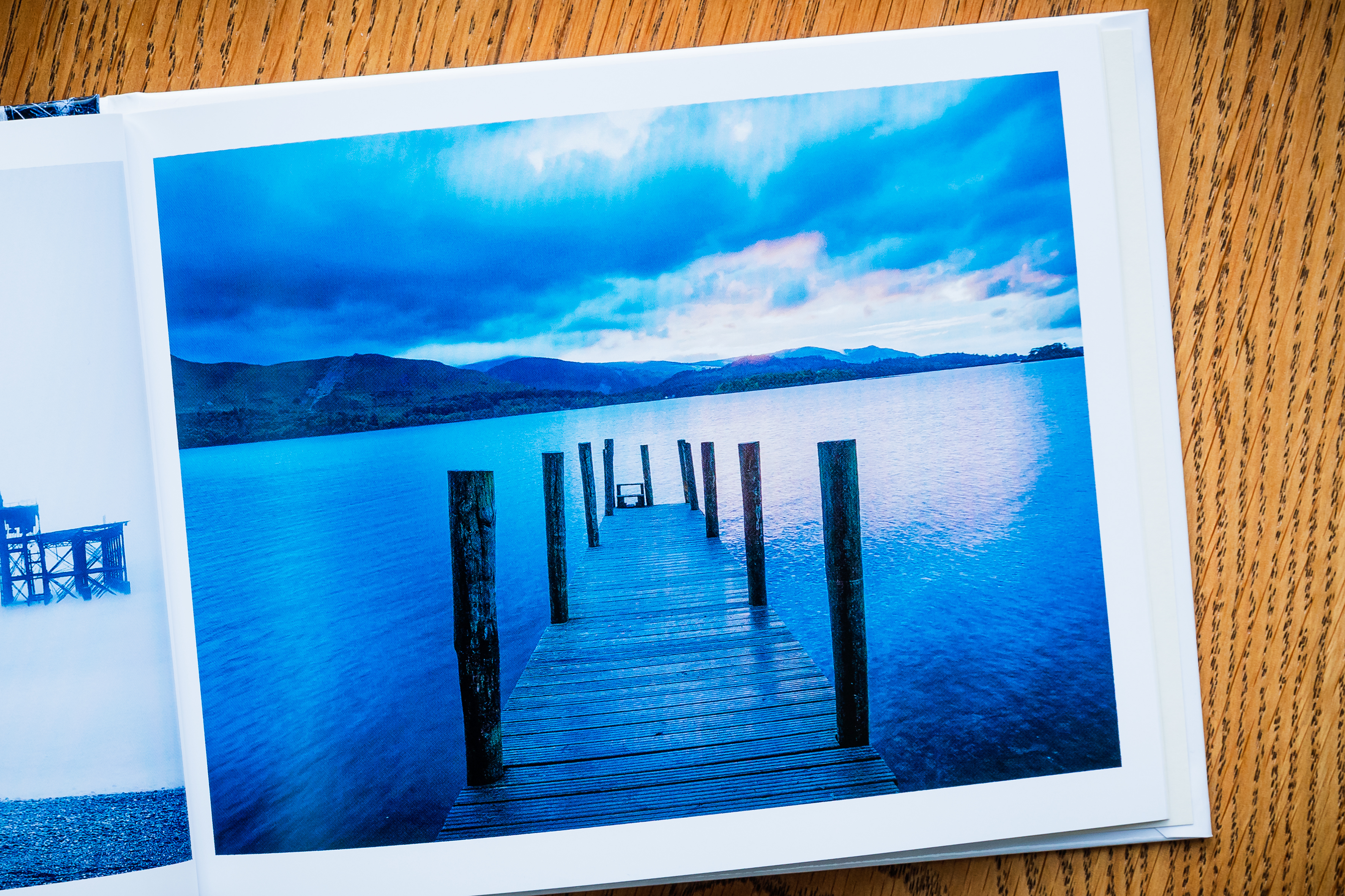
Choose the format of your photo book

Out now, the new Affinity Version 2 package offers professional photo editing with Affinity Photo 2, publishing with Affinity Publisher 2, graphic design, and even illustration at your fingertips. Experience the full power of Version 2 of Affinity apps with the Universal Licence; for just one discounted payment, get the entire Affinity suite (including Publisher for iPad!) on all your devices, across macOS, Windows and iPadOS – or try the 30-day free trial!
The first decisions you’ll need to make about your photobook are format related. Your choice from the three main options – square, landscape and portrait – will be largely dictated by the orientation of the pictures you’ll be using, as well as personal taste. Landscape-format images can be awkward to fit in a portrait-format book, for example. Landscape-format books are a little more forgiving; in addition to landscape images, it’s possible to fit a few portrait photos across a page. Square-format books suit either type of image, as well as square crops.
There are typically three main types of paper to choose from: matte, satin/semi-gloss and gloss. Matte has a subtle sheen level. It gives images a softer look that can suit fine art and wedding books. Glossy paper is more reflective, but it makes images appear sharper and more vibrant. The standard satin finish falls in the middle and is the most cost-effective.
When it comes to selecting the shape, consider how many portrait, vertical or square images you’re planning to include. If most of your images are horizontal, for example, then they’re going to fit naturally in a landscape-format book. Square-format books are arguably the most versatile, as they accommodate both horizontal and vertical shots with ease. The main problem is that you won’t be able to run ‘full-bleed’ shots that fill the page without them ending up being cropped to a square shape.
Choosing the right paper is more of a challenge. Unlike the shape, page count
and picture layout, which can all be easily considered on a computer screen, the paper quality is something you’ll only be able to get a feel for once the book is in your hands. But there are some general pointers that can help you to make the right decision.
The paper options available do differ between book-printing services – if only
in name alone – and the type of book you choose, but the basic selection is generally a classic or standard finish, matte and gloss. The standard paper finish is your mid-sheen, satin/semi-gloss option, and the most economical choice – particularly if your book has a high page count. Gloss paper’s shiny finish makes colours pop, while the matte option has little to no sheen and makes colours look more muted. Matte is a good choice for black and white or fine-art books or those where the softer, more subdued look will suit the subject matter, such as documentary or nature.
As well as digitally printed paper types, some book-printing services offer photographic paper options. These require the image to be exposed onto the paper and then developed via a traditional wet printing process. This can lead to higher quality, ‘smoother’ images that don’t have the individual ‘dots’ that are sometimes visible in images in digitally printed books. You may see this as a drawback though, as there’s something rather appealing to having pages that look like those in normal books rather than photo prints.
Photographic paper options are typically only available for ‘lay-flat’ bookbinding. This type of binding allows the book to open completely, without the ‘gutter’ running down the centre of the spread that causes pages to curve in the way they do in a standard ‘perfect-bound’ book. For digitally printed books, you’ll probably have a choice of hardback or paperback. The former looks more professional and is more protective, so it’s definitely worth the extra cost.
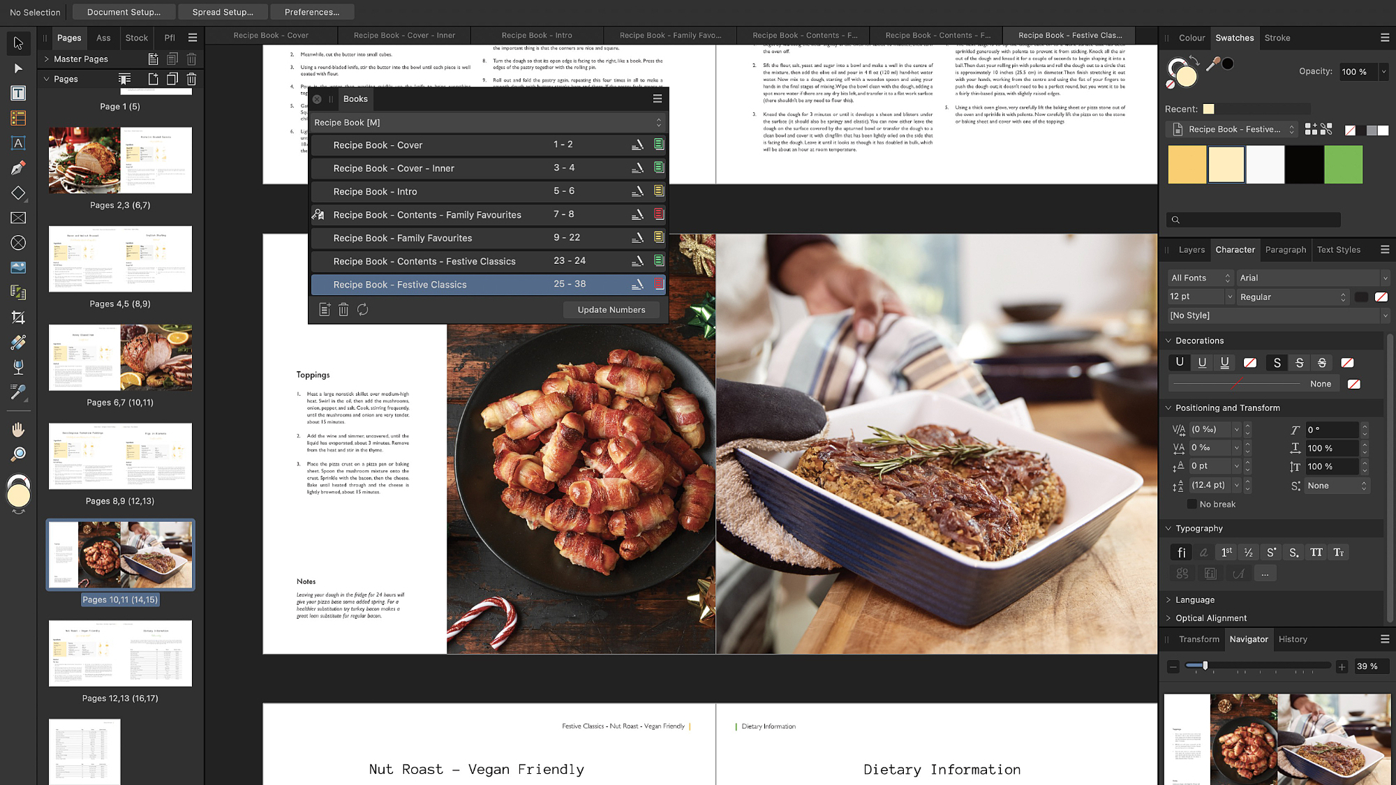
Book-printing services typically offer a range of DIY options for designing the pages of your book, including online, custom software/app, plugins for existing desktop programs, and PDF-to-print. Online is the most straightforward, although you may be a bit more limited in terms of templates. Software/app layout can provide a little more control, but you’ll obviously have to go through the process of downloading and installing more software.
A PDF-to-print service can enable you to create your own designs in desktop layout software such as Affinity Publisher 2 and upload these to the printing service. The advantage of this option is that you can add text and graphics and have complete freedom for the way each page looks. You’ll need to pay careful attention to the PDF specifications required by the printer, though.
Curating images is the final step in the process, and it always takes longer than you think it will. You’ll probably have the nice problem of having too many pictures to deal with, so you’ll need to be ruthless to cut down the number. Start with the images that you can’t live without, and then look for photos that link up with these, either visually or thematically.
That’s the key to designing a book: not looking at individual pictures in isolation, but at how they relate to others. Knocking out some small prints at home that you can rearrange can help you firm up the sequence of images. It also makes it easier to get input from other people. It’s always worth getting feedback from friends and family members, as they won’t be as emotionally invested in the creation of the photos, and can perhaps be more objective about the selection.
Finally, allow some time between finalising your book and submitting it to be printed, as having that gap gives you the opportunity to review your layout with fresh eyes and make any final tweaks before you commit. Once you’re happy, sit back and wait for your tome to arrive! And then start planning your next one…
5 tips for photo books
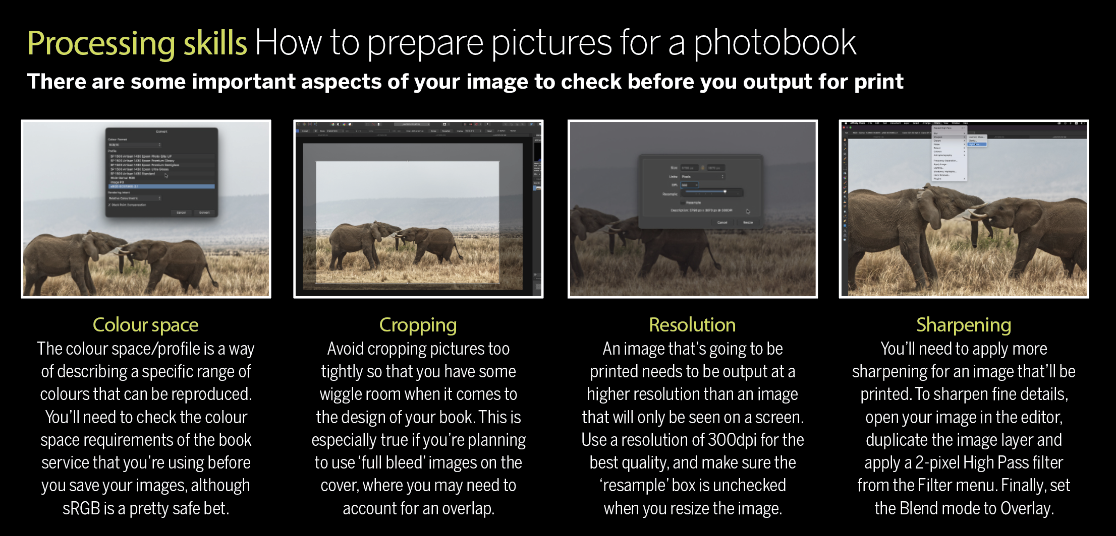
1) Weigh up your paper choice
Select a paper stock that will get the best from your pictures. Gloss-coated paper is great for vibrant shots of food, travel scenes and other images where colour and contrast are crucial, while matte’s more muted reproduction suits more subtle shots.
2) Find connections
Don’t view images in isolation, but rather in pairs or groups. How do the images relate to each other? Are there colours, shapes, patterns, lines or other shared elements that can be used to make a visual connection? Experiment with
similar image processing and crops to forge a link when there isn’t one.
3) Avoid padding
Less is more. It’s better to have a shorter, tightly edited collection of images than
a full round-up of everything that happened on a holiday or at a wedding, for example.
4) Look at your work critically
It can be hard to refine your selection, as photography is such a subjective thing. You decided what to include and exclude in a picture, after all. But don’t be afraid to ditch a favourite image if it doesn’t sit comfortably with the main body of work.
5) Make hard copies
Although you can see your book coming together on-screen as you fill the page templates, it’s always a good idea to print out small versions of your images so that you can get a better feel for the rhythm and pace before you hit the order button.
Get print ready with Affinity Photo 2
If you’ve taken a photo you’re proud of then there’s no better way to display it than in print. A physical print will aggrandise the photo in a way that can’t be matched by posting it online or viewing it on a screen. Whether you want to make a print for the wall, prepare a set of images for a photobook or send it off to be professionally printed, there are some things you can do beforehand that will make your image look its absolute best.
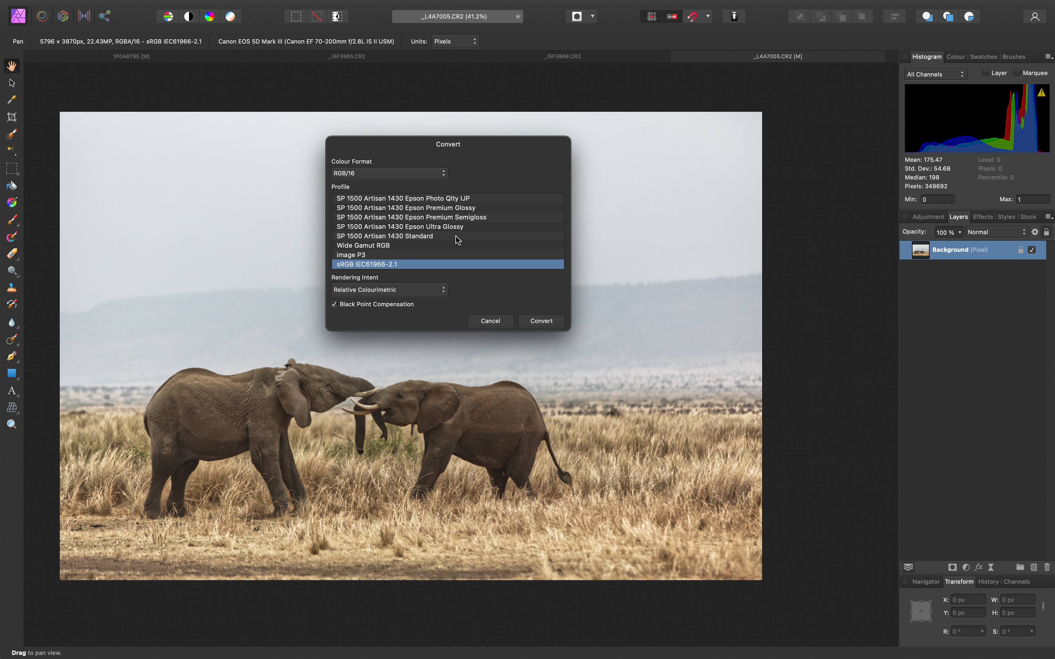
Affinity Photo 2 has all the tools you need and, with an exceptional soft-proofing feature, you can preview how the print is likely to look and fine-tune the colours. Soft-proofing is an important yet overlooked step in print preparation. By using downloaded ICC printer profiles, we can get an accurate idea of how our print will look, no matter the combination of printer and paper we’re using.
Typically the blacks will go brighter, as prints can’t produce blacks as deep as your computer screen. Strong, saturated colours may also become more muted. But there are tricks we can use to ensure the colours and tones in the print are as rich as possible.
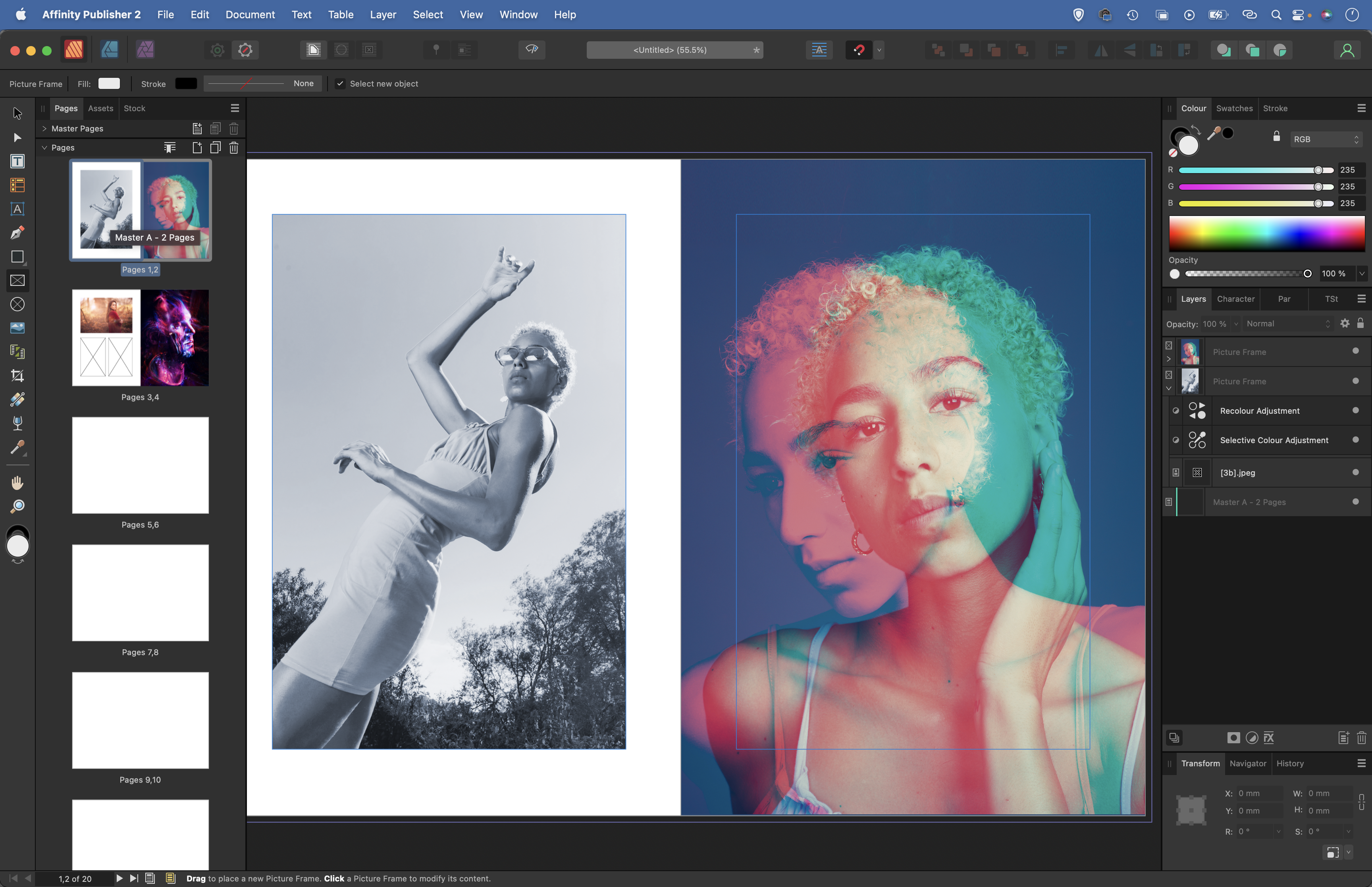
If you want to bring a set of photos together into a photo book then Affinity Designer makes things
easy. As well as the design features you’d expect – setting up a series of pages, choosing sizes, margins, colour spaces and so on – there’s integration with Affinity Photo through Studio Link. You can bring images into your layout in Designer, then switch to Affinity Photo (via an icon on the top left) to tweak colours or change the image, then switch back to Affinity Publisher and see the image updated in real-time.
1) Crop to size
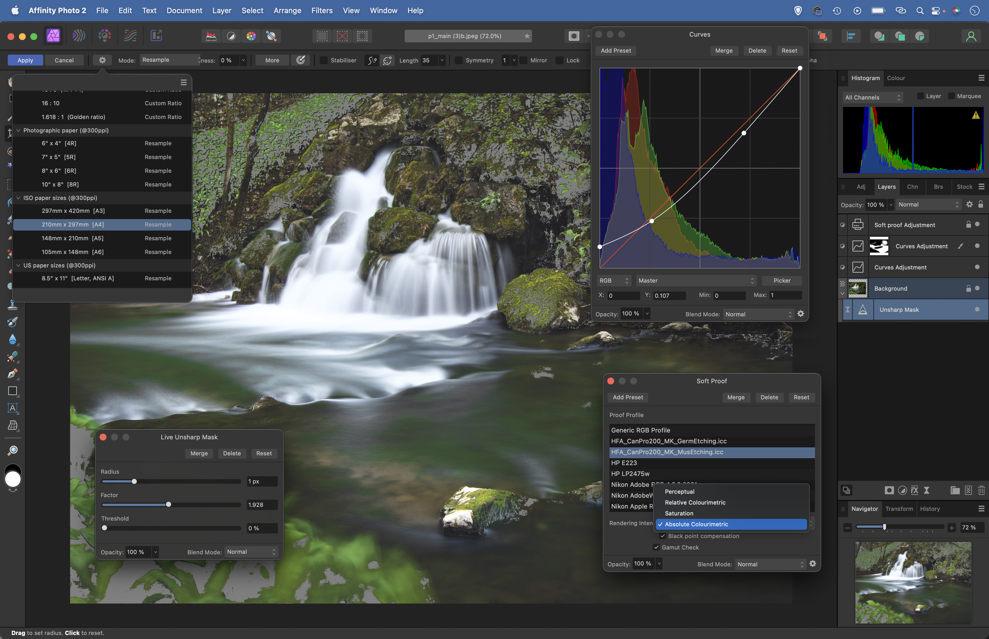
Ensure your image is the right size and resolution for your print with the Crop tool. Grab the Crop tool from the toolbar, then go to the options at the top and click the cog icon. This gives you a list of print sizes, like A4 and 10in x 8in. If you want to make a different size to those shown, choose Mode: Resample then input your own measurements for width and height. The DPI field here stands for dots per inch. For printing, a DPI of 300 is ideal.
2) Sharpen with Unsharp Mask
It’s best to carry out sharpening once you’ve cropped to the correct size and resolution for your print. The Unsharp Mask command is ideal for this final sharpening. Highlight the Pixel layer and go to Filter > LIve Filter Layer > Sharpen > Unsharp Mask. Increase the Radius to 1px (good for landscape scenes) then boost the Factor slider until the details look sharp (zoom in close to the image for this).
3) Soft proofing
Soft proofing is important if you want to see how your print will look. You’ll find Soft Proofing in the Adjustments panel. Go to Window > Adjustments, open the Soft Proof options and choose Default. If you have a printer/paper combination in mind, download the ICC Profile from the printer, paper, or photo book manufacturer's website. Load it in using File > Import ICC Profile and it will appear in this list.
4) Check out-of-gamut colours
A colour gamut is the range of colours a particular media can display. We edit photos using a wide colour gamut like Adobe RGB 1998, but printers can’t reproduce many of the colours on screen. These are out-of-gamut and will appear as a grey overlay when the box is checked. To force them within the gamut of the printer and paper, choose a Rendering Intent. Click through the options and pick one.
5) Adjust blacks
After adding a soft proof Adjustment, you can use other Adjustment Layers to bring colours back into gamut. Keep the Gamut Warning checked, then add other Adjustment Layers. We’ve dragged the bottom of the curve line up to adjust the black point, dragged down the middle to add depth to the shadows, and added a second Curves layer with a mask to boost the water..
6) Send to print
If you’ve used a Soft Proof layer then turn it off before printing, otherwise, it’ll affect the colours and tones. Once you’re happy, go to File > Print. Most of the settings here are obvious, and others will be specific to your printer. Choose the correct ICC profile for your paper and an appropriate media type. Once done, set up a print preset so you don’t have to go through all the settings next time.
Get the Digital Camera World Newsletter
The best camera deals, reviews, product advice, and unmissable photography news, direct to your inbox!
Digital Camera World is one of the leading authorities on camera and photography news, reviews, techniques, tutorials, comparisons, deals and industry analysis. The site doesn't just specialize in cameras, but all aspects of photography, videography and imaging – including camera phones, gimbals, lenses, lighting, editing software, filters, tripods, laptops, printers, photo books, desks, binoculars and more.
Whether you're using, looking to buy or trying to get the most out of a compact camera, action camera, camera drone, cinema camera, beginner camera or professional camera, Digital Camera World has a roster of experts with combined experience of over 100 years when it comes to cameras, photography and imaging.

