Color photography masterclass: Part 3
Get to grips with essential color relationships and create images with superior impact

A lot of the problems experienced when shooting colour photographs arise from misunderstandings about the science and technology of colour capture. Once you have a good grasp of colour theory and put this into practice, it is still possible to come away with images which lack depth and structure - a frustrating situation when you thought you had all bases covered. The missing element is an appreciation for how your camera sees colour and how you should be using colour management settings to control the style of your images.
Here we have put together answers to some of the most asked colour-related questions. These should help photographers of any experience level overcome some often-overlooked issues of working with colour in the digital age, enabling you to capture more accurate and dramatic images every time.
Read Color Photography Masterclass: Part 1
Read Color Photography Masterclass: Part 2
Colour Q&A
Question 1: Why do my shots lack depth?
Color photography masterclass contrast is very important in photography and art. While we often want to avoid harsh color casts, it is a good idea to have some different toning across an image. At sunset for example, you might find your shots look dull. This is because there is too much analogous color - it’s all yellow. You need some blue or magenta in there too, for contrast.
Question 2: Why do highly colorful areas sometimes ‘bleed’ and lack detail?
Get the Digital Camera World Newsletter
The best camera deals, reviews, product advice, and unmissable photography news, direct to your inbox!
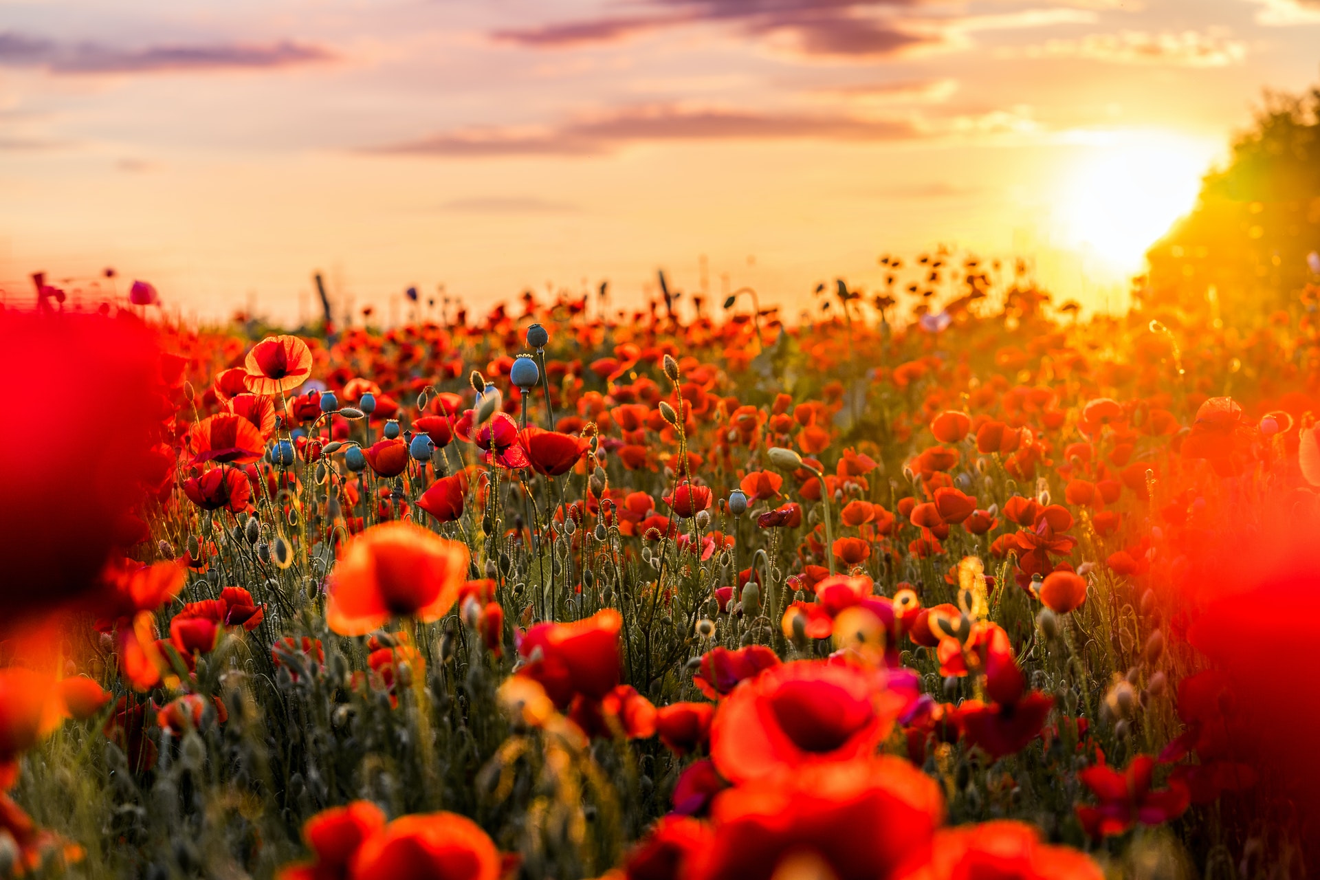
While burnt-out highlights occur when all color channels are clipped it is possible to lose detail in a single color channel. If you have a bright red flower for example, it is possible to saturate or expose this to the point where no more data can be recorded in the Red channel, resulting in a ‘blob’ or featureless, solid color. The solution is to take a custom White Balance and pull back the Luminance/Saturation sliders during HSL adjustment.

Question 3: Should I underexpose for color? What’s the deal?
A common technique is to underexpose slightly in order to produce more seemingly saturated color. While technically you’re reducing the luminance by doing this, not increasing saturation, the effect looks similar. While it is a valid technique, underexposing brings other problems like noise - it is better to use a polarizing filter and expose ‘To-The-Right’, reducing brightness of the RAW files down later, in processing.
Question 4: Why does my image look terrible on Instagram and my website?
So you’ve carefully captured and processed your images for color, then when you upload them to IG or your online portfolio they have strange color shifts and uninspiring saturation. This is caused by a lack of color profile support in browsers. Before you upload, always change the image color profile to sRGB. Go Edit > Convert to Profile, then choose sRGB IEC61966-2.1 as the Destination Space.

Question 5: Why does auto WB often get it wrong?
Modern auto WB systems are amazing but not infallible. They work using standardized color values, in combination with pre-programmed ‘case study’ scene information. If you present your camera with a highly saturated color it will try to render it neutral - not great for golden sunrises! If it has a ‘scene priority’ WB option this can help refine what you want it to do, or you can customize your WB Presets.
Question 6: How does the Kelvin scale work?
We often talk about reds and yellows as ‘warm’ hues for convenience, since we think of fiery colors as hot, and high numbers often give reddish casts in-camera. In reality the Kelvin scale says differently. Blue colors are the hottest (Tungsten burns at a higher temperature than a candle flame and gives off a blue color) so these have a higher Kelvin value. For this reason, if you want to remove a blue cast you’d match it by selecting a high Kelvin WB (like 8000K) for a neutral shot.
Read more:
A vision in pink: shoot incredible images of blossom
Color editing essentials: post process for complex colour palettes
Luminar AI sees Apple M1 support and better Sky AI in new update
Digital Photographer is the ultimate monthly photography magazine for enthusiasts and pros in today’s digital marketplace.
Every issue readers are treated to interviews with leading expert photographers, cutting-edge imagery, practical shooting advice and the very latest high-end digital news and equipment reviews. The team includes seasoned journalists and passionate photographers such as the Editor Peter Fenech, who are well positioned to bring you authoritative reviews and tutorials on cameras, lenses, lighting, gimbals and more.
Whether you’re a part-time amateur or a full-time pro, Digital Photographer aims to challenge, motivate and inspire you to take your best shot and get the most out of your kit, whether you’re a hobbyist or a seasoned shooter.

