Urban street photographer reveals his candid capture secrets
Find out what pro photographer Michael Eugster focused on when shooting this eye-catching scene
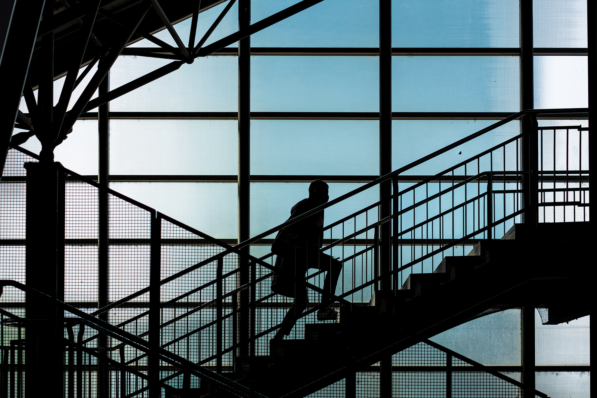
1. Statics and movement
By combining rigid architectural characteristics with organic structures, Michael has created an interesting interplay between a still moment and movement. The contrast turns the human silhouette into an additional graphic element of the photography and, because of this, the photograph is eye-catching and visually appealing. Integrating a person into the background allows parallels to be drawn between graphic and dynamic structures, preserving the balance within the image.
2. Strong contrasts
Dark shadow areas eliminate detail in the architectural elements and anonymize the person. “The strong contrasts go well with this silhouette image and help focus the eye on the essentials,” Michael says. The light background supports the dominant lines, creating a clear demarcation between both pictorial planes. Despite the static composition, the interaction between the light and dark parts of the image creates a certain dynamic that is characteristic of a light and shadow situation.
3. Color management
The choice of color here radiates a sense of objectivity, allowing the image to appear clear and the details to be visible. “The colors in the blue spectrum fit well with the minimalist style of the image,” says Michael. Due to the surface structure of the material, the colors change throughout to create a unique effect. The color gradient highlights the graphic elements and demonstrates how multifaceted these components are. This interaction creates a visual contrast between color and structure.
4. Graphic elements
By limiting the colors, the architectural elements stand out and are transformed into graphic lines. The graphic elements operate like building blocks and create a clear pictorial composition. The dominant structures skilfully guide the viewer’s gaze throughout the photograph.“This station is interesting in terms of its architecture and it offers countless possibilities when composing pictures. The windows in the background, the stairs that form diagonal lines up to the struts are all elements that help to structure the picture graphically,” says Michael.
Tech details

Camera: Fujifilm X-Pro 3
Lens: Fujifilm XF-35mm F1.4 R
Aperture: f/2.5
Get the Digital Camera World Newsletter
The best camera deals, reviews, product advice, and unmissable photography news, direct to your inbox!
Shutter speed: 1/1700sec
ISO: 250
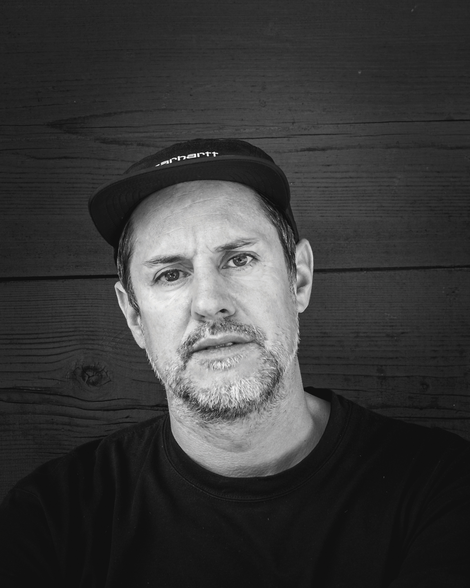
Zurich-based Michael Eugster focuses on candid moments on urban streets. By observing people, he captures unique moments and documents everyday life. His work was presented at the PhotoSchweiz 2021 exhibition.
This article originally appeared in Digital Photographer, a monthly magazine, and the kitbag essential for pros, enthusiasts, and amateurs alike!
Inside, you'll find practical guides, shooting tips, and techniques from working photographers, plus all the latest industry news.
Others in this series

Kim is the Staff Writer on Digital Camera World, and formerly Technique Editor at Digital Photographer, focusing on the art and science of photography. With a Master’s degree in Photography and Media, she is driven to educate through an analytical approach, visually and technically. With her guides and tutorials, Kim seeks to uncover new facets of this time-honoured medium and foster a deeper understanding of its profound role in culture. Kim highlights topics that resonate with modern society, including women in photography and critical issues such as environmental conservation. She also discusses and reviews camera gear, giving you an overview to find the best fit for your photography journey.
