Was the Canon EOS M100 the company's worst ever camera?
The Canon EOS M100 wasn't just dumbed-down – it was just plain dumb

The Canon EOS M100 may well have been the worst camera that Canon has ever made. Small, simple and smartphone shooter-friendly, its intentions were good. The execution, not so much.
Launched in 2017, the Canon EOS M100 was the entry-level body in Canon's first mirrorless camera system – EOS M, which was discontinued six years and three cameras later.
Designed to be a cheap and simple mirrorless model that would make camera phone users feel right at home, the Canon EOS M100 was a barebones camera at a barebones price – one that any novice could pick up and use without issue.
Canon has always been pretty good at making beginner cameras like these – but sometimes it goes just a bit too far. The EOS M100 went beyond being simple to being simplistic, and beyond affordable to become a bit awful.
When we first saw the camera at the launch event, we were cautiously optimistic in our initial impressions. Then, however, something happened: Canon ran a little photo competition, we won, and the prize was… a Canon EOS M100.
This meant that I got to spend a lot more time using the camera – and the more I used it, the less I liked it.

Canon EOS M100: What went wrong
The handling
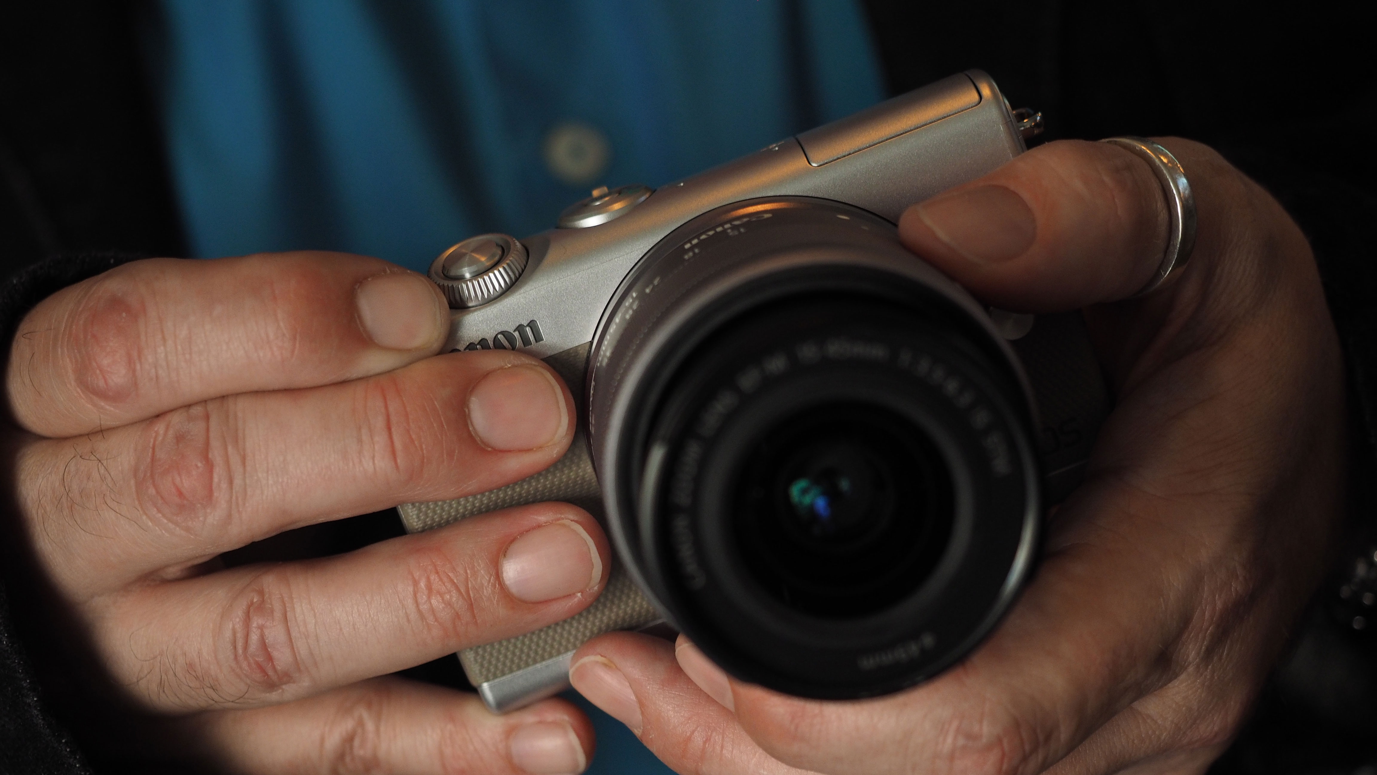
The Canon EF-M 15-45mm kit lens has a retracting mechanism, which keeps it small, yet it still felt way too chunky on the M100 body. The body has very little space for your hands either side of the lens, and doesn't have a raised grip at all – so it’s a real pain to actually hold.
Get the Digital Camera World Newsletter
The best camera deals, reviews, product advice, and unmissable photography news, direct to your inbox!
The controls
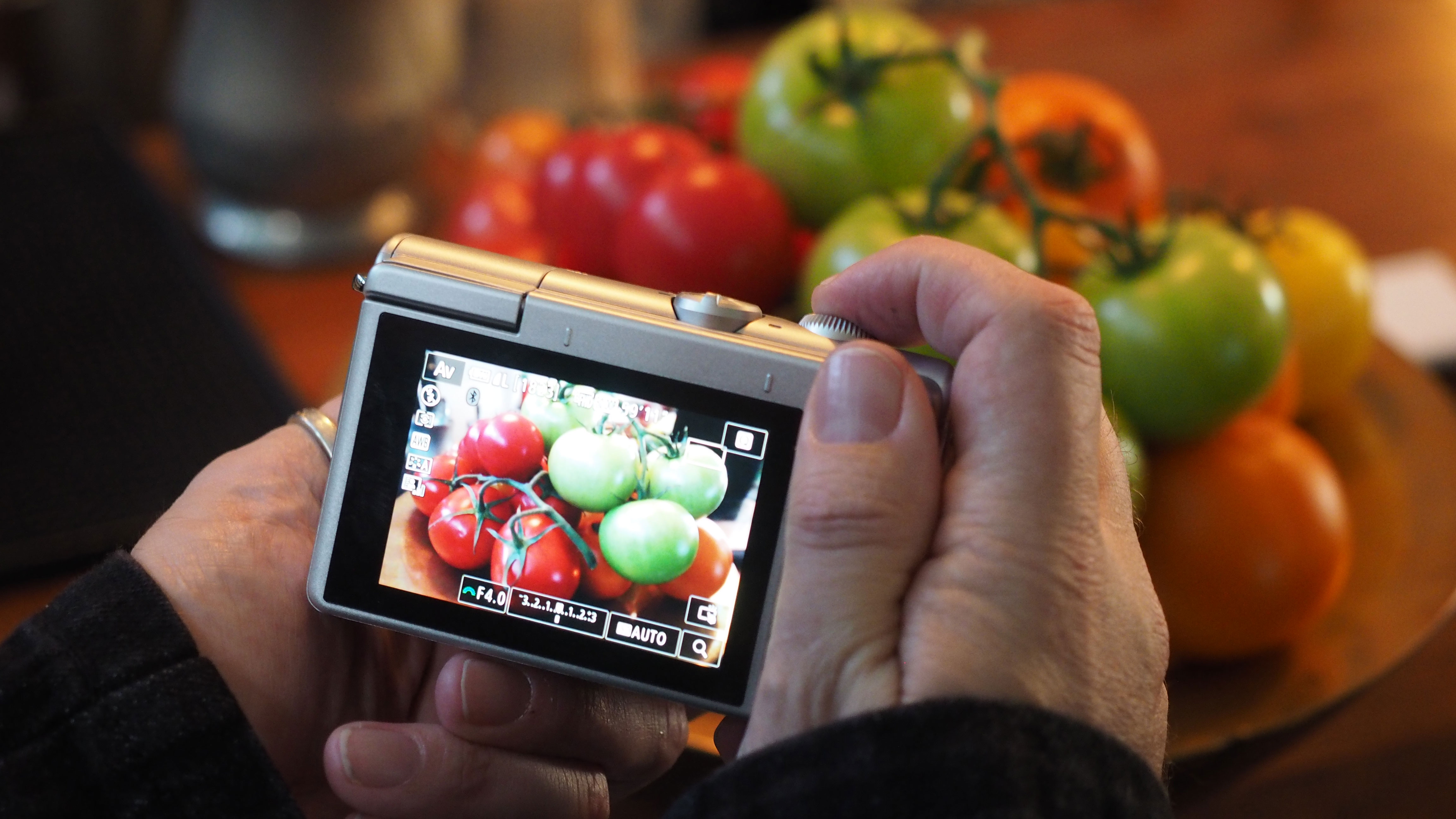
More specifically, what controls? The Canon EOS M100 held the dubious honor of being the only mirrorless camera not to have a mode dial or any equivalent. Instead, it had a dial with three options: full auto, 'less auto' and movie. Bizarrely, it actually had proper PASM modes but you had to wrestle with the touch interface to use them.
The interface
Speaking of, everything happened on the touchscreen. There was a teeny tiny four-way controller on the back, with buttons for exposure compensation and the flash, but if you wanted to use anything else then you had to deal with the digital interface.
It wasn't a phone
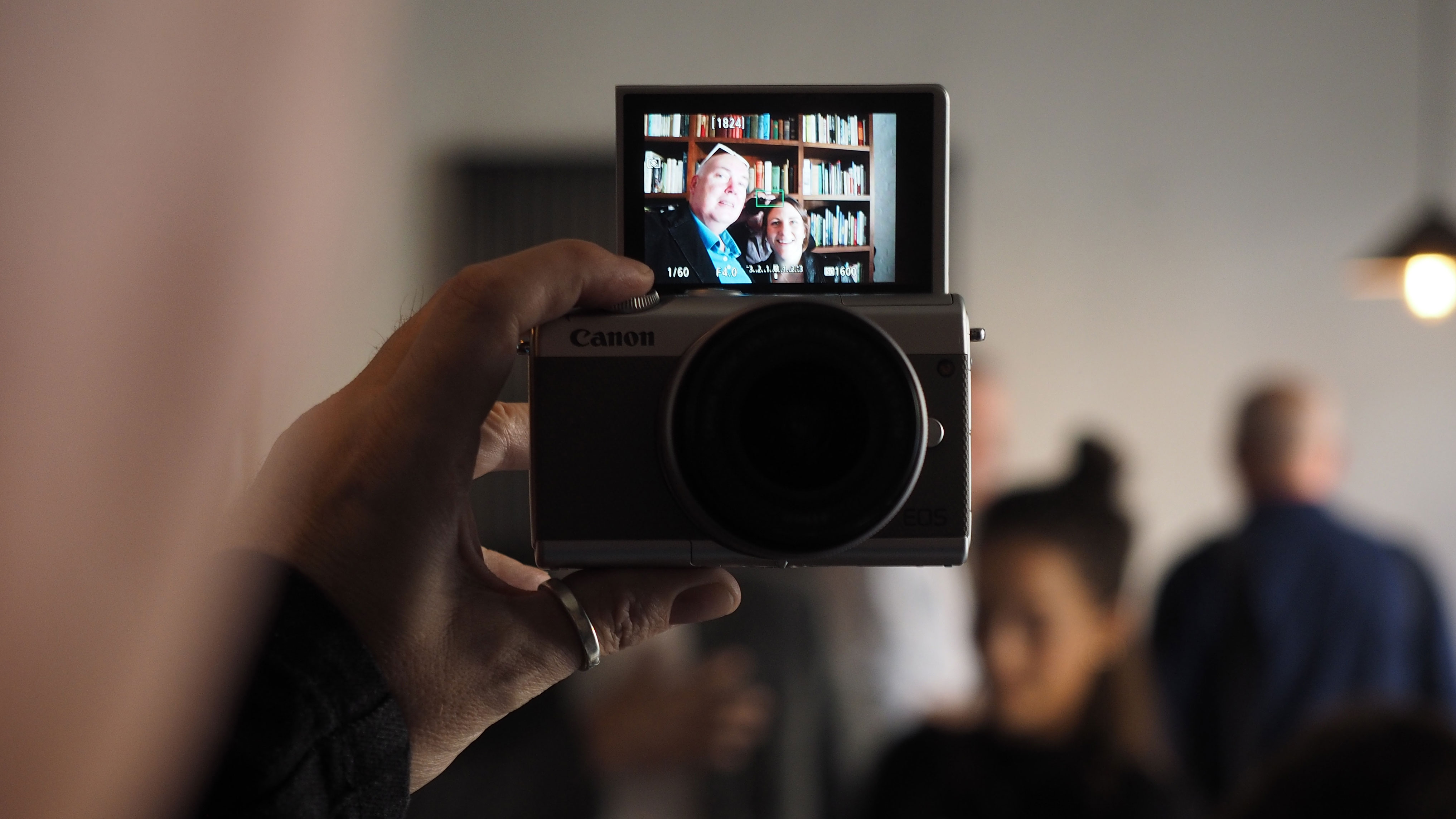
Canon clearly wanted to encourage smartphone user to graduate to the EOS M100. However, while it offered better image quality and the ability to change lenses, everything else was worse. You couldn't share images as quickly (in fairness, you still can't) and the screen was smaller, making selfies less easy.

While the Canon EOS M100 was followed by a successor, the EOS M200, the death of the EOS M line seems to have put an end to the barebones mirrorless experiment.
The Canon EOS R100 strikes a much better balance of beginner-friendliness, ease-of-use, price and performance. We're always grateful to Canon for trying new things, but the M100 is something it definitely doesn't need to try again.

Rod is an independent photography journalist and editor, and a long-standing Digital Camera World contributor, having previously worked as DCW's Group Reviews editor. Before that he has been technique editor on N-Photo, Head of Testing for the photography division and Camera Channel editor on TechRadar, as well as contributing to many other publications. He has been writing about photography technique, photo editing and digital cameras since they first appeared, and before that began his career writing about film photography. He has used and reviewed practically every interchangeable lens camera launched in the past 20 years, from entry-level DSLRs to medium format cameras, together with lenses, tripods, gimbals, light meters, camera bags and more. Rod has his own camera gear blog at fotovolo.com but also writes about photo-editing applications and techniques at lifeafterphotoshop.com
