Don't let Amazon screw you! Watch out for this sneaky trick during the Black Friday sales
This sneaky trick is being used by Amazon (and other retailers) and it could cost you HUNDREDS – watch out for it!

If you're shopping the Black Friday camera deals, be careful out there! Amazon has increasingly been using a new device on product listings that could potentially cost you hundreds of dollars.
The new mechanism (which, I'm told, is also being used by a few other retailers) at best makes it easy for you to overlook a discount, and at worst is intentionally designed to trick you into thinking you've got the best deal by obfuscating a further saving.
You might already have bought something via the Amazon website or app without noticing that a discount was being offered.
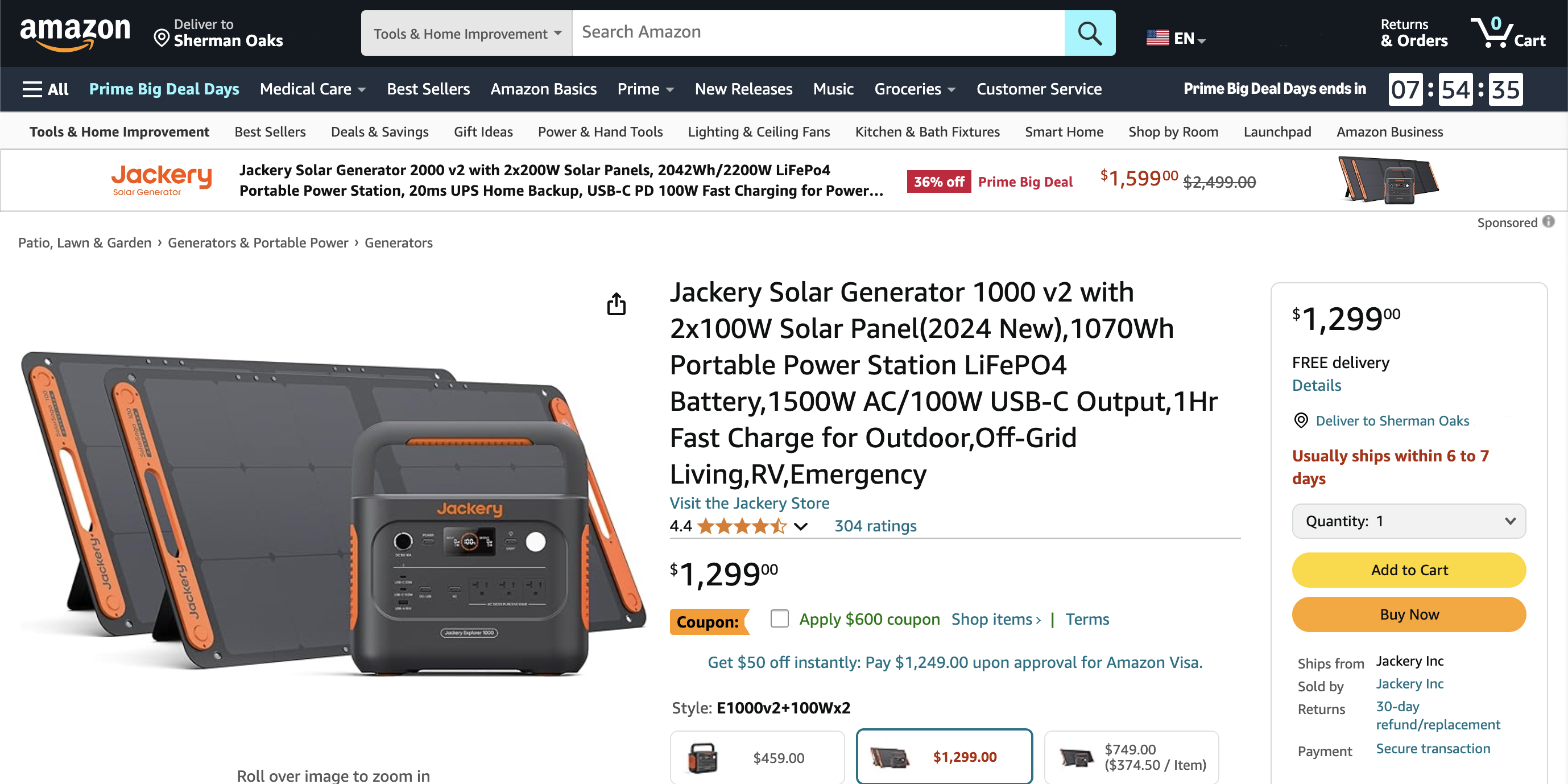
The company has been adding a very small, very discreet tickbox beneath the price on certain product listings, marked "Coupon" in the US and "Voucher" in the UK. I first noticed this a couple of months ago, and savings that are available only via these tiny checkboxes have ranged from £2 off a USB splitter to $600 off a portable generator.
Here's an example of a listing that I saw during the recent Prime Big Deal Days event:

The voucher checkbox is small and surrounded by colorful text, star ratings and visual elements, and is dwarfed by the giant-font product description – and, crucially, it is positioned away from the purchasing sidebar containing the normal buying options (such as quantity and add to cart).
In this case, a $600 saving could easily be missed by anyone who wasn't sufficiently observant or was simply browsing in a rush. The checkbox is even easier to scroll past on the mobile app, too.
Get the Digital Camera World Newsletter
The best camera deals, reviews, product advice, and unmissable photography news, direct to your inbox!
Why not just place the checkbox in the same purchasing sidebar, made obvious in the same way that the other buying options are? More's the point, given that this was in the middle of Amazon's Big Deal Days event, why wasn't this saving automatically applied – you know, on the off chance that someone shopping during a sales event might want to actually save money?
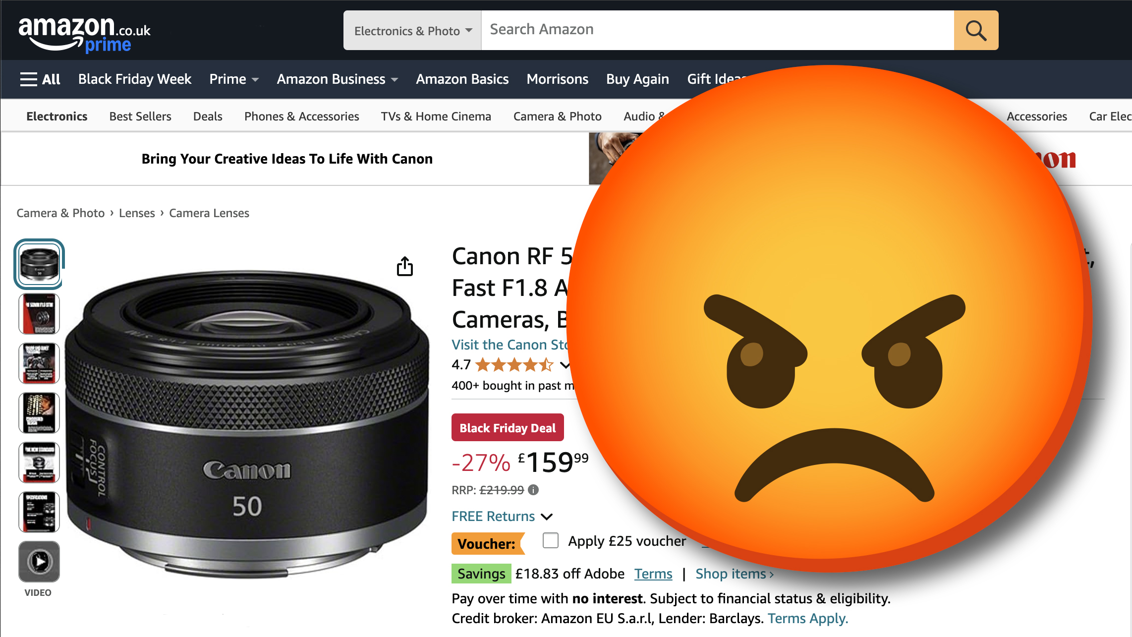
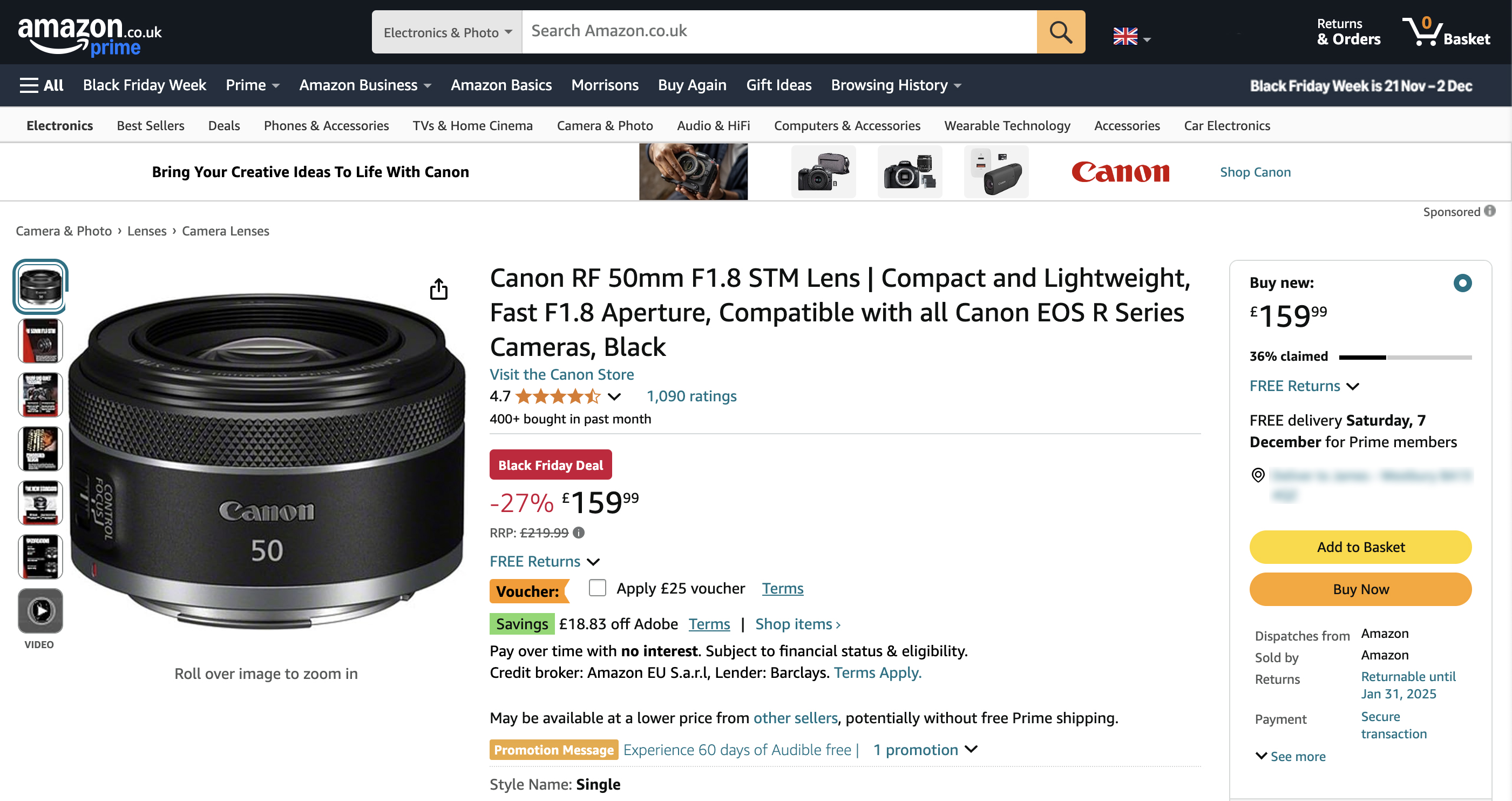
The way the checkbox is obfuscated by page elements during Black Friday feels even more insidious:

Here it feels like the listing is deliberately suggesting to the buyer that they have already got the best offer. "Black Friday Deal" is emblazoned in a red box, with a percentage saving highlighted in big red letters – so at a glance, you would think "Great, I've got my Black Friday saving!"
However, if your eyes creep a little further down, there's the option for a further significant saving – but only if you check the box.
Again, why isn't the discount automatically applied – especially during a huge sales event, when it can be fairly assumed that browsers are consenting to saving as much money as they can? What motive can Amazon have for adding extra steps to the process, other than hoping that the customer will miss the opportunity to save money?
It feels pretty unfair to me. Yes, we should all look very carefully at everything we click on the internet – it is, after all, our own responsibility to read everything on the page. But to me, this seems like caveat emptor in the most miserable, mercenary spirit possible. Sorry you screwed yourself out of getting the best deal. Happy Thanksgiving!
Take a look at the best cameras you can buy this Black Friday, and if you like the look of that RF lens then check out the best Canon Black Friday deals

James has 22 years experience as a journalist, serving as editor of Digital Camera World for 6 of them. He started working in the photography industry in 2014, product testing and shooting ad campaigns for Olympus, as well as clients like Aston Martin Racing, Elinchrom and L'Oréal. An Olympus / OM System, Canon and Hasselblad shooter, he has a wealth of knowledge on cameras of all makes – and he loves instant cameras, too.
