Good news for portrait photographers: Instagram to support "ultra-tall" images
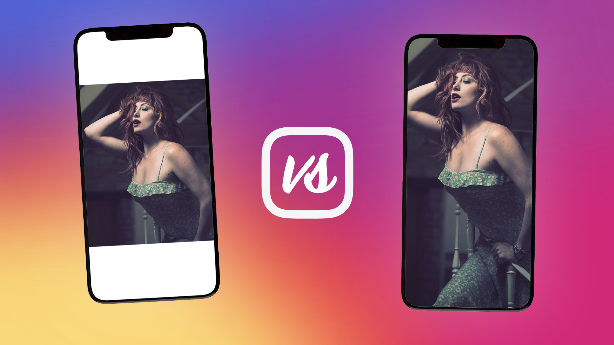
In an effort to match its full-screen video Reels, Instagram is reportedly planning to test an "ultra-tall" image upload feature

Reels on Instagram are essentially re-branded versions of Tiktoks, and most of them can be super annoying and make our feeds that much longer to scroll through, especially when we're shown content from influencers we don't follow.
Instagram has been under some heavy fire lately, facing unexpected competition from the likes of BeReal. Lately, we've been feeling like Instagram is no longer for photographers, and while Instagram seems to have rolled back to a more original format, users still aren't happy with how the platform seems to be turning into TikTok, and pushing influencer posts into home feeds.
• In recent news: Instagram banned a Cosplayer for looking TOO much like Benedict Cumberbatch!
With what appears to be a newly-found focus on full-screen content, head of Instagram, Adam Mosseri, revealed during one of his weekly "Ask Me Anything" live stories taking place every Friday via his own Instagram account , that the company will begin trialling what it calls "ultra-tall" 9:16 images on the platform, expected to roll out in a couple of weeks, as reported by The Verge.
The confirmation came after Mosseri was asked "Are you building any cool features for photos?" via an Instagram story questions widget. “You can have tall videos, but you cannot have tall photos on Instagram,” Mosseri said in a response to the question box, “so we thought maybe we should make sure that we treat both equally."
BREAKING; Instagram will be testing 9:16 vertical photos in the main feed. Per @mosseri, the thought is that Instagram should probably treat photos and videos with the same aspect ratio. pic.twitter.com/PyjiDdphTlAugust 6, 2022
Having the same aspect ratio for both videos and photos may not be the worst idea that Instagram has ever had, especially as the square 1:1 ratio can be the bane of existence for portrait-orientation shooting photographers who have to shrink or white-border their images to share the full photo, to avoid having to crop out any foreheads, feet, or watermarks in taller images.
Users have been able to share 9:16 ratio images to Instagram before, but only via Stories. These images could be viewed essentially full-screen on smartphone devices but only for a limited time, as Stories expire unless the uploader saves them to a highlight tab.
Get the Digital Camera World Newsletter
The best camera deals, reviews, product advice, and unmissable photography news, direct to your inbox!
Having a full-screen ratio and viewing experience for images on Instagram could be a game changer for photographers, able to create fully immersive scrollable content, using tactics like creating a blended image carousel - often presented by many in a collaged scrapbook style - for seamless swiping through multiple image posts.
A post shared by Adam Mosseri (@mosseri)
A photo posted by on
Mosseri has shared an update reel to his Instagram page (above) explaining that the company will always remain loyal to photo sharing, being its "heritage" as he describes it, but also explains that times are changing and shifting towards video as priority content, and that Instagram will be changing things around to reflect this.
So what does this mean for our carefully curated Instagram profile grids? How will taller 9:16 images fit in alongside the current square block formats? Are taller images going to be given a seperate profile tab similarly to reels? Will users who dabble in mosaic-posting have their formats ruined?
This new experimental format could be a make or break situation for the platform, already on thin ice, but it's intriguing to consider the approach Instagram will take to trialling this new image ratio and the response it will receive from content creators.
You may also be interested in the best cameras for Instagram, a super guide on how photographers organize their grids plus 10 tips for Instagram success with your photography.

Beth kicked off her journalistic career as a staff writer here at Digital Camera World, but has since moved over to our sister site Creative Bloq, where she covers all things tech, gaming, photography, and 3D printing. With a degree in Music Journalism and a Master's degree in Photography, Beth knows a thing or two about cameras – and you'll most likely find her photographing local gigs under the alias Bethshootsbands. She also dabbles in cosplay photography, bringing comic book fantasies to life, and uses a Canon 5DS and Sony A7III as her go-to setup.
