The latest Instagram update is the worst one yet… and I hate it!
Instagram has done some questionable updates over the years but the latest is by far the worst and I'm not alone in thinking that

Instagram has just released an update that is so bad that if it doesn’t revert back I might have to stop using the app altogether. For a long time, I’ve had a bit of a love-hate relationship with the photo-sharing platform but recently it’s starting to turn into more of a hate-hate relationship.
It all started when Instagram removed the chronological feed in favor of one generated by an algorithm. Since then it's introduced Reels, IGTV, Carousels and a shopping page all of which take away from what the app was originally designed for - to share photos. To makes things even worse for people who just want to share images, Instagram also favors the people who jump on these new trends, making them more visible.
Read more: Best cameras for Instagram
Thankfully they recently brought back the chronological feed but honestly, if I had to choose between losing that and going back to the old look Insta, I’d jump at the latter.
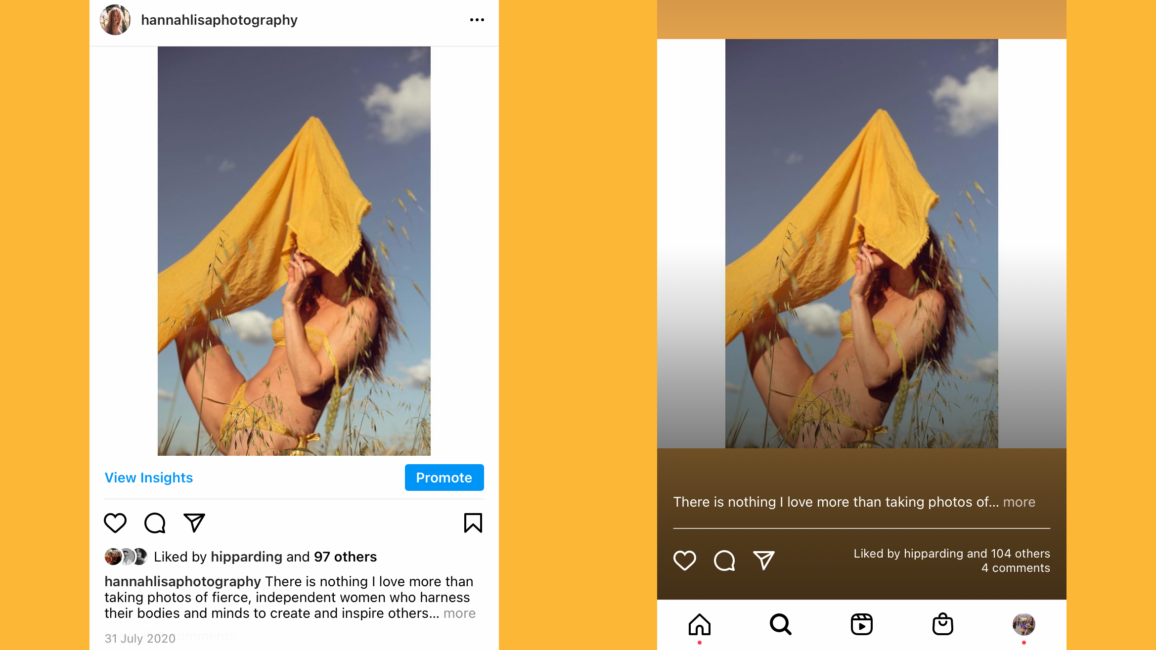
I’m all for updates if it’s going to make an app better to use but more often than not it seems like they do the exact opposite. The latest update from Instagram has changed the way you view posts in your feed by making each post taller and making the background match colors within the image as it does for stories.
One of the reasons I really do not like this new update is that it’s harder to tell the difference between when you’re viewing someone's story and when you’re viewing your news feed. It also makes the news feed feel cluttered and it’s much harder to write and view comments.

Rather than tapping to view the next image in a carousel, you now have to swipe and I don’t know why (maybe I’m just super lazy) but I much preferred just having to tap. We already spend so much of our life swiping (especially those of us unlucky enough to still be on Tinder) that the micro difference between tapping and swiping is one I notice.
Get the Digital Camera World Newsletter
The best camera deals, reviews, product advice, and unmissable photography news, direct to your inbox!
Not only does each individual post look a lot messier than it did before, but when you have an advert or suggested posts between two posts from people you follow, the white background sticks out like a sore thumb. Basically, absolutely nothing about the aesthetics of this update works.
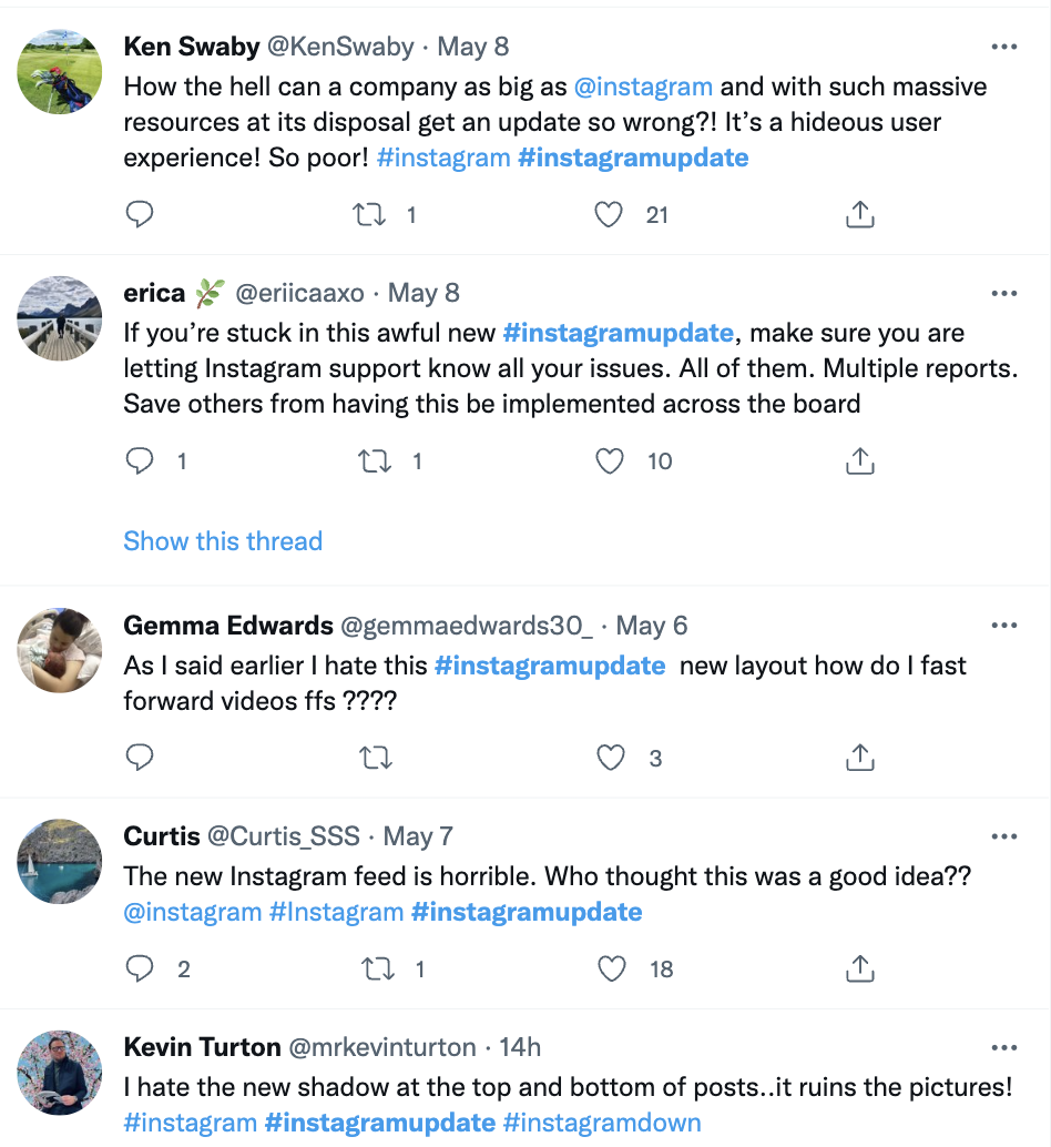
It would seem I am not alone in my hatred for this latest update. Over on Twitter people are using the hashtag #Instagramupdate to tweet the company their thoughts on its new look and no one is loving it. One user like me even said it might be the thing to make her delete it.
Lucky for us, updates can be easily reversed and hopefully when the computer masterminds at Instagram realize they have had a lapse of judgment, they will return it to its previous look. Some things just don’t need to be changed and the look of the Instagram feed is one of them so please, give us what we want and make Instagram great again.
Read more:
Want to download Instagram stories? Here's a super easy way
How to use instagram filters
Best cameras for vlogging

Having studied Journalism and Public Relations at the University of the West of England Hannah developed a love for photography through a module on photojournalism. She specializes in Portrait, Fashion and lifestyle photography but has more recently branched out in the world of stylized product photography. Hannah spent three years working at Wex Photo Video as a Senior Sales Assistant, using her experience and knowledge of cameras to help people buy the equipment that is right for them. With eight years experience working with studio lighting, Hannah has run many successful workshops teaching people how to use different lighting setups.
