Why I don’t use a monitor calibrator… though they still might work for YOU
It sounds like the perfect science for managing color perception and reproduction but it can lead you down a rabbit hole
The best camera deals, reviews, product advice, and unmissable photography news, direct to your inbox!
You are now subscribed
Your newsletter sign-up was successful
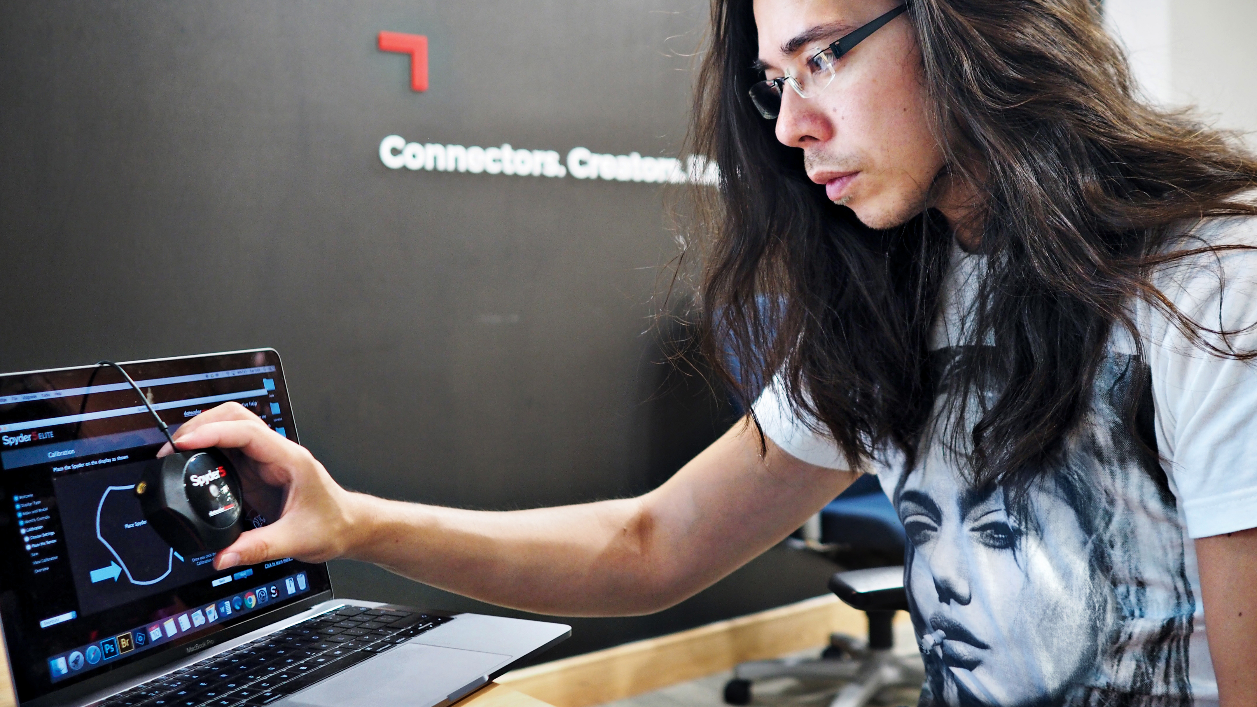
I’ve used monitor calibrators from Spyder and Datacolor. I’ve used scanner calibrators and printer calibrators. I’ve given the whole color management workflow a proper shot, and I’ve given up on the whole thing.
That’s not to say it won’t work for anyone, but the range of situations where it’s essential or even useful looks pretty narrow to me. Color management will often promise a perfection it's difficult to achieve in practice, it takes time, equipment and know-how and can introduce errors that you would never have had before.
What happened when I calibrated my monitors
I know what to do and I follow all the instructions, but whenever I calibrated one of my monitors, its new custom profile made it look dimmer and warmer than I was used to.
Article continues belowFine, I thought, that’s just my eyes failing to adapt to the correct color rendition. If I gave them time, maybe a few hours, or a few days, it would be fine. But the days stretched into weeks and I just couldn’t get on with my monitors’ new colors – they just looked unnatural.
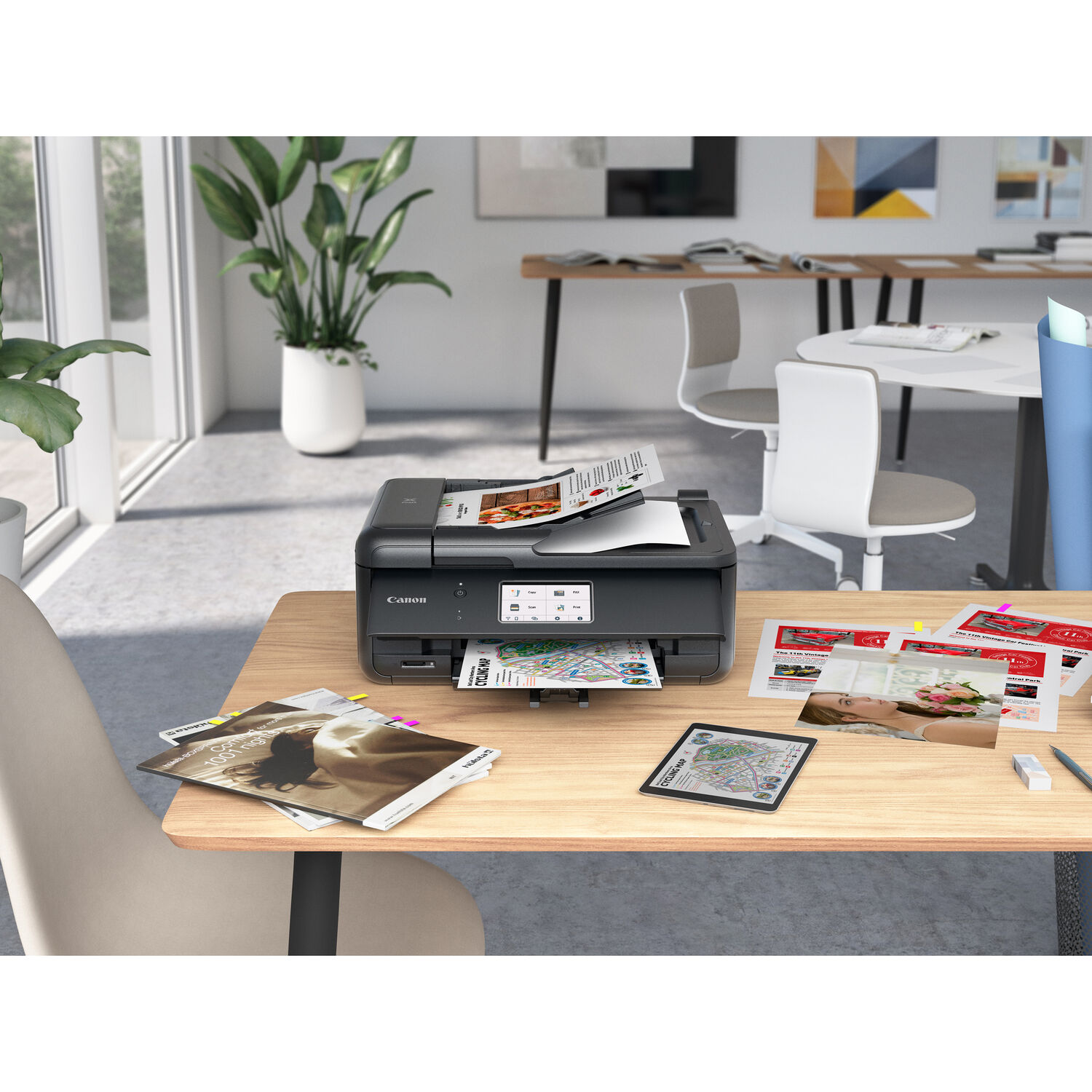
I concede they tied in pretty well with my photo printer’s colors when that used the correct profile too. Back then I did a lot of photo printing, especially with third-party ‘artisan’ papers (the makers would often supply ready-made profiles) and a lot in black and white too (don’t even bother trying without proper ‘gray’ inks).
But I still didn’t like the look of my monitor. I switched back to my default profile, my monitor looked ‘right’ again, and if my printer’s colors showed any difference I decided it didn’t matter or it was easy enough to tweak the image and do it again.
I don’t do any printing now, so that reason for sticking with color management is gone. I found its value dubious then, and unnecessary now.
The best camera deals, reviews, product advice, and unmissable photography news, direct to your inbox!
Of course, you can get prints done at a lab, even if you don’t print at home. Here, you should take the lab’s advice about color management and the color spaces or profiles they need.
What about commercial print publishing?
Very true. Commercial print publishers are likely to follow a color managed workflow and with good reason. HOWEVER, matching profiles for print is the designer’s job, not the photographer’s. You may try to help by supplying a correctly-profiled print-ready CMYK version of your photo, but they will have to check it anyway and would probably prefer you just sent an sRGB or Adobe RGB image.
sRGB vs Adobe RGB is an interesting question. Adobe RGB is a technically ‘wider’ color space than sRGB but it brings its own problems. Few monitors support the Adobe RGB color space, and if even if you use the correct conversion profile, an sRGB monitor will only approximate the Adobe RGB colors within in its own sRGB color gamut.
Personally, I don’t think I’ve ever seen an sRGB image that I can show would have been better in Adobe RGB – but I’ve seen lots of Adobe RGB images looking terrible because they’ve been displayed uncorrected on regular sRGB displays.
Monitor quality matters
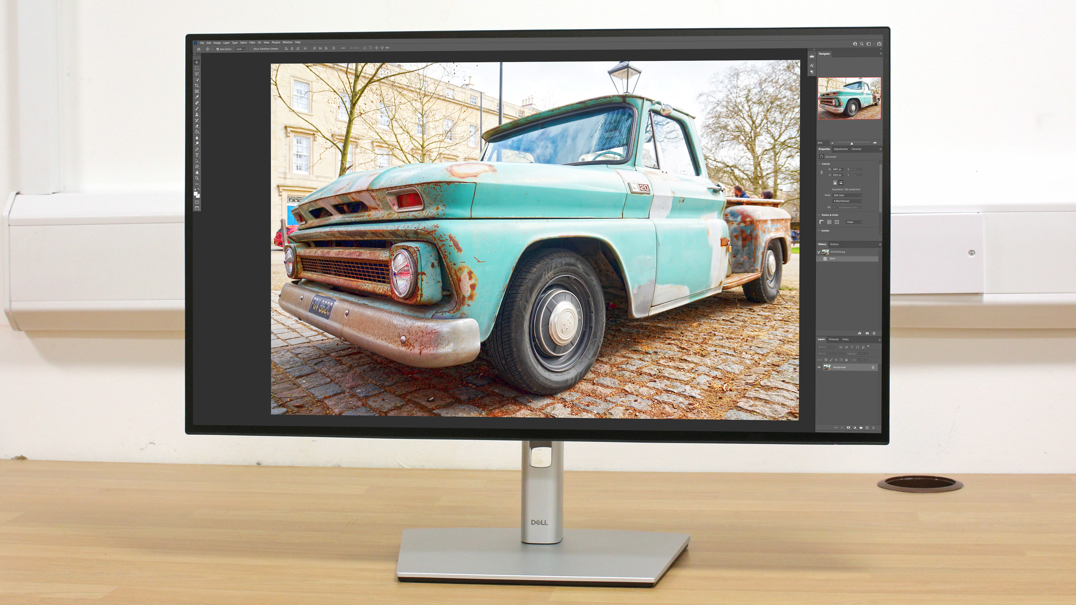
Monitors have come a long way. If you get a good-quality 1080 or 4K monitor designed for photo and video work you’re already half way to accurate color. And don’t forget that most monitors let you tune the color output manually – a quicker and dirtier way to match your printer if you need to.
The thing is, a monitor calibrator can’t make a poor-quality monitor good. If your monitor doesn’t have a good enough contrast ratio or can’t pump out enough nits for decent brightness, a monitor calibrator won’t help you much.
Here's the point: you can’t control your users' displays
Most of us now share our images digitally rather than in print. This means you have absolutely no control over the displays that other people are using. With this in mind, when I share or post an image I use the sRGB color space and make sure it looks right on my monitor, which I have to imagine is a fair representation of other people’s. In that respect, trying to 'correct' my monitor might put it out of kilter with everyone else's.
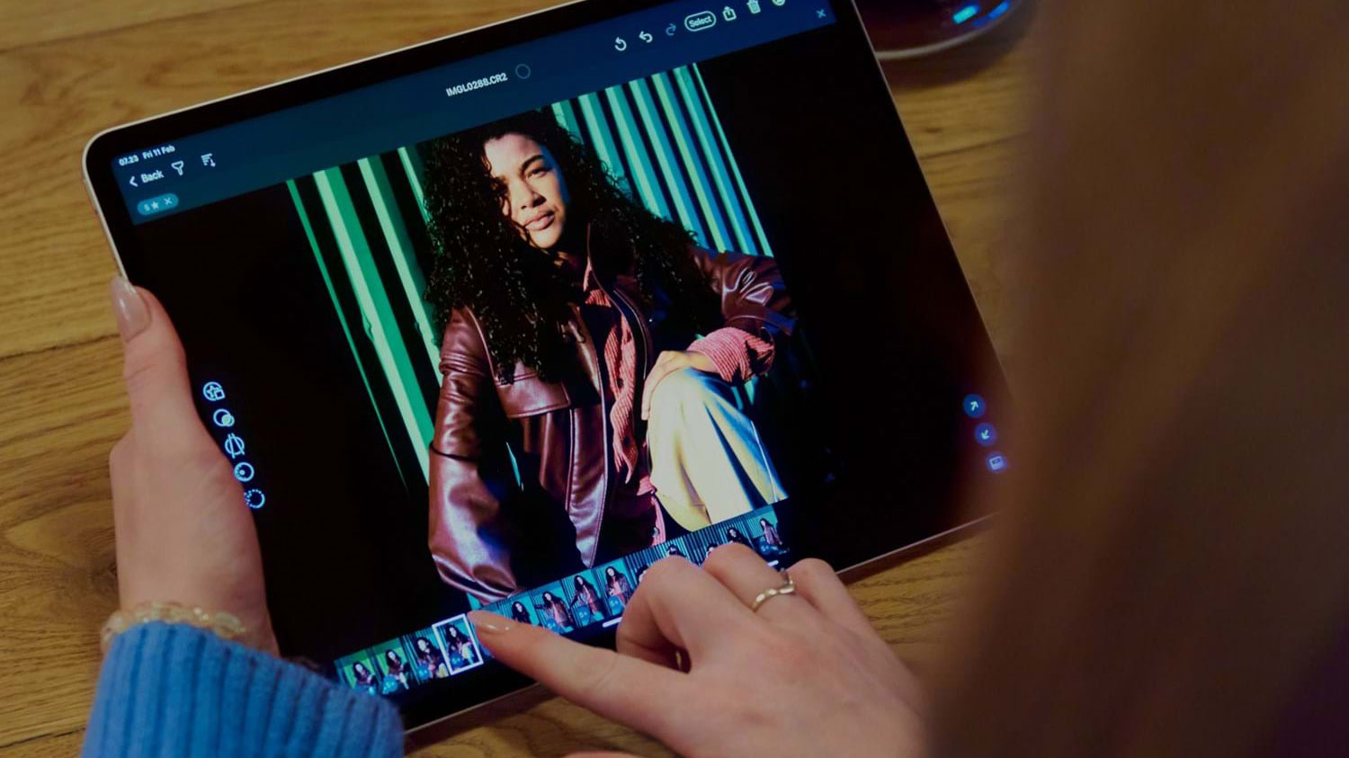
And then there are camera phone and tablet displays, which are sometimes brighter, richer and deeper than desktop displays – and sometimes dimmer and flatter. If you’re editing images for digital consumption, your best bet is to aim for the middle ground.
The IDEA of a fully managed color workflow sounds great. The reality is complex, messy and prone too errors and misunderstandings.
I think, basically, that decades of using uncorrected monitors has trained my brain to ‘correct’ them itself, so that when I see a ‘corrected’ monitor, it just doesn’t look right and perhaps never will.
If you do make your own prints, monitor calibration makes sense. We even have a guide to the best monitor calibration kits. However, if monitor calibration doesn't work for you, it doesn't make you a bad photographer. If you produce images for digital consumption, you're fine as you are.
Read more:
• Best monitor calibrator
• Best monitors for photographers
• Best photo printers

Rod is an independent photography journalist and editor, and a long-standing Digital Camera World contributor, having previously worked as Group Reviews Editor, Head of Testing for the photography division, Technique Editor on N-Photo, and Camera Channel editor on TechRadar, as well as contributing to many other publications.
He has been writing about digital cameras since they first appeared, and before that began his career writing about film photography. He has used and reviewed practically every interchangeable lens camera launched in the past 20 years, from entry-level DSLRs to medium format cameras.
Rod has his own camera gear blog at fotovolo.com but also writes about photo-editing applications and techniques at lifeafterphotoshop.com.
