Digital Camera World Verdict
A stylish and smart digital frame, the nicely crafted look of the Aura Mason is matched only by the simplicity of its set-up. A compact freestanding design makes it easy to position while images are easy to share from afar. It’s all helped by a streamlined user interface and app that has plenty of sharing options and clever image management features. Best of all, shared images look sharp, contrasty and colourful from all angles.
Pros
- +
Easy to set-up
- +
Landscape or portrait orientation
- +
Can be set up for gifting
- +
Image quality
- +
Stylish freestanding design
Cons
- -
Can’t change viewing angle
- -
WiFi network required
- -
Small touch bar
- -
Limited settings to adjust
Why you can trust Digital Camera World
We all take thousands of photos, but where do they go? If they are hidden on smartphones and in the cloud, this smart digital photo frame presents a neat, compact and easy-to-use way of displaying them either at home or away.
Ideal for gifting, Aura’s Mason digital photo frame is smart in more ways than one, with curated slideshows as simple to set up as its novel freestanding design is convenient. With a standout style, the Mason makes a serious play for space on your shelf.
Specifications
Weight: 1kg
Resolution: 1600x800 pixels (1.2-megapixels)
Screen size: 8.75-inch touchscreen
Dot pitch: 224 pixels-per-inch (PPI)
Key features
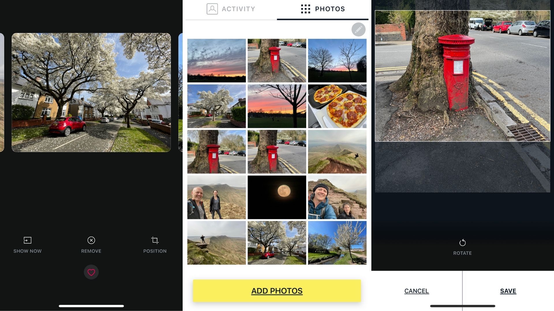
The most applying feature of Mason – and all Aura digital frames – is unlimited photos. Once your smartphone has been hooked up via the Aura Frames app (iOS/Android, including iPads) it shows newly-added photos first, with older photos shuffled.
Photos are set to display for 10 minutes as default, though you can set Mason to show a photo for anything from 15 seconds to 24 hours before advancing to the next one.
At any time a left or right swipe of the Mason’s Touch Bar calls up the previous or next photo. They then stay on screen for the default time you’ve selected. That Touch Bar also switches Mason on and off, which thanks to an ambient light sensor it also does automatically when you switch off the lights in the room it’s positioned it. That ambient light sensor also adjusts the image’s brightness to suit the room.
Since there’s no SD card slot or built-in storage it’s not possible to preload a Mason and gift it ready to go, but the Mason can be set up to show photos before it’s even been removed from the packaging. A QR code on the outside of the box makes it possible to set up and link to a source of photos.
The idea here, of course, is that a grandparent can have a Mason frame that magically fills with the latest photos of, for example, a grandchild, as the photos are automatically added to the app via the smartphone they’ve just been taken on. That is a nice touch, but it does need to be attached to a WiFi network, so it’s not super-simple.
It’s also possible to ‘like’ a photo using the Touch Bar, which whoever added the photos will get feedback on – and so confirmation that a newly-added photo has been seen.
Quality and usability
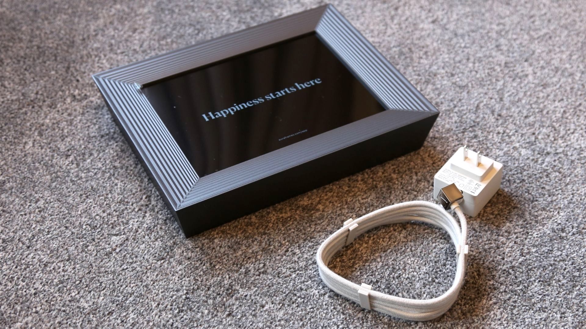
Thanks to the stylish bevelled frame around it, that screen goes right to the edge for a wonderfully high-end look. It’s available in graphite and white quartz. Also in the box is a power cable that’s covered in braided fabric. It’s of excellent build quality and malleable enough to be curled out of sight without protruding from the sides.
In use, the Mason mostly excels. It’s an ideal size for a shelf or sideboard, with plenty of room for photos to look great – sharp and colourful – without dominating. It also leans back nicely and is completely free-standing. That also means its position can’t be adjusted, but in practice, that’s a non-issue because viewing angles are wide. Nor can you tweak picture quality.
The Mason is all about simplicity, and never more so in its set-up. Plug it in and within a few seconds, the Mason generates a four-digit code. Then you need to download the app, create an account, associate it with the Mason via Bluetooth, then attach it to a WiFi home network.
Without the latter it won’t do much because the Mason has no internal storage save for a small cache, instead fuelling photos from a smartphone’s camera roll or from Google Photos. You can crop photos before you upload them to be shown on the Mason, but any photo touch-ups and edits need to be done within your smartphone’s camera roll.
You can manually add photos from your camera roll, picking out the highlights for the Mason to gradually scroll through, or set it to random. You can then use it either in landscape or portrait orientation; the photo changes as you physically rotate the Mason. You can also set slideshow timing and sleep schedules.
However, Mason is largely about automatic image management; it makes its own decisions on blurred photos and duplicates and doesn’t allow tweaks to colour settings or transition effects.
Most importantly, at all times the Mason presents photos cleanly and colourfully, with plenty of shadow detailing and a really wide viewing angle.
What we loved most was being able to take a photo – theoretically anywhere in the world – and within seconds have it purposefully shown on the Mason.
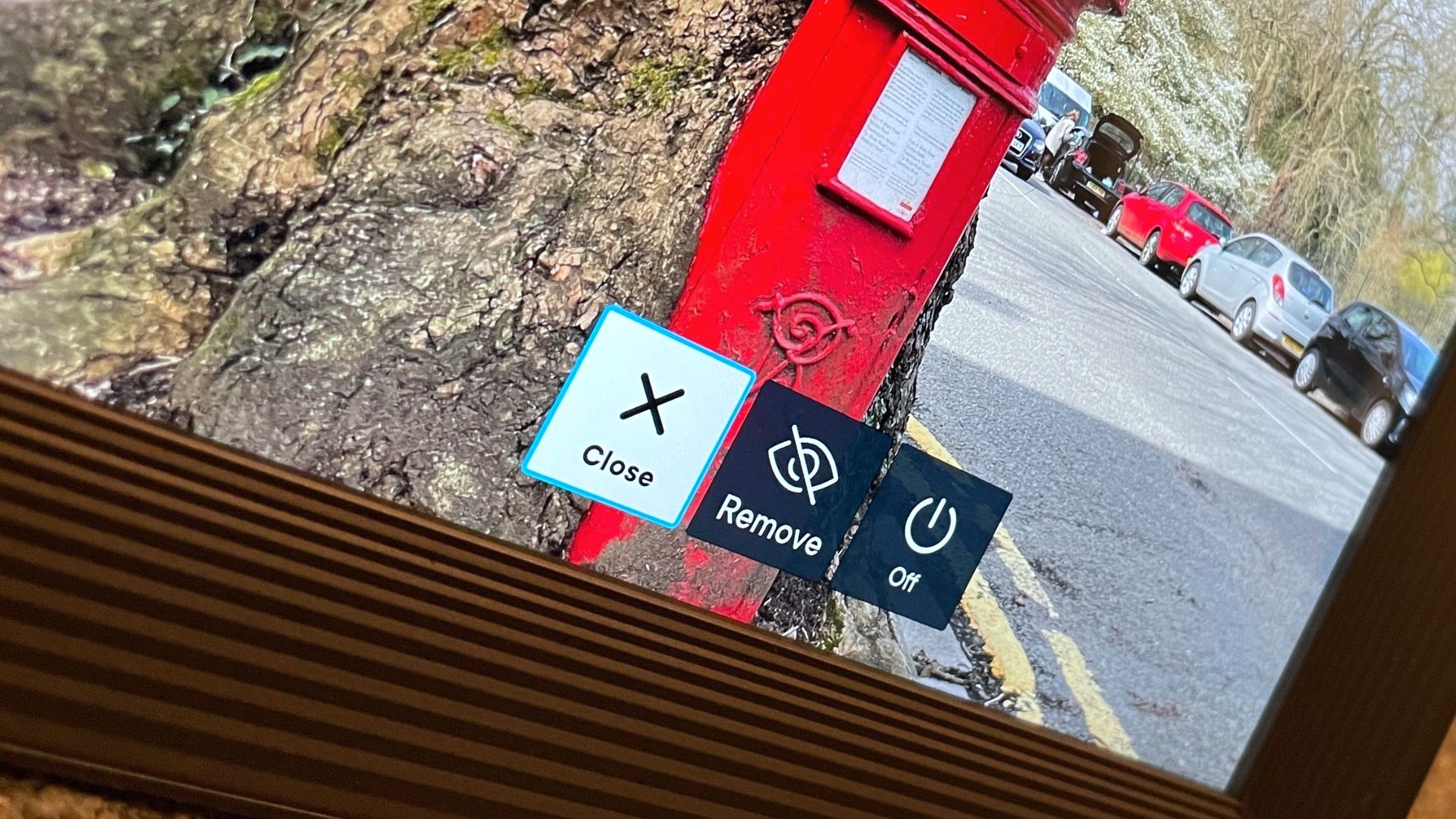
However, the Touch Bar is a touch disappointing. We liked the on-screen tutorial on how to use it, but it’s not big enough or sensitive enough to be of much practical use. A tap brings up some of the image details comprising the date, location and photographer, which is a nice touch.
Verdict
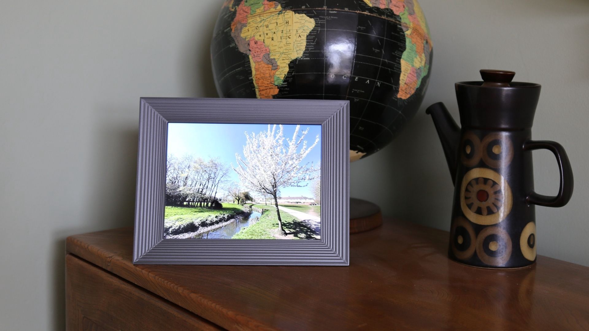
A stylish and smart digital frame, the nicely crafted look of the Aura Mason is matched only by the simplicity of its set-up. A compact freestanding design makes it easy to position while images are easy to share from afar. It’s all helped by a streamlined user interface and app that has plenty of sharing options and clever image management features. Best of all, shared images look sharp, contrasty and colourful from all angles.
Read more:
• Best photo frames
• Best photo books
• Best photo gifts
• Best photo printers

Jamie has been writing about photography, astronomy, astro-tourism and astrophotography for over 15 years, producing content for Forbes, Space.com, Live Science, Techradar, T3, BBC Wildlife, Science Focus, Sky & Telescope, BBC Sky At Night, South China Morning Post, The Guardian, The Telegraph and Travel+Leisure.
As the editor for When Is The Next Eclipse, he has a wealth of experience, expertise and enthusiasm for astrophotography, from capturing the moon and meteor showers to solar and lunar eclipses.
He also brings a great deal of knowledge on action cameras, 360 cameras, AI cameras, camera backpacks, telescopes, gimbals, tripods and all manner of photography equipment.


