Digital Camera World Verdict
The Nothing Phone (1) is a very good phone for the price, and packs features missing in much of its competition – wireless charging, a dynamic screen refresh rate, and most notably, unique, standout style. If you want the Glyph lights to change your life – they won't. They do help the phone's design edge ahead, though, and the fact its core user experience is strong must be commended. Most impressive is the camera though – it takes brands years to hone their camera software, and Nothing's pulled together some mighty image processing first time around. Yes, the battery life could be better, and a telephoto camera wouldn't have hurt either. Nevertheless, the Nothing Phone (1) is still a standout smartphone for the price.
Pros
- +
Great camera for the price
- +
Novel and playful design
- +
A fully-featured package
- +
Wireless charging
Cons
- -
Battery life could be better
- -
Doesn't pack best-in-class power
- -
No headphone jack
Why you can trust Digital Camera World
It's quite a feat to make a brand new smartphone like the Nothing Phone (1). By new, we mean totally new – no established holding company (that we know of) working behind the scenes to ensure success or absorb the cost of failure. In fact, we've not seen a successful new entrant to the smartphone market hit headlines for years. What about Poco, Realme and Redmi – they're all new and independent, right? Wrong. All are backed by bigger brands – Oppo and Xiaomi.
Truly new, indie brands like Essential and Fxtec historically launch, land, then sink. Essential is probably the most alarming cautionary tale, given it had a co-creator of Android at the helm and still failed. So why should you invest your time, long-term memory capacity, and money in Nothing and its Phone (1)?
For starters, Nothing is the new hype machine. Founded my Carl Pei, who's partially responsible for turning OnePlus into a household name. The Nothing Phone (1)'s launch has enjoyed the same brazen teaser-a-minute, community-minded hooks, like those that reeled in early die-hard OnePlus fans.
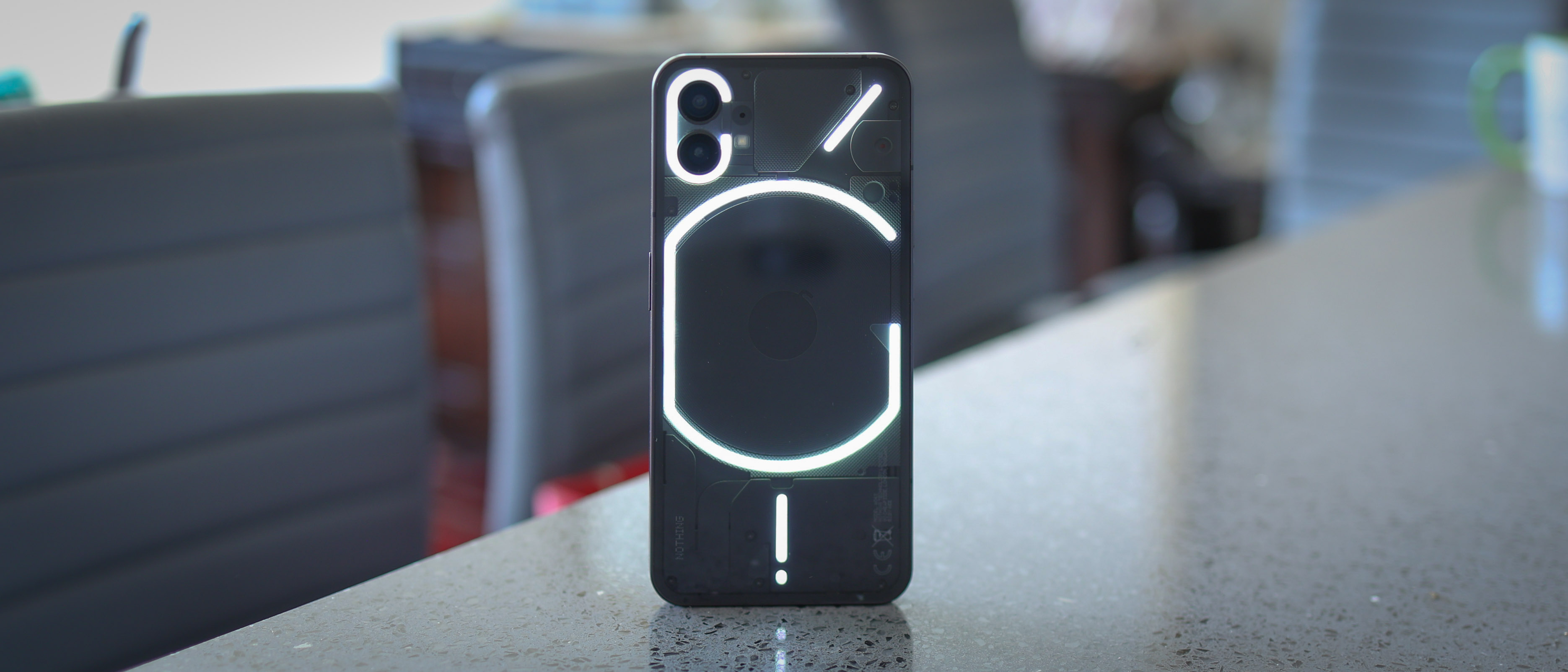
Nothing's debut phone is also attention-grabbing – iPhone from the front, alien spaceship from the back. It fuses familiar and novel with panache, while shamelessly copying the iPhone 13 Pro Max's rough dimensions and shape. Scandalous.
Also read our guide to the best Android phones.
There's also a lot of exclusivity being played up by the Nothing collective. In addition to a well-executed pre-order process that involved waitlists, codes, and a lot of lead-generation, you can't buy this phone in the US. A phone that's massively hyped by US tech sites and vloggers, that you can't buy in the US. This must be driving some American phone geeks crazy.
Most importantly for us, we really dig the less is more logic behind the Nothing Phone (1)'s camera system: two quality cameras around the back – no filler.
As for where you can actually buy the Nothing Phone (1)? It's available in the UK, both without a contract/plan from £399 (roughly $490) for the 128GB storage option, and with a contract/plan on O2 – the same carrier that exclusively ranged previous OnePlus devices. It's also available in other parts of Europe, India, and other markets – just not the US.
So there you have it – the successful hype train that's been and gone. Now the phone has launched, does it live up to the hype?
Nothing Phone (1) design and screen
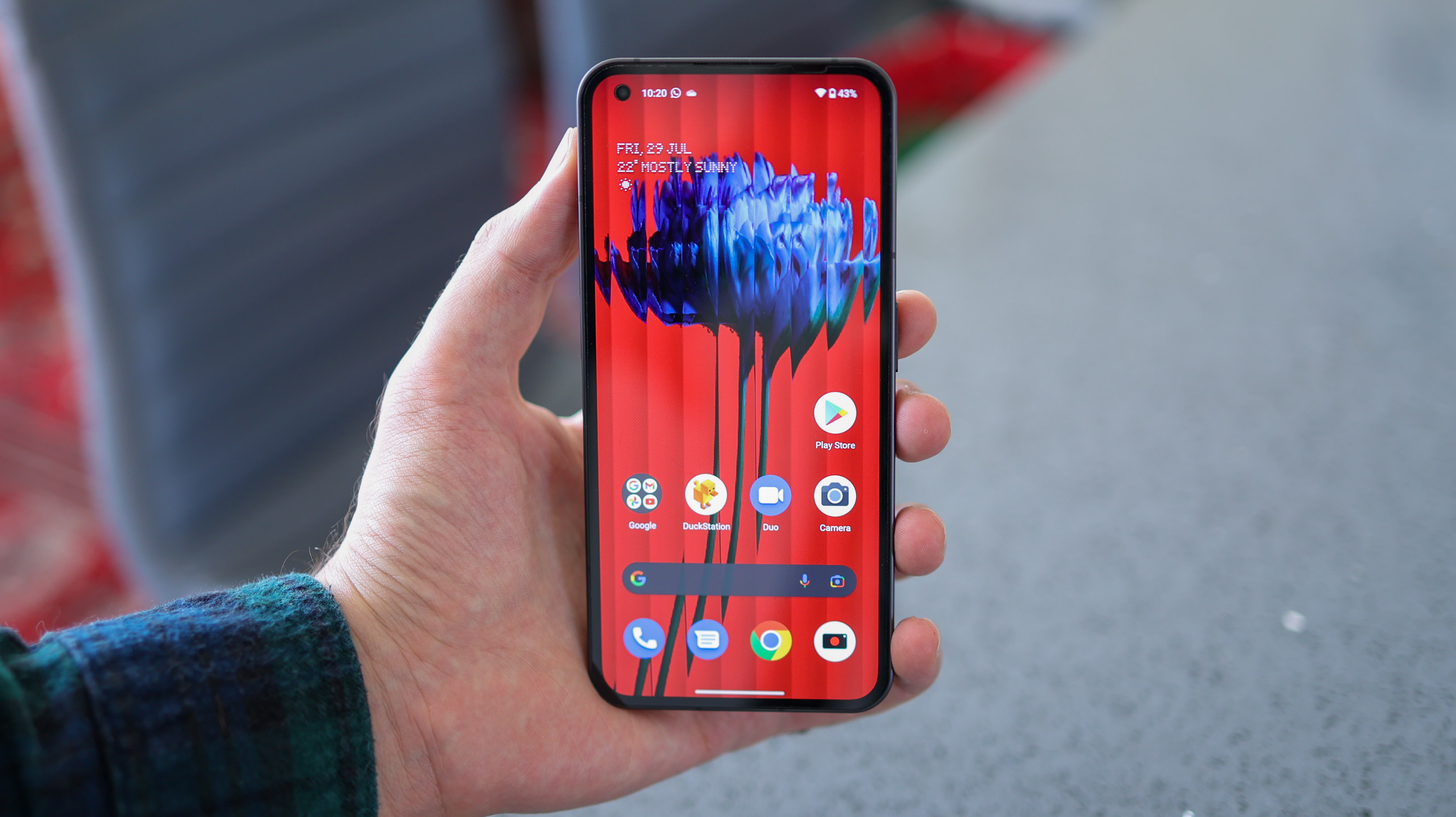
The Nothing Phone (1)'s design is smart. It dares to be different with its Glyph lights around the back, and dares to be familiar, with the same shape – and, therefore feel as the iPhone 13 Max Pro. The Phone (1) succeeds in standing out while looking and feeling good – largely because everything feels considered.
The screen is a 6.55-inch OLED panel that's evenly flanked by a tidy bezel. This bezel (the black border around the screen) is the same thickness around the whole display, and that's very satisfying, given the fact most phones have chins (a thicker bottom bezel).
The Nothing Phone (1)'s metal frame is 8.3mm deep – a touch thicker than the iPhone 13 series, and it weighs 193g – more than the iPhone 13 Pro, but less than the Pro Max.
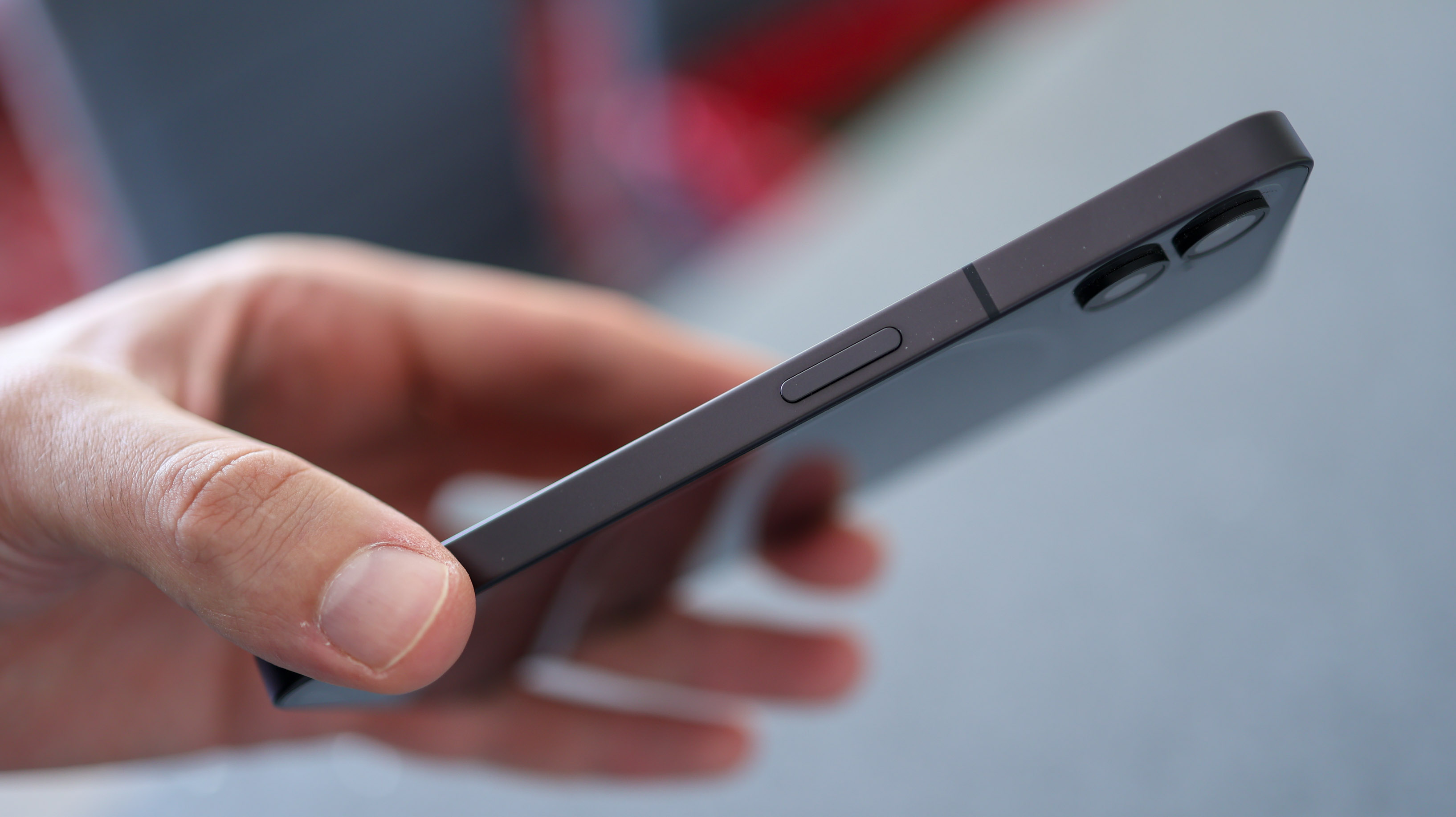
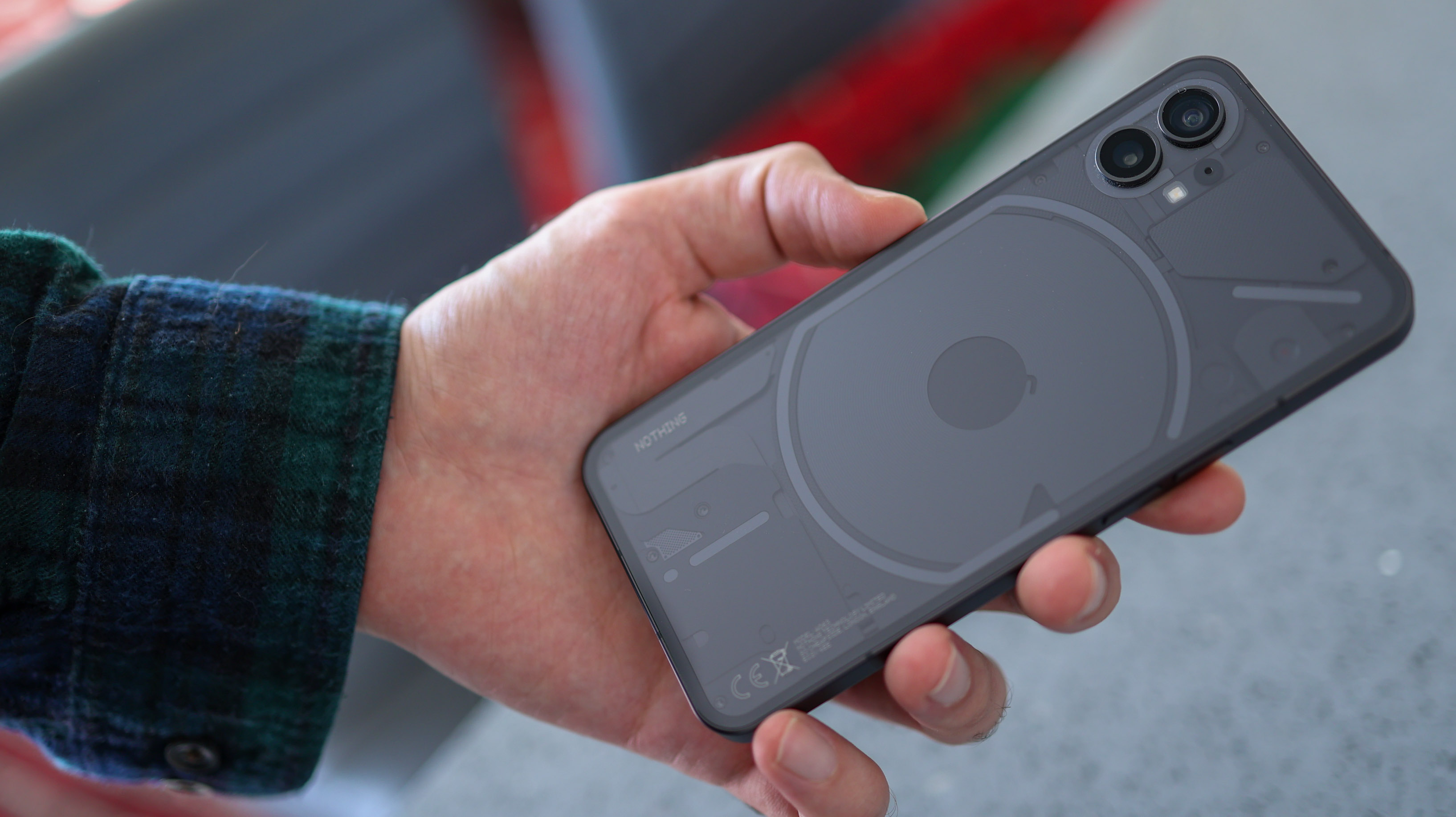
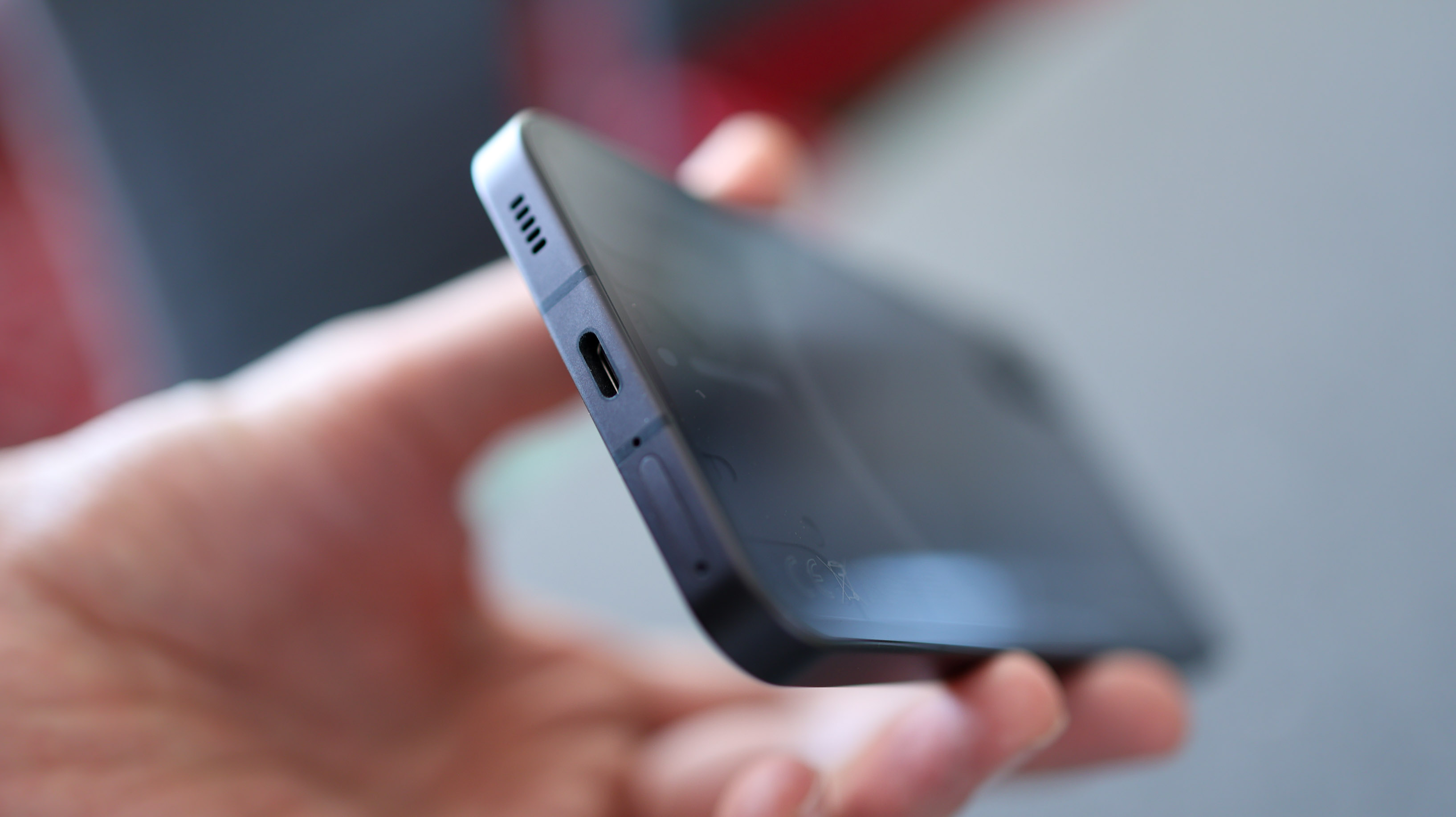
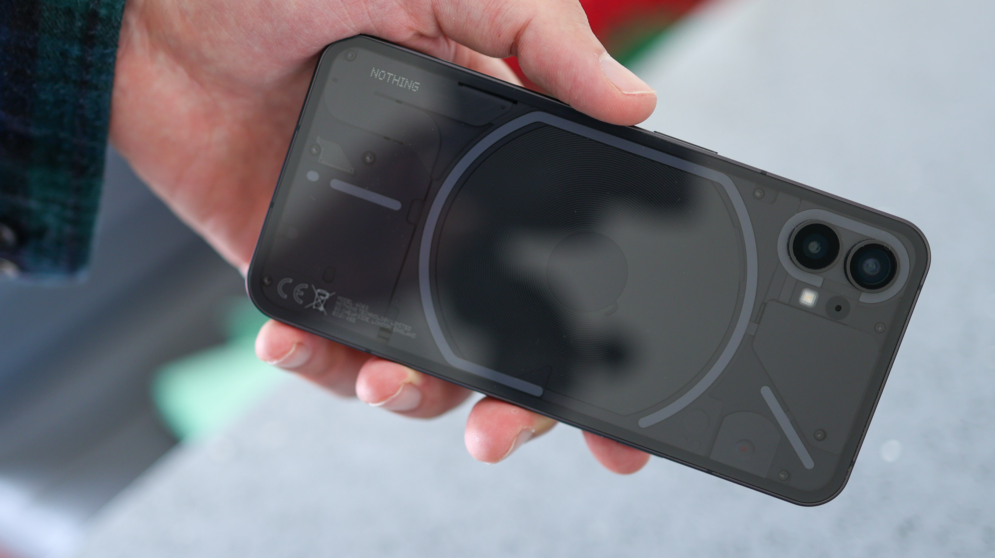
With flat Corning Gorilla Glass on the front and back, the Nothing Phone (1) feels chunkier than curved screen phones that are around the same thickness – like the Xiaomi 12 for example. You'll notice it in your pocket.
The Nothing Phone (1) has two layers around the back – or is it three? The first is the back you can touch – a transparent sheet of glass. Then there's the back that you can see – plates covering the smartphone's innards. Sandwiched between these layers are the Glyph lights. While the lights are always the same color, the phone's available in black and white.
As unusual as the lights may be, there's nothing out of the ordinary about the Nothing Phone (1)'s ports and buttons – a USB-C port at the base, a power button to the right, and volume buttons on the left.
Some may find Nothing's first phone a bit too out there. After a couple of weeks of using it day in and day out, though, the design gets a thumbs up from us, specifically when it comes to build quality. Holding it feels secure thanks to the phone's flat sides – and it's versatile too, looking standout or subtle, depending on whether it's face down or up.
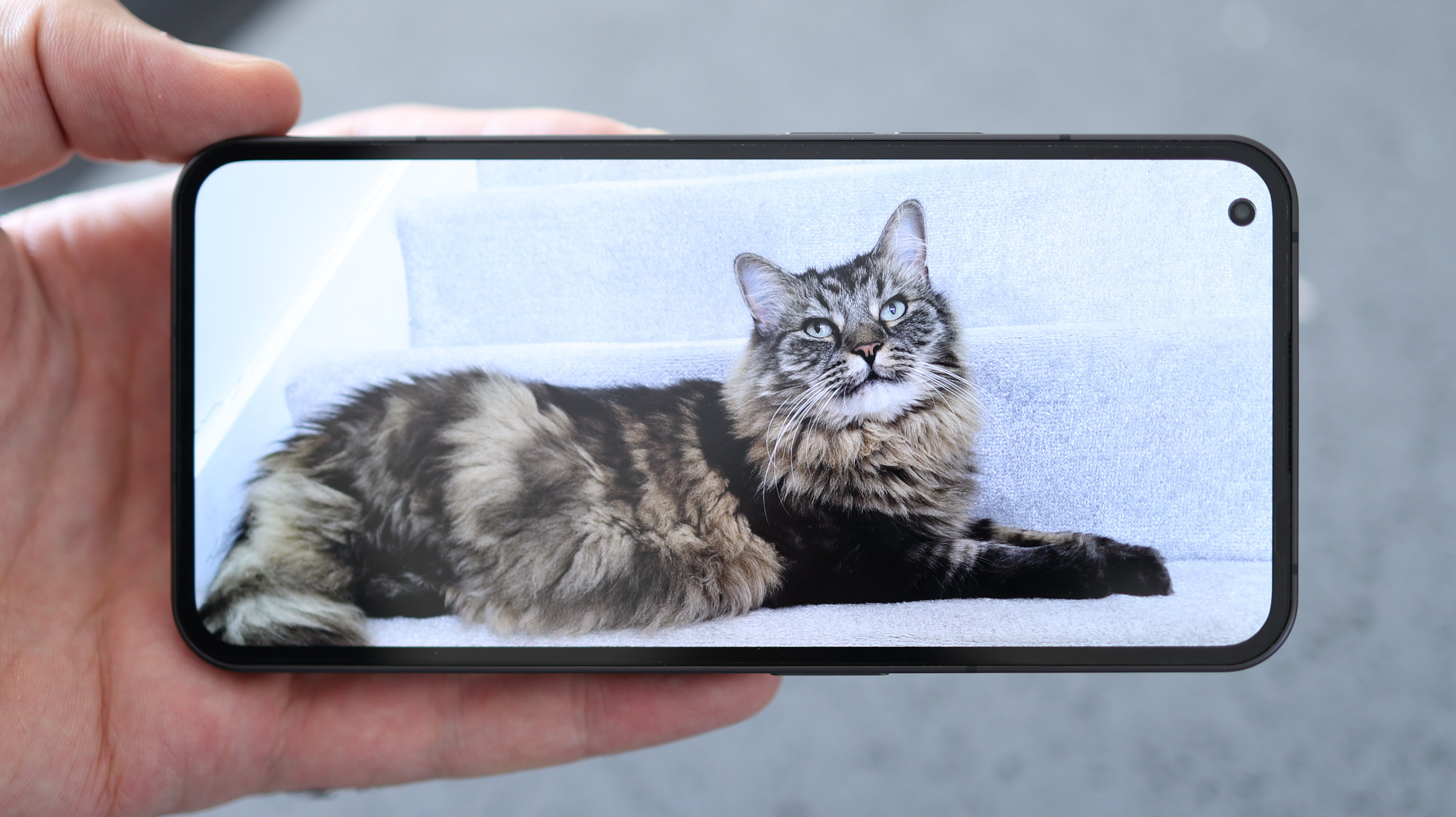
Big but not too big, the 6.55 OLED on the Nothing Phone is a good quality screen that packs HDR10+ and a high 1,000,000:1 contrast ratio for broad tonal ranges, whether watching movies or just swiping through Instagram.
With a peak brightness of 1,200 nits, the Nothing Phone is easy to see outdoors and shows up pricier competition like the Asus Zenfone 9, which caps out at 800 nits. Just remember, you can only hit 1,200 nits when the screen's set to auto brightness. When set to manual, the screen peaks at a dim 500 nits.
The Nothing Phone (1)'s display is also smooth, with an adaptive 120Hz refresh rate. So unlike other 120Hz phones like the Xiaomi 12 Lite, it can intelligently switch between 60Hz and 120Hz depending on what's on screen. The reason this matters is because it helps with battery consumption – and as we'll come onto, the Nothing Phone (1)'s Achilles heel, at least on paper, is battery capacity.
Nothing Phone (1) Glyph lights
Around the back of the Nothing Phone (1) are its trademark Glyph lights. Even if you never use them, this is a phone that feels good in the hand and looks novel. If you do use them, though, you can geek out, and customize things to blip and flash just the way you want them to.
Within the settings, select Glyph Interface, which is written in the same dot matrix typeface as the Nothing insignia – a nice touch, and you can choose what the phone's Glyph lights do.
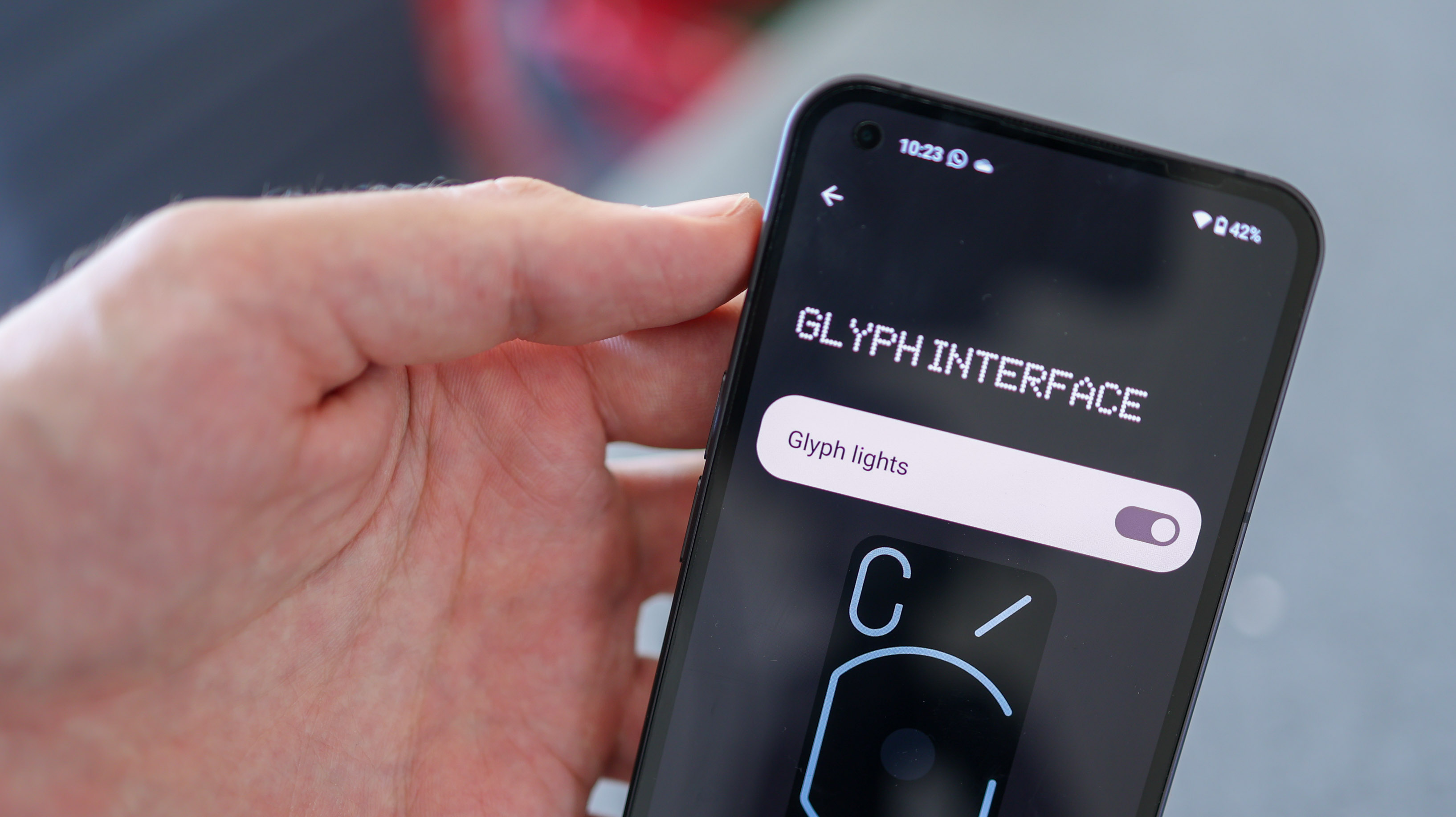
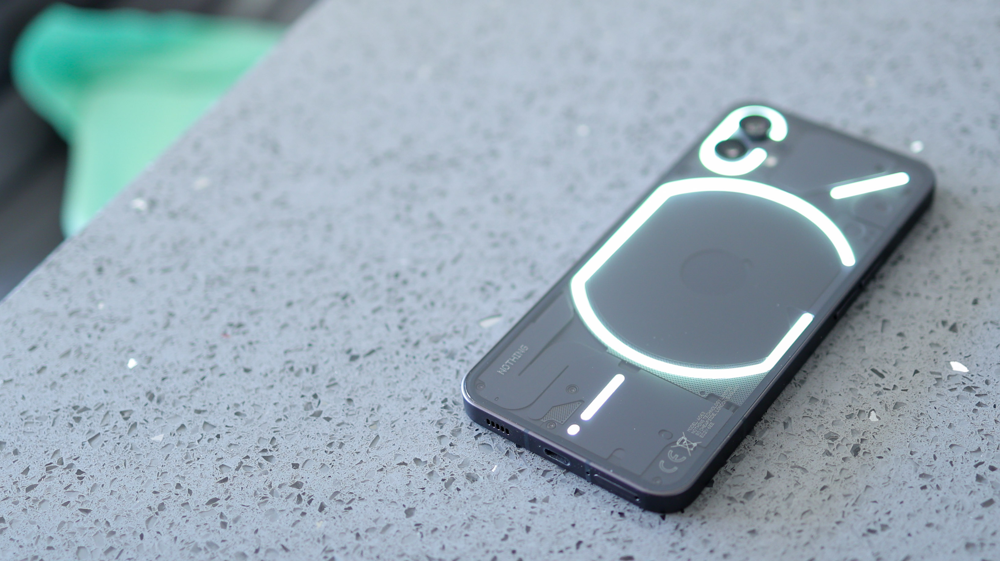
Options include Brightness control, Ringtone, and Notification sound – each of the ten pre-installed ringtones has a corresponding light flashing pattern. You can also switch on Charging meter – so as the phone charges, the progress is displayed on the bottom Glyph near the USB-C charging port, and Google assistant feedback fires up blinking lights when you say "okay Google".
The most fun feature on the whole phone is probably Flip to Glyph. Turn your phone upside down, and the Glyph lights will flash a couple of times, indicating it's on silent mode. Now, all your notification alerts will be in the form of illuminating glyphs until your phone is face up again.
Did we ever use this feature in our time with the phone? Repeatedly – but only to show people how the lights look when they flash. At no point did we actually find the Glyph Lights useful.
So from a utility point of view, at least, the Glyph lights are a gimmick. But that's not a bad thing. Nothing's made a novel, good-looking phone that stands out in the right ways. Design isn't just a means to an end, and the Glyph light system helps make the Nothing Phone (1)'s indulgent design an end unto itself.
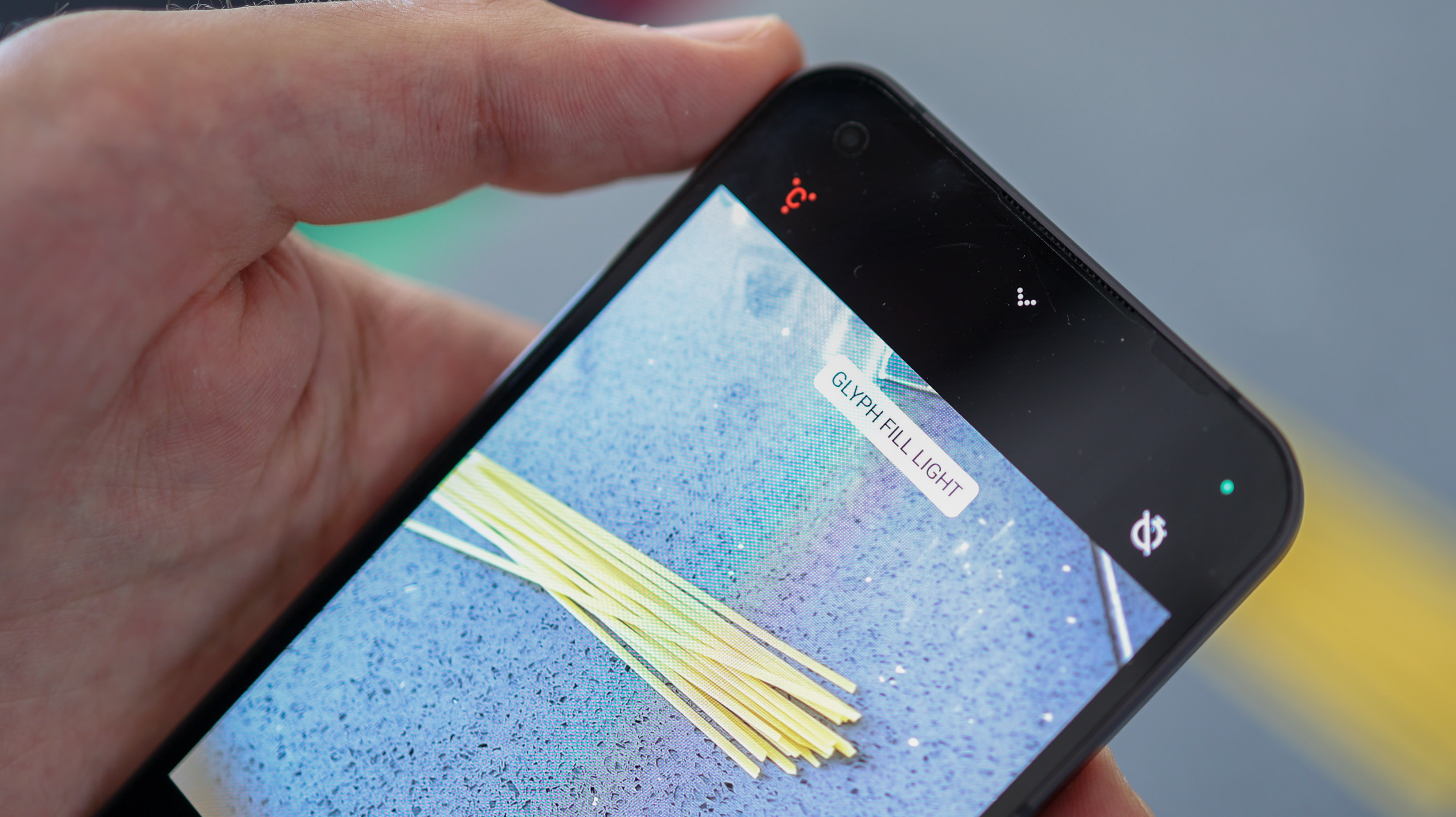
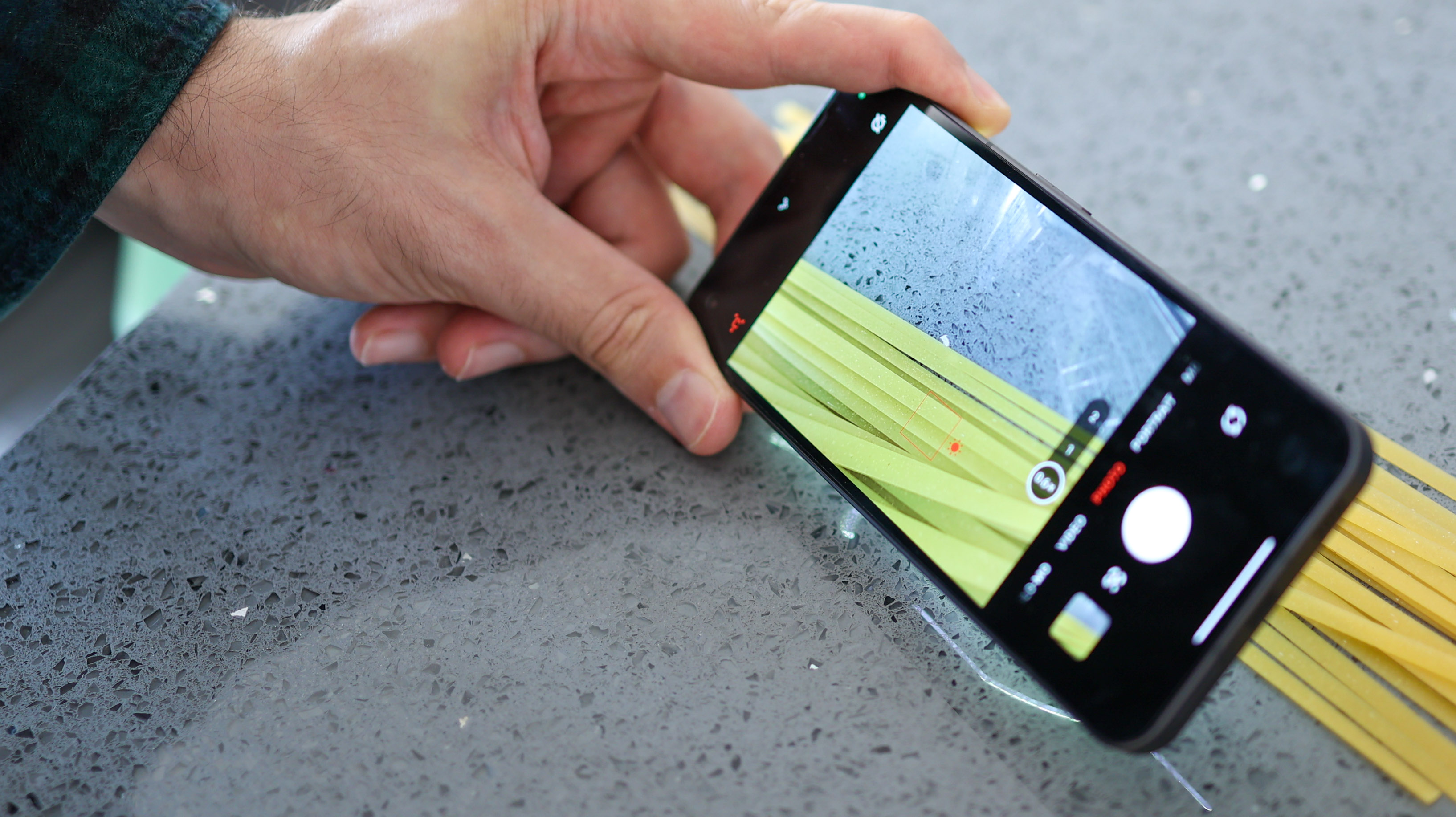
Besides – the Glyph lights aren't exclusively indulgent. They make for powerful, diffuse fill lights for macro and portrait photography.
Nothing Phone (1) camera
The Nothing Phone (1) brings back one of the better sensors from the last few years – the Sony IMX 766 with OIS. First introduced on the Oppo Find X3 Pro, and then on the Find X5 series, it's generally a great performer, especially when matched with OIS. As we've seen from the Asus Zenfone 9, though, this sensor isn't always a knock-it-out-of-the-park option – camera processing has to be just right to eke the best out of it.
Already off to a good start, we're also optimistic about the ultra-wide camera on the Nothing Phone (1), with its f/2.2 lens with PDAF, matched with a 50MP, 1/2.76 Samsung JN1, and a 114-degree field of view. Doubling up as a macro camera, it can capture close-up photos as near as 4cm.
Finally, the front camera, which is a 1/3.1-inch, 16MP Sony IMX471 sensor, f/2.45 lens combo, and captures up to 1080p videos.
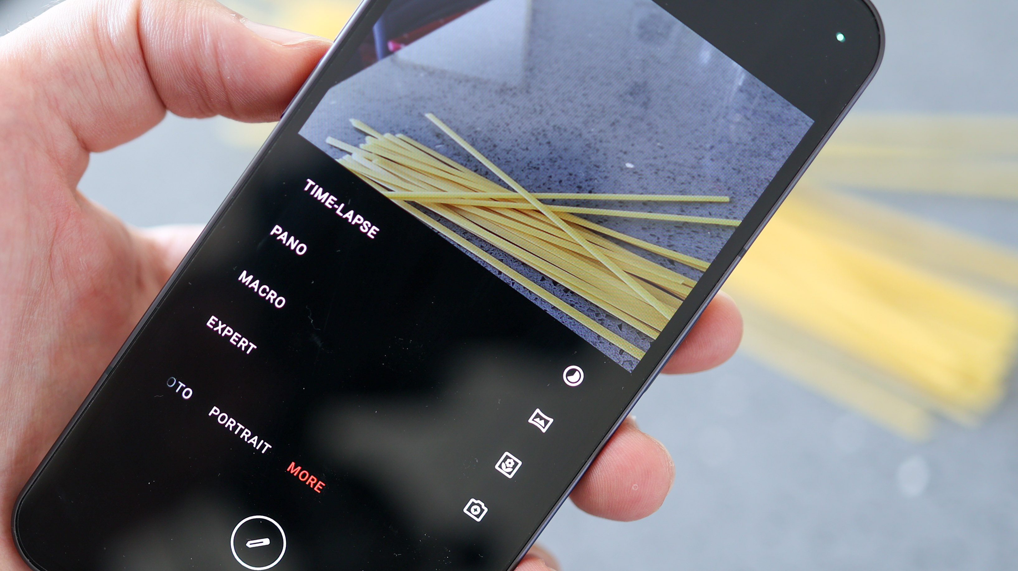
As for shooting modes, Nothing keeps it simple with Auto, Expert, Video, Portrait, Macro, Pano, Time-lapse, and Slow-mo. There's no selectable night mode, however, when the light is low, a crescent moon icon appears on the screen, and you can tap it to access the Phone (1)'s night mode. Not ideal – we would have liked it to be selectable, but at least it's here.
The main camera records up to 4K resolution video at 30fps, and Full HD resolution video at 60fps, but if you switch to Slo-mo mode, this can bump up Full HD capture to 120fps.
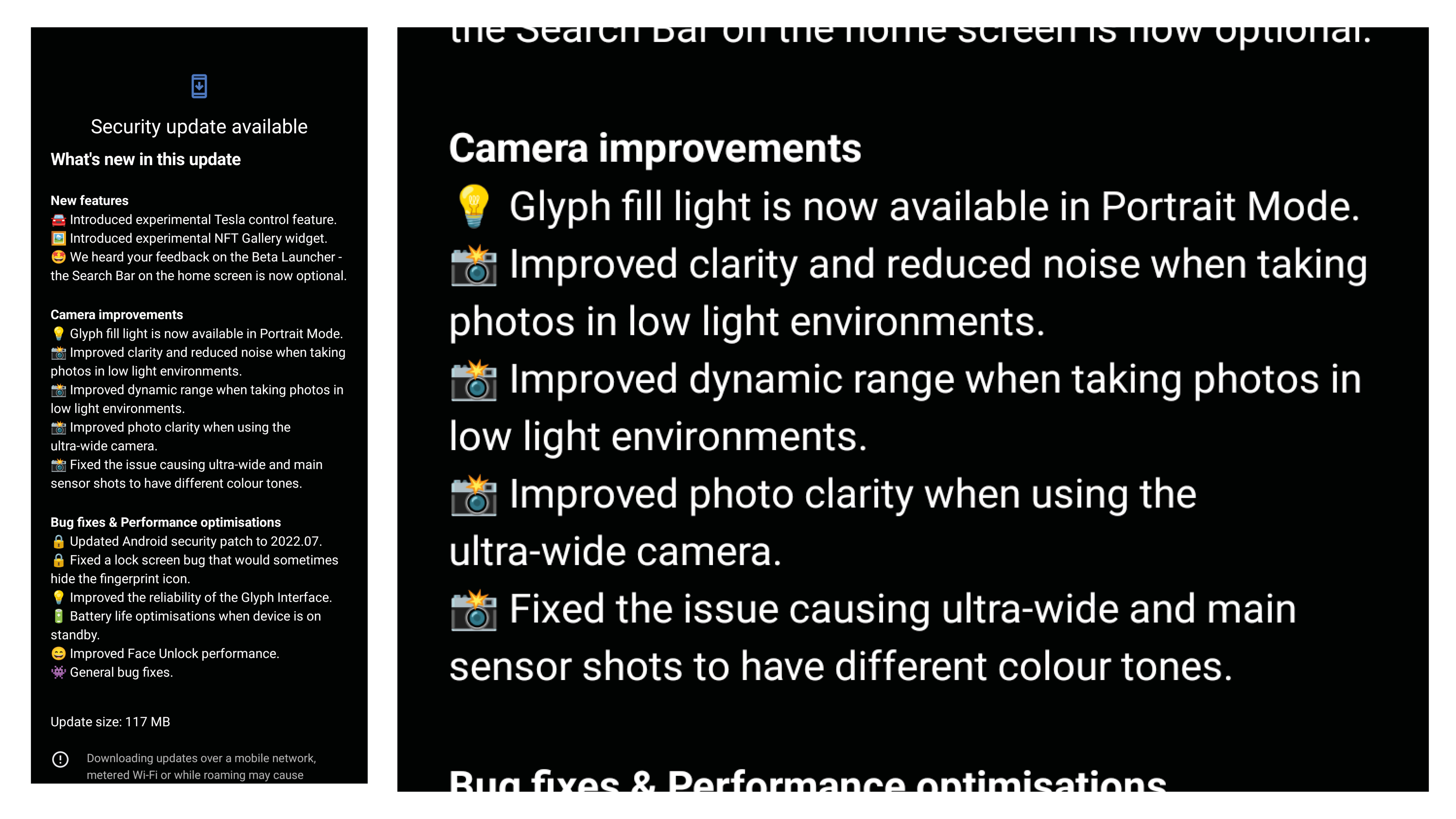
Nothing has rolled out a major update in our time reviewing the phone, improving the camera performance. Most of our photo samples were taken after the update, which refines noise handling and a number of other camera processes, but we have clarified in the caption which photos were taken before it rolled out.
Nothing Phone (1) camera review
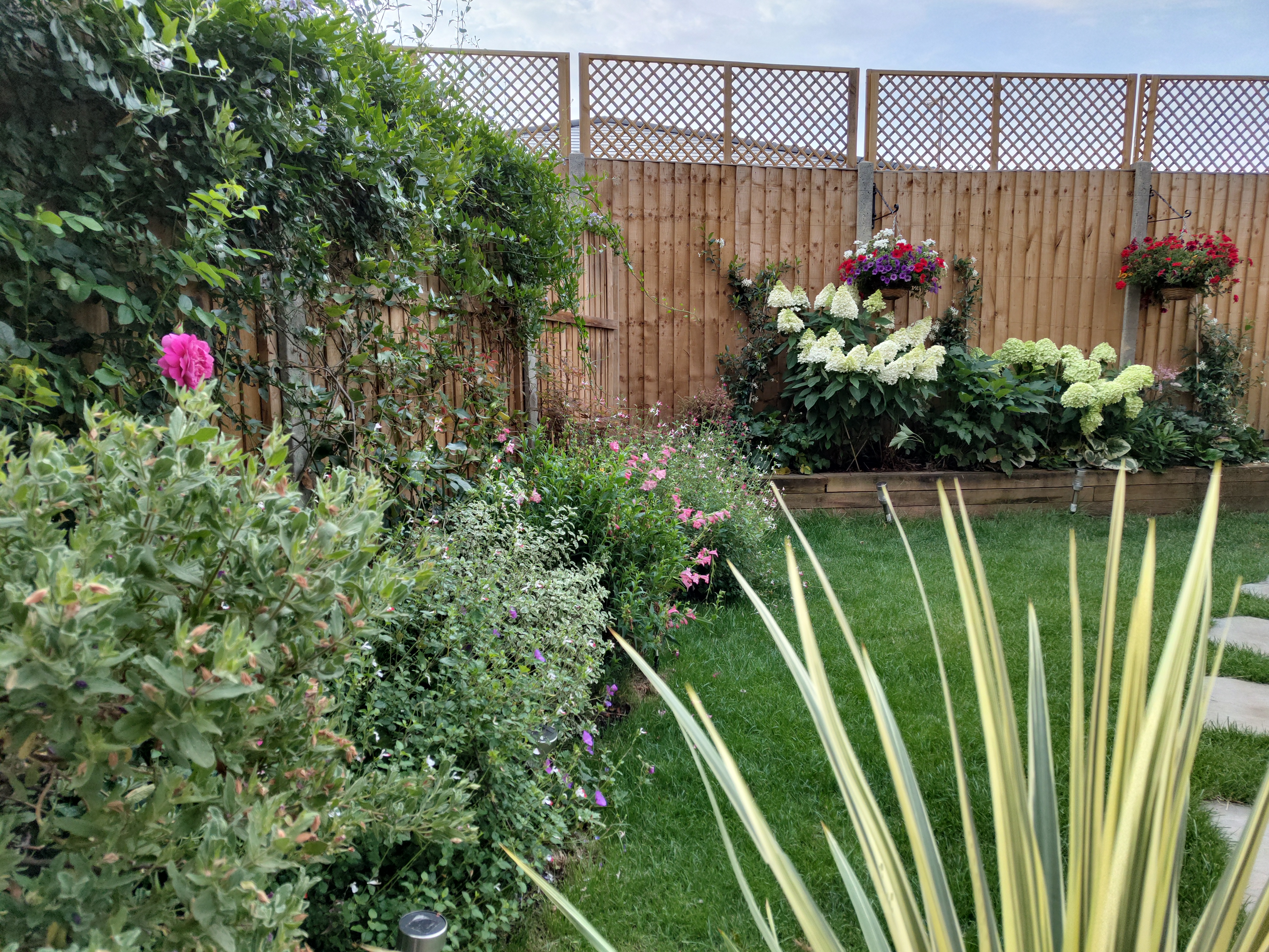
Photos from the primary 50MP camera are loaded with detail, even downsampled to the 12.5MP default photo size. Impressively, sharpening, exposure, and contrast are all well managed by the Phone (1)'s processing, both in bright scenes, and most artificially lit environments we tested the phone in.
Nothing has managed to do a better job with the Sony IMX766 sensor in the Phone (1) than Asus in its new Zenfone 9. This is a huge win for a fledgling brand.
Provided you can give the phone a relatively steady hand, and a clear focus point, it will likely take a crisp shot. Subjects nearer than a meter away enjoy a slightly soft background, and close-up photos from the main camera are swimming with depth.
Set against photos taken on an iPhone 13 Pro Max, colors are a bit muted, but you might actually like that – we do. The Nothing Phone (1)'s photos are more natural-looking than those taken by most competing phones but still look inviting while offering plenty of scope for a saturation boost in Instagram or Lightroom.
The Phone (1)'s 50MP ultrawide camera also impresses in most environments. Before the camera update, it struggled in lowlight until night mode was fired up. Now, though, it automatically activates an almost-night mode, which brightens things up nicely.
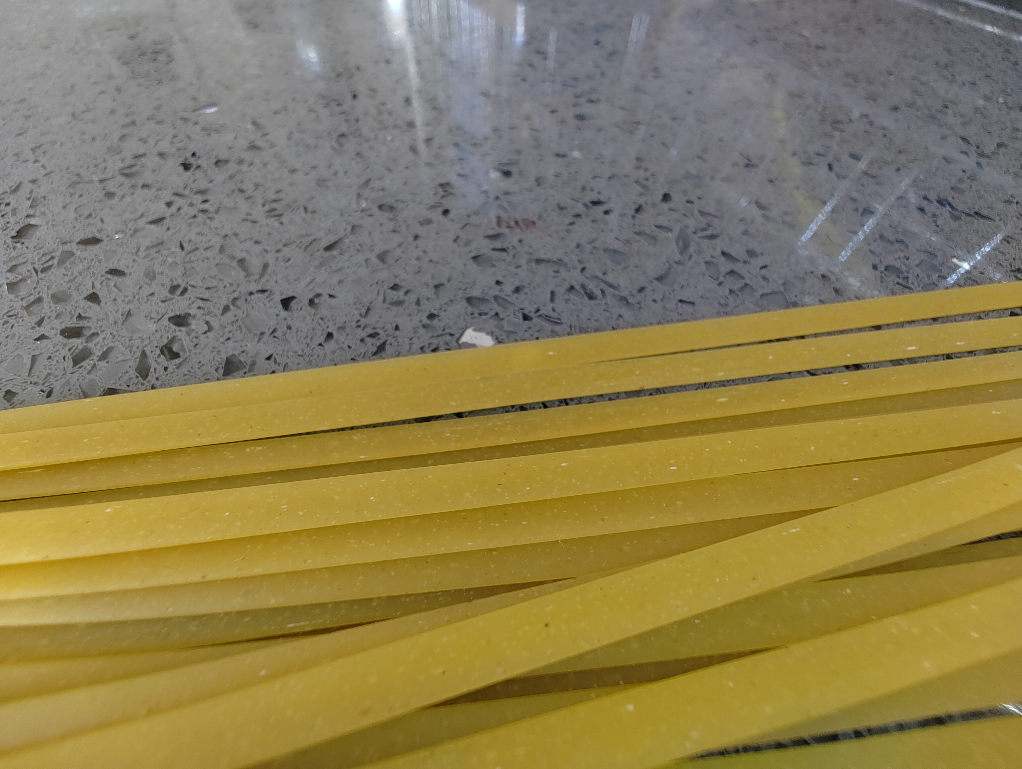
The ultra-wide's macro photos have a more sustained depth of field than the shallow, primary camera, and so captures a different type of close-up photo, richer in information. Add the Glyph fill lights to the mix, and you can garner a lot of visual detail from 4cm away, even in dimly-lit scenes. We just wish we were able to slide the Glyph light brightness up and down in the camera app for even more nuanced macro shots.



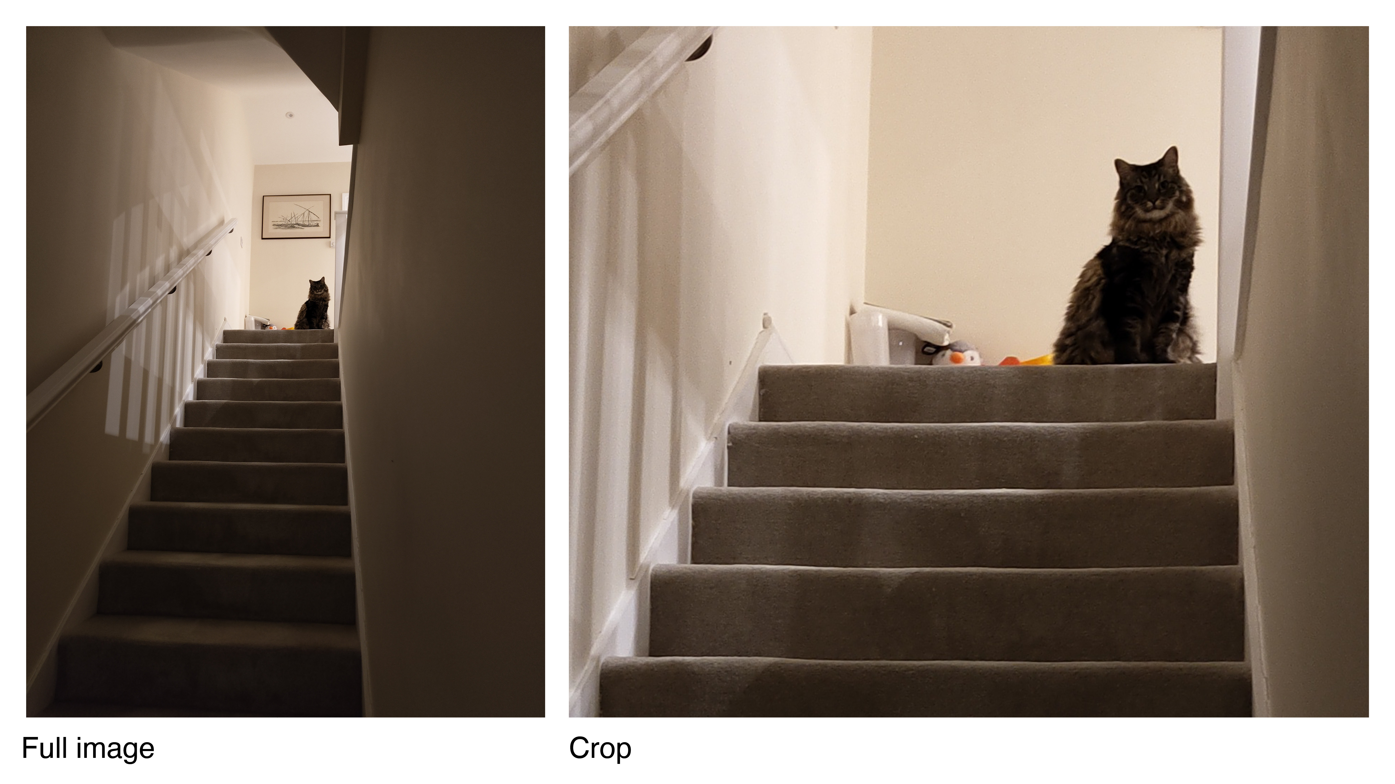
Dynamic range isn't as strong as some of the best phones out there. Nevertheless, if you don't mind shooting in RAW, the Phone (1)'s shots give you a fair amount of shadow detail to bring to life.
If you're big into selfies, the Phone (1) is good, but won't wow you. There's no autofocus, and results pull out decent detail, without being exceptional. We found the portrait mode to be accurate for the most part – both on the front and primary cameras, with natural-looking foreground and background separation.
Camera samples



Nothing Phone (1) additional specs
A midrange price means midrange power, and rather than the latest Qualcomm Snapdragon 8+ Gen 1, the Nothing Phone (1) packs a Snapdragon 778G+. As far as we're concerned, this is a smart move from Nothing.
Despite its affordable internals, we experienced no lag in our time with the Phone (1), and the only time we were left waiting was when batch editing photos in Lightroom – and that was only a matter of seconds.
The Nothing Phone (1) was able to play back top-tier games at middling graphics settings, and emulators without breaking a sweat. With its high-quality, bright screen, it's also perfect for streaming movies and TV shows, messaging, browsing the web and all the other stuff most people do on their phones.
If you love wired audio – there's no headphone jack here, sorry. The Nothing Phone (1) also has a weak top speaker – it's a stereo setup with one primary speaker at the base, and a second speaker where the in-call speaker is. Sound is loud, though, even if it doesn't truly feel like stereo audio.
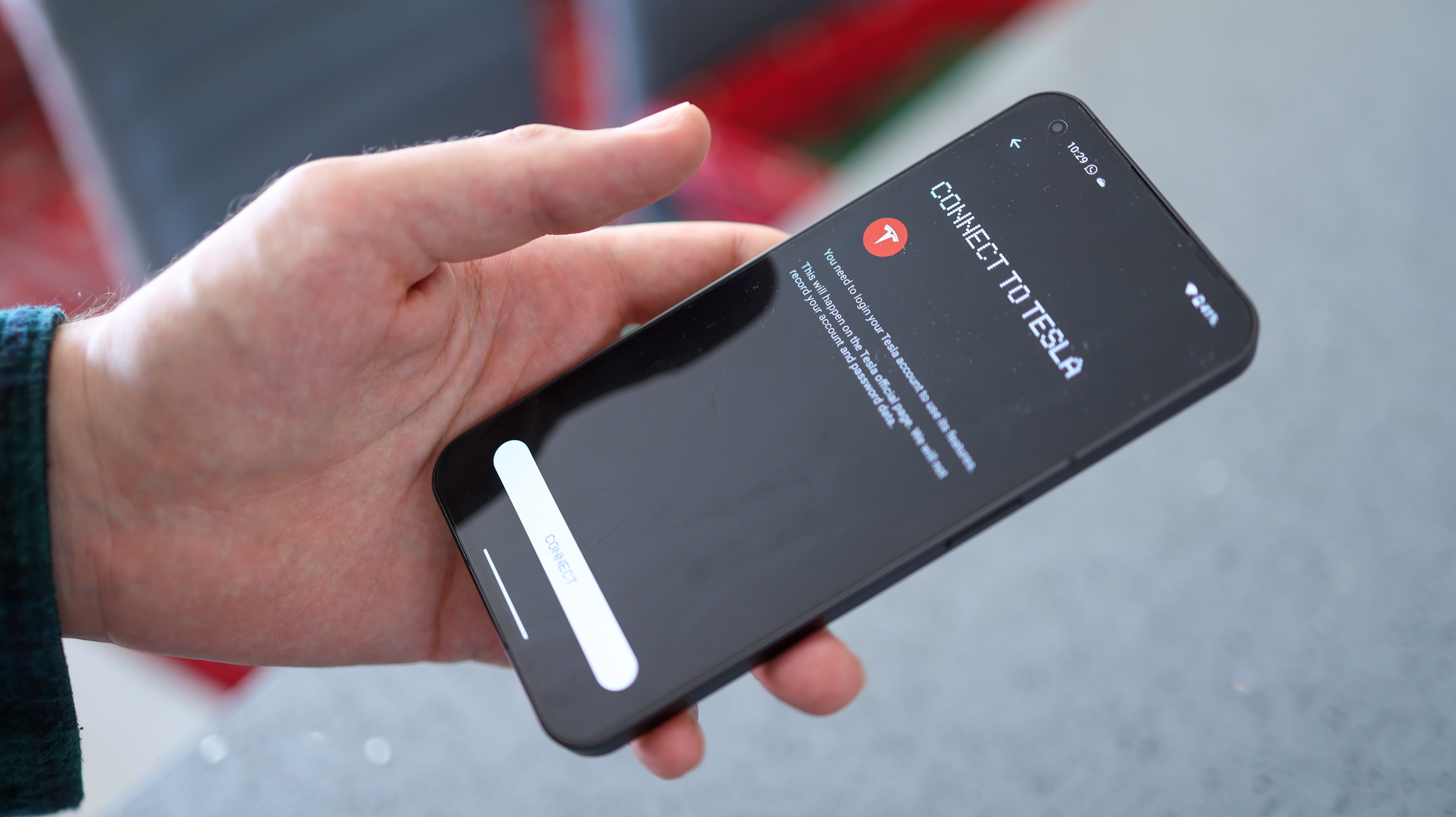
Nothing released its Android Android 12 launcher on the Play Store to some scathing reviews, and has taken those onboard, so the launcher you get on the phone is something of a V2. The reality is, it isn't too far off stock Android 12, with some considered visual flourishes. The phone's also loaded up with Tesla connectivity out of the box, which we haven't tested, but speaks volumes for the it-factor the brand's trying to muster up with tech enthusiasts.
With either 8 or 12GB RAM and 128 or 256GB storage having space for your favorite apps shouldn't be an issue, though there's no microSD card expansion support.
We didn't expect excellent battery life from the Nothing Phone (1)'s small 4500mAh battery, and we didn't get it – especially in the first week with the device. After the 21 July update, however, battery life improved – and our benchmarks showed an extra two to three hours of screen-on time per full charge. This translates to day-long battery if you're mindful, and a midday top-up on intensive days.
Super-fast charging may be missing, but Nothing outdoes Apple with its 33W charging speeds. We were able to powers up the phone fully a little over an hour, and it also features wireless charging at up to 15W, a feature seldom seen at the Nothing Phone (1)'s price. A final point to note, you won't get a charging brick in the box with your Phone (1), and the entire box is cardboard, for easy recycling.
Verdict

The Nothing Phone (1) is one of the best budget camera phones of 2022, and thanks to its latest update, which helped us eke a few extra hours out of its battery and capture better photos, it's also one of the most charming, enjoyable phones we've tested to date.
Don't get us wrong, this is a flashing, beeping, iPhone-styled midrange smartphone that differentiates itself from the crowd with a gimmick and a prayer. That said, this phone's style is matched by substance – a midrange price, a great screen, stable performance, wireless charging, and a very solid camera experience.
While you can get other great phones with similar camera setups for less or the same amount of money – the Realme 9 Pro Plus and Pixel 6a spring to mind, we'd stick with the Nothing phone given the choice. It's an exciting smartphone, from an exciting brand. We also trust how its elements are curated and are impressed with this first effort – even if it has taken a software update to get us to this point.
Read more
Best camera phones
Best rugged phones
Best budget phones
Basil Kronfli is a freelance technology journalist, consultant, and content creator. He trained in graphic design and started his career at Canon Europe before moving into journalism. Basil is also experienced in video production, independently running the YouTube channel TechEdit, and during his time at Future, he worked alongside the Digital Camera World team as a senior video producer.
