8 composition mistakes photographers make (and how to avoid them)
Focus on your framing, and avoid these faux pas, to nail better-looking photos

Photography presents all sorts of technical challenges which, with time - and trial and error - anyone can come to master. But one of the hardest things to master as a photographer is the art of seeing. What do we mean by ‘seeing’? We mean spotting the elements that make up a good image, from focal points to camera angle to depth of field and more. We’re talking about photo composition.
One of the most common mistakes photographers make when composing images is not having a good sense of balance in their composition. This can manifest in a variety of ways, from not having an even distribution of elements in the frame to not creating enough negative space. When photographers fail to create a sense of balance in their images, the end result can be an image that feels cluttered or off-kilter.
Below we’ve rounded up some of the most common photo composition mistakes photographers make, which can upset the balance of an otherwise great image. What’s more, we explain what you can do to get it right the next time around.
01. The background

Perhaps the most common mistake photographers make when composing images is not paying close enough attention to the background. Because our focal point is typically a foreground element, we sometimes fail to consider how the background elements may be distracting or detract from the overall composition.
When composing an image, photographers should be mindful of the background elements and how they interact with the foreground elements and contribute to the overall atmosphere of the image. This is why you typically see portraits, for instance, frame against plain-colored walls or nature photographers shoot wide open for shallow depth of field to smooth over the vegetation behind their main subject.
02. Use the Rule of Thirds
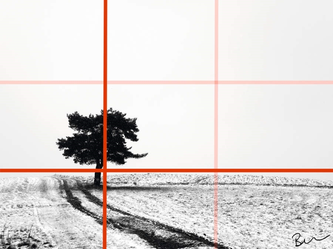
We all like to break the rules from time to time, but the creative rules do exist for a reason. And the first step to creating a well-balanced image is to consider the Rule of Thirds. The Rule states that when composing an image, photographers should divide the frame into three equal sections both horizontally and vertically. This creates a grid on which they can place the main elements of the image. By positioning these elements along one of the four lines or at one of the four intersections of the grid, photographers can create a much more balanced image.
In addition to the rule of thirds, photographers should also pay close attention to the placement of elements within the frame. They should be mindful of how the elements interact with each other and the frame as a whole. This means avoiding placing elements too close together or having them overlap. It also means considering the position of elements in relation to the frame’s edges. Photographers should make sure that the elements are not too close to the frame’s edges, as well, because this can make them appear cramped or unbalanced.
03. Subject too small in the frame
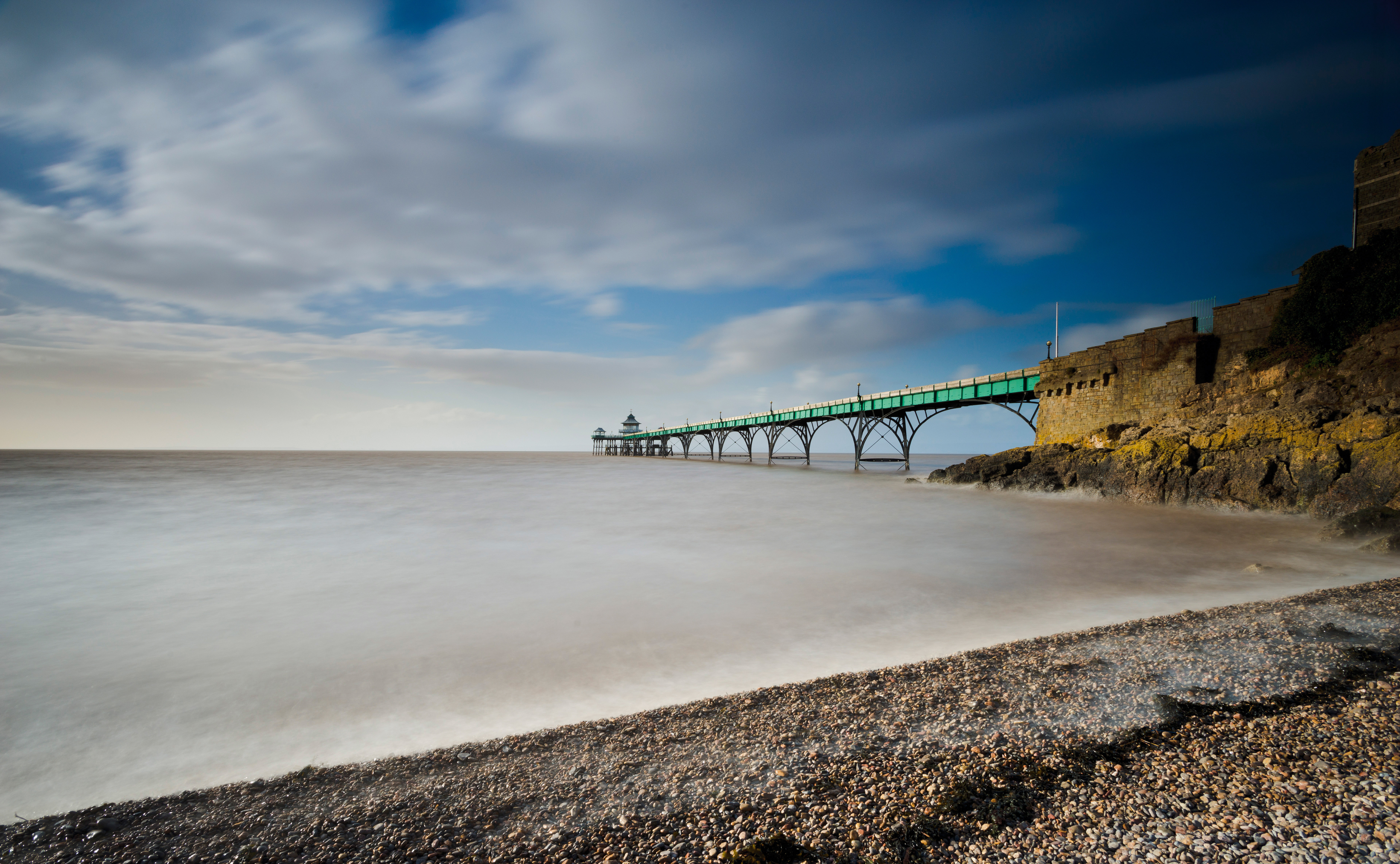

Our brains do a great job of zooming in on a subject and somehow excluding the surroundings, but when you look at the resulting image it suddenly becomes obvious that your subject seems small and inconsequential in the frame. Before you take a shot consider whether it would look better if you took a few steps forward or zoomed in a little with your lens so the subject really fills the frame.
04. Shooting straight-on
Many novice photographers get preoccupied with finding a subject and forget to think about how they're going to photograph it. If you shoot a subject straight-on you will record its appearance, but you may fail to capture any context or atmosphere. When you're shooting a flower in a garden, for example, rather than shooting it straight-on from the edge of the bed, think about shooting it from the side so you have the rest of the flowerbed extending into the distance to give a sense of the huge number of blooms and the depth of color.
05. Nothing in the foreground
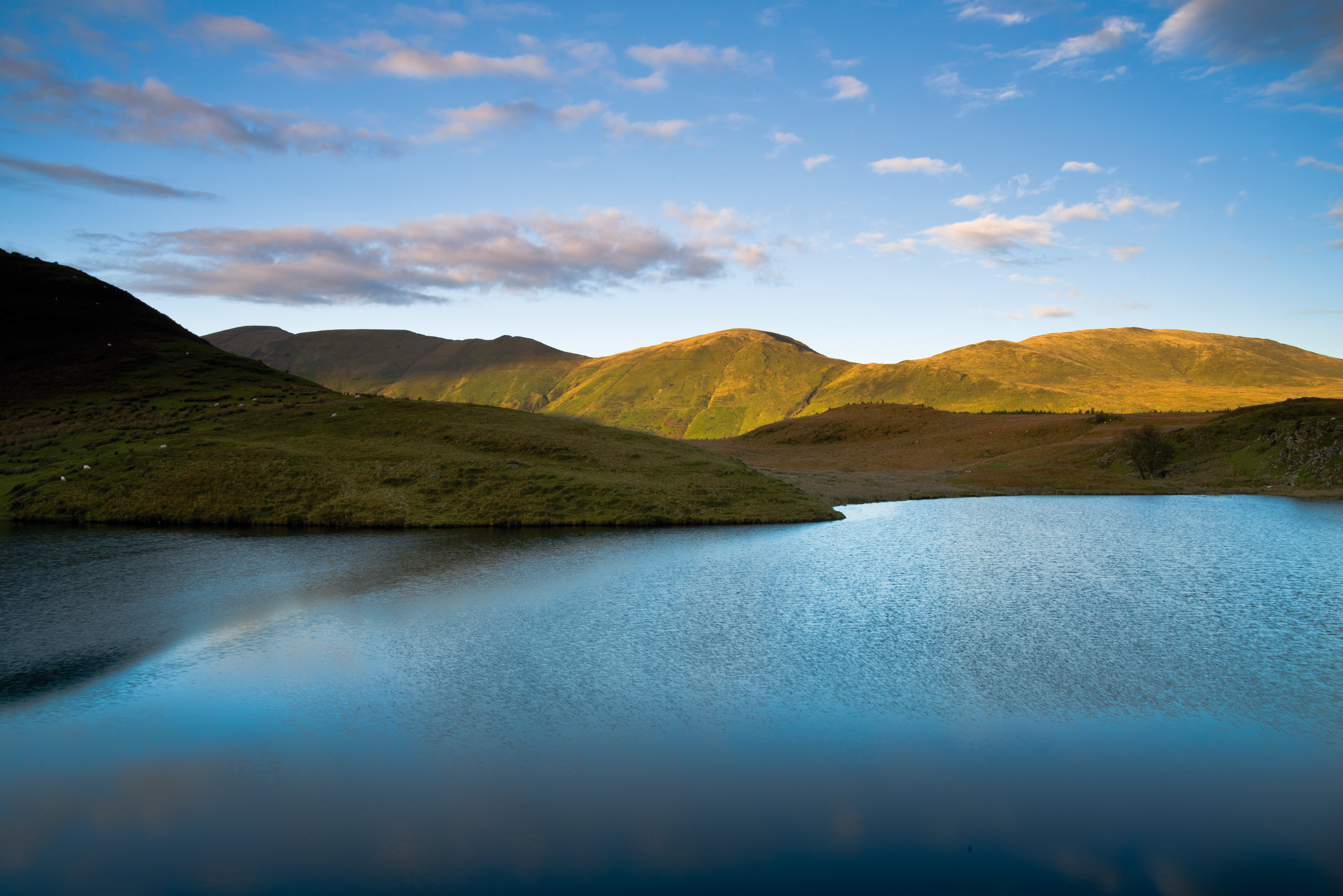
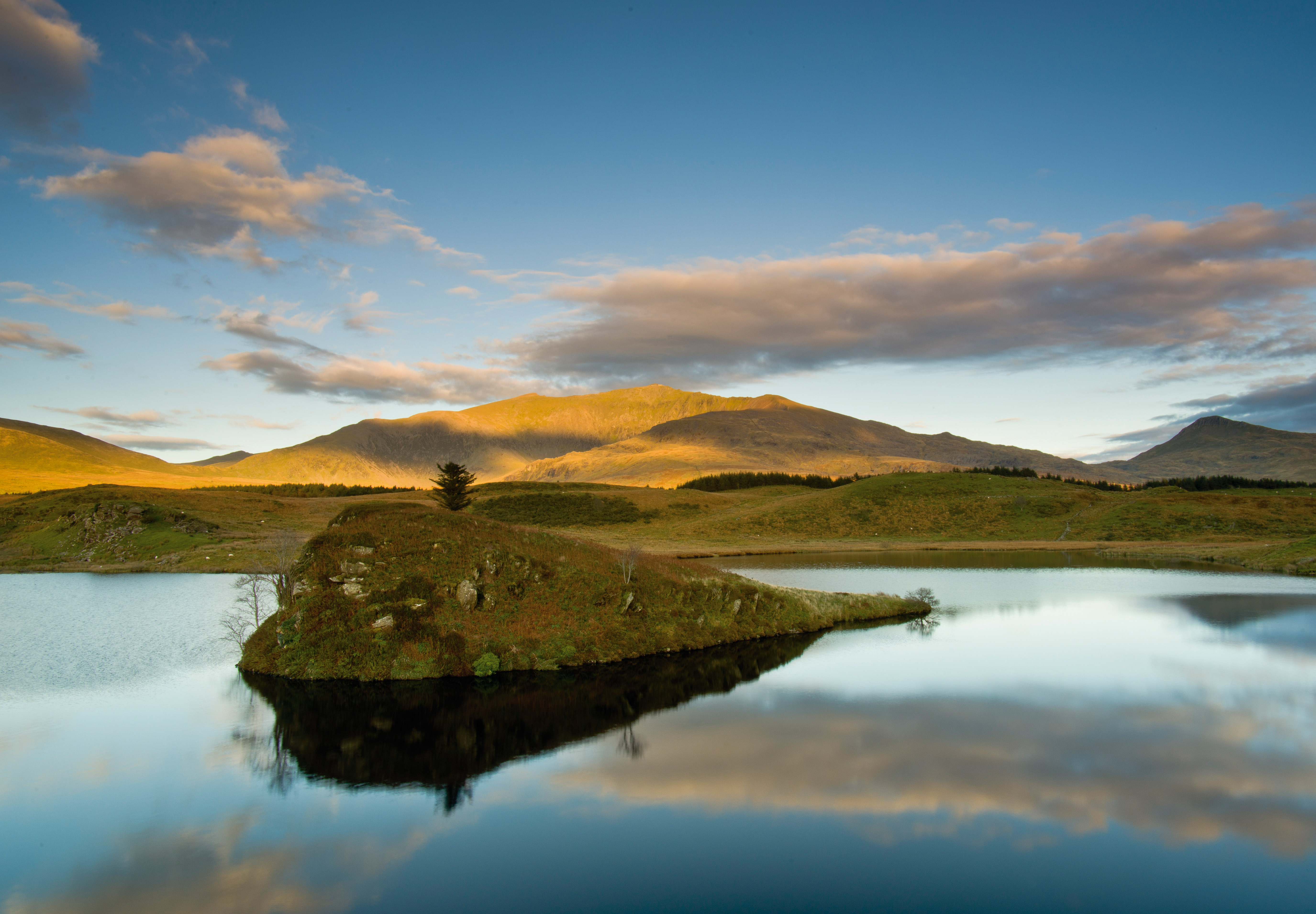
Whether you're shooting a landscape or a still-life image, it pays to have something in the foreground to give an image depth, add some scale and help draw the viewer's eye. As well as being a waste of space, an empty foreground can act as a barrier to the eye that you feel you have to peer over.
Whether it's a clump of flowers, a rock or tidemarks in the sand, most landscapes have something that can be used to inject a little interest into the foreground. When you're constructing a still-life scene, it's up to you to put something in the right place.
06. Deciding aspect ratio post-capture
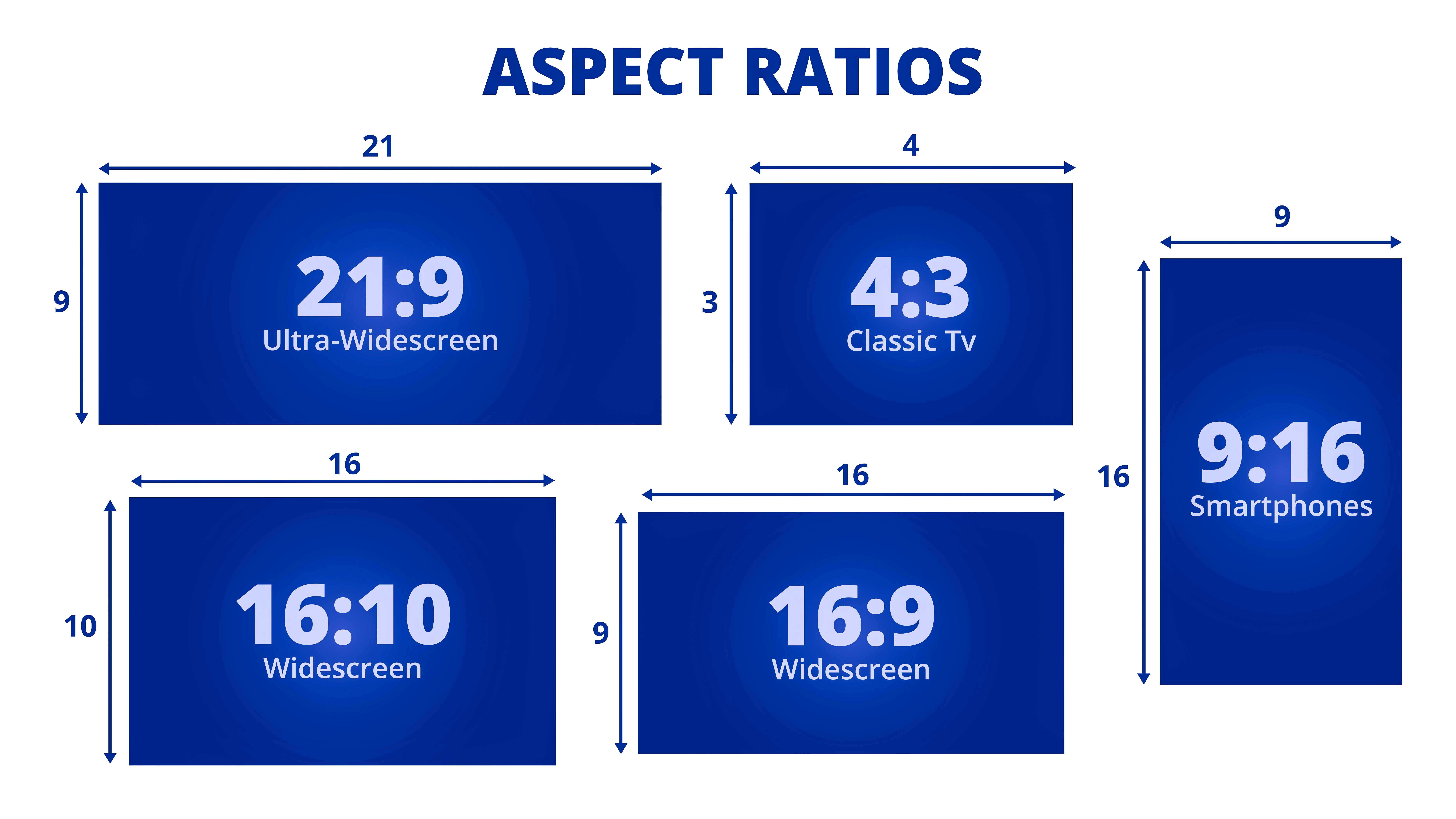
This point often goes hand-in-hand with an empty foreground because there's a tendency to crop to remove the blank space and improve the composition. Post-capture cropping is fine, but you'll usually find you make better images if you consider the aspect ratio at the shooting stage. Most cameras allow you to set aspect ratio in your general menu settings.
07. Bad use of depth of field
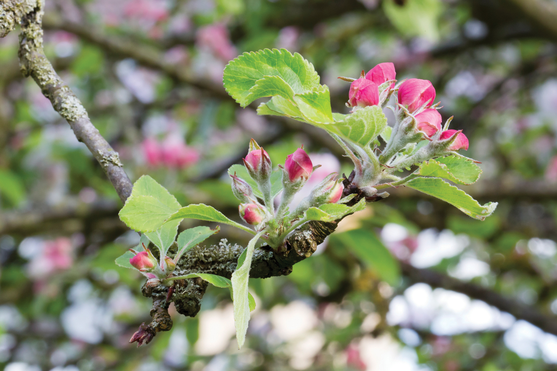
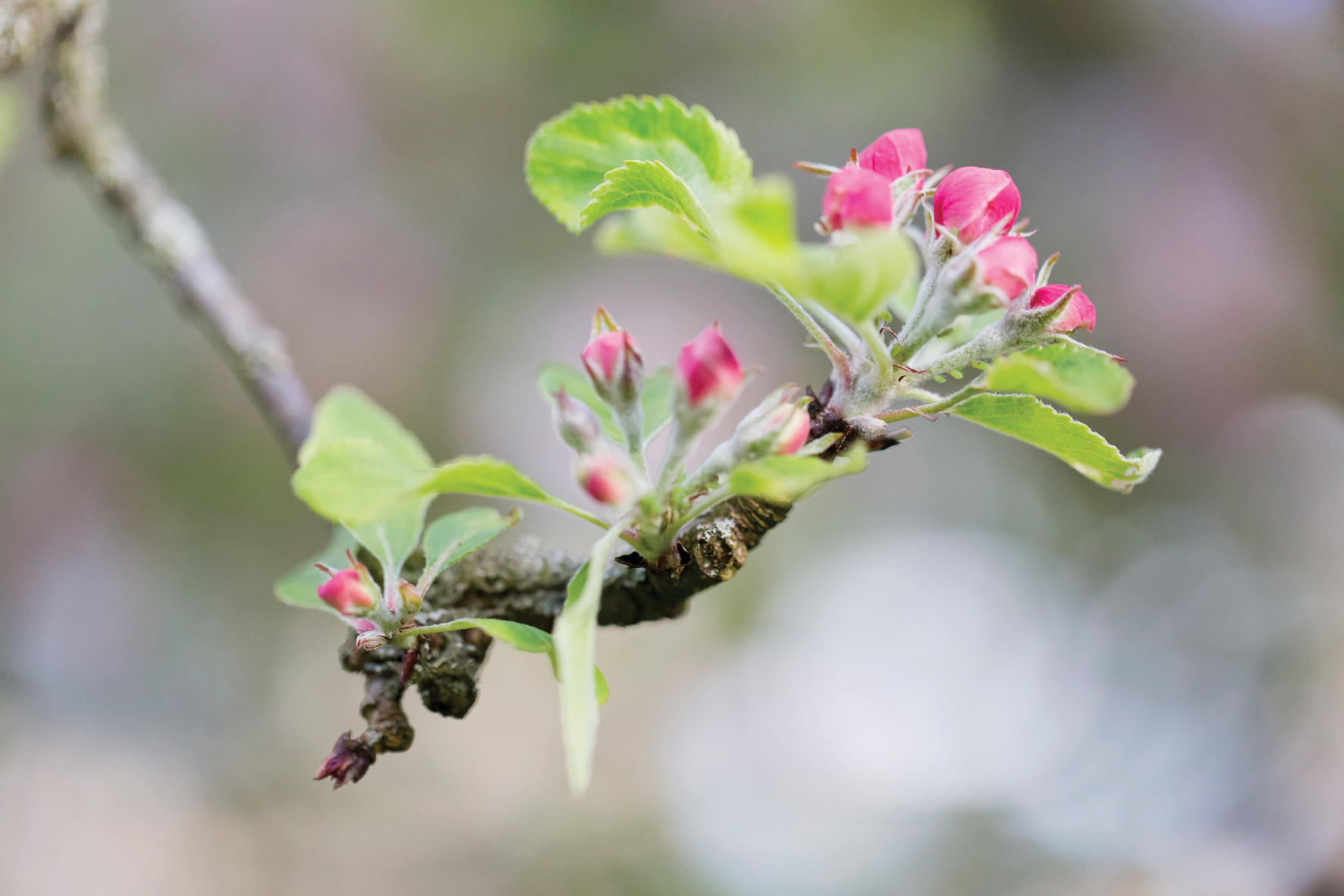
We mentioned above how shallow depth of field can be used to smooth over and de-clutter a background. Depth of field is a very powerful tool for photo composition because it can determine which elements within a scene are clearly visible in the image.
Shooting with a small aperture creates lots of depth of field, which is often desirable, but if you want your subject to stand out from its surrounding it's usually better to shoot with a bigger aperture to restrict depth of field.
08. Sloping horizon
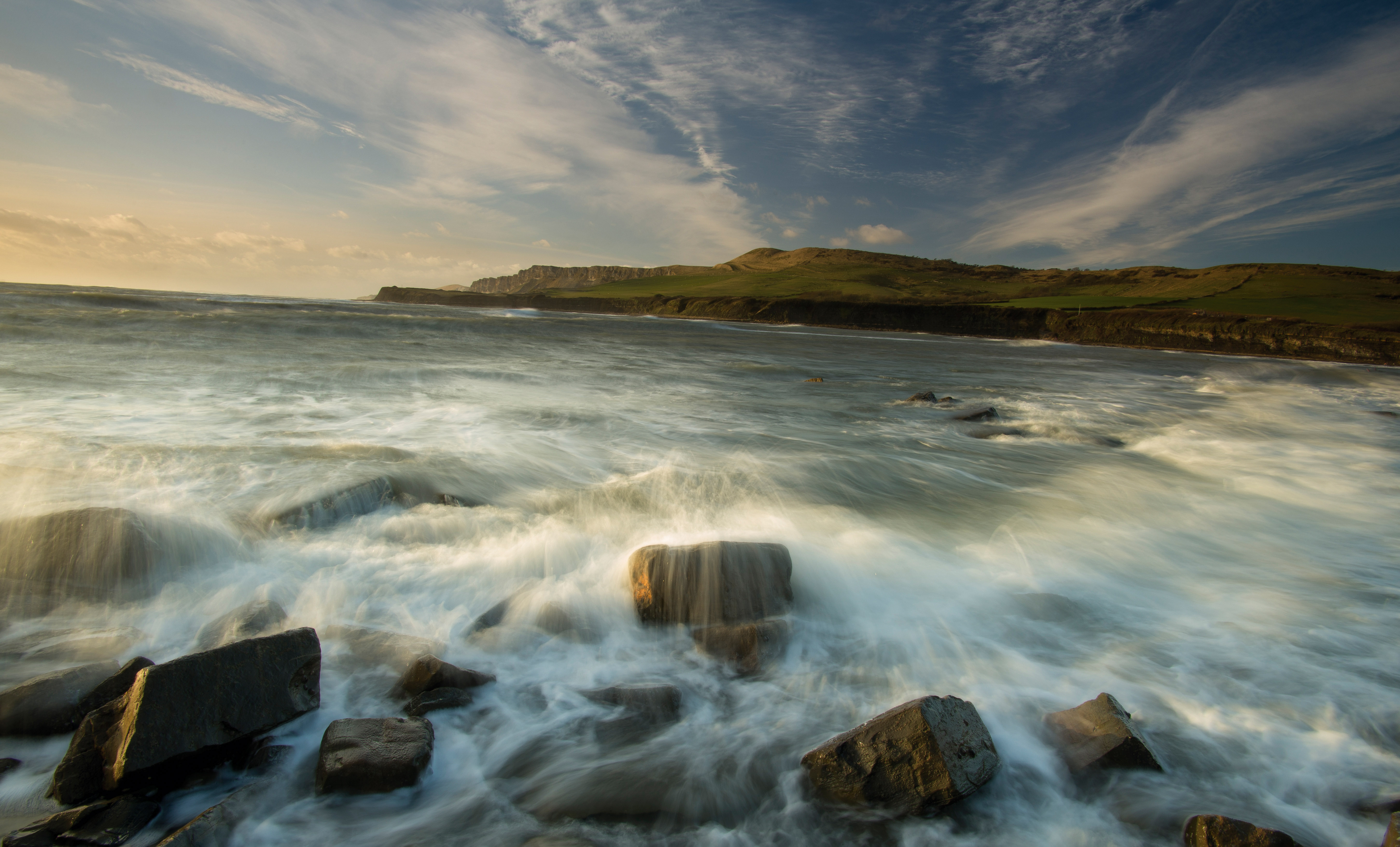
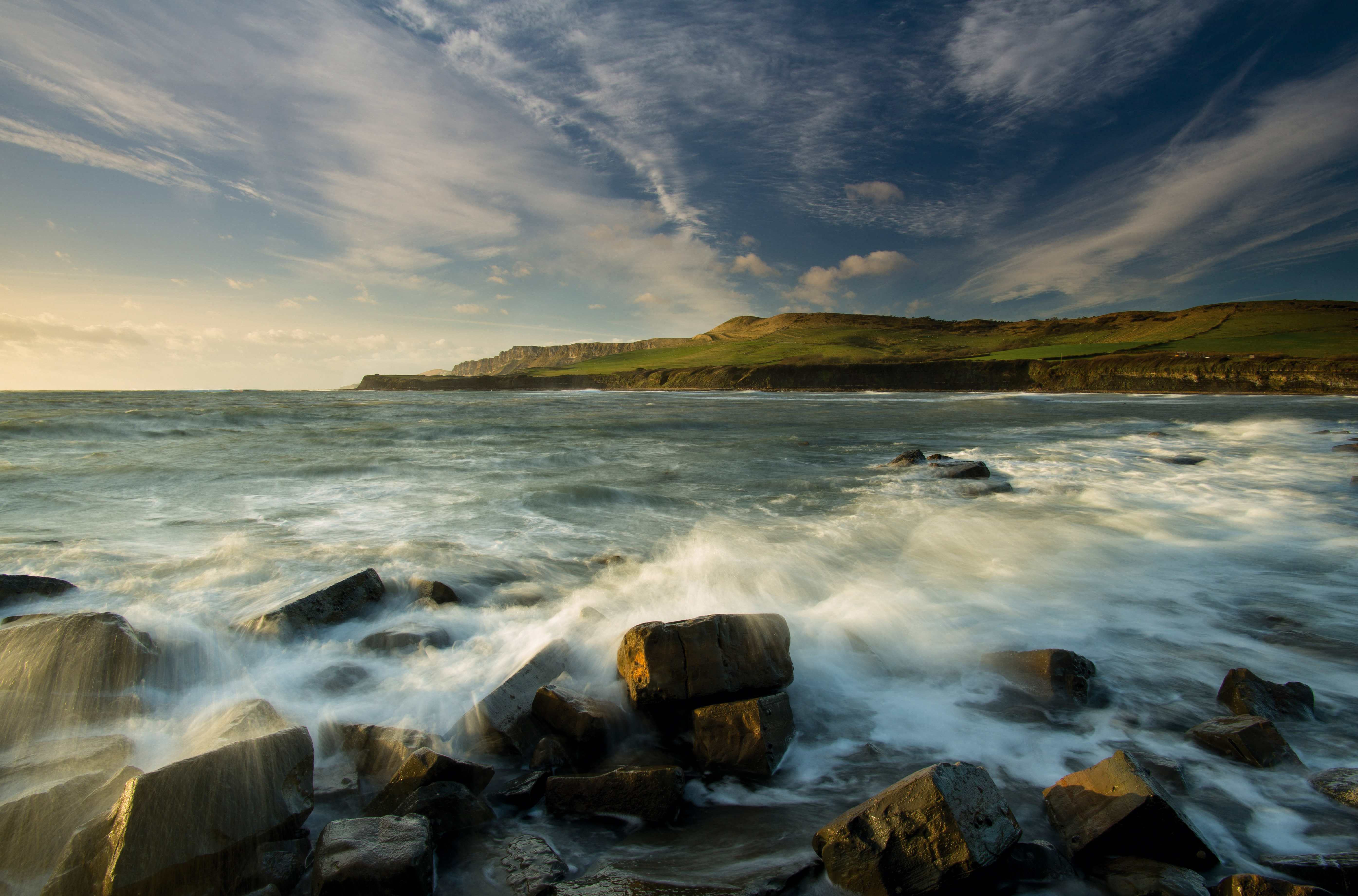
A sloping horizon in a landscape or even behind a portrait subject can be incredibly distracting so it's worth making the effort to ensure that it's level. Most cameras now have a built-in electronic level that can be displayed in the viewfinder or on the LCD to guide you. Alternatively, many tripods have a spirit level built-in.
It's especially important to make sure that water looks level, but this can be deceptive when the water's edge or a shoreline is in the frame. Even if the camera was perfectly level at the time of the shoot you may find that you need to rotate the image a little post-capture to get it looking right.
- Common tripod mistakes photographers make
- 8 portrait photography mistakes (and how to avoid them)
- 10 editing mistakes (and how to avoid them)
- Common wildlife photography mistake
- 10 wedding photography mistakes every beginner will make (and ...
- 7 common landscape photography mistakes
- 5 biggest mistakes you can make when entering a photo competition
Get the Digital Camera World Newsletter
The best camera deals, reviews, product advice, and unmissable photography news, direct to your inbox!
