Watch video: How to create a split tone in Photoshop Elements
A split tone is a great way to give your images a cinematic look quickly, by assigning a different color bias to the highlights and shadows of your images. And while it works well on any photograph, we find that it's particularly useful for portraits.
We're going to show you how easy it is to pull off in Photoshop Elements 2020 but the steps are largely the same for Photoshop CC too. The effect works brilliantly well on portraits like our starting image which you can download for free here.
You can use any color combination you like, but we used a red and blue to mimic the orange and teal look often used in Hollywood movies for a slick modern flourish. Complementary colors typically seem to work best, so bear this in mind when choosing your own.
01 Retouch the skin
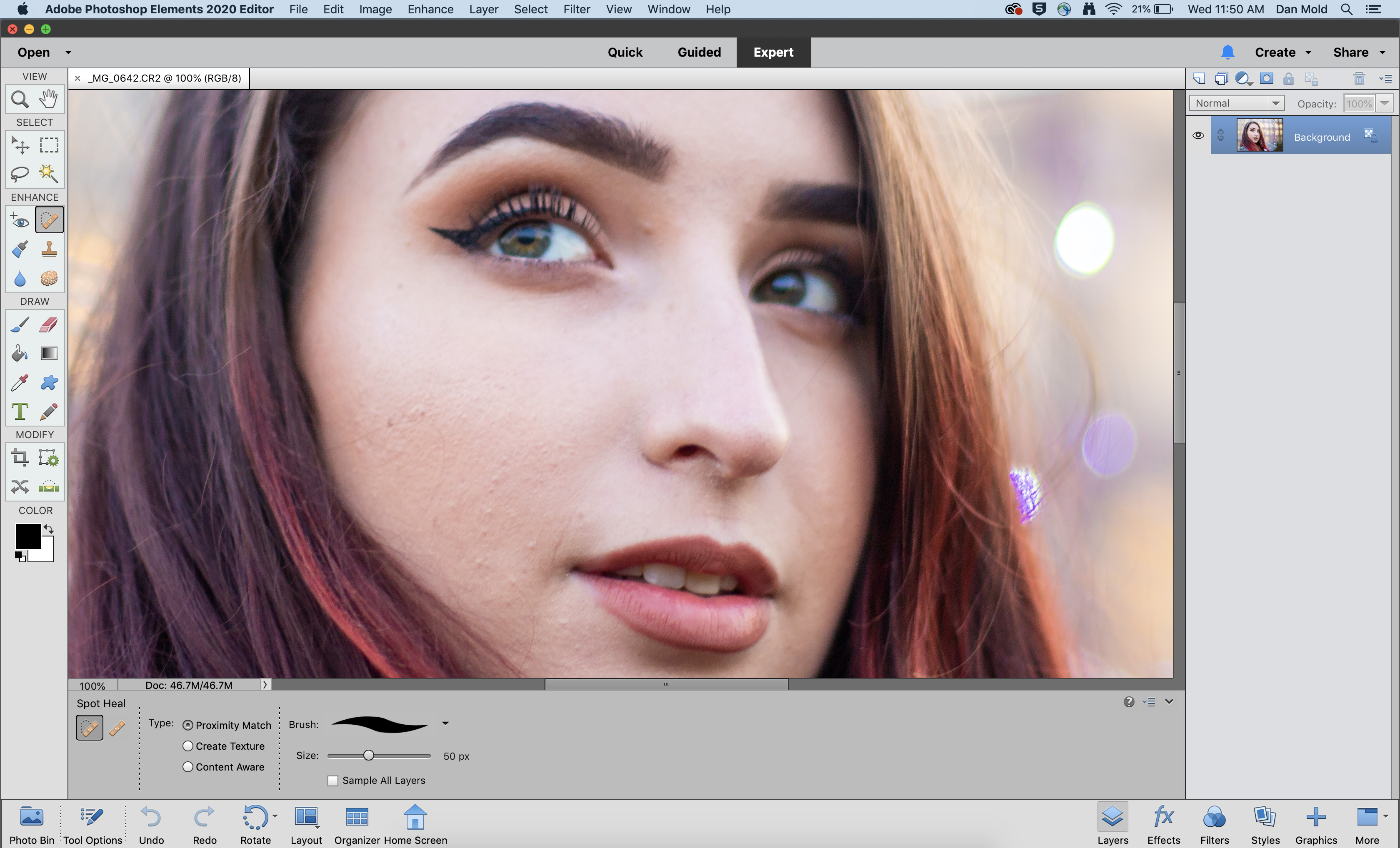
Open your portrait into Elements and grab the Spot Healing Brush Tool to begin the retouching. Set the Type to Proximity Match, then use the square bracket keys to resize your brush, so it’s just larger than your blemishes, and paint over them.
02 Add a high pass layer
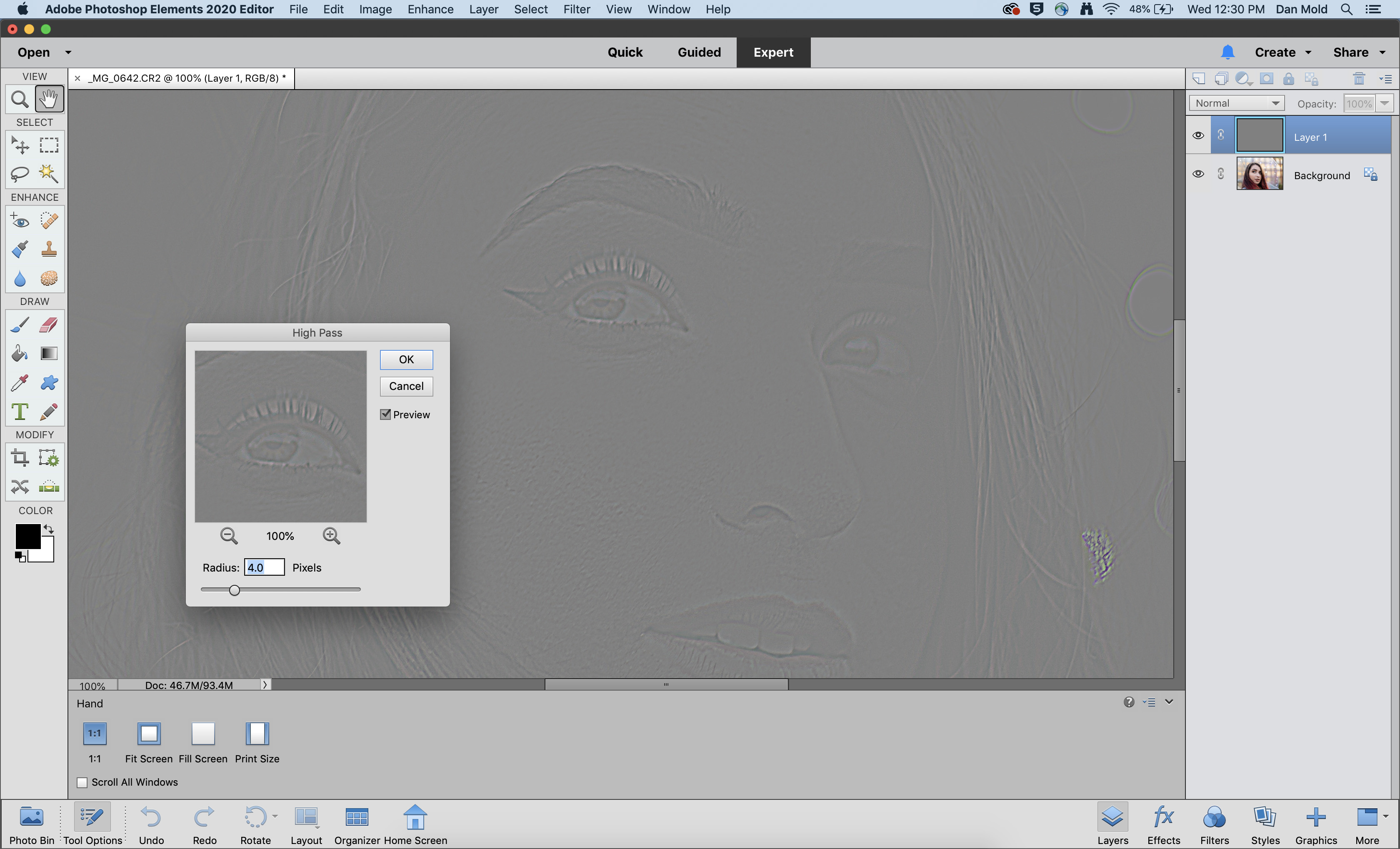
To sharpen the model’s closest eye hit Ctrl / Cmd+J to duplicate the layer, then go to Filter > Other > High Pass Filter and set the value to 4px, hit OK. Now press Ctrl / Cmd + Shift + U to desaturate it, so that it doesn’t interfere with the colors when blended in.
03 Blend it in to sharpen the eyes
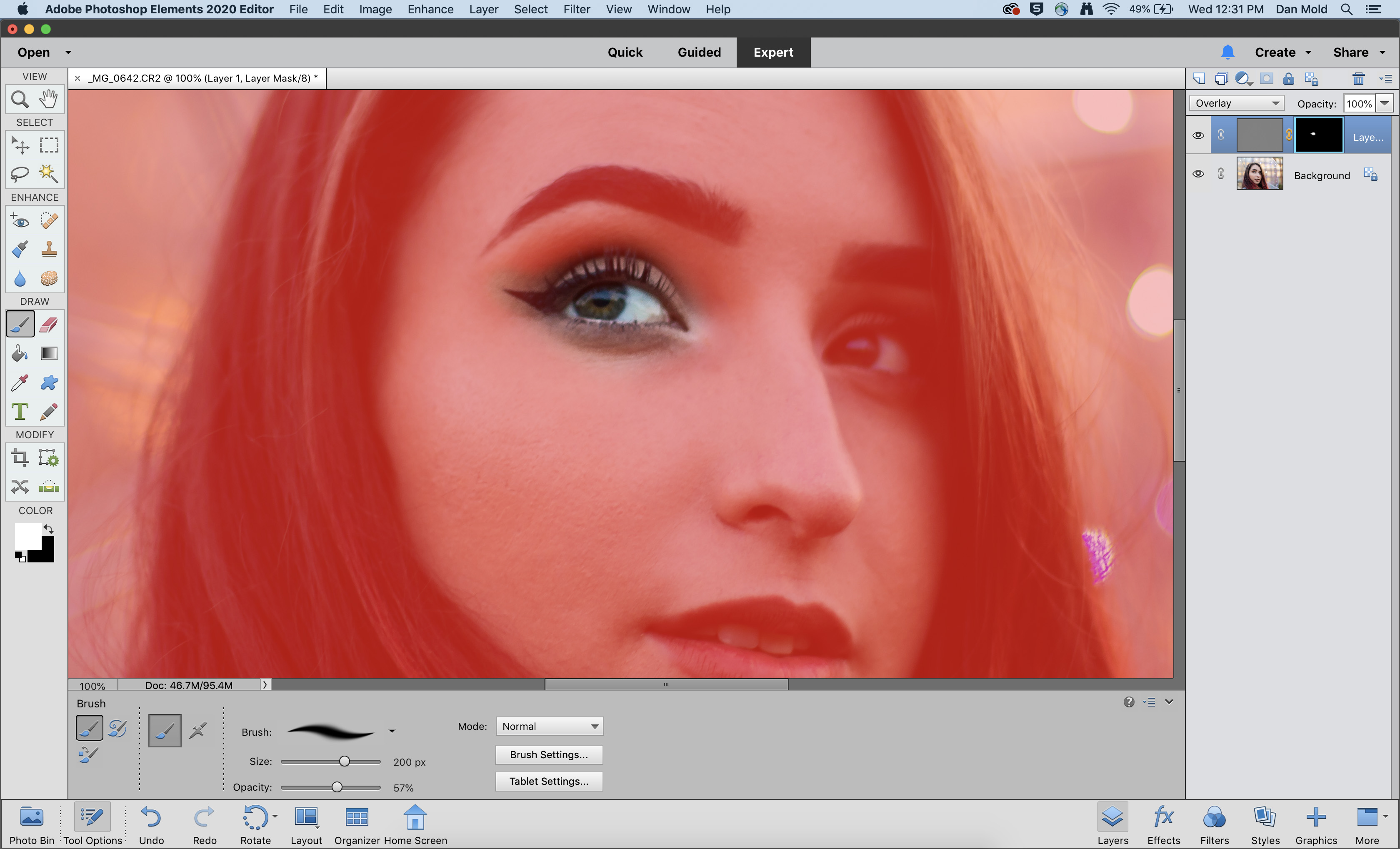
Head over to the Layers panel (Window > Layers) and change the Blending Mode to Overlay to sharpen the image. Now add a Layer Mask and hit Ctrl / Cmd + I to invert it, and use a soft white Brush Tool to paint over the eye to increase sharpness locally to this area.
04 Add a Gradient Map layer
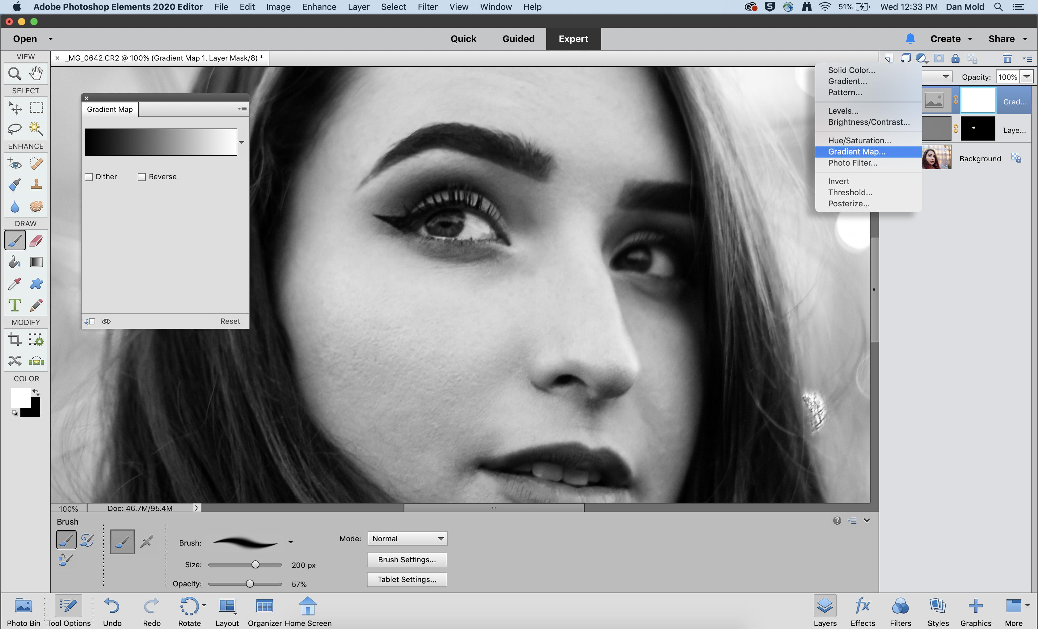
In the Layers panel click the Create new adjustment layer icon and choose Gradient Map from the list that appears. By default it will apply a black and white gradient map, in the Gradient Map panel that appears; click on the rectangle fading from black to white.
05 Fine-tune the colours
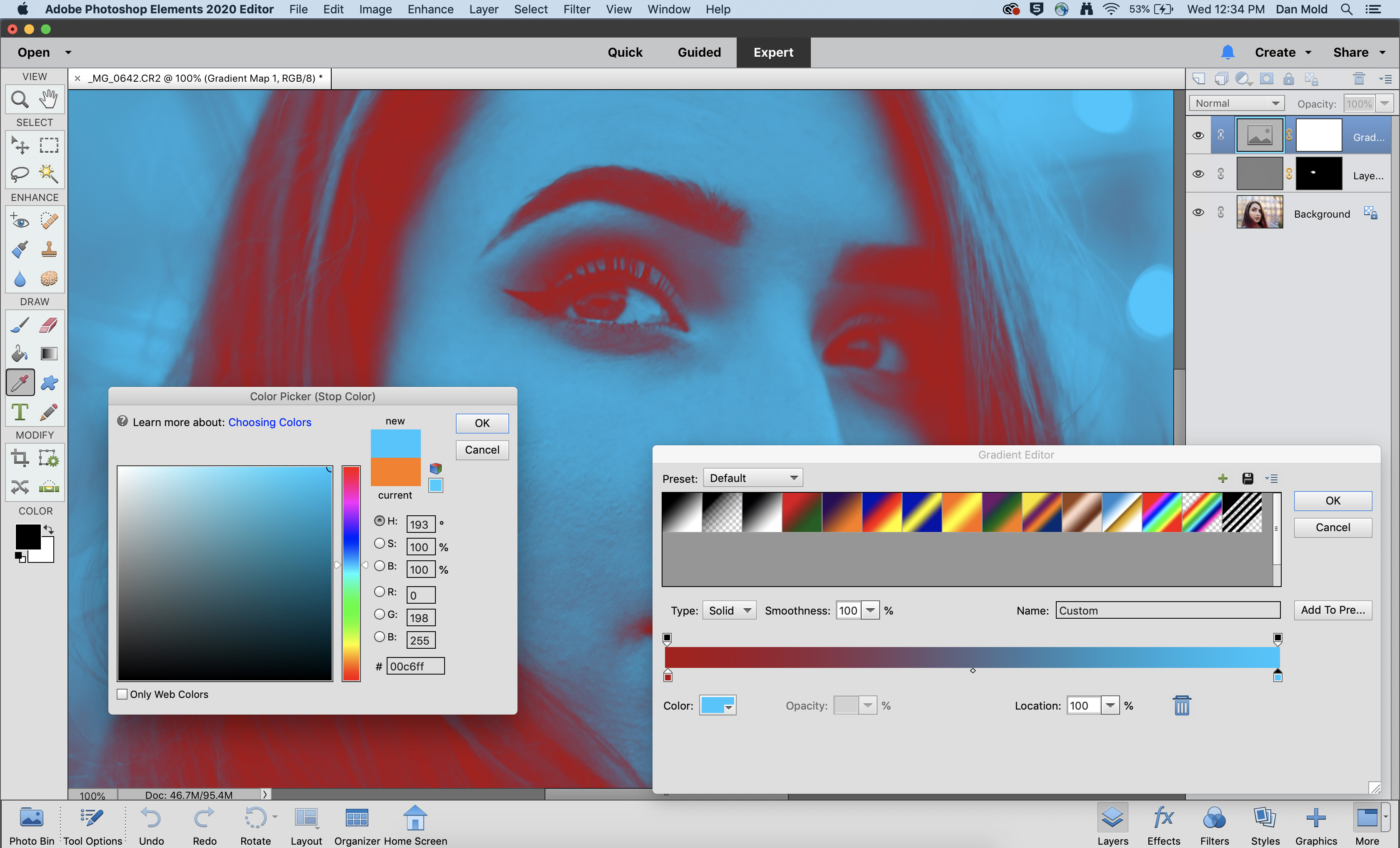
In the Gradient Editor you’ll see a bar with a ‘stop’ at each end on the bottom. Double-click on these to set your own colors in the split tone – we went for a red fading into a blue to contrast it. Hit OK to close the Color Picker and OK to close the Gradient Editor.
06 Use levels to control the brightness
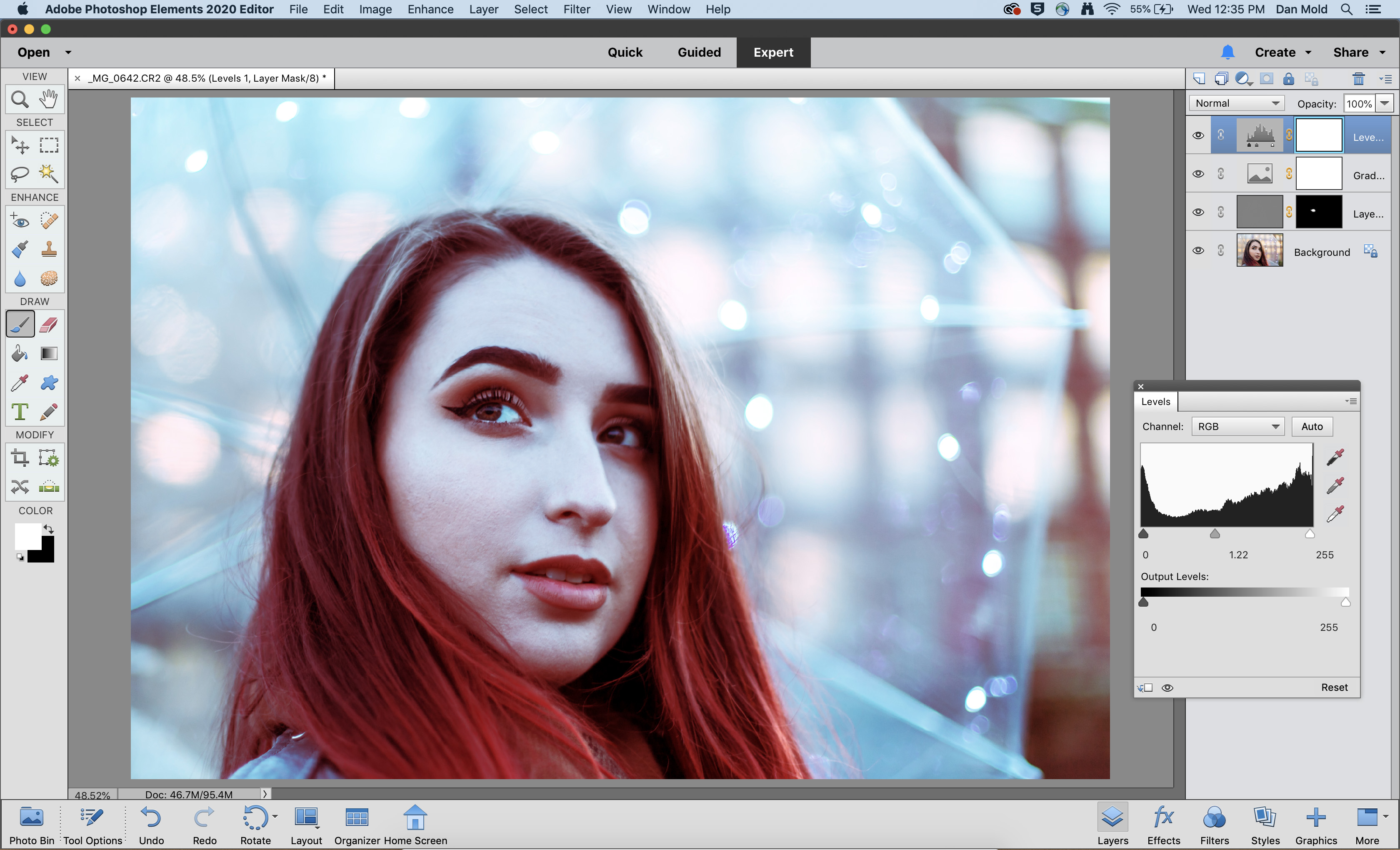
If your image is looking a little too dark or bright, click on the Create new adjustment layer icon again, this time choosing Levels from the list. Then in the Levels panel you can drag the middle midtones slider to change how bright or dark the image is.
PhotoPlus: The Canon Magazine is the world's only monthly newsstand title that's 100% devoted to Canon, so you can be sure the magazine is completely relevant to your system.
Read more:
The best photo editing software: image editors for novices through to pros
The best photo-editing laptops in 2020: top laptops for photographers
10 best online photography courses – from beginner guides to masterclasses
Get the Digital Camera World Newsletter
The best camera deals, reviews, product advice, and unmissable photography news, direct to your inbox!

Deputy Editor on PhotoPlus: The Canon Magazine, Dan also brings his technical wizardry and editing skills to Digital Camera World. He has been writing about all aspects of photography for over 10 years, having previously served as technical writer and technical editor for Practical Photography magazine, as well as Photoshop editor on Digital Photo.
Dan is an Adobe-certified Photoshop guru, making him officially a beast at post-processing – so he’s the perfect person to share tips and tricks both in-camera and in post. Able to shoot all genres, Dan provides news, techniques and tutorials on everything from portraits and landscapes to macro and wildlife, helping photographers get the most out of their cameras, lenses, filters, lighting, tripods, and, of course, editing software.

