Get the moody monochrome look in Affinity Photo: split toning explained
Create punchy black-and- white effects and gorgeous split-toned photos with Affinity Photo’s powerful Develop Persona
The best camera deals, reviews, product advice, and unmissable photography news, direct to your inbox!
You are now subscribed
Your newsletter sign-up was successful
Watch the video: Get the moody monochrome look in Affinity Photo
Start here
• Affinity Photo tutorials
The tutorials
1. Affinity Photo vs Photoshop
2. RAW editing with Affinity Photo
3. Focus merge with Affinity Photo
4. Replace a sky in Affinity Photo
5. Moody mono in Affinity Photo
6. Six Affinity Photo landscape tips
7. Color correction in Affinity Photo
8. Live Filters in Affinity Photo
9. Create a classic wet plate look
10. Remove objects in Affinity Photo
11. Paint an abstract portrait
12. Enhance skintones in Affinity Photo
13. Create HDR in Affinity Photo
14. Replace a sky in Affinity Photo
15. Affinity Photo double exposures
16. Affinity Photo Denoise tool
There are several ways to convert to monochrome in Affinity Photo, but the two most useful methods both offer crucial control over the brightness of different colours during the conversion. One of these is the Black & White adjustment layer, which is found within the Photo Persona. The other is the Black & White panel within the Develop Persona. Both offer a similar set of colour sliders that let you fine-tune the look of the black and white by, say, darkening a blue sky or lightening foliage.
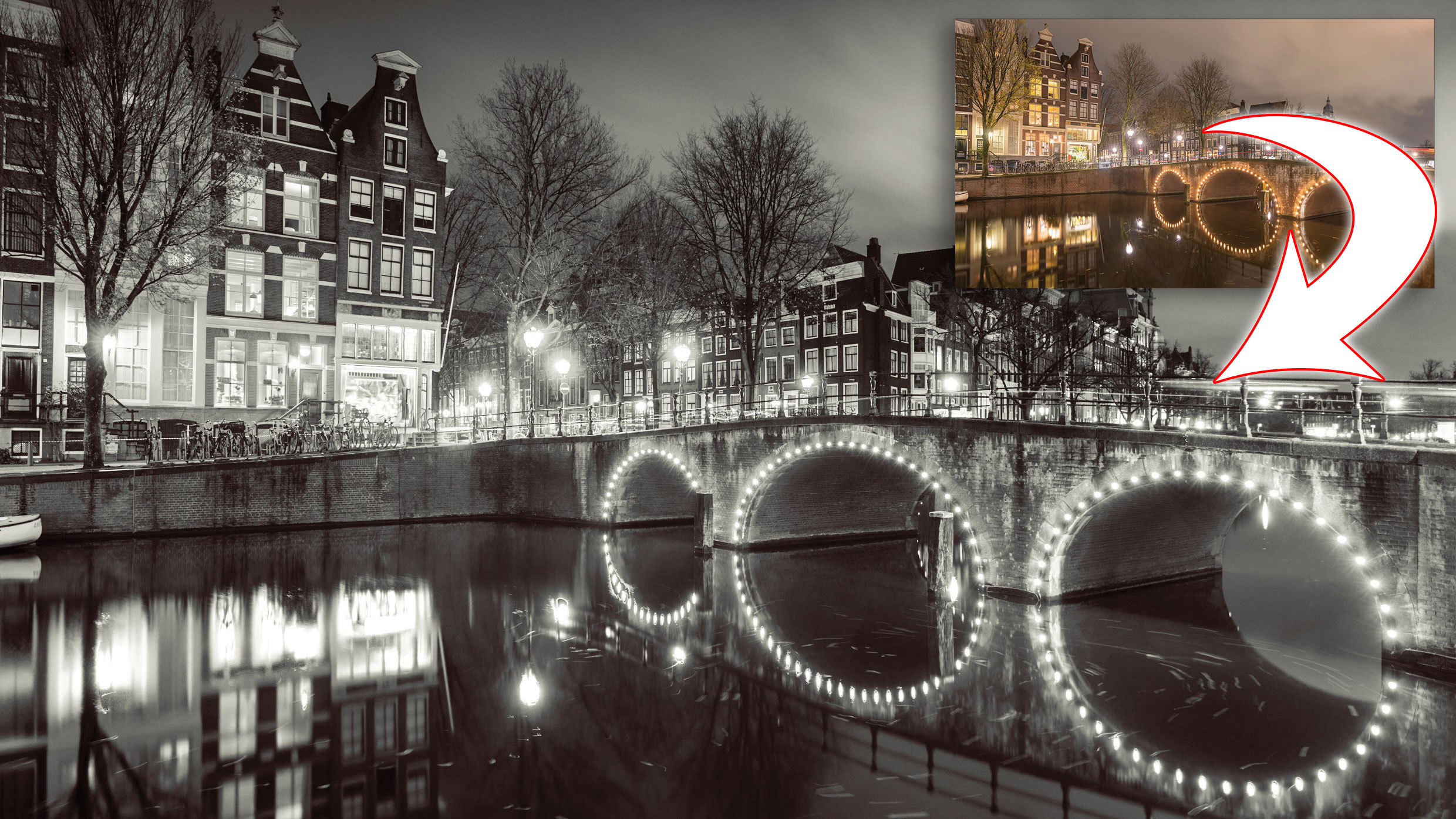
Here we’ve used the Develop Persona (which can be used for Raws and JPEGs). The controls allow us to lower the brightness of the blown-out lights in the scene, revealing detail and balancing out tones.
Article continues belowOf course, converting to mono is often only the starting point for a range of other edits. Initially, black-and-white images can look a little flat, so we’ll go on to boost contrast here with Curves.
Black-and-white images also offer the chance for selective lightening and darkening (often to a greater degree than the colour versions), so we can dodge and burn parts of the scene to balance the dark foreground with the brighter sky.
We do this using the Develop Persona’s Overlays – the best tool for selective adjustments. Finally, we can add a colour toning effect. We created a warm tone using the Develop Persona’s Split Toning controls.
Read more: Affinity Photo 1.8 review
The best camera deals, reviews, product advice, and unmissable photography news, direct to your inbox!
Step 1: Convert to mono
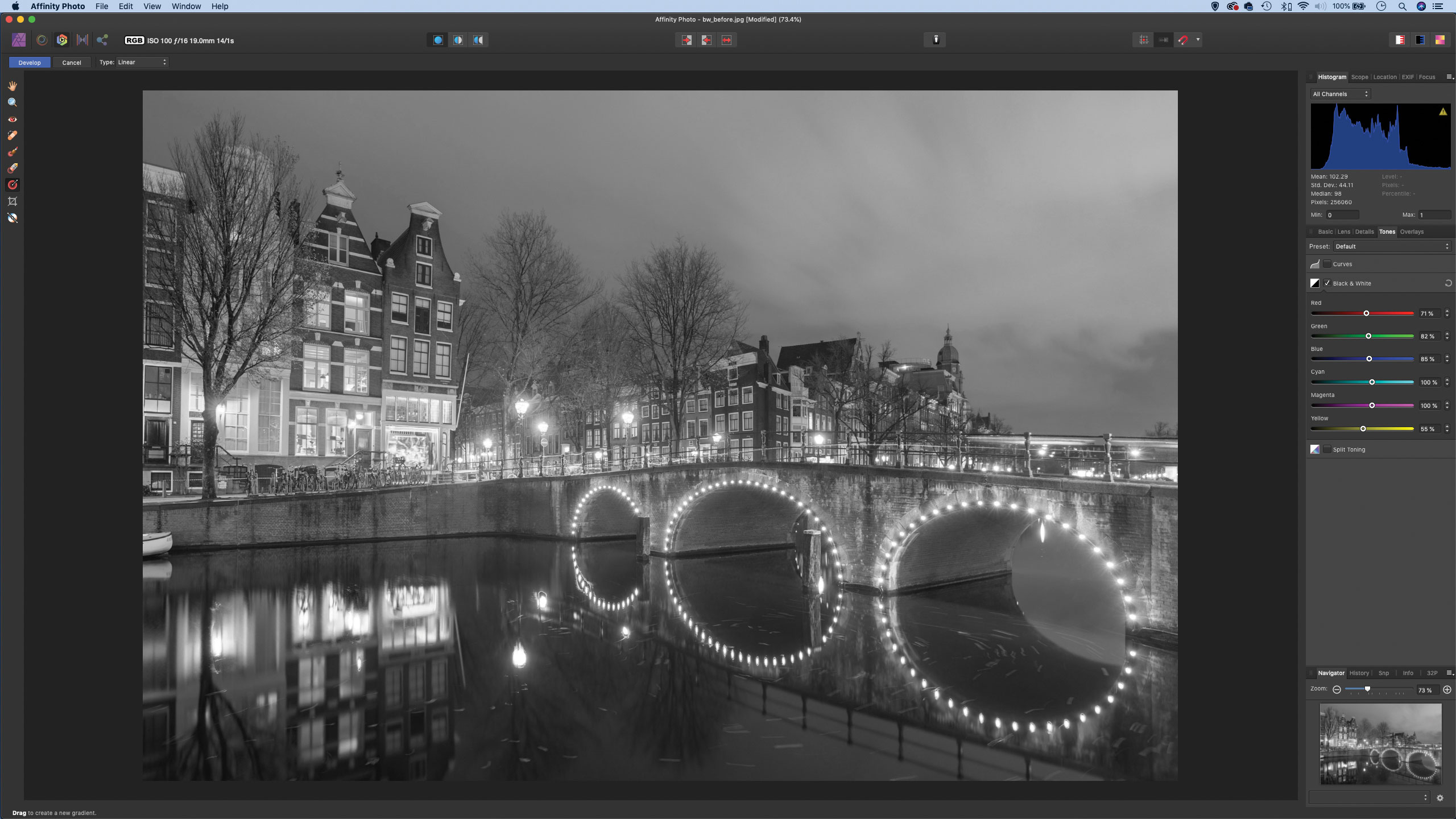
We open the image then click on the Develop Persona at the top left. Next, we go to the Tones tab on the right and check Black & White. The sliders here let us alter the brightness of the different colour ranges in the picture. We drag the Yellows slider to the left to darken down the bright lights.
Step 2: Tweak white balance
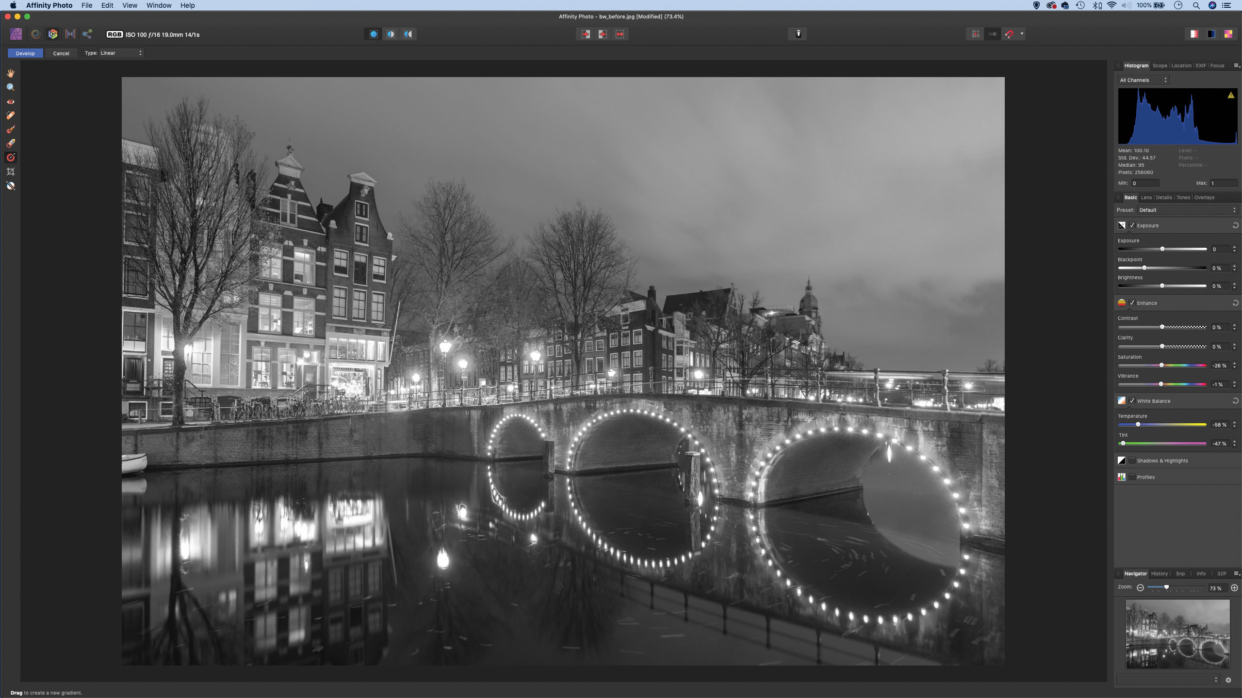
The conversion is based on the colour information in the photograph, so we can affect the general look of things by altering the other colour settings in the Develop Persona. We click on the Basic tab, then go to the white balance settings and experiment with Temperature, Tint and Saturation to tweak the conversion.
Step 3: Use Curves for contrast
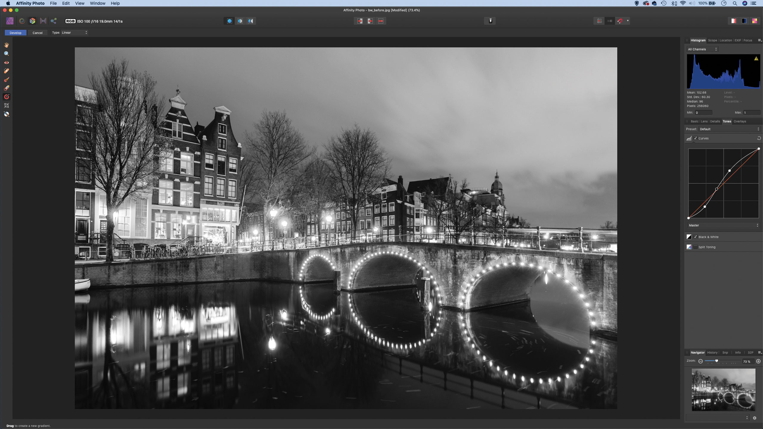
Next, we click the Tones tab again and check Curves, then drag the curve line upwards near the top and downwards near the bottom to make an S-shaped curve that boosts contrast. At this stage, if you like, you can click the Preset dropdown at the top to make a new preset so you can use the same settings on other images.
Step 4: Darken the sky
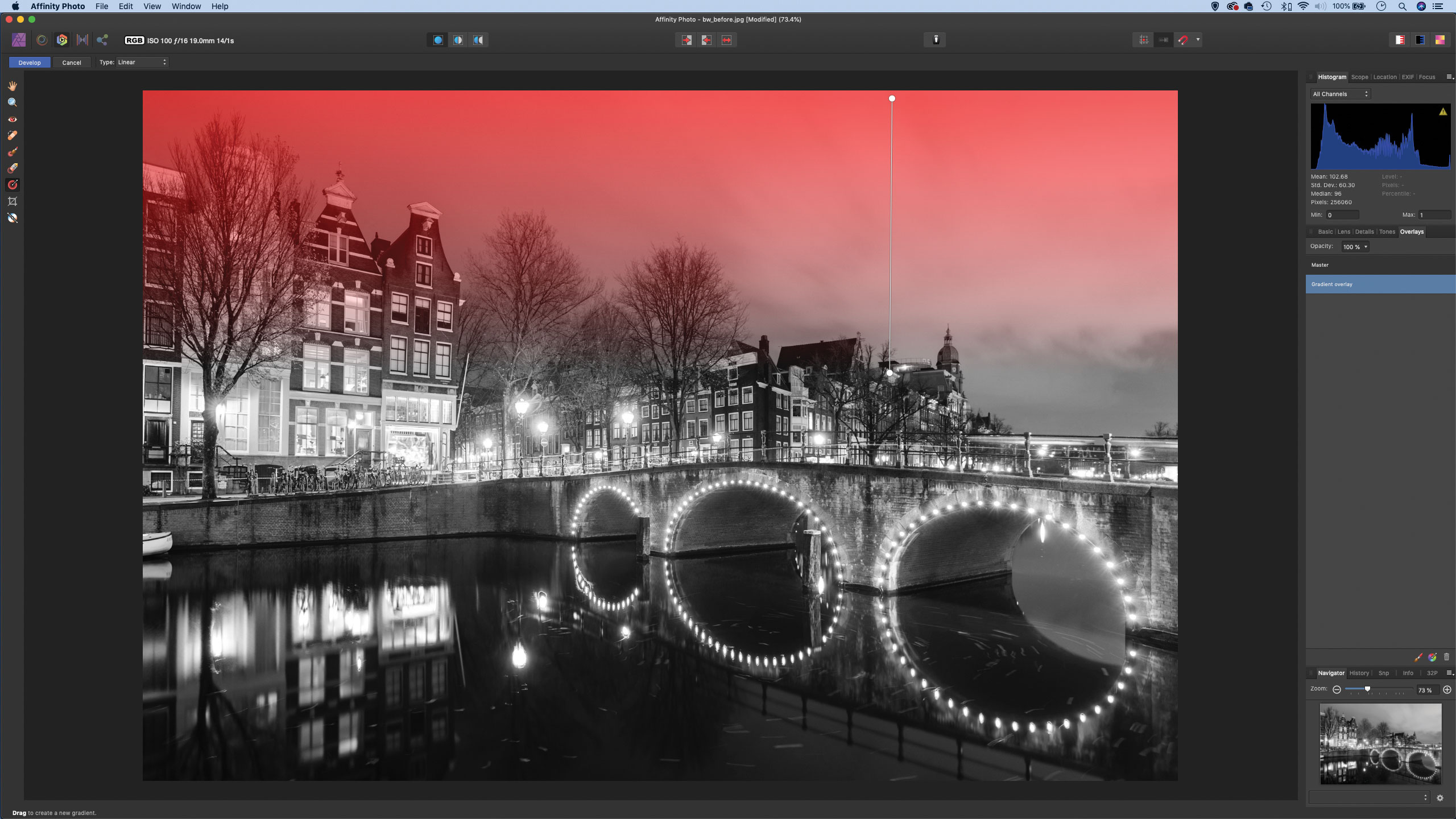
The sky is looking too bright, so we grab the Gradient Overlay tool from the toolbar, then click-and-drag downwards from the top of the frame towards the middle. Once done, we click the Basic tab and drag Exposure downwards to darken the sky.
Step 5: Lift the foreground
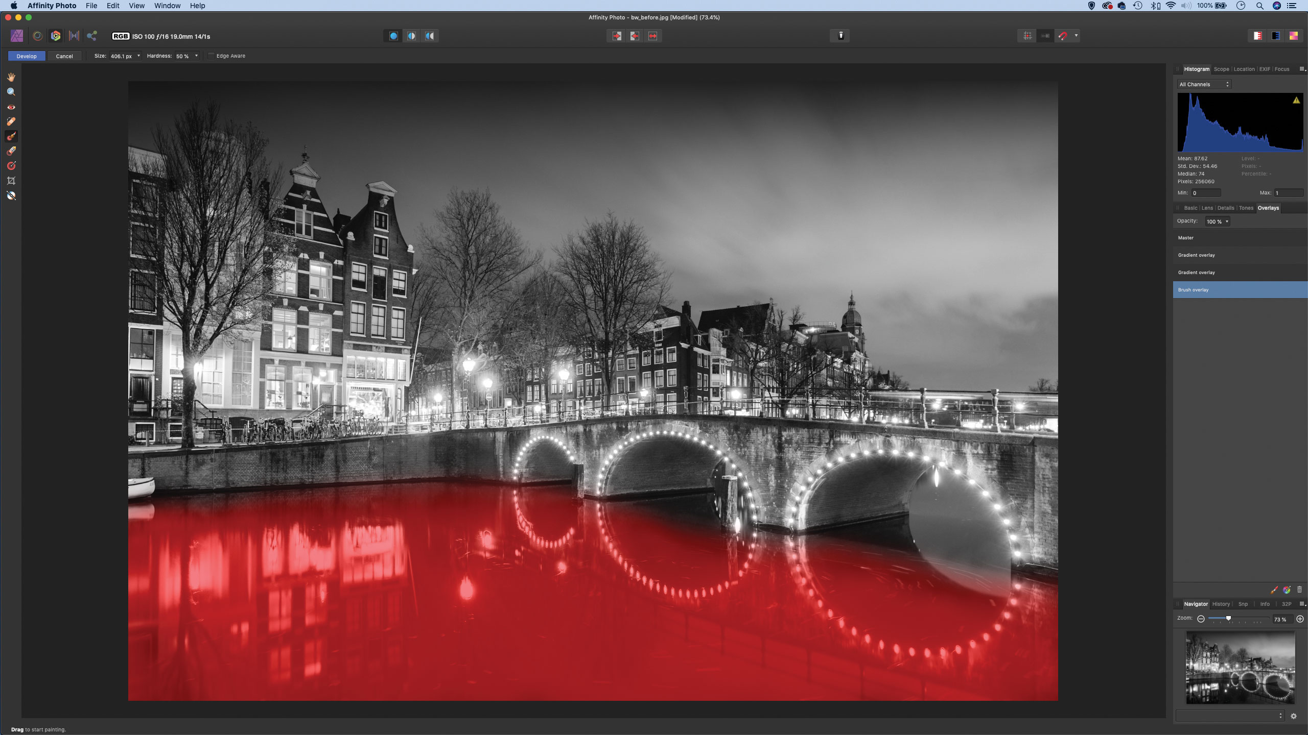
Sometimes a second gradient to darken the very top of the sky can be effective, so we go to the Overlays tab and click the Gradient tool, then make another gradient. Next, we grab the Brush overlay tool, paint over the water, then use the Basic panel sliders to lighten the area slightly.
Step 6: Try split toning
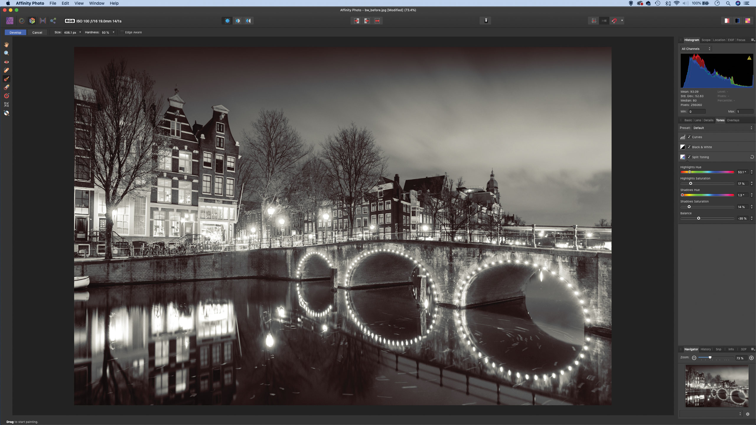
For this, we go to the Overlays tab and highlight the Master Overlay, then go to the Tones tab and check Split Toning. We can drag the Highlights Hue to yellow and use the Saturation slider below to control the strength of the colour. Similarly, we can add a red hue to the shadows, then use the Balance slider to control the split.
Quick Tip
Using a Black & White adjustment layer in combination with certain layer blend modes can give us some very interesting tonal effects to our photograph. By first of all adding a Black & White adjustment layer, then changing the blend mode to Overlay, we can get a rather fun grungy high-contrast look. Of course, we can still fine-tune the effect by altering the colour range sliders within the Black & White settings. The Luminosity blend mode is another one to try out – it keeps the original image in colour, but lets you alter the luminance of the different colour ranges.
About N-Photo magazine
This tutorial originally appeared in N-Photo, the monthly newsstand magazine for Nikon photographers. Why not subscribe to a print edition, and have the magazine delivered direct to your door every month?
Alternatively, we have a number of different digital options available, including:
• Apple app (for iPad or iPhone)
• Zinio app (multi-platform app for desktop or smartphone)
• PocketMags (multi-platform app ideal for Android devices)
• Readly (all-you-can-eat digital magazine subscription service)
If you wanted a printed version of any of our most recent issues we have a selection of back issues to choose from in our online store.
Read more:
• Photography tips and tutorial videos
• The best photo editing tools and accessories
• The best desktop computers for photo editing
• The best photo-editing laptops right now
• The best photo editing software today
N-Photo: The Nikon Magazine is a monthly publication that's entirely dedicated to Nikon users. As a 100% independent magazine, you can be assured of unbiased opinion from a trustworthy team of devoted photography experts including editor Adam Waring and Deputy Editor Mike Harris.
Aimed at all users, from camera newcomers to working pros, every issue is packed with practical, Nikon-specific advice for taking better photos, in-depth reviews of Nikon-compatible gear, and inspiring projects and exciting video lessons for mastering camera, lens and Photoshop techniques.
Written by Nikon users for Nikon users, N-Photo is your one-stop shop for everything to do with cameras, lenses, tripods, bags, tips, tricks and techniques to get the most out of your photography.
