Home photography idea: Put color theory into practice
Contrasting or complementary colors? RGB or CMYK? What is hue? Shoot colorful images and put theory into practice!
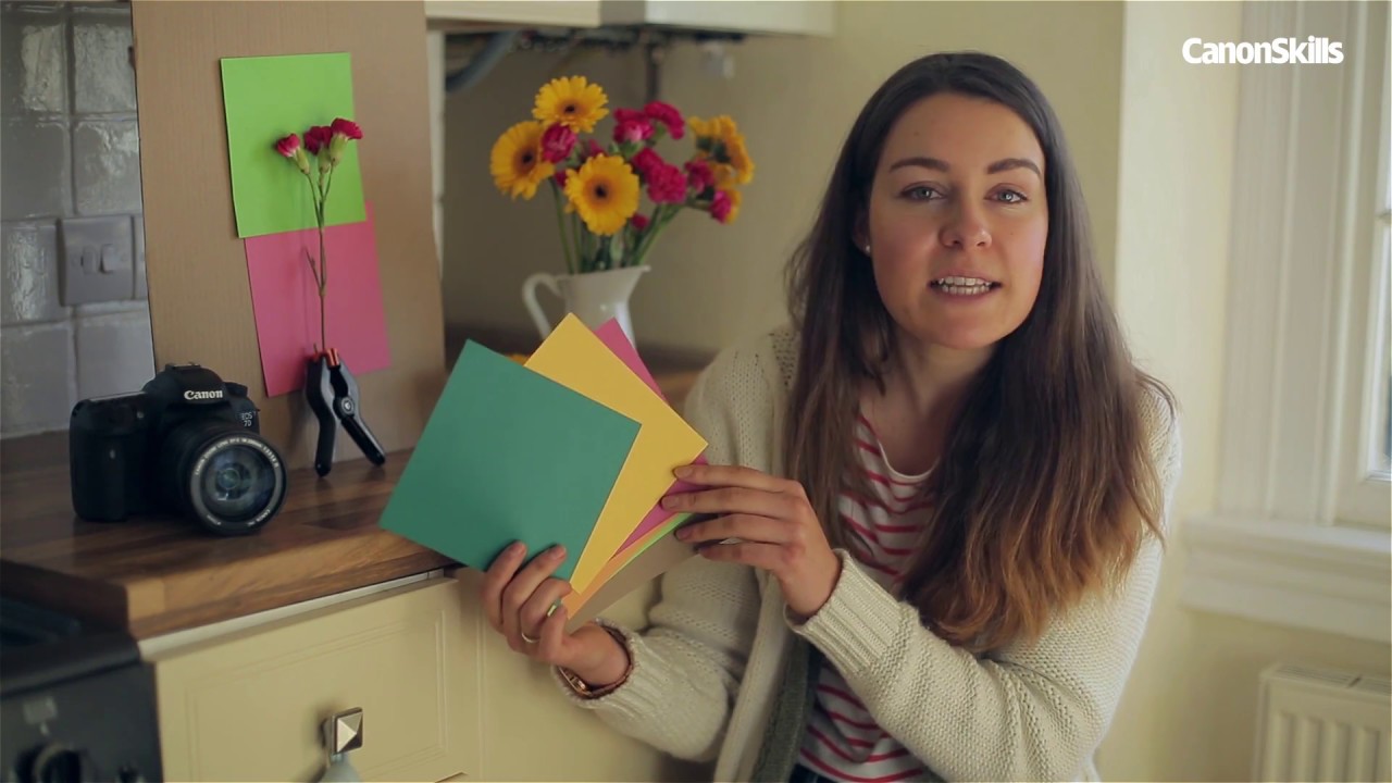
Watch video: Home photography ideas – Put color theory into practice
Photography projects at home
• Home photography ideas
Useful home photography kit
• Best tripods
• Best lighting kits
• Best reflectors
• Best macro lenses
We all know that color is one of the most important and active ingredients of photographic composition, but as a consideration in our images it’s often forgotten about right until the editing stage.
In portraits, landscapes and still life shots, color can be used to add depth, create mood or draw the viewer’s eye to a certain part of the frame, so it’s important to understand the basics of color theory.
• 10 best online photography courses
What is a hue? What’s the difference between an RGB and a CMYK color palette? Once the basic schooling is over, we’ll apply these ideas in a practical sense with some vibrant flowers and equally colorful craft papers.
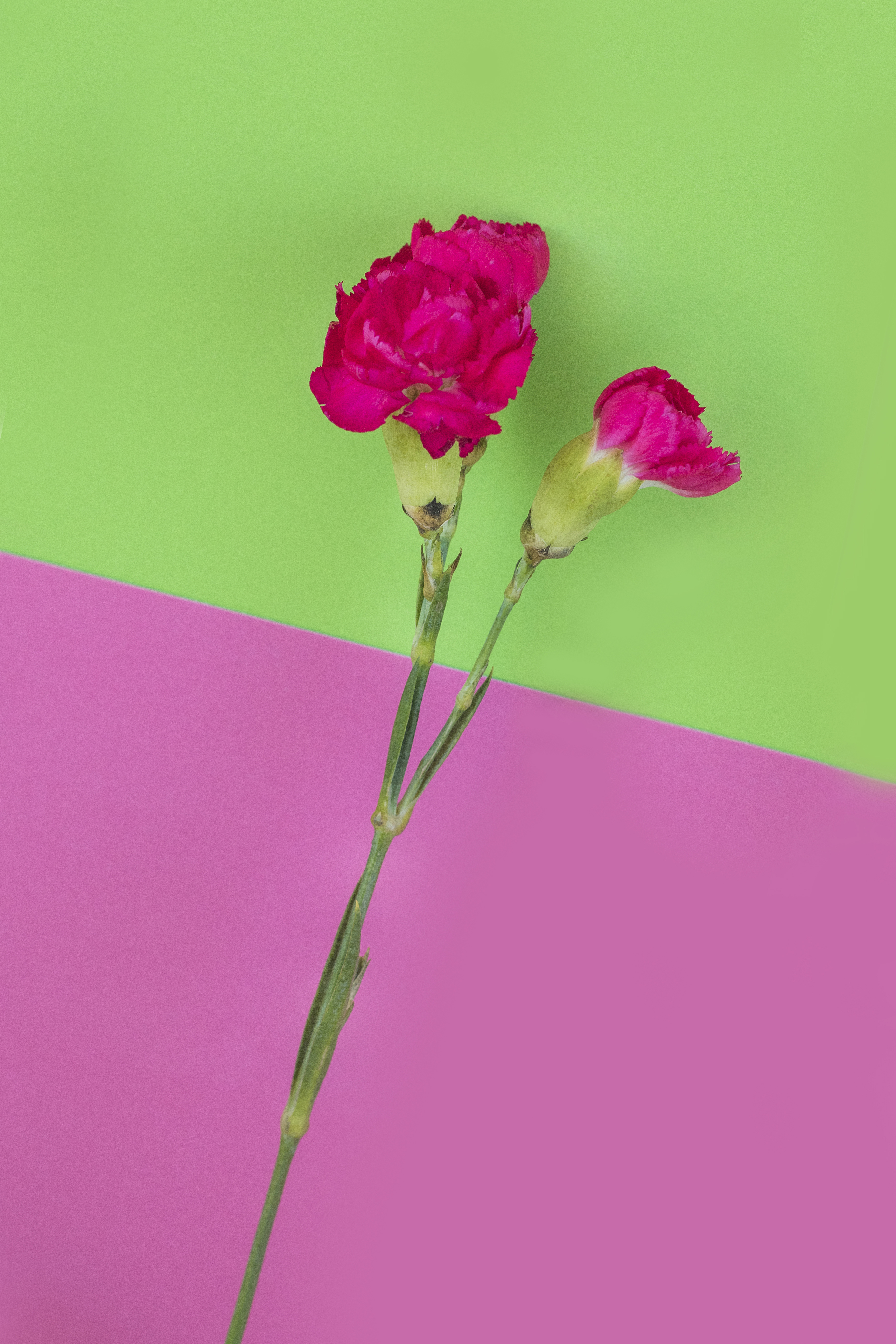
Of course, you can change the color of backgrounds in Photoshop, but where’s the learning there? When you work with physical elements, in-camera, it becomes easier to experiment with different color combinations.
Use contrasting or complementary colored paper, and play around to find a palette that works for you and your subjects, then go out and put your new skills into practice in the real world!
What is color? The basics
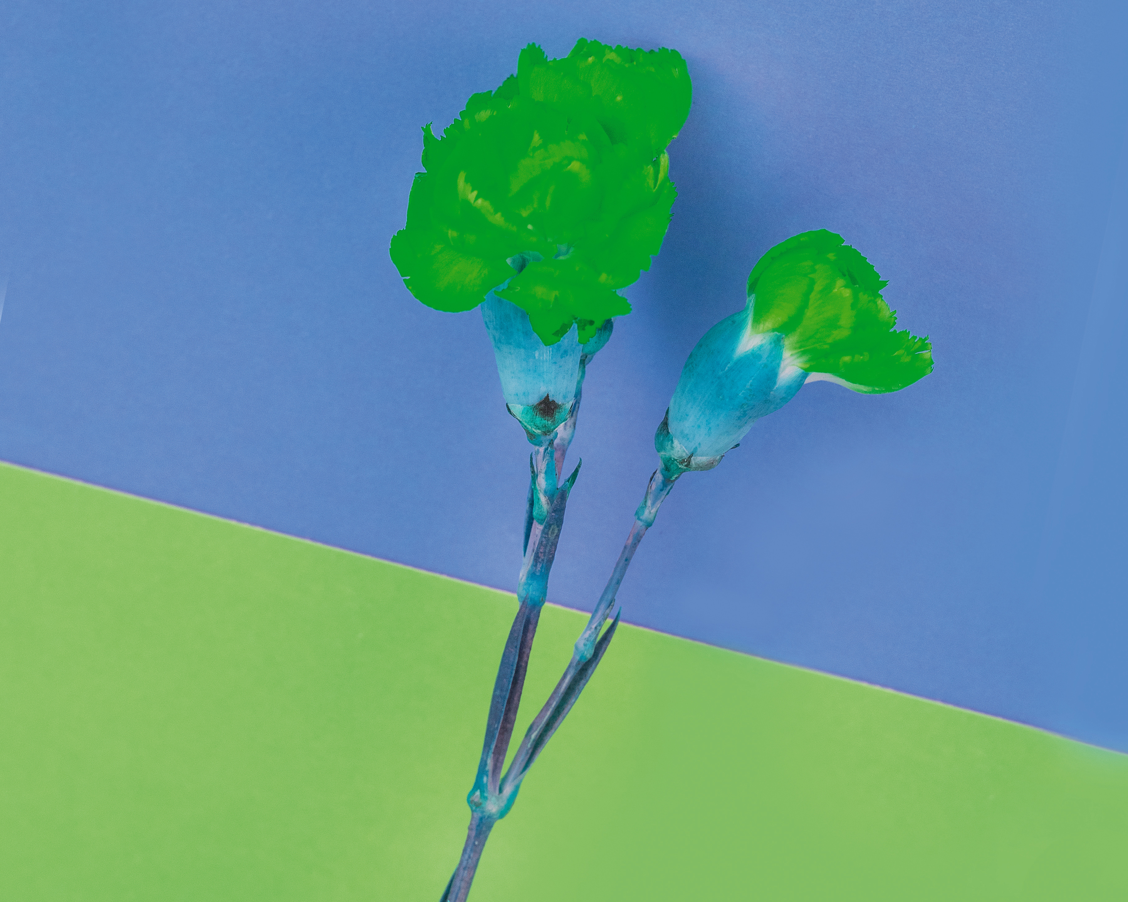
01 Hue
A hue is the term given to a pure spectrum color – the ones we all know, such as red, orange, yellow, blue, green and violet. A physicist would describe color in terms of wavelengths of light, but each person has their own personal perception of color.
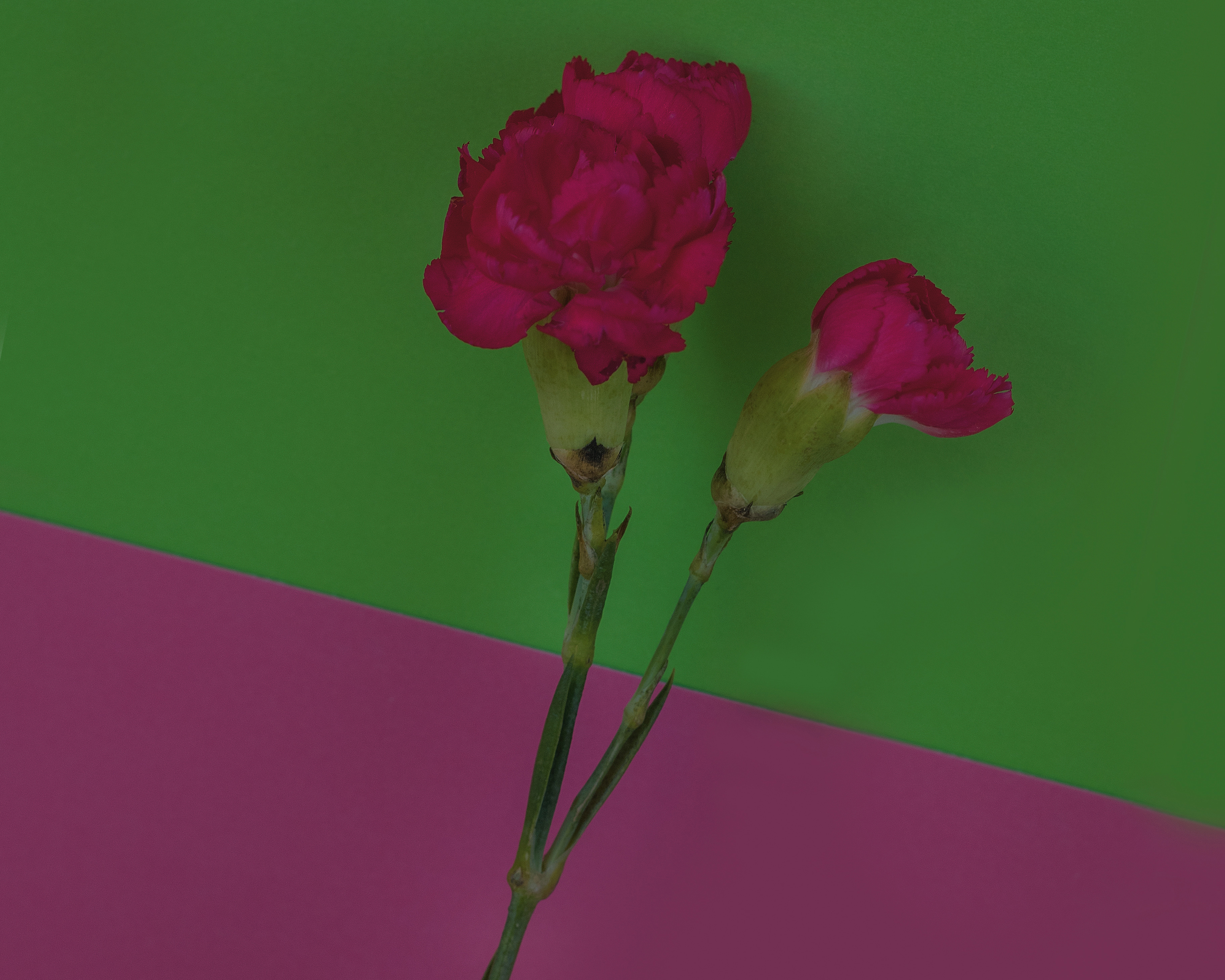
02 Value
Value essentially refers to the darkness or lightness of a color, whereby less value equates to a darker color. Brightness is another term that’s sometimes used to describe value, which is altogether much more intuitive and easy to remember.
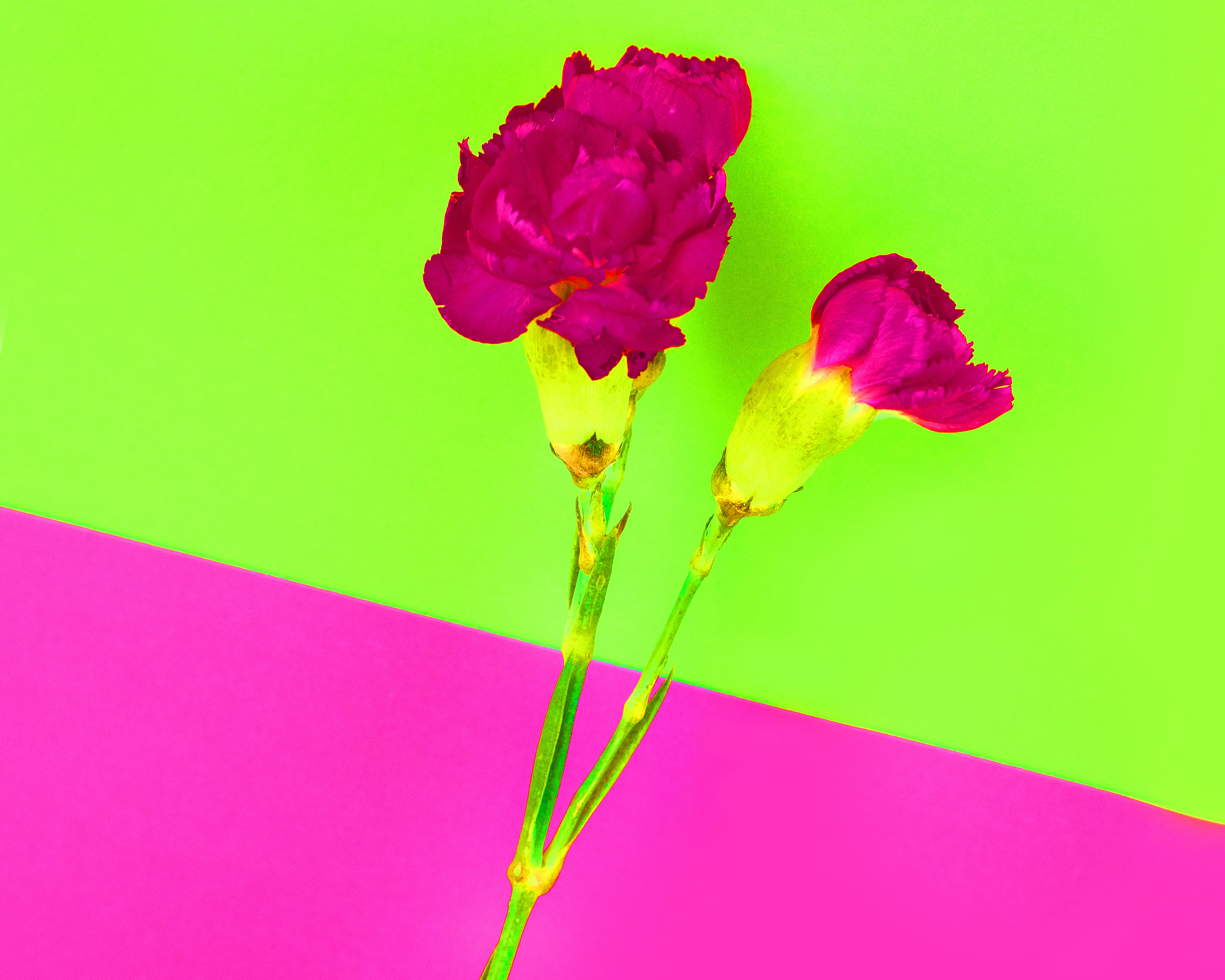
03 Saturation
This refers to the depth of a color. As you’d expect, more saturation means more color, and less saturation equates to a lighter shade of that color. Just to confuse things even more, luminosity is another term used to describe saturation.
The color wheel: Wheely important stuff
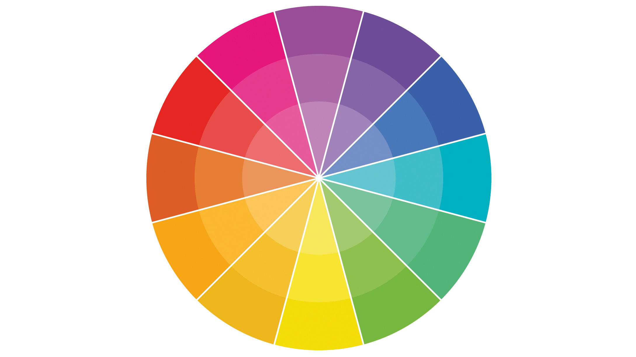
RYB wheel
Some of you may be familiar with this from art lessons at school. Red, yellow and blue are the three primary colors (which artists have used for centuries). We’ll be using it as our color wheel in this project. The secondary triad of colors are purple, orange and green.
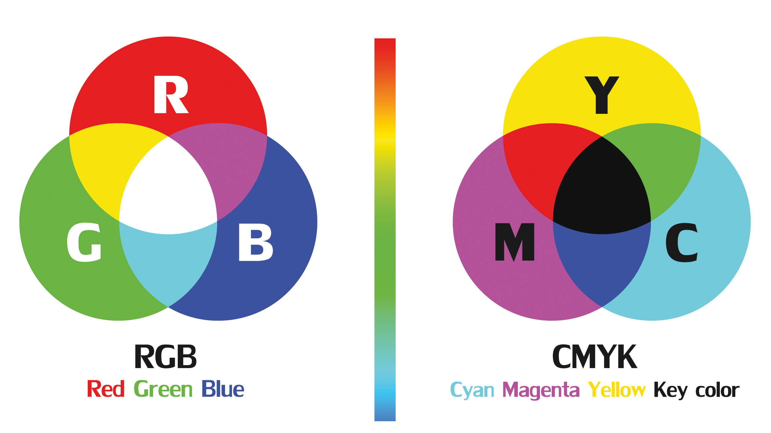
RGB mode: RGB is important to photographers from a technical sense when editing images. Computer monitors and projectors use red, green and blue (RGB) as their primary colors, then mix them to create cyan, magenta and yellow.
CMYK mode: This color model was introduced for printing, and refers to cyan, magenta and yellow. When these inks are combined, the resulting mixtures are red, green and blue. Mixing all three gives an imperfect black.
Controlling the color
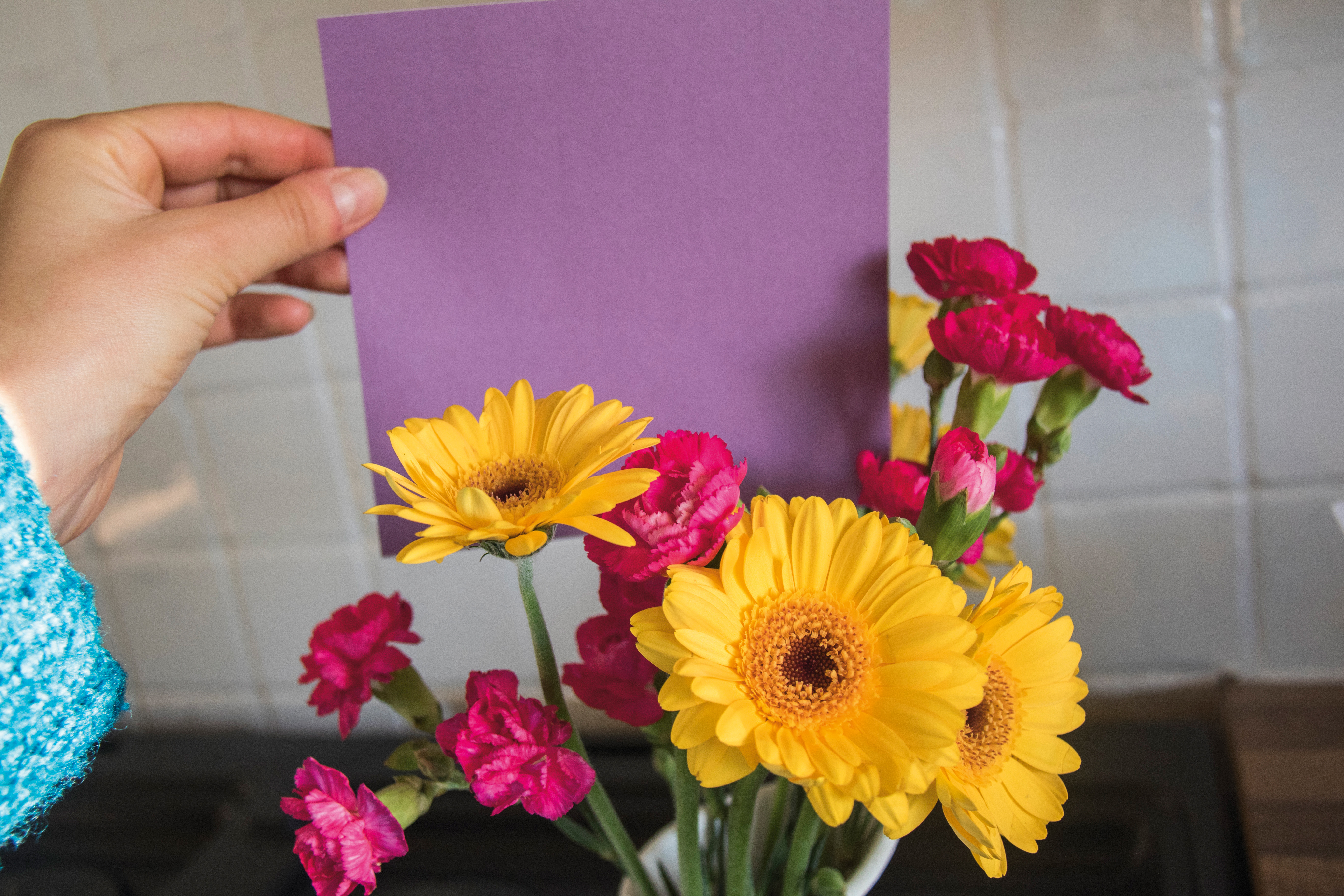
01 What you need
A variety of flowers was used to splash the color into this shoot. We had a few clamps to hand, as these would hold our flowers in place in front of the paper.
A 50mm prime, kit lens or mid-zoom is ideal.
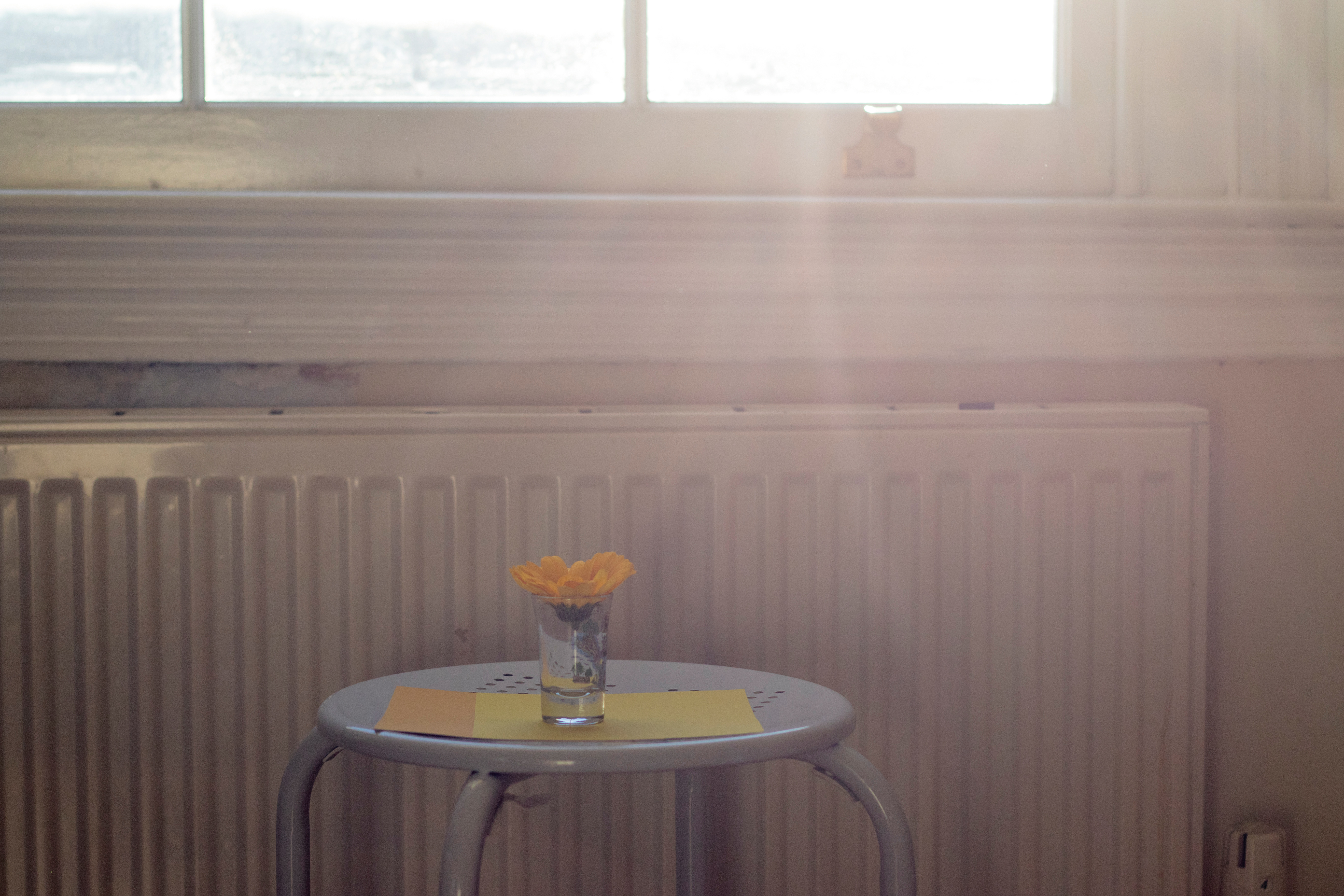
02 the location
There’s no need to go overboard with studio lighting; plentiful natural light, such as that from a large window, works well. If you have brightly painted walls, make sure that these don’t cast color on your subjects.
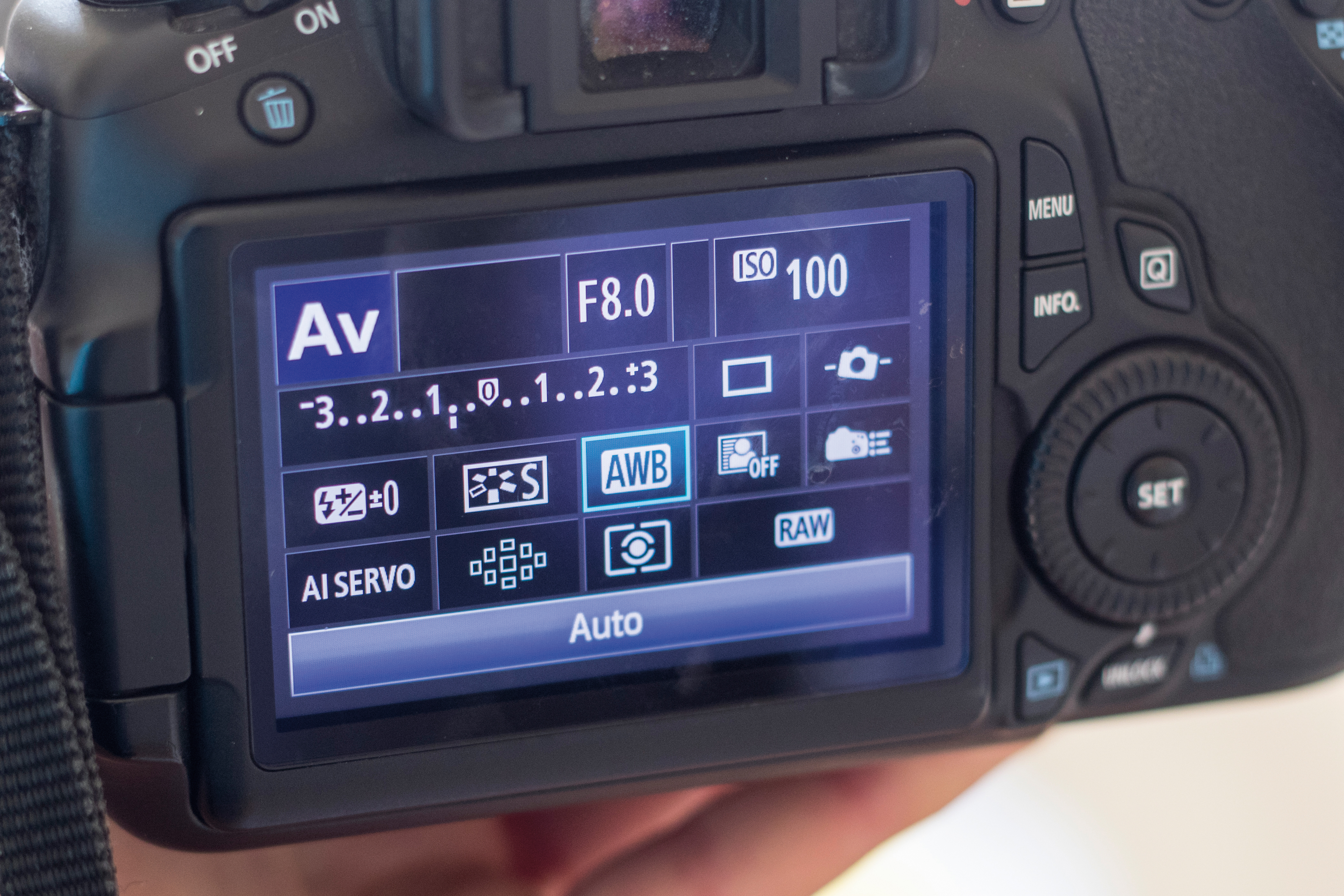
03 camera settings
Use aperture priority with an aperture of around f/8. Set the white balance to Auto and shoot in Raw, so that you can tweak the color temperature more easily later. Set the ISO to suit the ambient conditions.
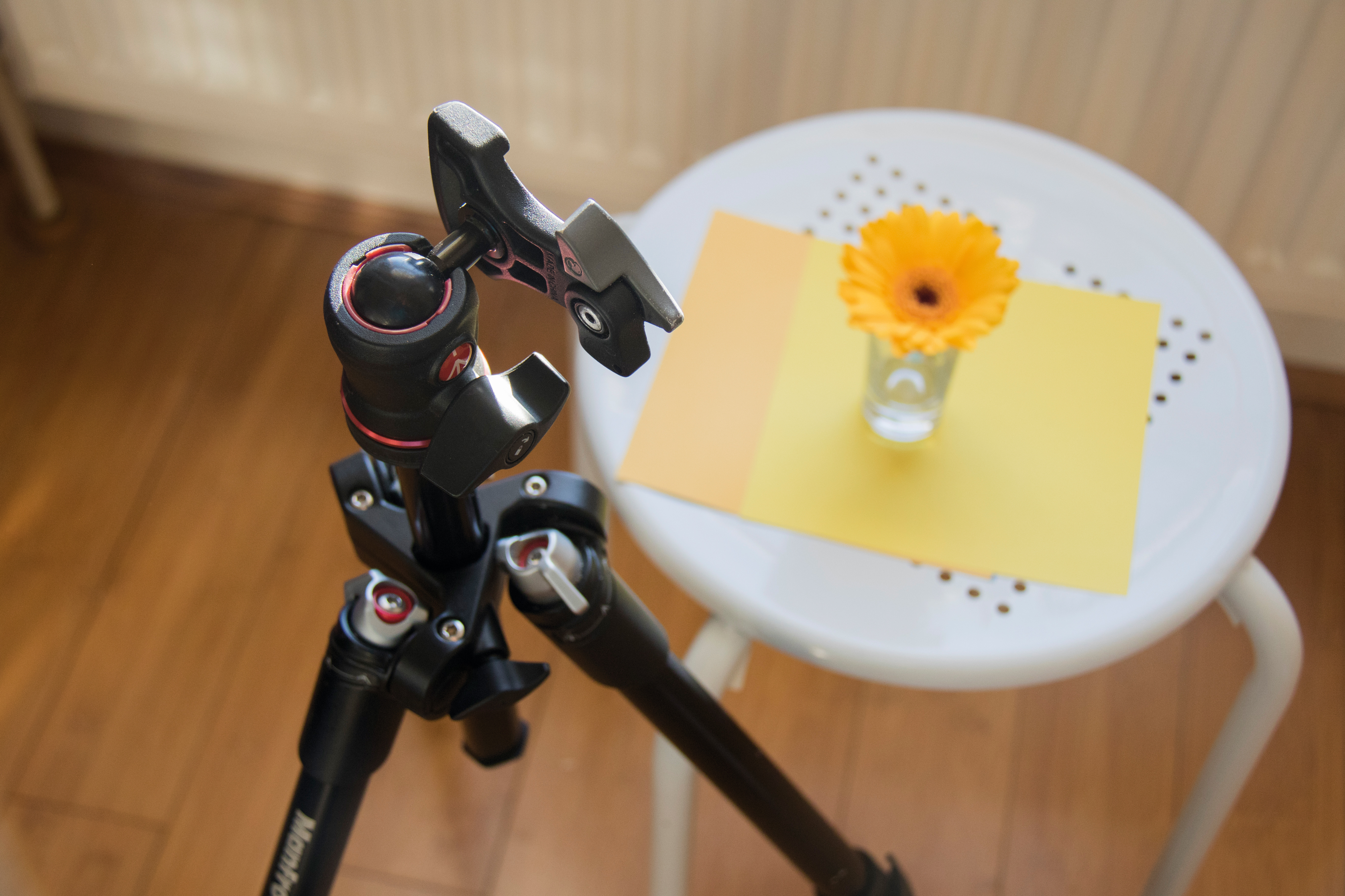
04 Use support if you need it
You can shoot with a tripod or handheld here. We generally found it freeing to shoot handheld, and move closer to and away from our subjects, though in rooms with lower light levels a tripod is necessary to avoid camera shake.
05 Paper combos
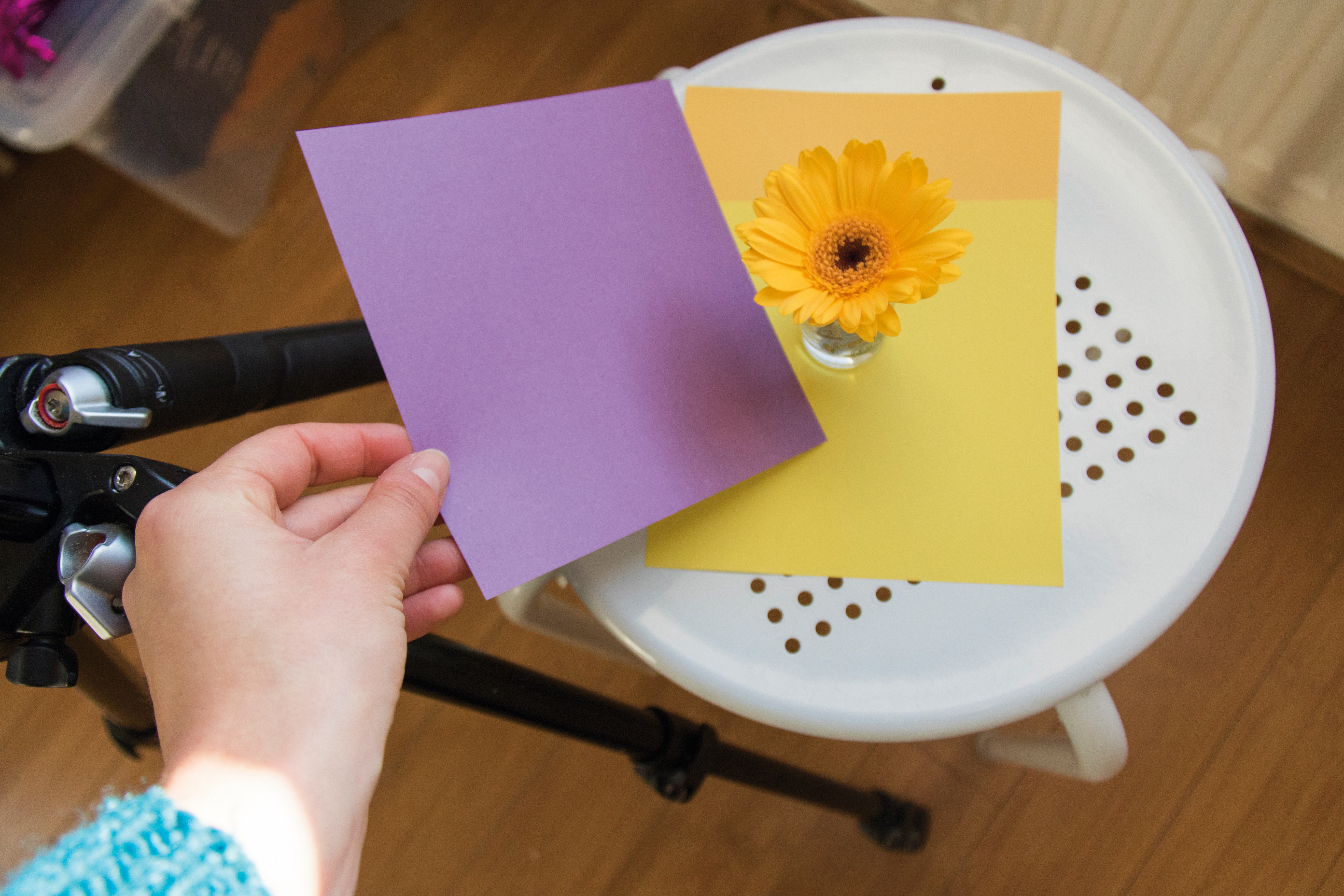
Clamp your subject in place, then position the paper behind. Use the color above to come up with complementary color palettes – two colors that are opposite each other on the wheel, such as yellow and purple.
06 Take it further
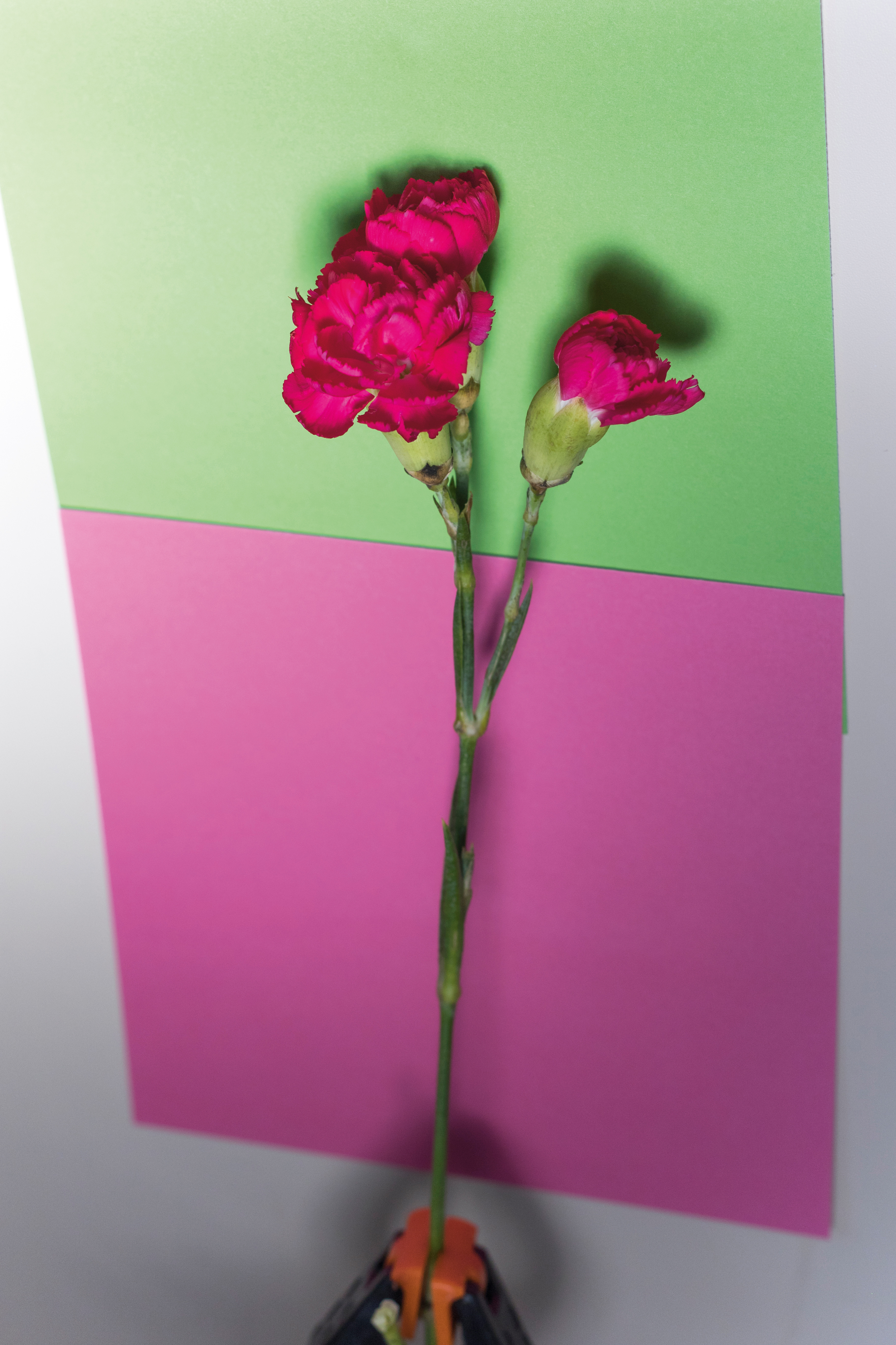
To create a double-complementary palette, combine two pairs of complementary colors. We used pink and green paper, and laid the flower across diagonally to build contrast and complexity in the composition.
PALETTE 1: MONOCHROME
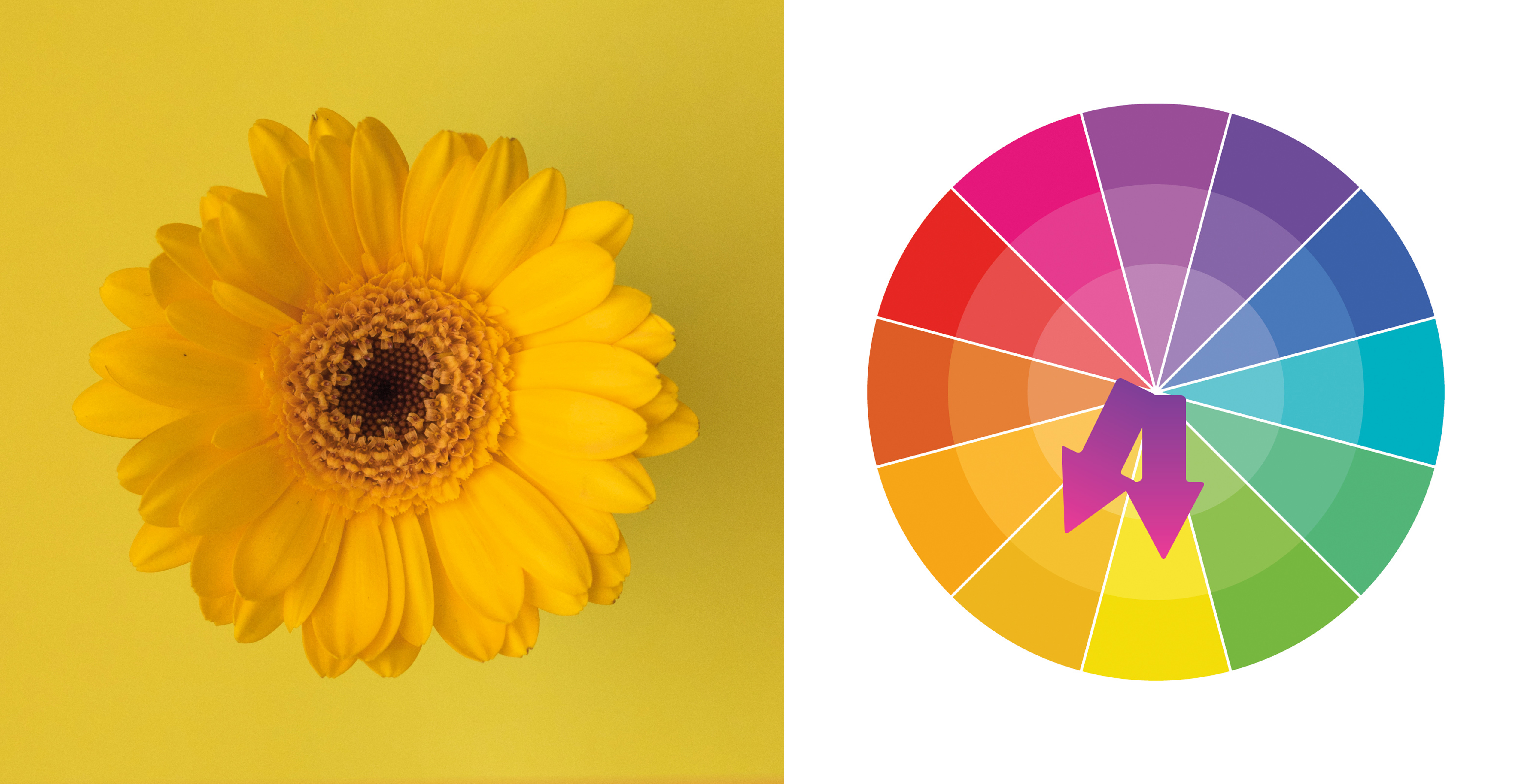
A monochromatic palette is one that includes one hue, used to create a sense of balance and calm in an image. A similar feeling is achieved when you include colors that are next to each other on the color wheel, because contrast is minimized.
PALETTE 2: COMPLEMENTARY
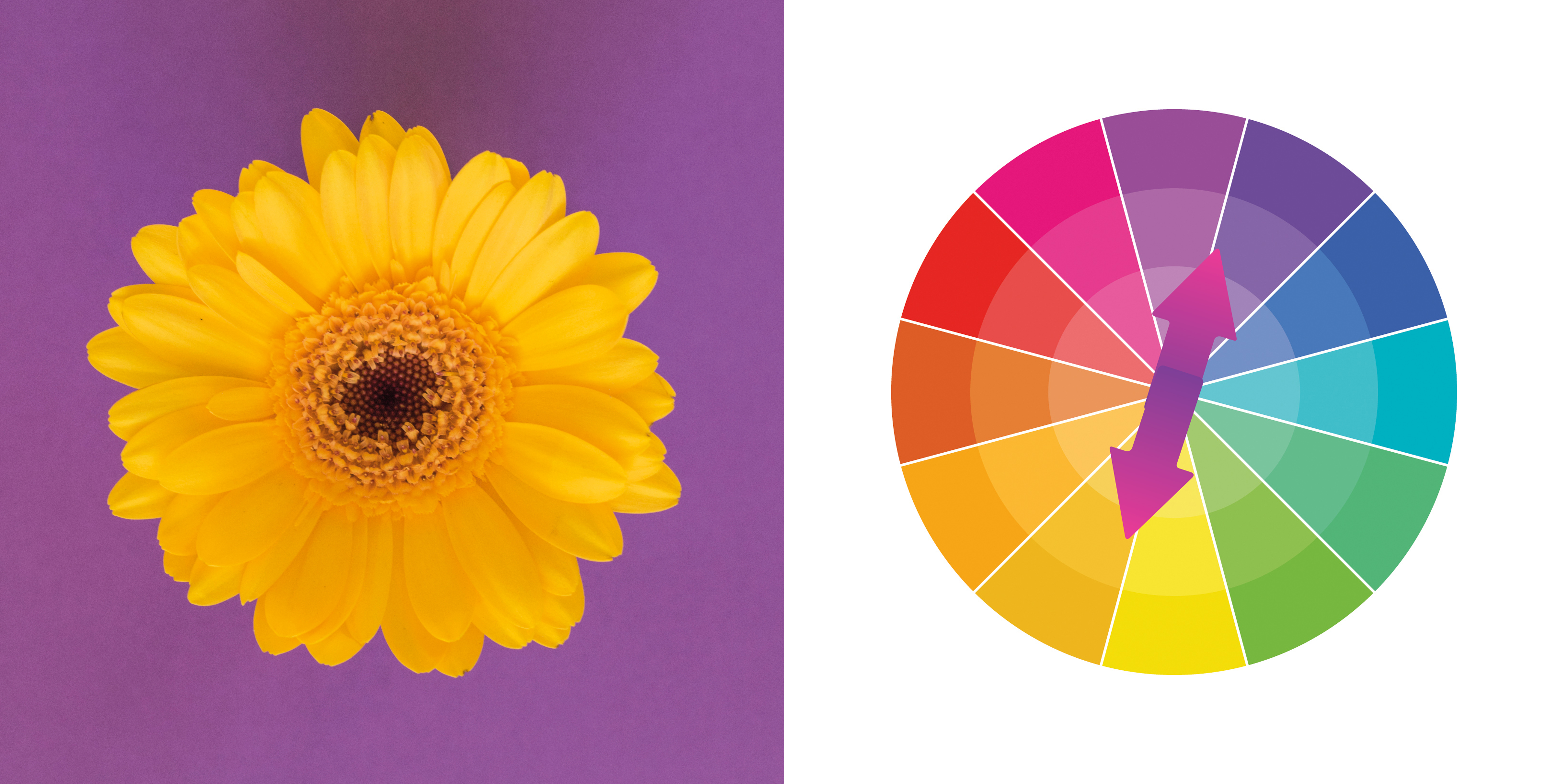
By including contrasting colors that are opposite each other on the wheel, you achieve a complementary palette. Because the two hues contrast with one another, the image is usually bolder and more dynamic as a result. Seek complementary colors in nature, as they’re a really effective way to draw attention to a subject – a red flower in a green field, for example.
PhotoPlus: The Canon Magazine is the world's only monthly newsstand title that's 100% devoted to Canon, so you can be sure the magazine is completely relevant to your system.
Read more:
The best 50mm lens: Which 'standard prime' is the right one for you?
The best standard zoom lenses
The best photography tips videos
Get the Digital Camera World Newsletter
The best camera deals, reviews, product advice, and unmissable photography news, direct to your inbox!
Lauren is a writer, reviewer, and photographer with ten years of experience in the camera industry. She's the former Managing Editor of Digital Camera World, and previously served as Editor of Digital Photographer magazine, Technique editor for PhotoPlus: The Canon Magazine, and Deputy Editor of our sister publication, Digital Camera Magazine. An experienced journalist and freelance photographer, Lauren also has bylines at Tech Radar, Space.com, Canon Europe, PCGamesN, T3, Stuff, and British Airways' in-flight magazine. When she's not testing gear for DCW, she's probably in the kitchen testing yet another new curry recipe or walking in the Cotswolds with her Flat-coated Retriever.
