How to add tints for extra impact
Use a subtle tone to change the mood
DOWNLOAD PROJECT FILES TO YOUR COMPUTER FROM: http://downloads.photoplusmag.com/pp121.zip
Replicate the split-toning darkroom technique
Time needed: 30 minutes
Skill level: Beginner
Kit needed: Lightroom 5 or CC
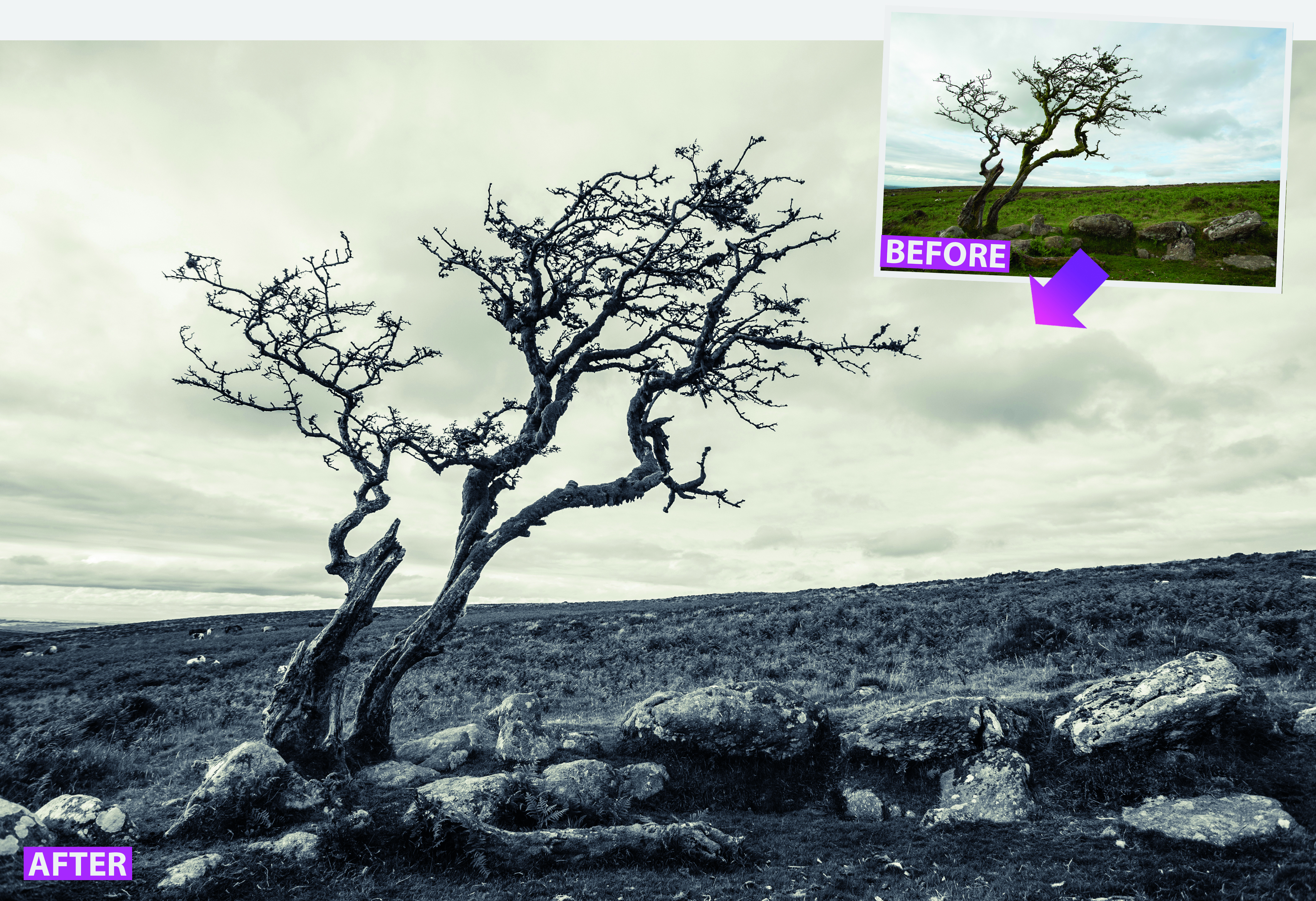
Landscape photographs shot on a dull day can lack impact due to drab colours, flat lighting and an absence of contrast. Interesting detail can be lost in the midtones. However, by using the Develop module in Lightroom you can tease out these details using the various sliders in the Basic panel. But you don’t need to stop there, as you can produce something much more striking – such as a dramatic high-contrast split-toned image.
Photographs that have had a monochrome conversion can look very striking and dramatic in their own right, but by reintroducing a hint of colour into the scene you can evoke specific moods – such as melancholy blue or nostalgic sepia – and add more variety. This has been done since the earliest days of photography, though nowadays software has replaced the complex chemical toners used to achieve the colour effect, and you can be much more precise with the tones you choose.
In this tutorial, we’ll show you how to use Lightroom’s Split Toning panel to independently tint a monochrome conversion’s shadows and the highlights with two distinct colours.
STEP BY STEP: Tint your photos
Discover Lightroom’s Split Toning panel to add impact to monochrome scenes
01 ADJUST THE EXPOSURE
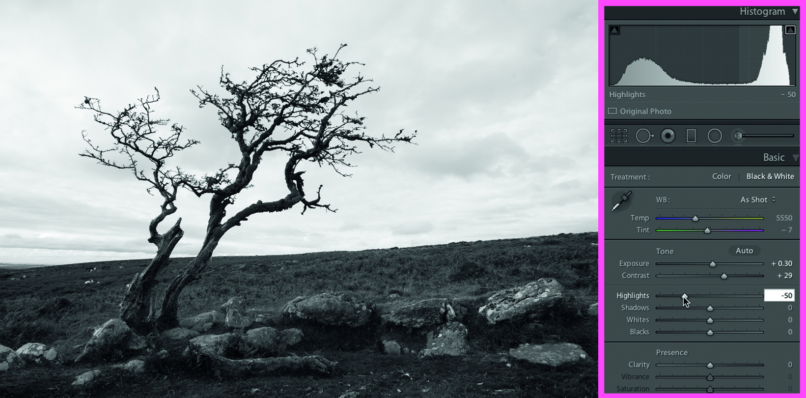
Take toning_start.dng into the Develop module. Click the Black & White tab in the Basic panel to desaturate the photo. The histogram shows a lack of midtone detail. Drag Exposure to +0.30 to brighten things up. Raise Contrast to +29 and drop Highlights to -50.
02 IMPROVE THE CONTRAST
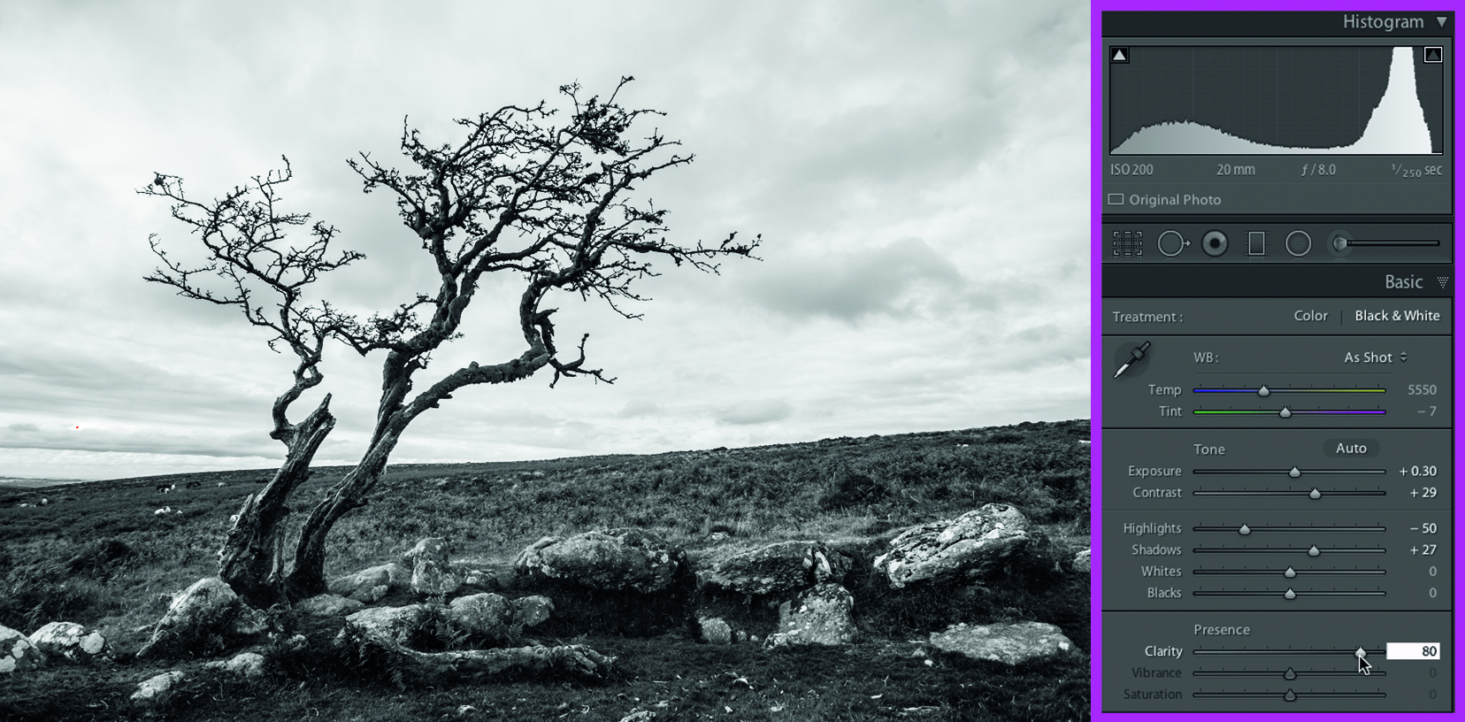
The tree stands out where it overlaps the sky, but the rest of the detail is lost in a mass of midtones. Drag Shadows to +27 to lighten the foreground and Clarity up to +80 to increase midtone contrast and reveal textures in the mossy rocks and blades of grass.
03 TINT THE HIGHLIGHTS
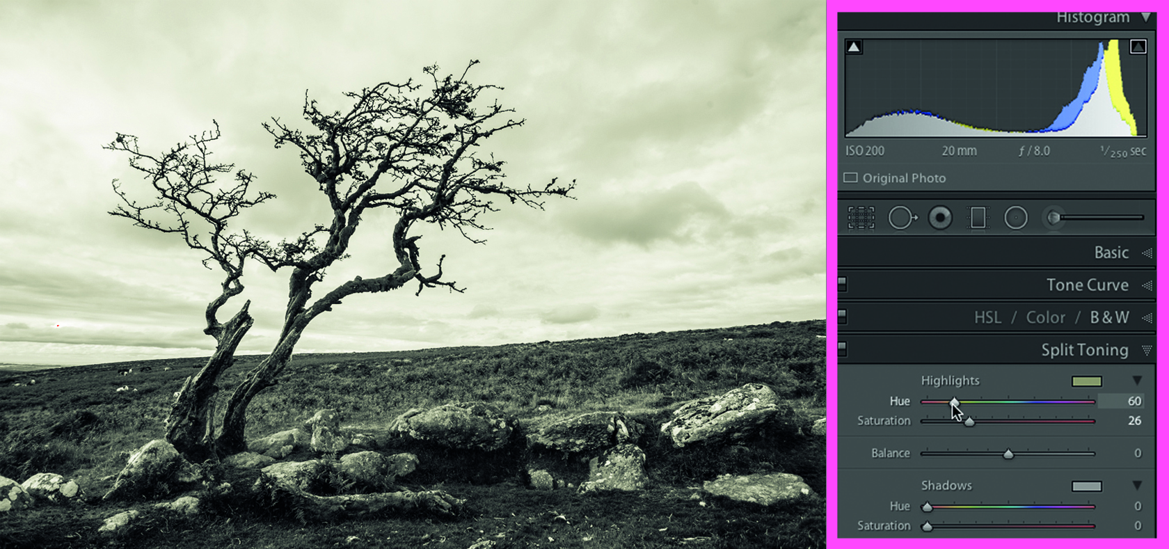
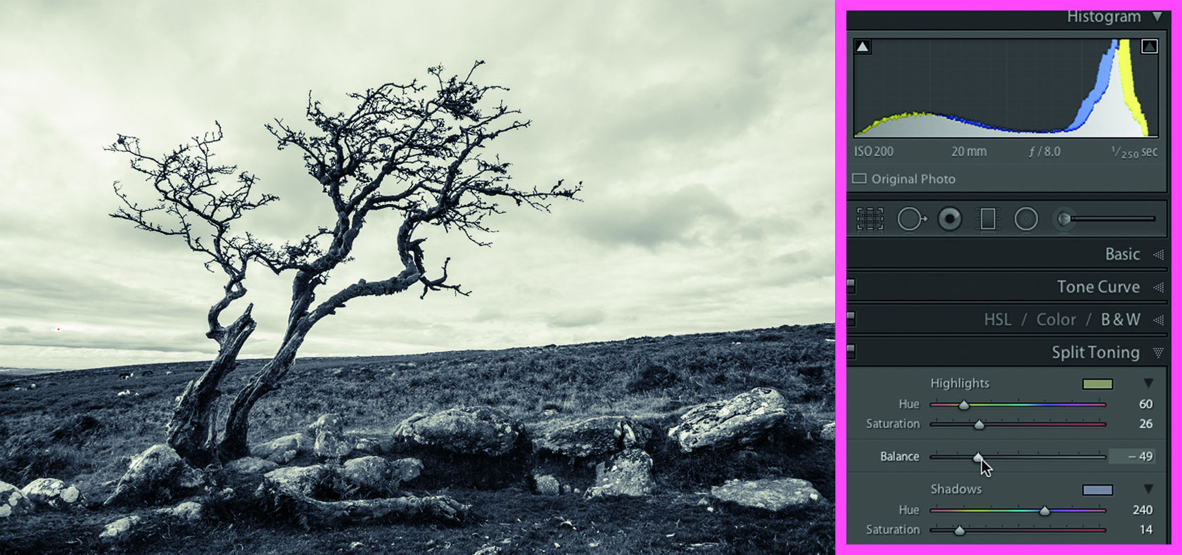
To add washes of colour to shadows and highlights, toggle open the Split Toning tab. In the Highlights section, drag Saturation to 26. By default this adds a red tint. Click the Swatch icon to sample a new colour, or drag the Hue slider to 60 to add a wash of sepia.
04 ADJUST THE BALANCE
Set the Shadows Saturation slider to 14 to reveal a little colour in the darker areas. Drag Hue to 240 for a subtle wash of purple. We now have a warmer sky that contrasts with the colder colours in the foreground. Drag Balance left to -49 to make the purple dominant.
TAKE IT FURTHER: Other looks to try
Experiment with the sliders in the Split Toning tab to achieve different effects

SATURATION
We’ve kept the original split-toned colours, but we’ve boosted the Saturation of both colours to 60 and reduced the Balance slider to 0. The stronger colours emphasise the contrast between the sky and land.

ALTERNATIVE
We used the colours from version one and the Saturation settings from version two, but pushed the Balance slider right to +46. This makes the highlight’s sepia more dominant, leaving a hint of purple in the shadows.

SURREAL
We set the Highlights Hue to 21 and Saturation to 64. The green Shadows have a Hue of 137 and a Saturation of 50. The Balance of +35 stops the midtones in the clouds from being tinted green.
Get the Digital Camera World Newsletter
The best camera deals, reviews, product advice, and unmissable photography news, direct to your inbox!
George has been freelancing as a photo fixing and creative tutorial writer since 2002, working for award winning titles such as Digital Camera, PhotoPlus, N-Photo and Practical Photoshop. He's expert in communicating the ins and outs of Photoshop and Lightroom, as well as producing video production tutorials on Final Cut Pro and iMovie for magazines such as iCreate and Mac Format. He also produces regular and exclusive Photoshop CC tutorials for his YouTube channel.

