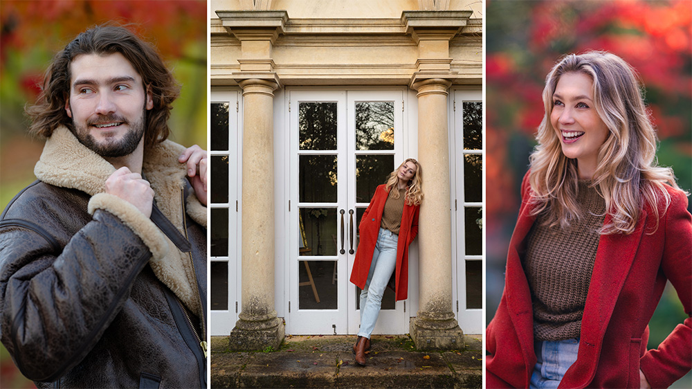
Transform your food photography at home with printed backdrops
Give your food photography an elegant yet consistent look by using printed backdrops in the background of your frame
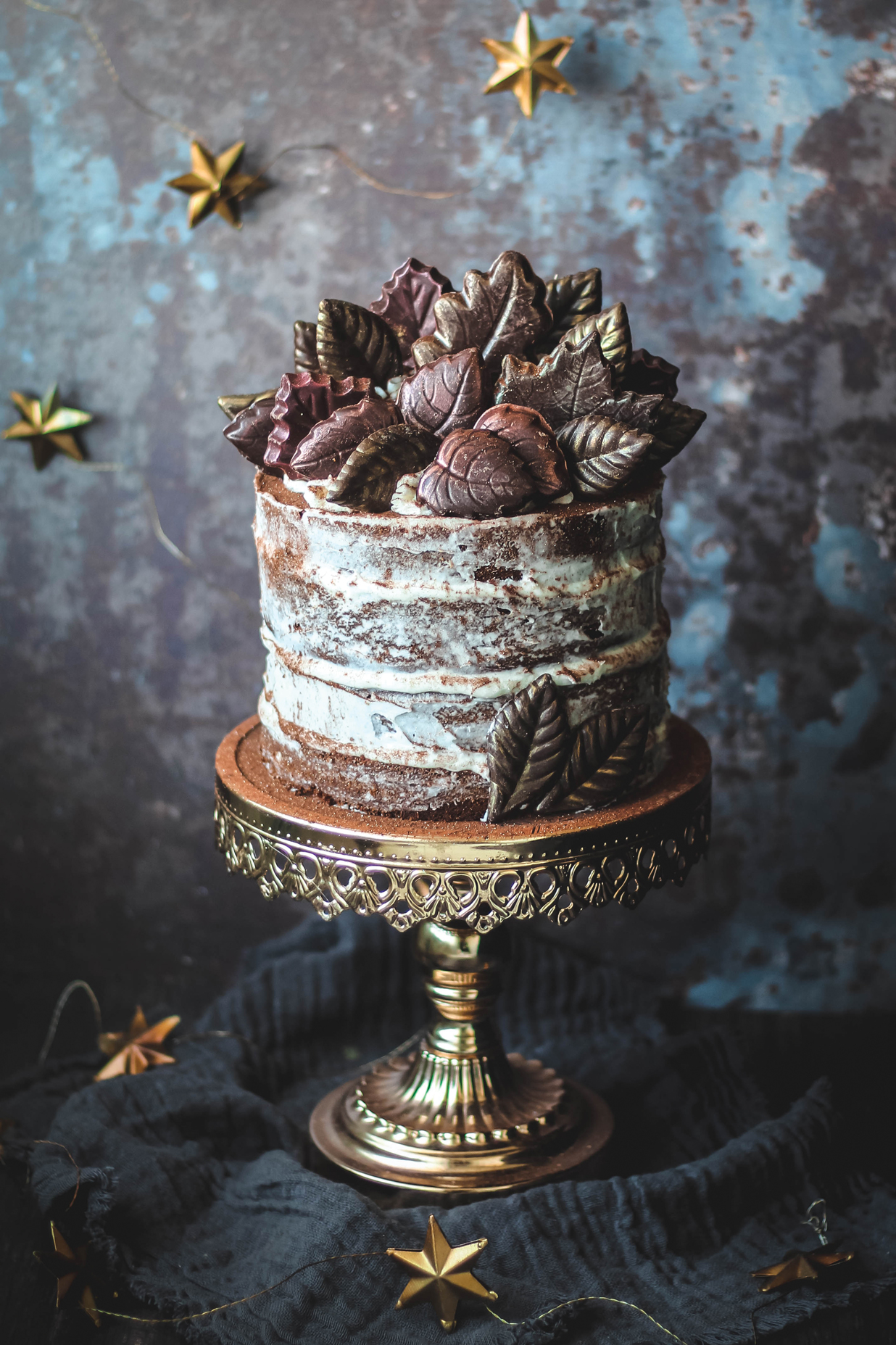
Modern food photography – from supermarket ads to Instagram posts – is awash with beautifully curated images of foodie scenes. Most of us love to eat delicious food, just as much as we love pouring over pictures of it, but taking professional shots can be more challenging than you’d think.
Successful food photographers and lifestyle bloggers know how to arrange setups and match colors to make the most enchanting scenes. They also use complementary textures and props behind their subjects to complete the mood of an image.
• Read more: 10 food photography tips
Food and props aside, if you want to instantly transform your own setups, shooting with a specialist background is a good place to start.
We’re not going to focus on how you should style a whole still life setup – as we’d need pages for that – but simply how to shoot and choose your settings and camera position to get the best results. Here’s how to get set up!
01 Choose your backdrop
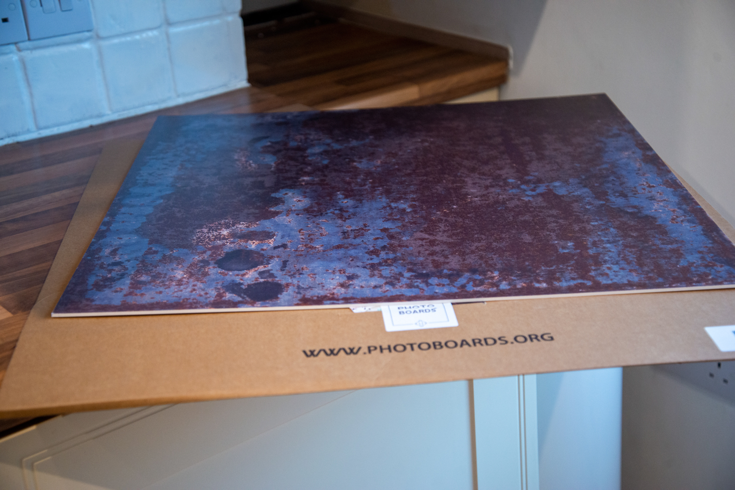
The right board depends on the look and feel you want, as well as the items in your frame. We chose a 60cm board called Foundry from Photo Boards, which had the effect of a rusted metal surface and suited a rustic cake.
02 Position the board
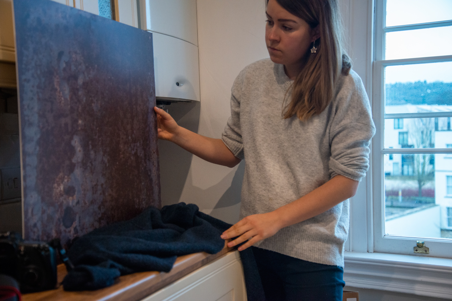
Stand your board on a work surface to act as a metal-effect background. For a realistic table and wall appearance, use two boards and ensure you can’t see any giveaway board edges in the shot.
03 Use window light
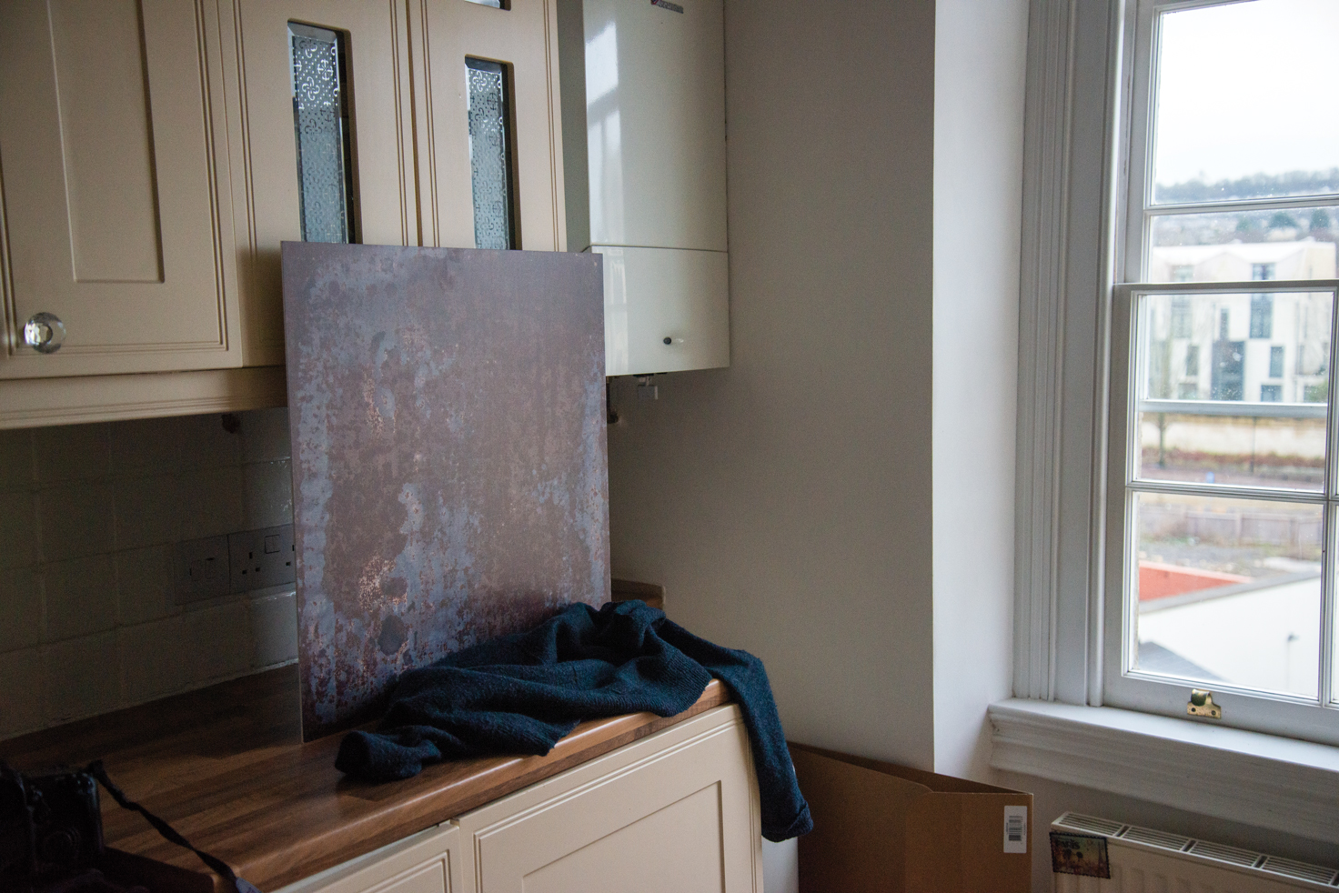
Setting up near a large window should give a more even spread of light, but avoid reflections on the board. Shoot your setup straight on (directly above for flat lay shoots), or from a 45-degree angle.
04 Don't get too close
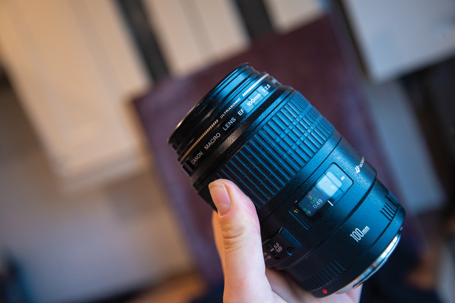
For the best results when using printed backdrops, don’t shoot them too closely or you’ll start to see the dots of the print. When we noticed this, we swapped our macro lens for a 50mm prime.
Read more: best lenses for food photography
05 Camera settings

In Aperture Priority mode, set a low ISO and a wider aperture such as f/3.5. Handheld shooting is more freeing for composition, but mount your camera on a tripod in dim light to avoid blur.
06 Fill the frame
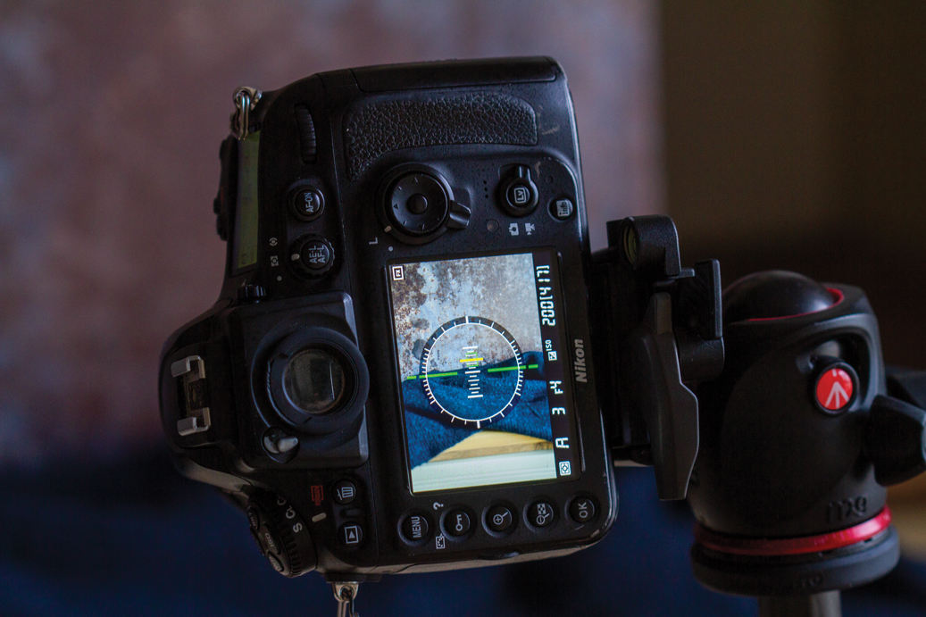
Use Live View mode to frame your scenes, filling the entire background area with the board so that you can’t see any edges. Shoot a few test images, then introduce the props when you’re happy.
Read more
Best camera for food photography
Best light tents for photography
Best flash diffusers, softboxes and modifiers for your speedlight
Best backdrops for photography: collapsible backgrounds for the home studio
Best books on food photography
Best green screen backgrounds
Get the Digital Camera World Newsletter
The best camera deals, reviews, product advice, and unmissable photography news, direct to your inbox!
Lauren is a writer, reviewer, and photographer with ten years of experience in the camera industry. She's the former Managing Editor of Digital Camera World, and previously served as Editor of Digital Photographer magazine, Technique editor for PhotoPlus: The Canon Magazine, and Deputy Editor of our sister publication, Digital Camera Magazine. An experienced journalist and freelance photographer, Lauren also has bylines at Tech Radar, Space.com, Canon Europe, PCGamesN, T3, Stuff, and British Airways' in-flight magazine. When she's not testing gear for DCW, she's probably in the kitchen testing yet another new curry recipe or walking in the Cotswolds with her Flat-coated Retriever.
