More lockdown projects
• Home photography projects
• Photo projects to try indoors
• Photography tips, tutorials and videos
Useful home photography kit
• Best tripods
• Best lighting kits
• Best reflectors
• Best macro lenses
It can be difficult to attract a lot of eyeballs to your content on Instagram. Engagement for users across the board began to fall off a cliff not long after the platform was sold to Facebook, because Facebook’s business model favors ‘pay to play’ – which means that if you want your stuff to be seen, you’ve got to pay to boost your content.
Read more: 20 famous photographers you should follow on Instagram
However, it’s a trap set for your ego – one that you can avoid with a little perspective shift. Please remember that you shouldn't be focusing on the number of likes and comments you get; doing so can be depressing.
Instead, we’d like to encourage you to treat Instagram in a completely new way. It’s time to start thinking of Instagram as your pocket portfolio; treat your whole Instagram grid as a digital calling card, that showcases your journey and capabilities as a creative.
• 5 steps to becoming a pro content creator on Instagram
Top tips for Instagram
Think in threes
Theming your posts gives an impression of who you are as a creative. Triptychs and ‘rule of threes’ posts are common approaches: you can share three images from the same shoot at a time, or post three images that are connected in some other way (such as by subject, color or location). Aesthetically, it’s very clean and enables you to organize your posting schedule in advance. The downside is that unless you post three images in relatively quick succession, your grid can look disjointed.
Go behind the scenes with Carousel
Being shareable is one of the keys to building a following on any platform. Take advantage of the Carousel function in Instagram to show people how you set up and nailed your best content. People are more likely to save and share your posts if they can learn from them.
The best camera deals, reviews, product advice, and unmissable photography news, direct to your inbox!
Add a location guide
Have you ever wondered where a shot was captured, but you don't know as the photographer didn’t tag the location? Don’t be that person! Add some additional pictures to your post to show people where it was taken and how you found it. Use the caption to tell a story about the place and the process.
Share knowledge
The same principle applies to sharing behind-the-scenes images and videos. Grabbing people’s attention with a beautiful portrait, stunning landscape or product shot is great – but sharing your lighting and settings insights in the carousel elevates the value of your post tenfold to other users, especially if you add a detailed caption.
Design and upload a creative Instagram grid
01 Starting your layout
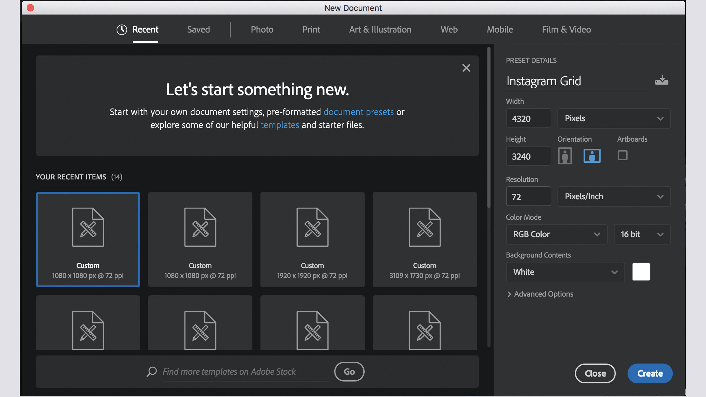
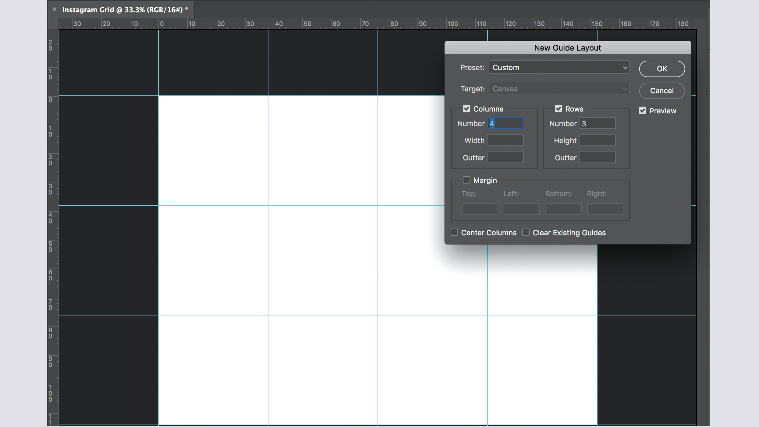
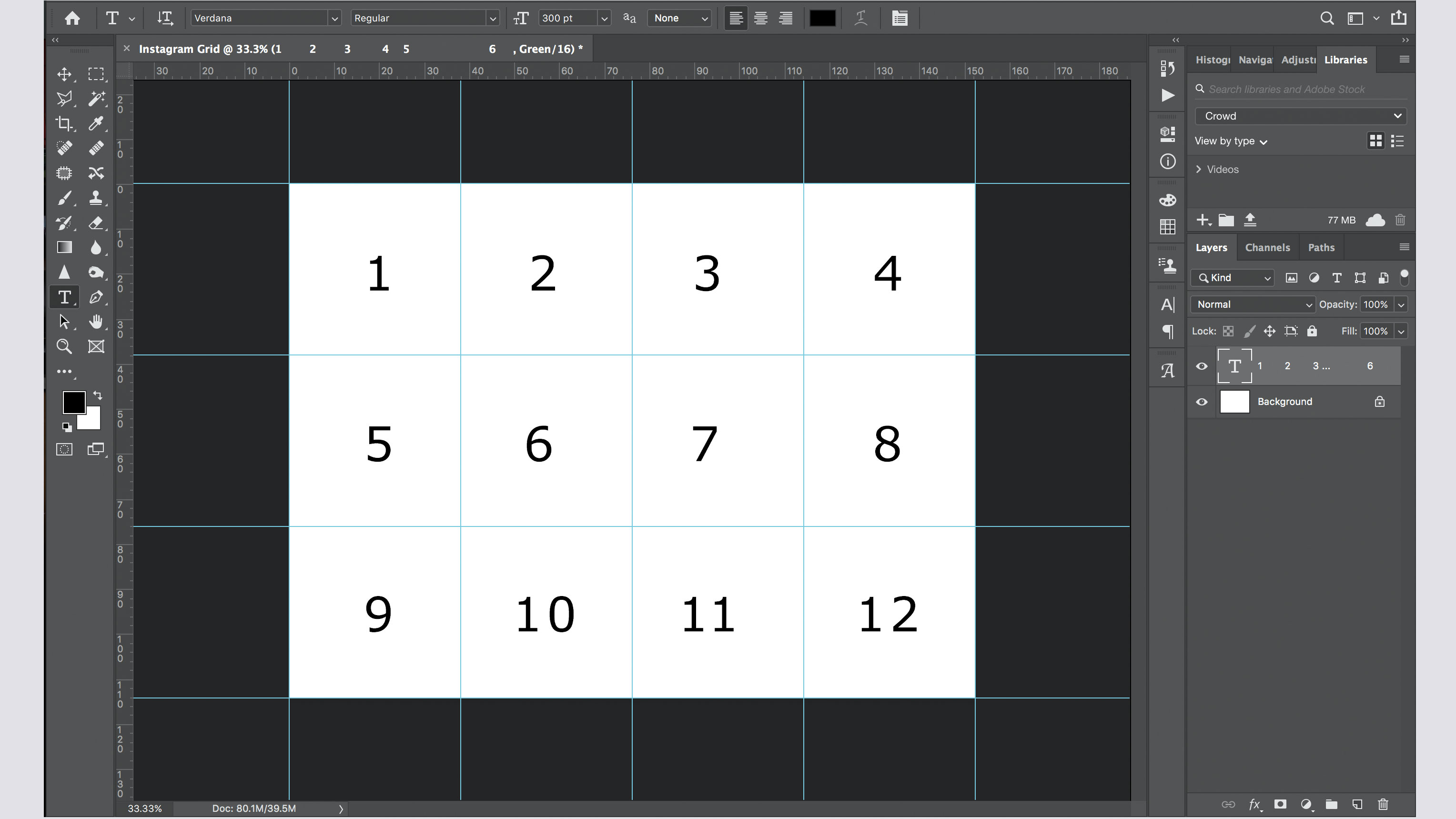
Using Photoshop, create a new file. Set your Width to 4,320 Pixels and Height to 3,240. Set Resolution to 72. Select View > New Guide Layout with 4 Columns and 3 Rows, with Gutter set to 0. You should now have a blank document with 12 boxes outlined by the guides. Use a new text layer to number these squares from 1 to 12, from left to right.
02 Begin your blend
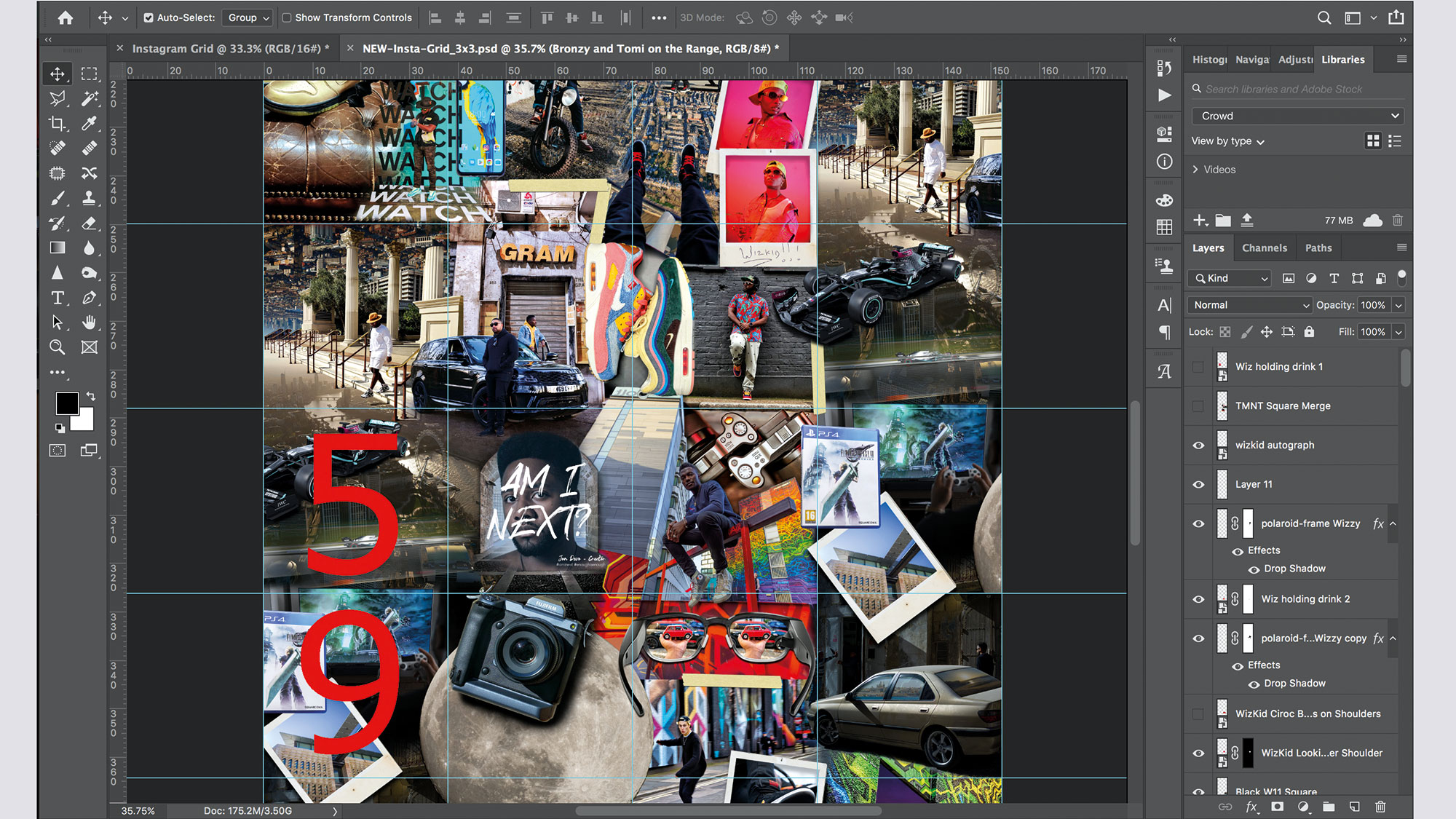
Populate the first three columns, blending your images as creatively as you can. Try to obscure the edges of each picture. Cut out sections and blend them using masks and brushes. You can also use elements such as tape, frames or torn paper. In my grid you can see I’ve used analogue film elements to frame, blend and overlay pictures, connecting each frame. For inspiration, approach the grid like a scrapbook – but remember to keep the fourth column empty…
03 Feel the flow
Once your grid is starting to look the part, duplicate all your layers and merge them. Use the Marquee Tool to copy square 9, then paste it and drag it to square 8. Do the same with square 5, placing it in square 4. To make sure that these squares continue the flow of your design, you now need to blend them with squares 3 and 7, using the same techniques you’ve been using to create your design so far.
04 Bring it together
When you’ve finished, duplicate and merge your active layers. Grab the Slice Tool, then click Slice From Guides in the tool options bar above your image. Select File > Save For Web and Devices (Export > Save For Web in some versions). In the dialog box, select PNG-24. Click Save.
In the Save dialog box select Images Only under Format and All Slices under Slices. There will be 11 images in your folder. Delete image 9 and image 5, as they are not the blended squares.
05 Testing your new grid
Transfer the images to your phone or tablet and download a free app called Preview: Planner for Instagram. Log in to your Instagram account, and Preview will allow you to preview your uploads. Once you’re happy, you can begin publishing your images.
The key to this method is planning ahead, creating visual elements like tape and paper tears. Always keep this in mind when you’re out shooting. Try to capture shots that enable you to crop, frame and blend creatively. Most of all, have fun exploring and experimenting.
Read more
The best cameras for Instagram: take your gram game to the next level!
10 tips for Instagram success with your photography
Best free Instagram Stories templates for photographers
Jon is a gadget reviewer, content creator and influencer. He spends his time reviewing products, covering technology news, giving talks on content strategy and creating content in partnership with a wide variety of forward-thinking brands. He also contributes to commercial radio, as well as in national print newspapers and magazines.


