Lightroom series part 1: How to recreate print toning effects in Lightroom
Find out why Lightroom is called a Digital Darkroom: how to make sepia prints, duotones and more

Stuck indoors during the coronavirus crisis? We're determined to help you make the best of it, as we republish a full 32-part Lightroom series first shown in Digital Camera magazine. We also have a 5 issues for $5/£5 special subscription – scroll down to the bottom of this article for more.
And if you don't yet have Lightroom Classic CC, we follow this with advice on the best Adobe Photography plan – and the best deal is definitely not the most expensive!
In this first installment of Lightroom tutorials, we look back in time to the early days of photography. Photography began in black and white, using glass plates. It then moved on to printing to paper from negatives. The main issue with printing was the longevity of the print, so often additional chemicals were used to lengthen the life of a print. These chemicals usually stripped the silver from the print, changing the colour.
This gave rise to tones that are familiar to anyone looking at older photos from a pre-digital era, right back to the start of printing. We see these as the brown-yellow look of sepia toning or the red-purple of selenium toning. Other processes used gold or platinum to enhance the print.
Fortunately, we don’t have to use the messy chemicals any more: we can achieve these looks easily in Lightroom using the Split Toning Panel.
• See more Lightroom tutorials
Split toning
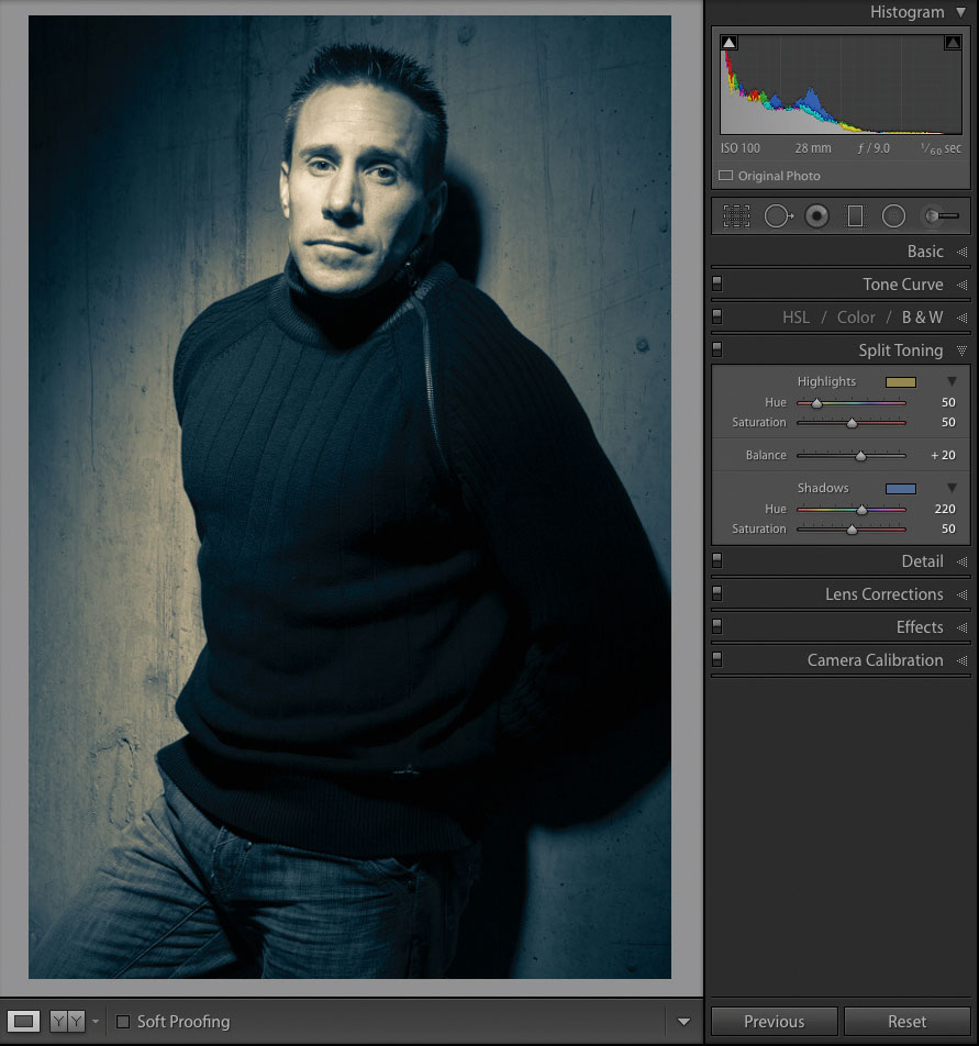
Split toning is where you use different toners to affect different parts of the image. A good approach is to cool down the shadows and warm up the highlights. (See the Split Toning panel below) For warm Highlights, try Hue 50, Saturation 50. For cool Shadows, try Hue 220, Saturation 50. If you think you need to emphasise the Highlights more, you can try changing the Balance setting to 20.
The Split Toning panel layout
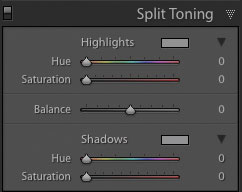
The five sliders in Split Toning are divided into three sections: Highlights with a Hue and Saturation slider; Shadows with a Hue and Saturation slider; and Balance, to control which of the Shadows and Highlights sliders has the greatest effect. Hue controls the toning colour, while Saturation controls the strength of that colour.
Our finished image
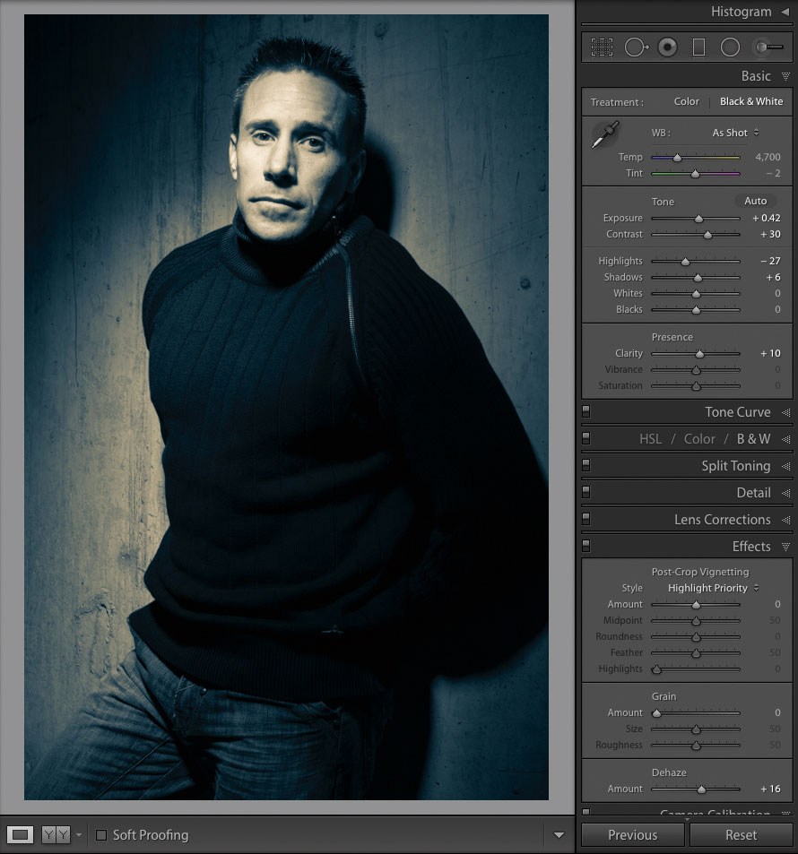
To create our final image, we need to add some punch to draw out more character. For this, we use three sliders: Contrast to increase the level of shadows and highlights (+30); Clarity to increase mid-tone contrast and make the image more gritty (+10); and finally, Dehaze, which increases contrast and saturation in a distinctive way and can also be used on non-hazy images (+16)!
To see any Hue shift, you need to have some level of Saturation set. A quick way of working the Hue sliders in both Highlights and Shadows is to hold down Alt as you drag the slider. This creates the effect of showing Saturation at 100, allowing you to see the colour change. Releasing the Alt key turns off the effect.
Try cross-processing
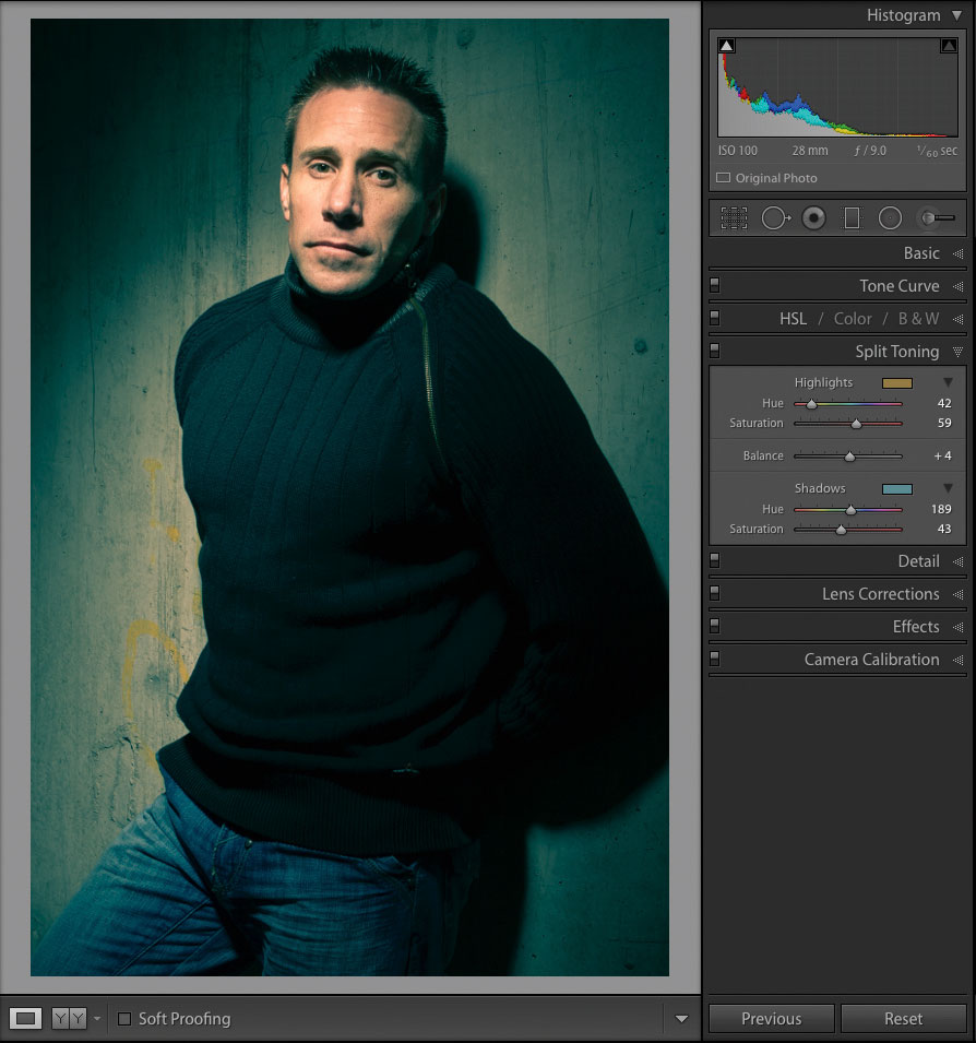
Toning isn’t limited to black- and-white photographs. Before Lightroom had a Point Curve option, the Split Toning Panel held the only tool available to emulate looks like film cross-processing.
Cross-processing is a technique where slide or negative film is processed in the wrong chemicals, giving wacky colour and contrast shifts. It was loved in the fashion world. As all things retro are still in vogue, you can do it yourself with Split Toning. With your colour image, try using a green-blue Hue in the Shadows and red-orange-yellow for the Highlights hue. Think of the teal-and-orange look you see in so many films now.
Sepia toning
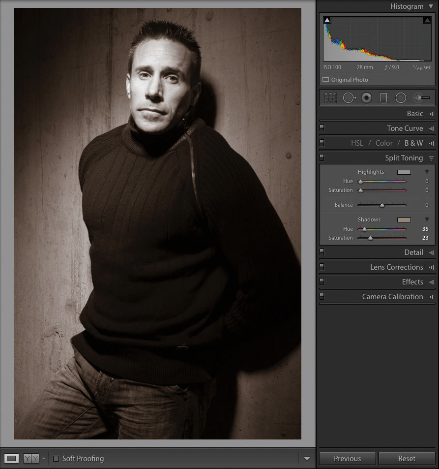
For single-toned images like Sepia or Selenium, I find using just the Shadows section works well. For Sepia, first make the image black-and-white by pressing V. Set Hue between 25 and 40, and Saturation to taste. Personally I prefer lower values, around 20-25. The Highlight tone is set by the paper, which is usually white, so we don’t need to set it.
Selenium toning
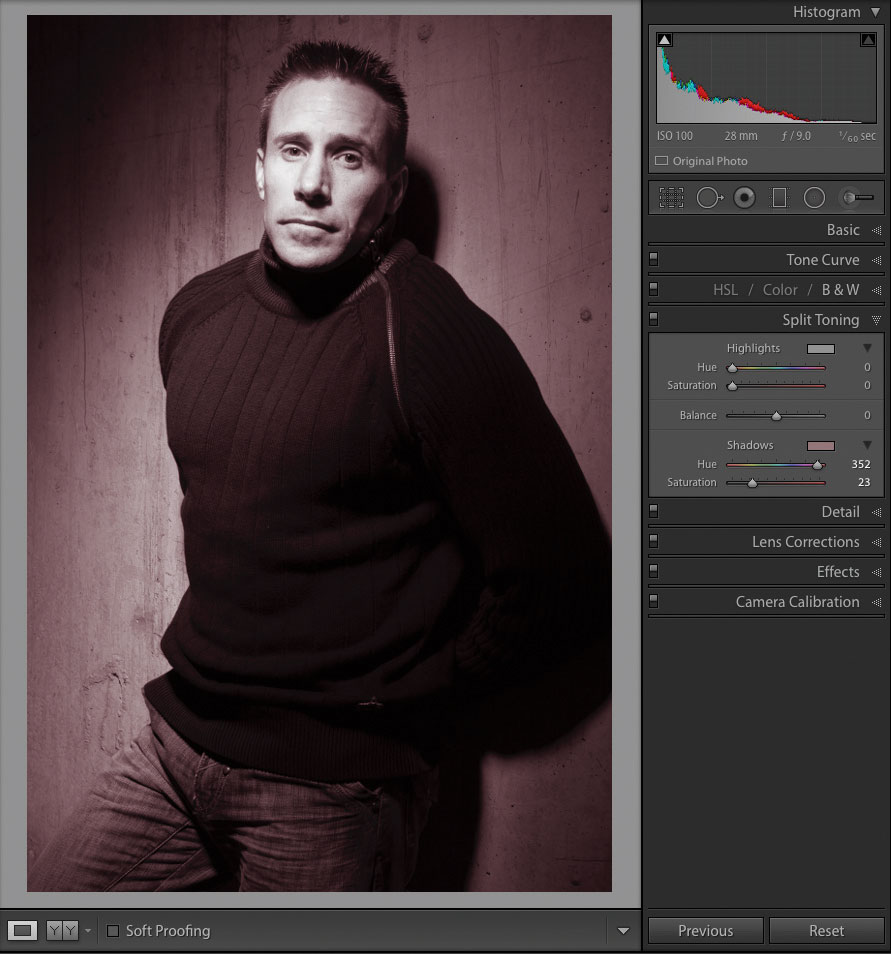
Selenium Toning is more reddish or purple. To start, make the image black-and-white. The best Hue settings for this effect are the extreme ends of the slider, from 0-10 or 340-360: these have a wider range of colour than a sepia-toned image. You don’t need to be extreme with Saturation: try 20-25. Try out higher settings, though: your taste may be different to mine.
About Digital Camera magazine
This tutorial originally appeared in Digital Camera Magazine, the monthly newsstand magazine for all photographers. Why not subscribe to a print edition, and have the magazine delivered direct to your door every month?
Alternatively, we have a number of different digital options available, including:
• Apple app (for iPad or iPhone)
• Zinio app (multi-platform app for desktop or smartphone)
• PocketMags (multi-platform app ideal for Android devices)
• Readly (all-you-can-eat digital magazine subscription service)
If you wanted a printed version of any of our most recent issues we have a selection of back issues to choose from in our online store.
How to get Adobe Lightroom
Adobe Lightroom is available in two versions: the regular Adobe Lightroom Classic CC designed for desktop users, which is what we cover in this series, and a new cloud-based Adobe Lightroom CC, which stores your files online and offers a similar but reduced set of features. For regular desktop users we recommend Adobe Lightroom Classic CC.
Adobe offers three subscription based Photography Plans which you can click on below. We recommend either the regular Photography Plan, or the Photography Plan (1TB) which costs more but comes with 1TB online storage in case you decide to go with Lightroom CC.
For this set of tutorials and for anyone who likes to work on a single main computer, we recommend the regular Creative Cloud Photography Plan. This is the cheapest way to get started AND it comes with Photoshop CC too.
Read more:
• This is the best photo-editing software today
• These are the best laptops for photographers right now
• We help you choose the best desktop computers for photo editing
• How to download Lightroom and try it for free
Get the Digital Camera World Newsletter
The best camera deals, reviews, product advice, and unmissable photography news, direct to your inbox!
Sean McCormack is a commercial, and editorial photographer, book author, and regular contributor to Digital Camera magazine based in Galway, Ireland. He has extensive experience with Lightroom, dating back to its original beta version, and has tried out just about every plugin and preset available. His latest book is Essential Development 3: 25 Tips for Lightroom Classic’s Develop Module.

