Lightroom series part 21: Correcting lens and perspective distortions in Lightroom
If your building shots are looking squiffy, Lightroom can fix your images so that everything is looking nice and straight
The best camera deals, reviews, product advice, and unmissable photography news, direct to your inbox!
You are now subscribed
Your newsletter sign-up was successful
Architecture and cityscapes are fantastic things to photograph. Often you’re shooting them in tight spaces, though, which means you’re forced to point the camera up in the air. This makes the parallel lines of a building converge in, and looks odd at the best of times.
Welcome to the 21st instalment of our Lightroom series, first published in Digital Camera magazine (see below for subscription offers).
If you are already a Lightroom user, you could discover some new tricks and processes you haven't tried yet. If you don't use Lightroom, then scroll down to the bottom where you'll discover how to get it and which Adobe Photography Plan is best.
Unless you’re shooting architectural shots professionally, it’s hard to justify the expense of tools like tilt-shift lenses, which use sophisticated optics to help keep the vertical lines straight. Fortunately, Adobe has been working away to provide tools that can help correct for this distortion of perspective.
• See more Lightroom tutorials
1. Apply a lens profile
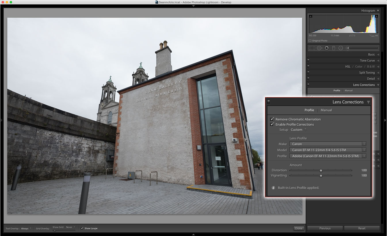
The first step is to apply a lens profile in the Lens Correction panel. As this was shot with a Fujifilm camera, an internal profile has been applied automatically. For other cameras, the lens should be detected automatically: if it isn’t, select it from the list.
2. Ready to apply fixes
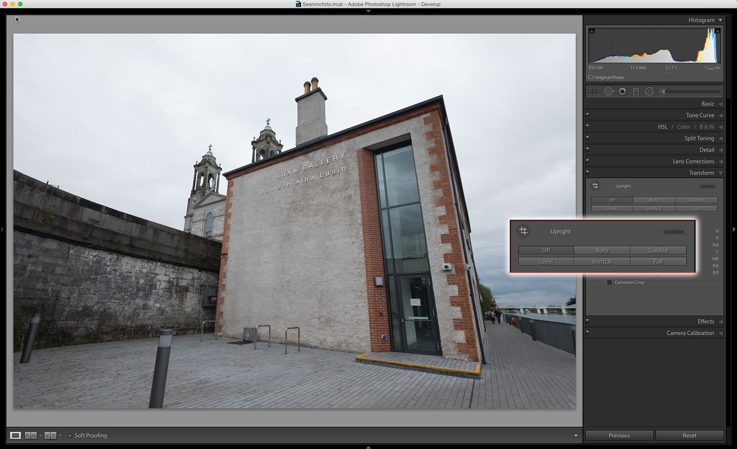
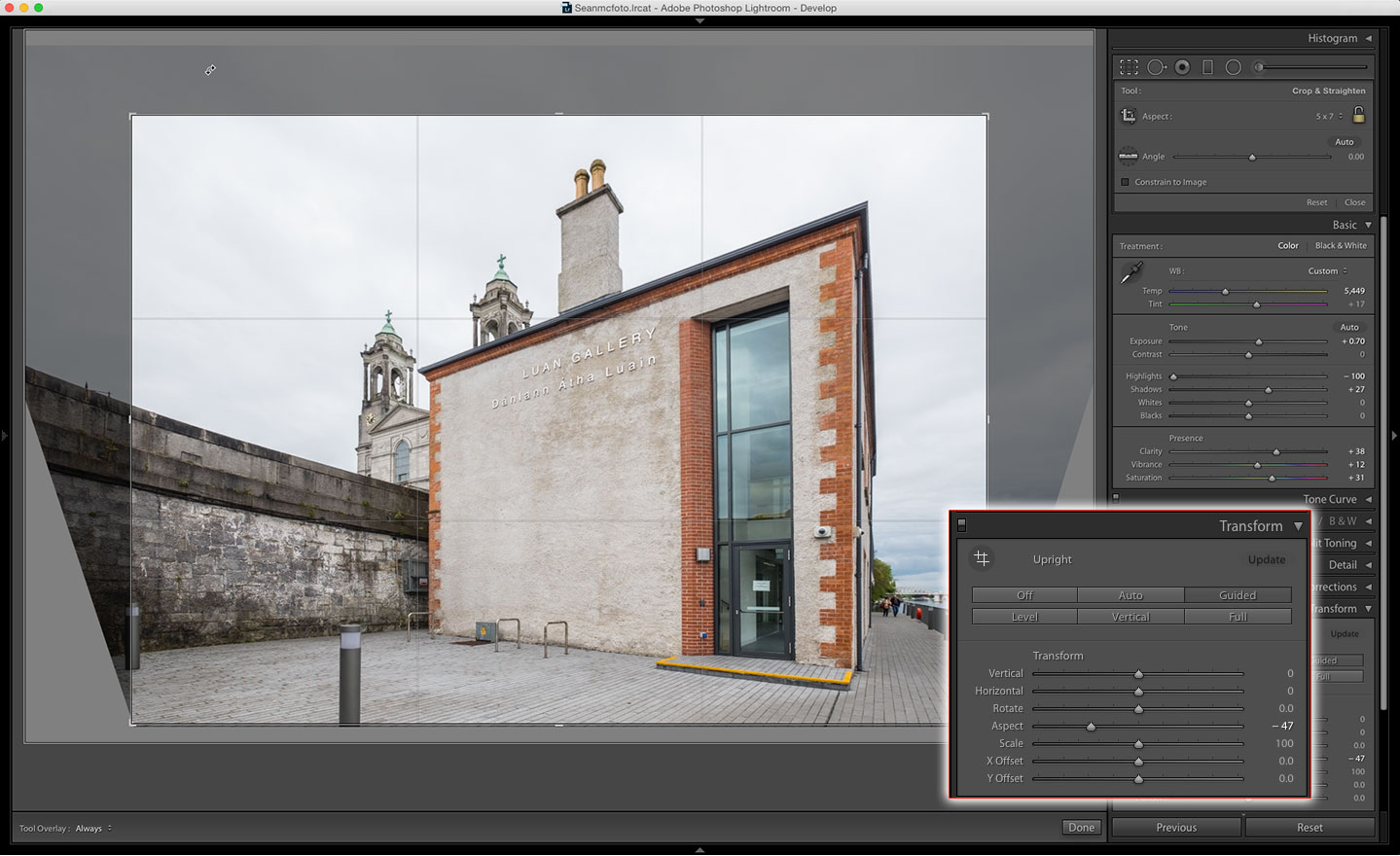
Now go to the Transform panel, where you’ve a range of options to choose from. Level fixes rotation issues; Vertical fixes converging verticals only; and Auto combines these. Full attempts to fix all issues. Guided allows you to drag out lines on the image corresponding to straight lines in the photo.
The best camera deals, reviews, product advice, and unmissable photography news, direct to your inbox!
3. Start with Auto
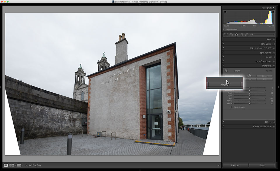
Unless you need to fix only the levelling, you should try the Auto button first. If you’re face onto a building, Full can often yield a better result. In this case, Auto looks OK, but perhaps we can get a better result with Guided...
4. Guided options
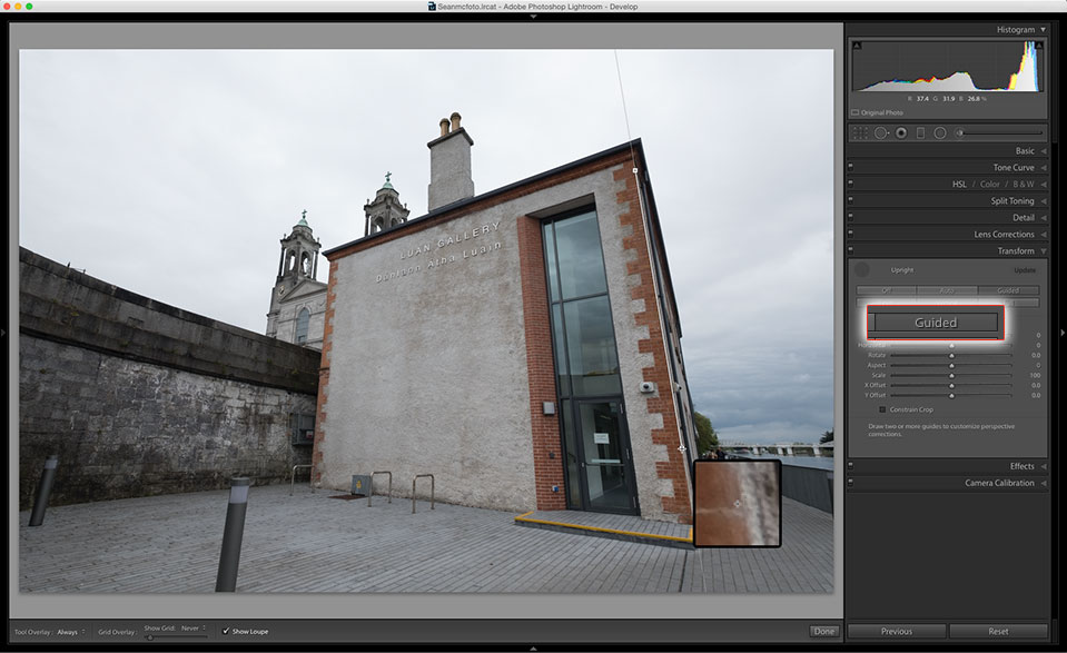
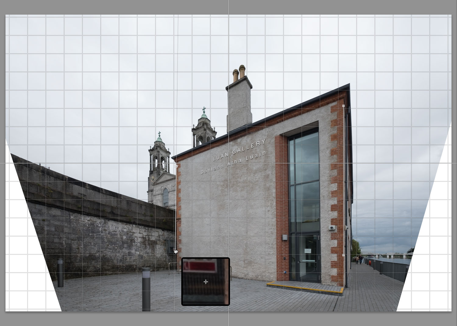
Pressing Guided, or clicking on the Guided tool on the top left of the panel opens the Guided panel. Start by clicking on one edge of what you know to be a straight edge and drag down to the far side of that edge. From the Toolbar, choose Show Loupe to have a zoomed-in view of the edge.
5. Guided tweaks
Repeat this on a second edge. Guided uses up to four edges, but will work with just two. Four is great for a face-on image, but as this one isn’t face-on, two will suffice. To better see how the edges are lining up, turn on the Grid from the Toolbar.
6. Finishing touches
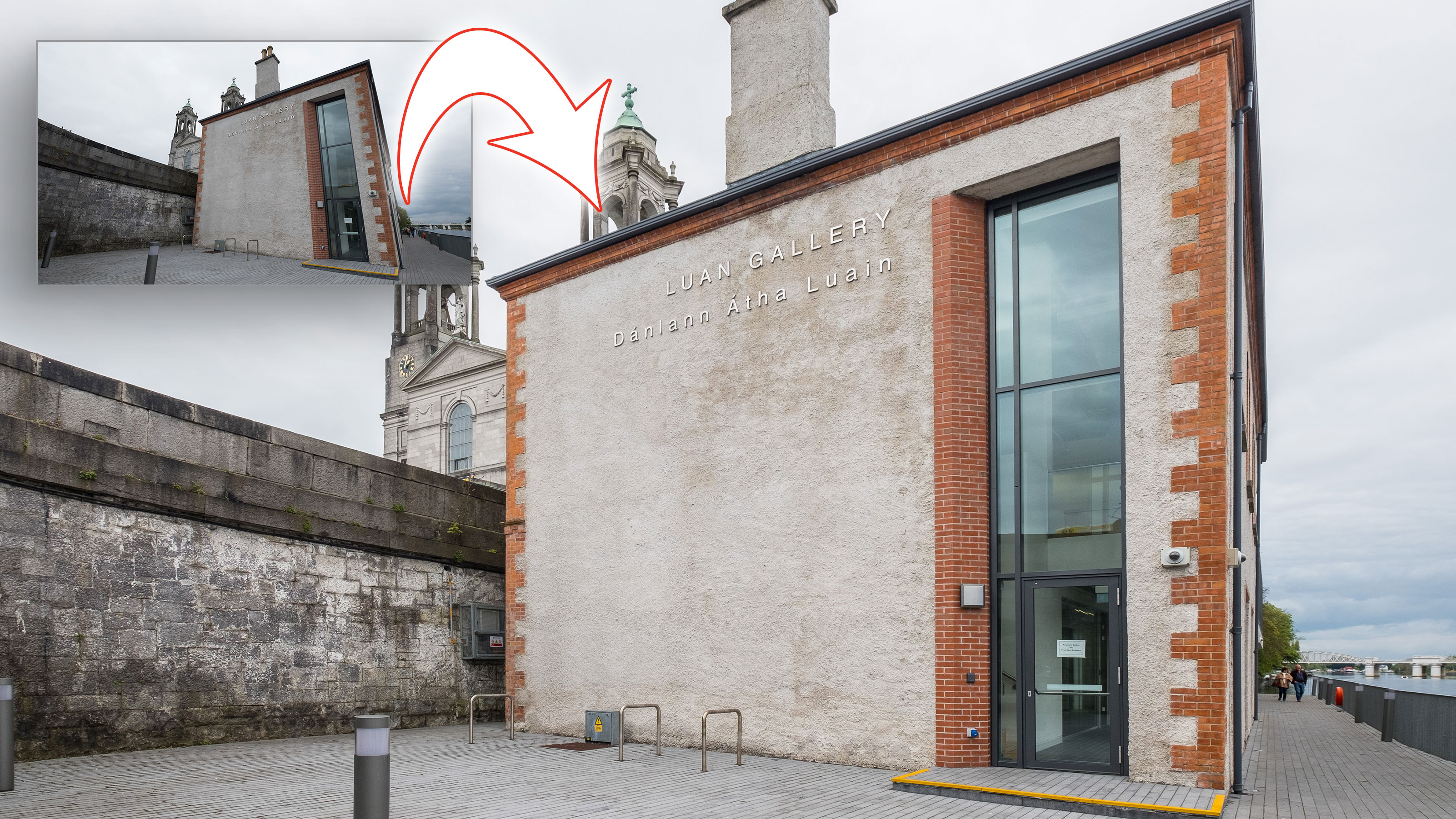
Fixing perspective issues can lead to either a squished or stretched-looking building, so use the Aspect slider to correct this. Finally, press R for Crop. Click the lock to unlock the aspect ratio and drag the crop handles to get the best crop from the photo. Edit the image for a finished look.
Expert tip: Prepare for correction
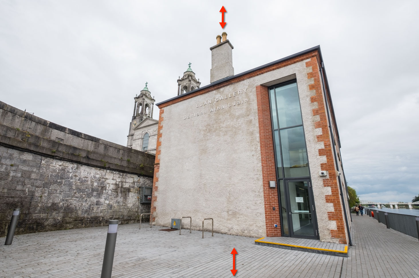
Perspective correction in post-processing changes pixels and often removes parts of the images. You can mitigate this when you take the original shot, however. If you’re shooting indoors, place the camera a little above mid-room height and keep it level and centred. This will help keep the line straighter with less cropping needed. For outdoors, get the camera as high as possible and leave room at the top and bottom for cropping. Try not to have the lines bend in too much. This is harder in tight spaces, but can save time later. In processing, there’s another slider in Transform that can help: Scale. Use this to zoom out and help get more room for cropping later.
About Digital Camera magazine
This tutorial originally appeared in Digital Camera Magazine, the monthly newsstand magazine for all photographers. Why not subscribe to a print edition, and have the magazine delivered direct to your door every month?
Alternatively, we have a number of different digital options available, including:
• Apple app (for iPad or iPhone)
• Zinio app (multi-platform app for desktop or smartphone)
• PocketMags (multi-platform app ideal for Android devices)
• Readly (all-you-can-eat digital magazine subscription service)
If you wanted a printed version of any of our most recent issues we have a selection of back issues to choose from in our online store.
How to get Adobe Lightroom
Adobe Lightroom is available in two versions: the regular Adobe Lightroom Classic CC designed for desktop users, which is what we cover in this series, and a new cloud-based Adobe Lightroom CC, which stores your files online and offers a similar but reduced set of features. For regular desktop users we recommend Adobe Lightroom Classic CC.
Adobe offers three subscription based Photography Plans which you can click on below. We recommend either the regular Photography Plan, or the Photography Plan (1TB) which costs more but comes with 1TB online storage in case you decide to go with Lightroom CC.
For this set of tutorials and for anyone who likes to work on a single main computer, we recommend the regular Creative Cloud Photography Plan. This is the cheapest way to get started AND it comes with Photoshop CC too.
Read more:
• This is the best photo-editing software today
• These are the best laptops for photographers right now
• We help you choose the best desktop computers for photo editing
Sean McCormack is a commercial, and editorial photographer, book author, and regular contributor to Digital Camera magazine based in Galway, Ireland. He has extensive experience with Lightroom, dating back to its original beta version, and has tried out just about every plugin and preset available. His latest book is Essential Development 3: 25 Tips for Lightroom Classic’s Develop Module.
