Lightroom series part 29: How to 'insta-fy' a photograph in Lightroom
Avoid manufactured social media filters and create your own Instagram-inspired look – one you can adapt over again

The best camera deals, reviews, product advice, and unmissable photography news, direct to your inbox!
You are now subscribed
Your newsletter sign-up was successful
There's no doubt that the popularity of filters in social-media photos won’t be going away any time soon.
Often the looks you get are ‘take it or leave it’, with little in the way of options. Wouldn’t it be much better to make your own looks that you can use again and again? That’s where Lightroom comes into play. By using the tools in its Develop module, you can get a look you like – and, even better, know how to tweak it for different photos.
It’s also easy to get the photos onto your device using Lightroom CC for mobile devices, and posting from there to your favourite social media accounts.
Welcome to the 29th instalment of our Lightroom series, first published in Digital Camera magazine (see below for subscription offers).
If you are already a Lightroom user, you could discover some new tricks and processes you haven't tried yet. If you don't use Lightroom, then scroll down to the bottom where you'll discover how to get it and which Adobe Photography Plan is best.
• See more Lightroom tutorials
1. Fix the basics
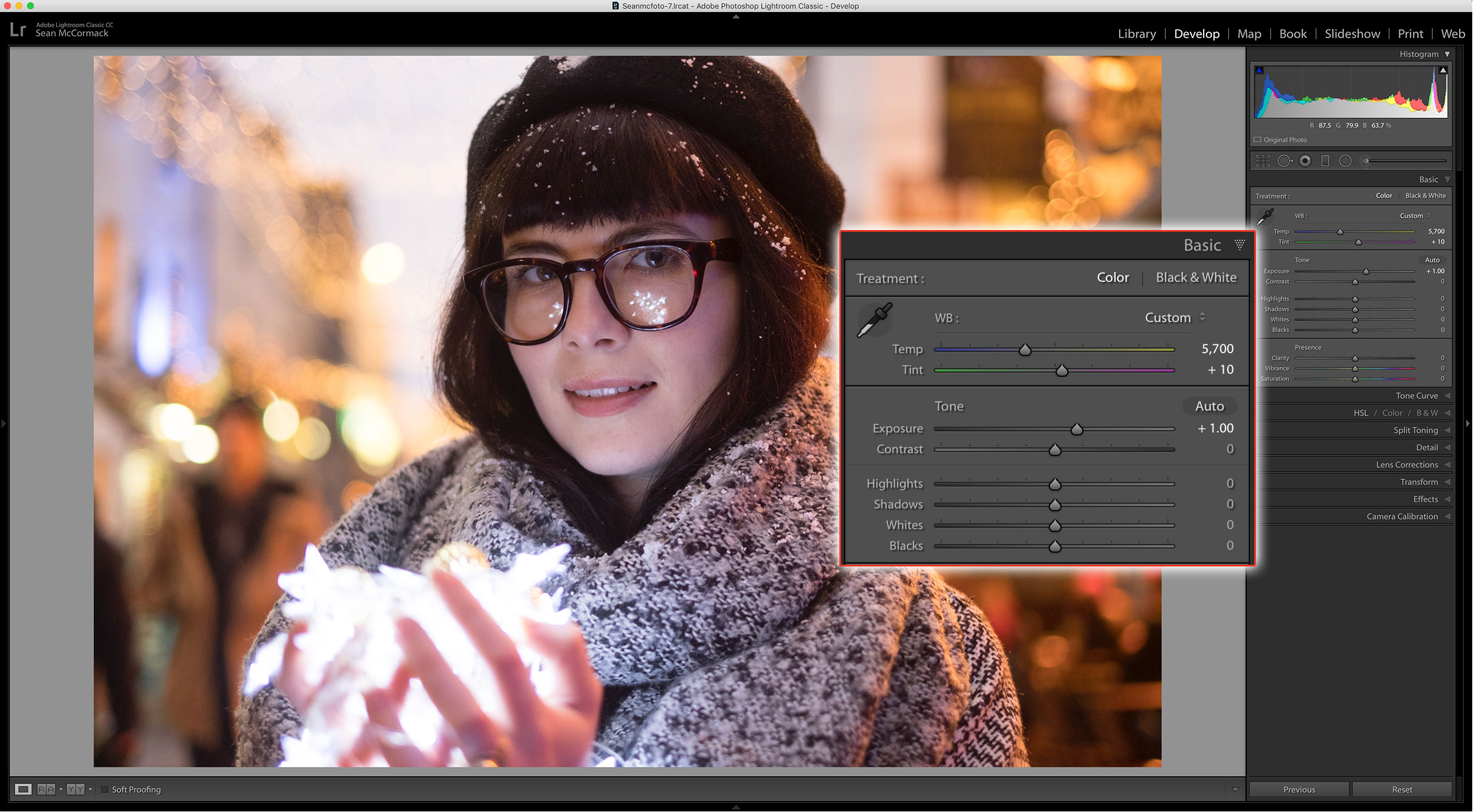
Start with fixing your exposure and white balance. A boost to Temperature warms up the colder tones from the LED lights here. Dropping Tint to +10 removes some of the magenta. Exposure of +1 brightens the photo suitably.
The best camera deals, reviews, product advice, and unmissable photography news, direct to your inbox!
2. Adjust the Blacks
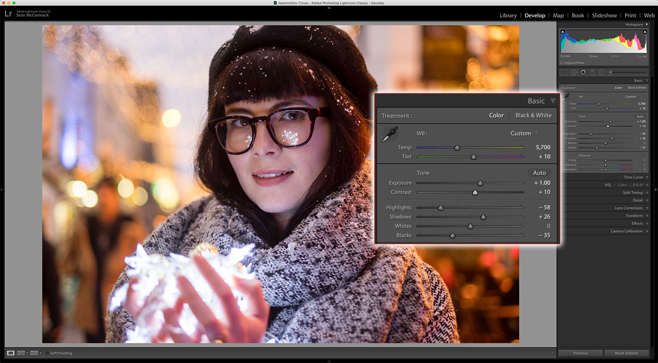
To enhance the punch in this image, I increase Contrast to +10. To open up the tones a little, I turn down Highlights; I’ve gone for -58. I also open up Shadows to +26. An unwanted side effect is loss of tonal depth, so turn down Blacks to -35.
3. Tone Curve panel
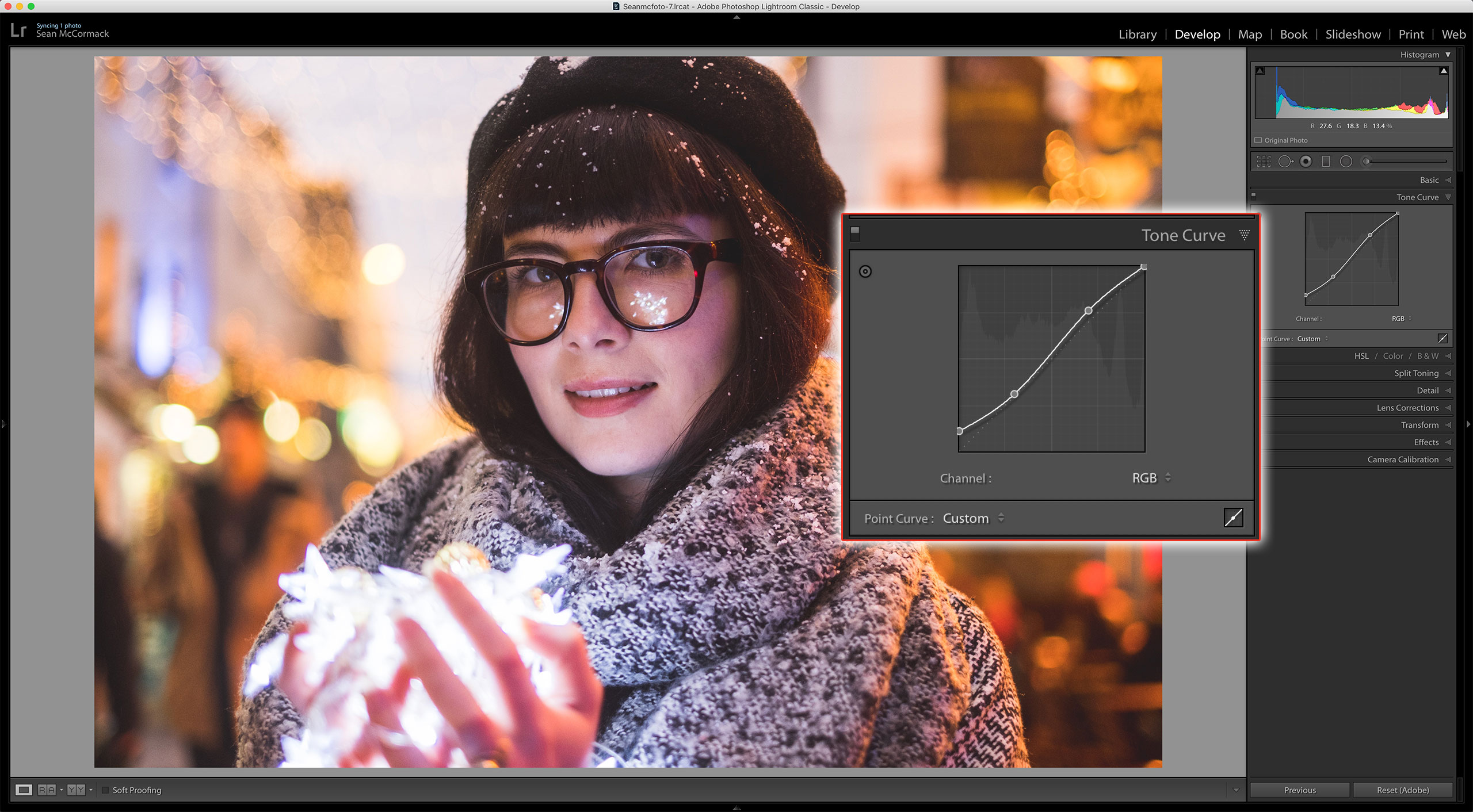
In the Tone Curve panel, I click the icon in the bottom-right to open the Point Curve. One quarter of the way in from the left, I click the line. Now I drag the leftmost part of the line up. This will give a faded look. I boost the top part of the curve to bring some contrast back.
4. Add a dash of color
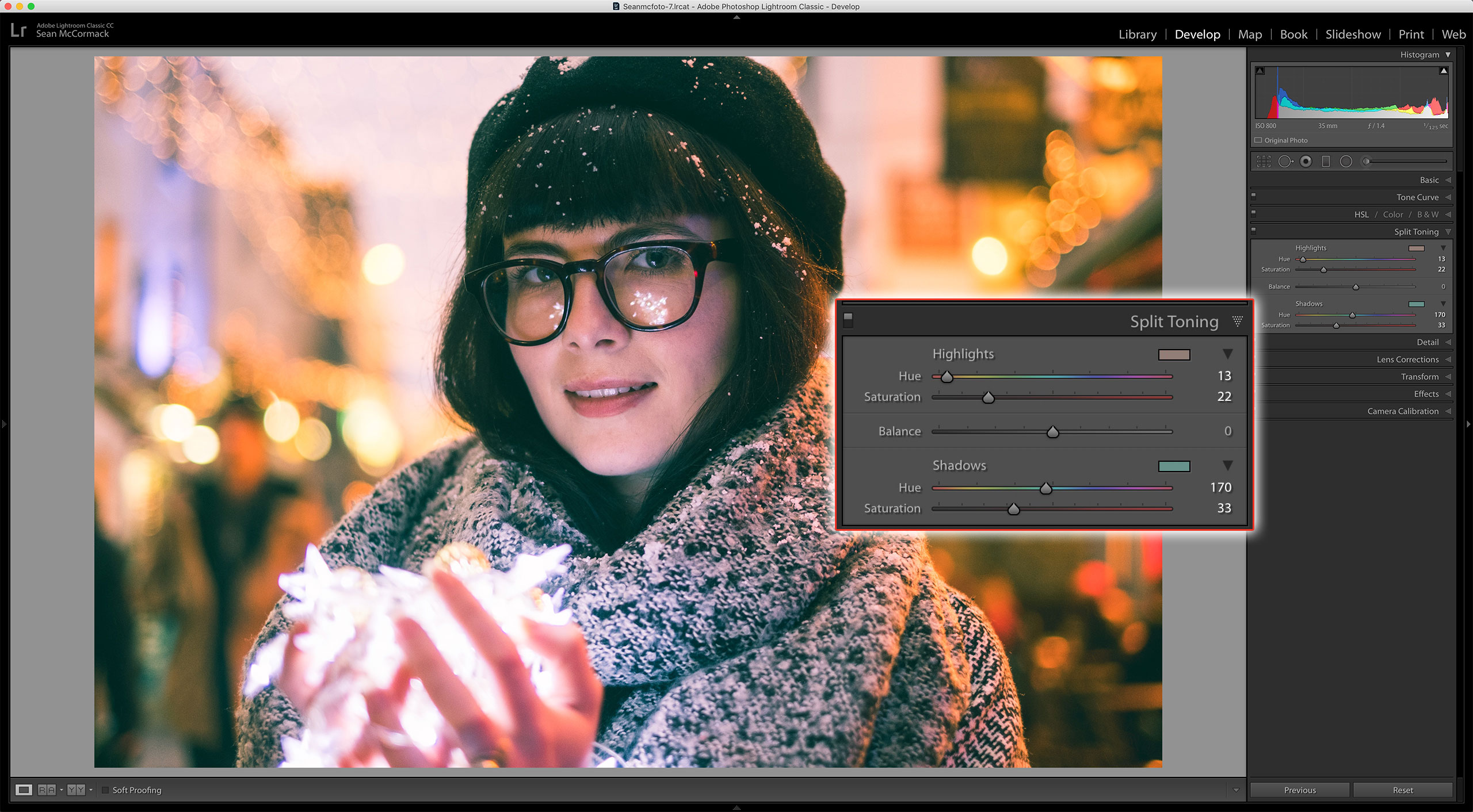
For our color, let’s go to Split Toning. With Highlights, go for a warmer, more orange tone. Set Saturation to taste. For Shadows, a blue-green Hue is great. Again, set Saturation to taste. A classic film-inspired combo is the Teal & Orange look.
5. Finishing touches
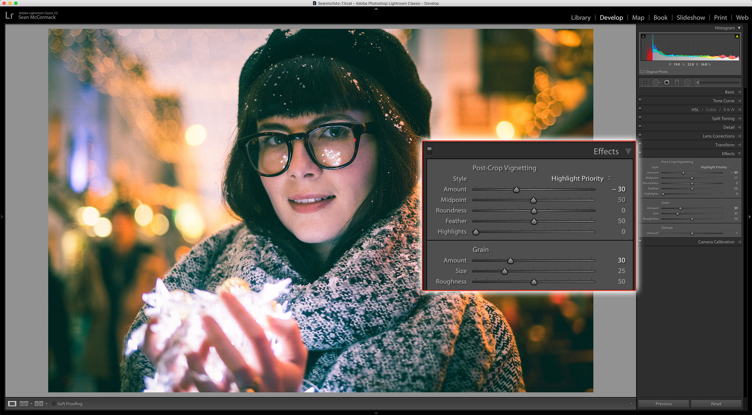
We’ll finish the look in the Effects panel. First, I bring the Vignette Amount down to around -30. Next, I bring Grain Amount up to 30. As a final tweak, I go back to White Balance and take Tint down to 0 to remove more magenta from the face.
6. Re-use as a preset
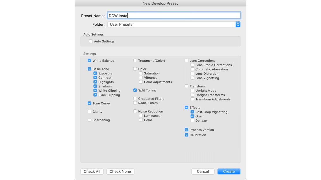
To use this look again, make a preset. In the Presets panel on the left, click the + icon to create a new preset. In the dialog box that appears, you can either save with all the settings applied, or select only the ones you want the preset to change. The saved preset with go into the User Presets folder for using again.
Expert tip: Lightroom CC for mobile
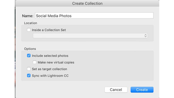
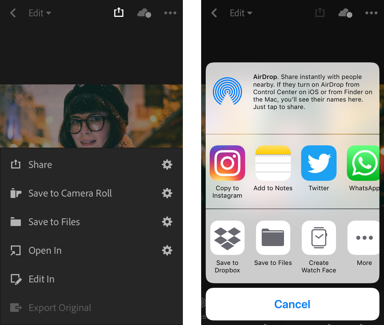
Our technique gets you the look you want on your computer, but how do you get that look to your phone? Easy! In Grid mode, create a Collection (Ctrl/Cmd+N) called something like ‘Social Media Photos’. The dialog box has an option called Sync With Lightroom CC: tick this, and anything in this collection will automatically go to your phone or device. On your mobile device’s Lightroom CC app, find the Social Media Photos folder. From there, select the image you want to post online. At the top of the screen on the left is a box with an up arrow: the Share icon. Click this. Select Open In... to choose where you want it go. Choose the image size and the service (for example, Copy To Instagram). Voilà!
About Digital Camera magazine
This tutorial originally appeared in Digital Camera Magazine, the monthly newsstand magazine for all photographers. Why not subscribe to a print edition, and have the magazine delivered direct to your door every month?
Alternatively, we have a number of different digital options available, including:
• Apple app (for iPad or iPhone)
• Zinio app (multi-platform app for desktop or smartphone)
• PocketMags (multi-platform app ideal for Android devices)
• Readly (all-you-can-eat digital magazine subscription service)
If you wanted a printed version of any of our most recent issues we have a selection of back issues to choose from in our online store.
How to get Adobe Lightroom
Adobe Lightroom is available in two versions: the regular Adobe Lightroom Classic CC designed for desktop users, which is what we cover in this series, and a new cloud-based Adobe Lightroom CC, which stores your files online and offers a similar but reduced set of features. For regular desktop users we recommend Adobe Lightroom Classic CC.
Adobe offers three subscription based Photography Plans which you can click on below. We recommend either the regular Photography Plan, or the Photography Plan (1TB) which costs more but comes with 1TB online storage in case you decide to go with Lightroom CC.
For this set of tutorials and for anyone who likes to work on a single main computer, we recommend the regular Creative Cloud Photography Plan. This is the cheapest way to get started AND it comes with Photoshop CC too.
Read more:
• This is the best photo-editing software today
• These are the best laptops for photographers right now
• We help you choose the best desktop computers for photo editing
Sean McCormack is a commercial, and editorial photographer, book author, and regular contributor to Digital Camera magazine based in Galway, Ireland. He has extensive experience with Lightroom, dating back to its original beta version, and has tried out just about every plugin and preset available. His latest book is Essential Development 3: 25 Tips for Lightroom Classic’s Develop Module.
