Lightroom series part 30: How shoot and edit classic concert photos in Lightroom
Get out and about to capture a performance, then deal with the effects of low light and bring out the colour of the scene
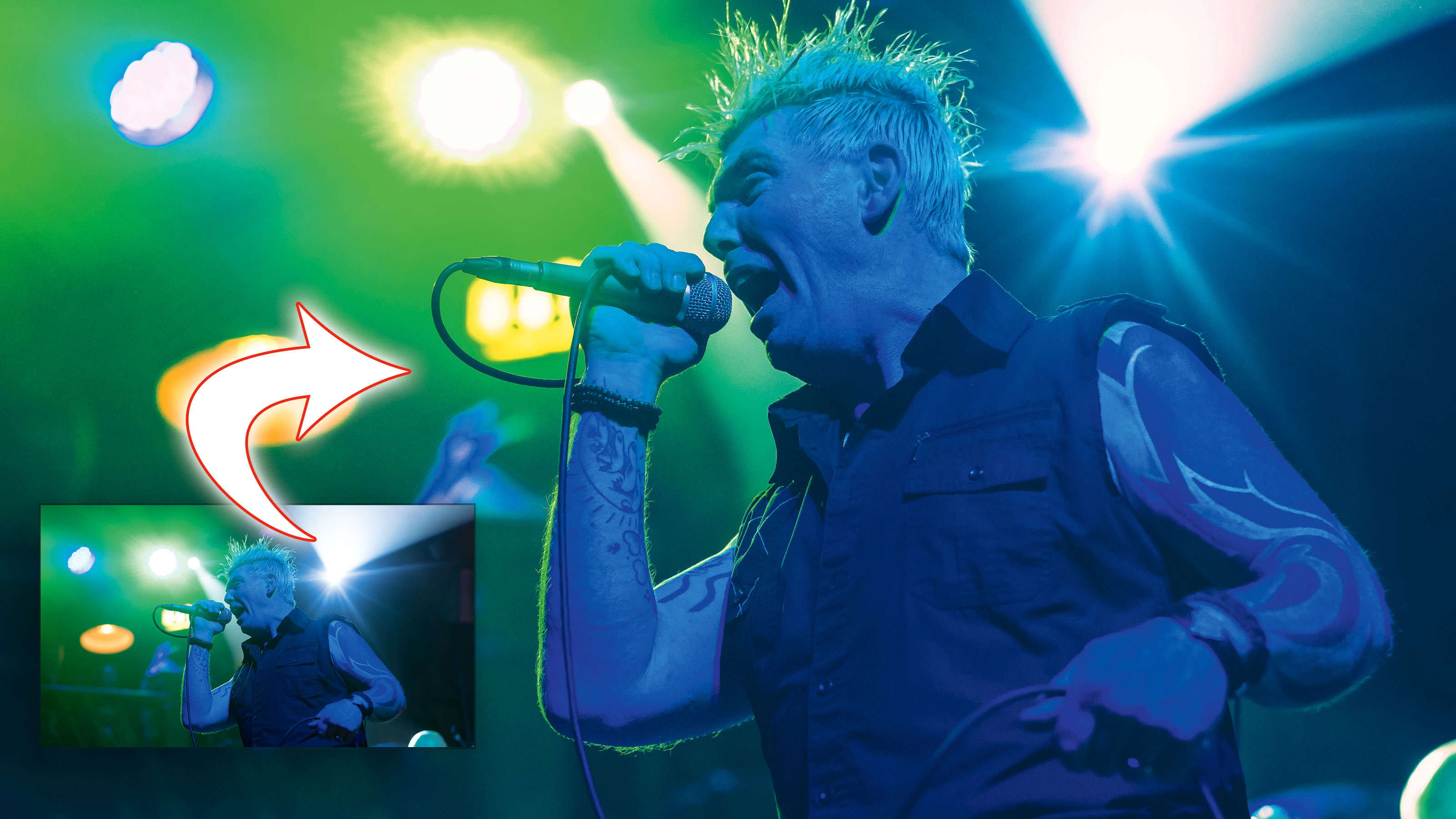
Back in the days of film, grain was par for the course in concert photography. It was simply a result of the ISO required, meaning a lot of push processing. We’re blessed with digital, especially with current cameras that allow us clean files at higher ISO. Even if it’s not perfect, we can still use Lightroom to extract even more from it.
Welcome to the 30th instalment of our Lightroom series, first published in Digital Camera magazine (see below for subscription offers).
If you are already a Lightroom user, you could discover some new tricks and processes you haven't tried yet. If you don't use Lightroom, then scroll down to the bottom where you'll discover how to get it and which Adobe Photography Plan is best.
With concert photography, there's still a special 'look'. All those classic concert images shot on various films have their own unique character. Lightroom is the perfect place to get that mix of old and new: the super-clean look of digital, mixed with the colour character of old film.
• See more Lightroom tutorials
1. Composition
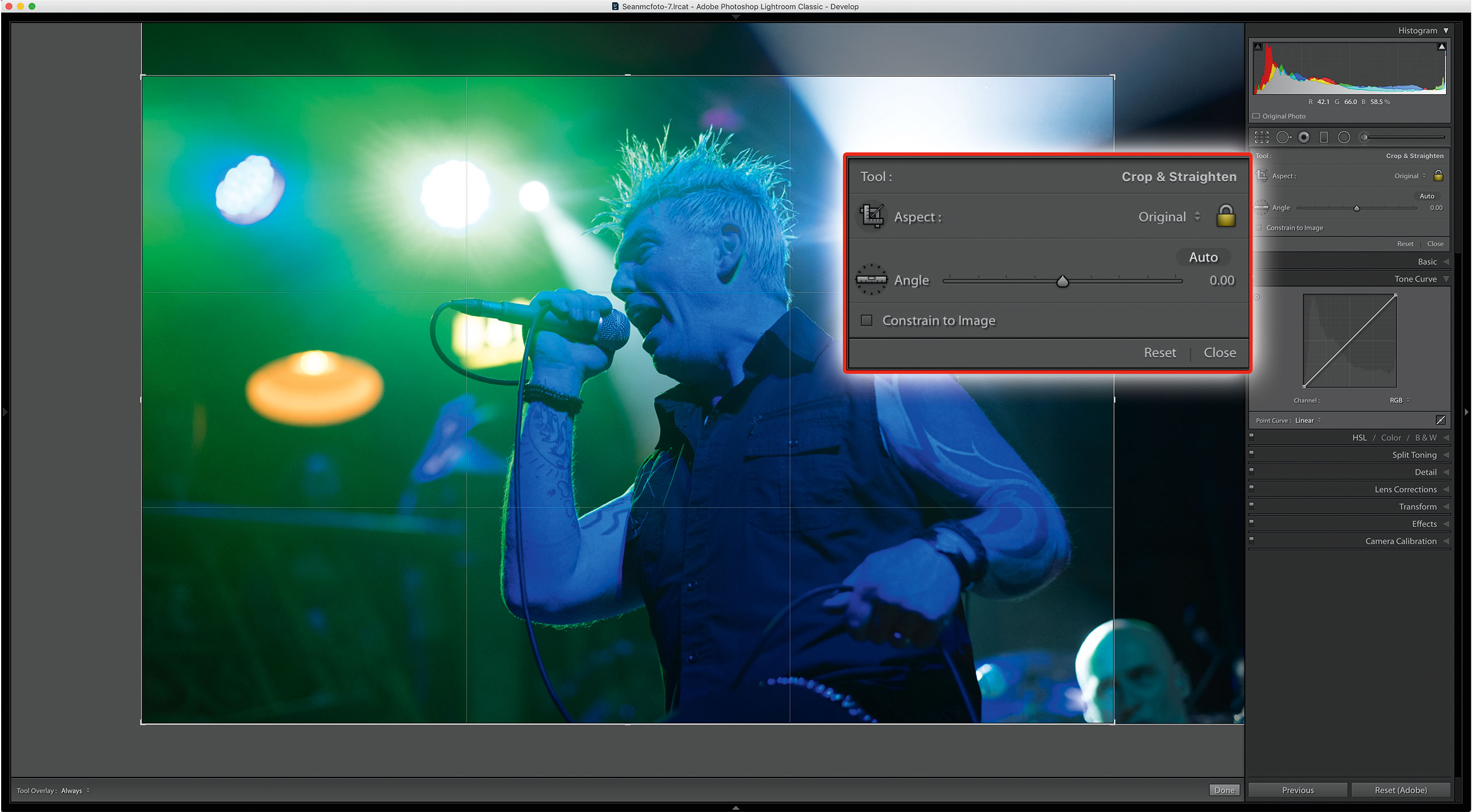
Shooting wider is wiser when you’re shooting concerts. It allows you the opportunity to recompose the shot with cropping, away from the hectic ‘first three songs, no flash’ rules. Here we’re reducing the negative space on top, and cropping into the distracting head on the right. The eyeline is close to the horizontal centre too.
2. Dynamic range
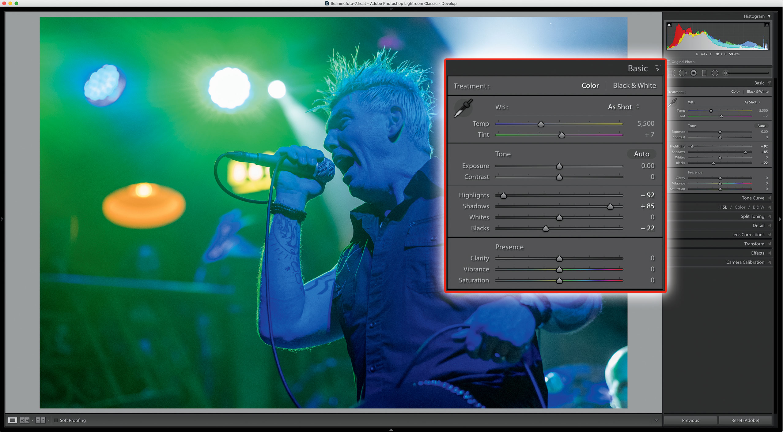
It’s time to open up the dynamic range. For this shot, I pull Highlights down (-92) and open up Shadows (+85). To compensate for a lifted black point, I pull Blacks down to retain contrast (-22).
3. Fix the noise
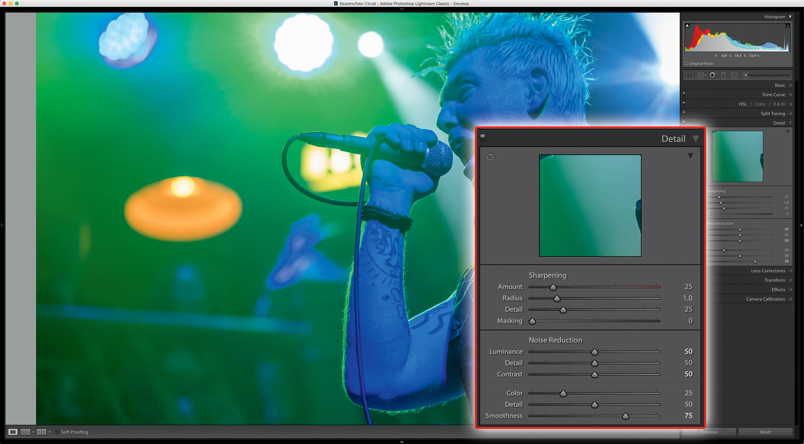
Before I customise the color, I need to fix some of that noise. First, I zoom to 1:1. In the Detail panel, I set Luminance and Contrast to 50. I set Smoothness to 75 to reduce the larger areas of uneven colour. The effect will blur the whole image, so I’ll need to sharpen next...
4. Sharpen edges
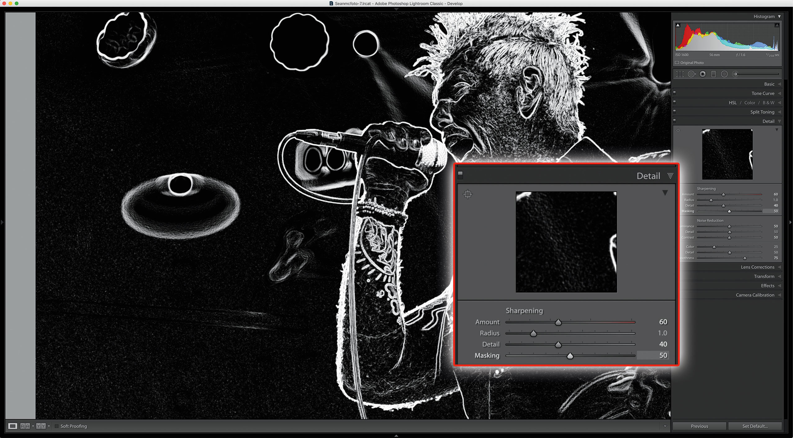
I only want to sharpen edges, so I set Masking to 50. Hold Alt as you drag the slider and you’ll be able to see the edges. I set Amount to around 60. To bring out the finer elements of the shot, I set Detail to 40.
5. Contrast
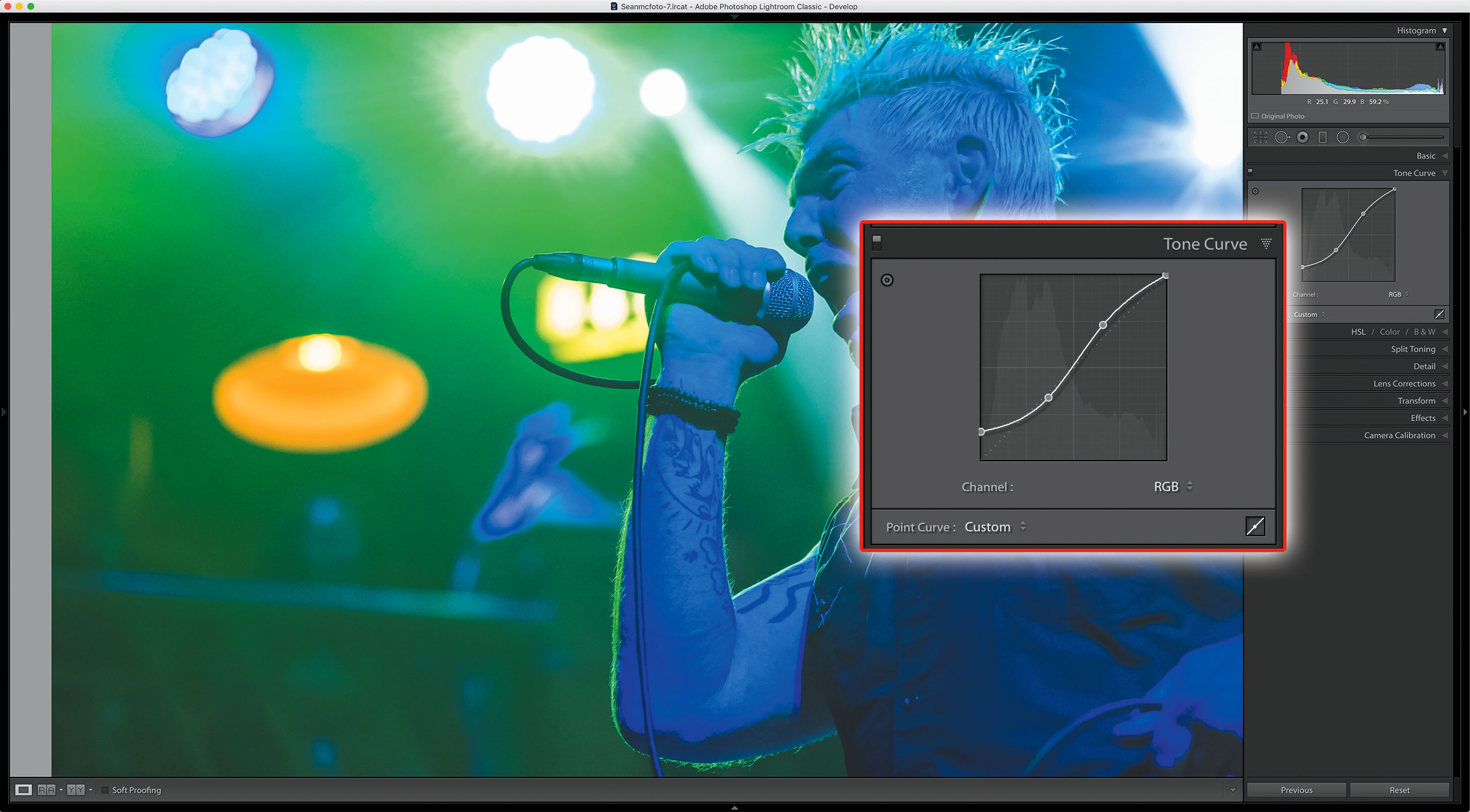
I’ll set the final contrast here. I go to Tone Curve and select the Point Curve from the small icon on the bottom right of the panel. About a third along the line, I click to set a point. I drag the bottom-left point up to fade the shot. About a third from the top, I drag the line up to increase contrast.
6. Color
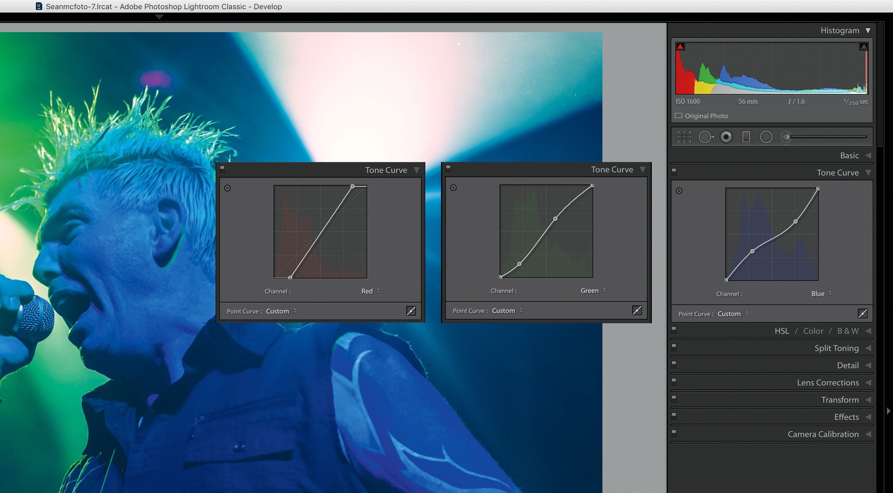
For color, I’ll use the RGB Channels. First up: Red (A) . Here I restrict the range by pulling both end points into the centre. For Green (B), I create an S curve that boosts magenta in the shadows and green in the highlights. For Blue (C) I do the opposite, to increase warmth in the highlights and coolness in the shadows.
Expert tip: Mono concert photos
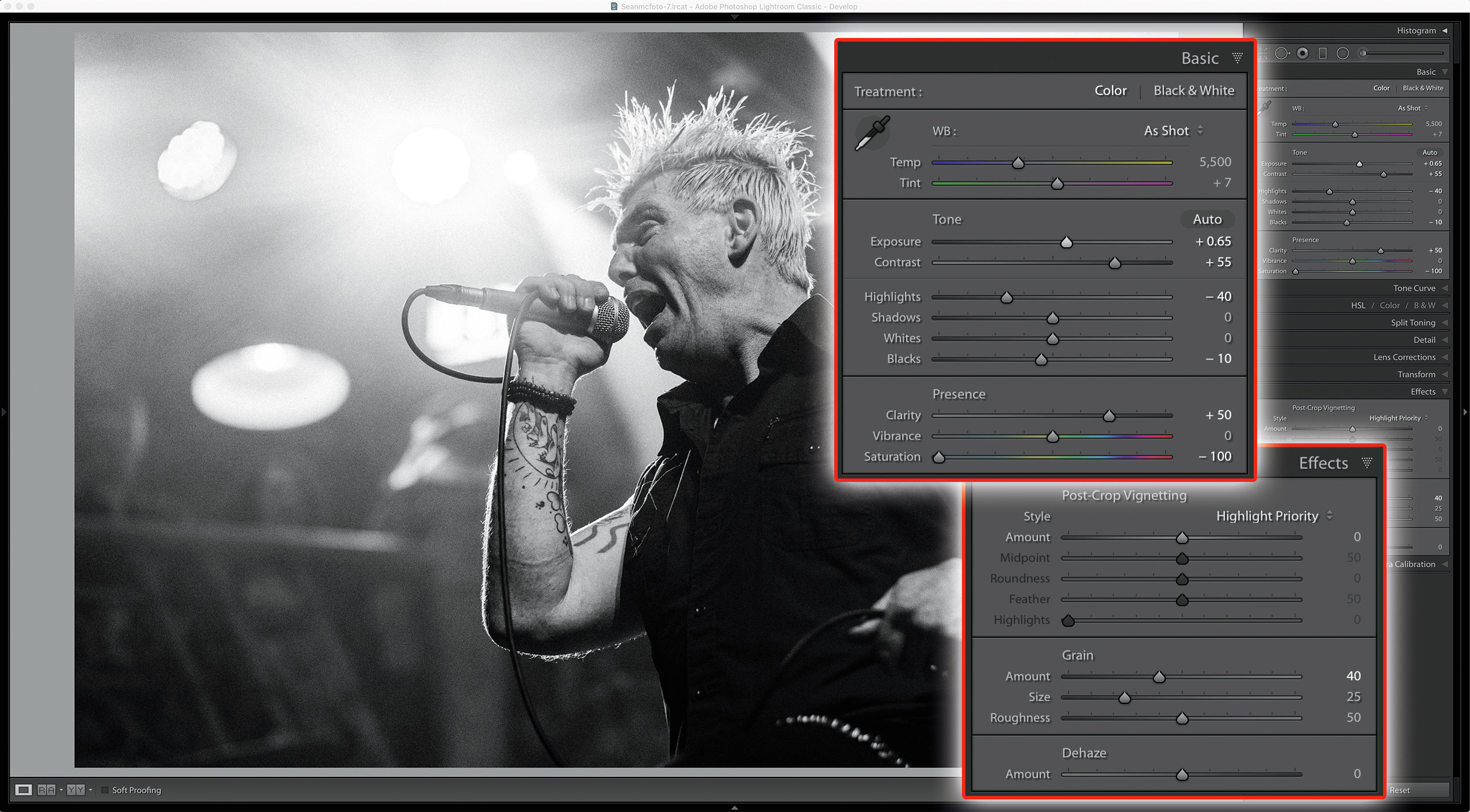
Classic Concert photos also come in black and white. It’s a different approach here, though: it’s all about rich blacks and grain. To keep your colour photo, make a Virtual Copy (Ctrl/Cmd+’ ). Go back to the Crop in History, or set a new crop. First, I set Saturation to -100. I increase Exposure to taste, and pull Highlights to -40. Then I pull Blacks to -10 and set Clarity to 50. Sharpening and Noise Reduction can stay at their default settings. Finally, add some Grain for a vintage effect – and that’s a classic concert black-and-white formula.
About Digital Camera magazine
This tutorial originally appeared in Digital Camera Magazine, the monthly newsstand magazine for all photographers. Why not subscribe to a print edition, and have the magazine delivered direct to your door every month?
Alternatively, we have a number of different digital options available, including:
• Apple app (for iPad or iPhone)
• Zinio app (multi-platform app for desktop or smartphone)
• PocketMags (multi-platform app ideal for Android devices)
• Readly (all-you-can-eat digital magazine subscription service)
If you wanted a printed version of any of our most recent issues we have a selection of back issues to choose from in our online store.
How to get Adobe Lightroom
Adobe Lightroom is available in two versions: the regular Adobe Lightroom Classic CC designed for desktop users, which is what we cover in this series, and a new cloud-based Adobe Lightroom CC, which stores your files online and offers a similar but reduced set of features. For regular desktop users we recommend Adobe Lightroom Classic CC.
Adobe offers three subscription based Photography Plans which you can click on below. We recommend either the regular Photography Plan, or the Photography Plan (1TB) which costs more but comes with 1TB online storage in case you decide to go with Lightroom CC.
For this set of tutorials and for anyone who likes to work on a single main computer, we recommend the regular Creative Cloud Photography Plan. This is the cheapest way to get started AND it comes with Photoshop CC too.
Read more:
• This is the best photo-editing software today
• These are the best laptops for photographers right now
• We help you choose the best desktop computers for photo editing
Get the Digital Camera World Newsletter
The best camera deals, reviews, product advice, and unmissable photography news, direct to your inbox!
Sean McCormack is a commercial, and editorial photographer, book author, and regular contributor to Digital Camera magazine based in Galway, Ireland. He has extensive experience with Lightroom, dating back to its original beta version, and has tried out just about every plugin and preset available. His latest book is Essential Development 3: 25 Tips for Lightroom Classic’s Develop Module.

