Lightroom series part 31: How to create a mono masterpiece in Lightroom
Take advantage of the latest tools in Lightroom Classic to choose and customise your preferred black- and-white look
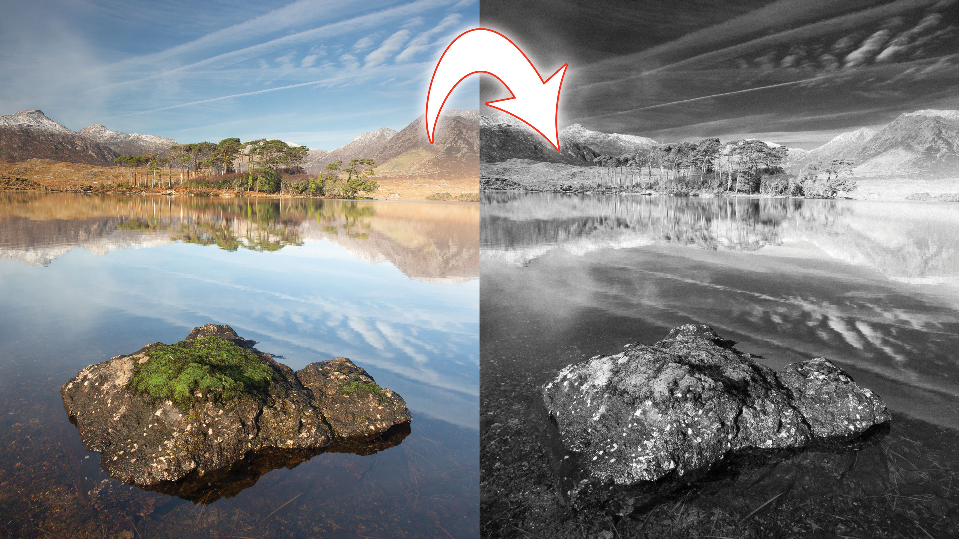
One thing that is constant in the new subscription-based Lightroom Classic CC game plan is change!
Welcome to the 31st instalment of our Lightroom series, first published in Digital Camera magazine (see below for subscription offers).
If you are already a Lightroom user, you could discover some new tricks and processes you haven't tried yet. If you don't use Lightroom, then scroll down to the bottom where you'll discover how to get it and which Adobe Photography Plan is best.
This instalment marks the change-over to a subscription model for Lightroom Classic CC and changes to the program itself.
The 7.3 update, for example, completely changed how black-and-white photos are created in Lightroom: you now apply a profile instead of doing a conversion. These profiles are XMP-based rather than the traditional DCP profiles. That might sound complicated, but it’s really more like applying a preset, except none of the settings sliders get changed and it all happens under the hood. You also get to see screen-sized previews, and you get tons of options for different looks.
• See more Lightroom tutorials
1. How to access Profiles
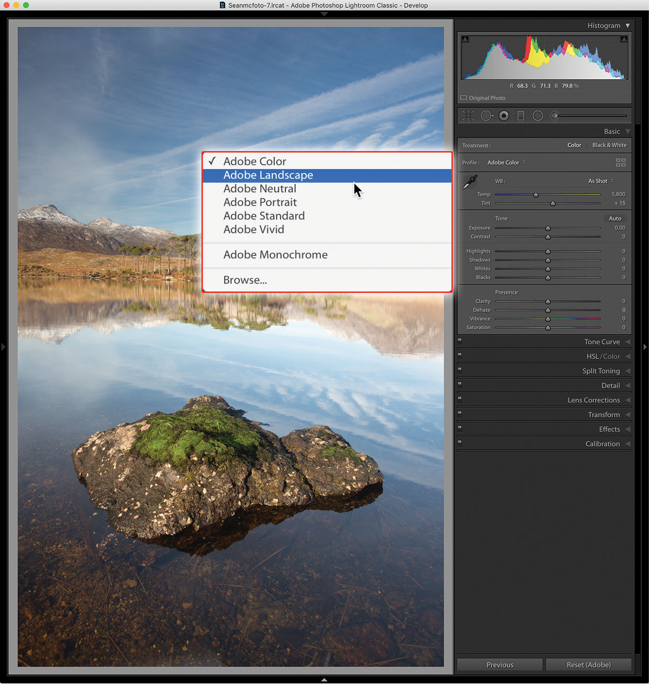
A big change is the location where Profiles are accessed. They’ve moved from the top of the Camera Calibration panel to the Basic panel. The Profile dropdown menu only includes a few basic selections for profiles. One of these is Adobe Monochrome, which is the default black-and-white option, and the basis for the other profiles.
2. The Profile browser
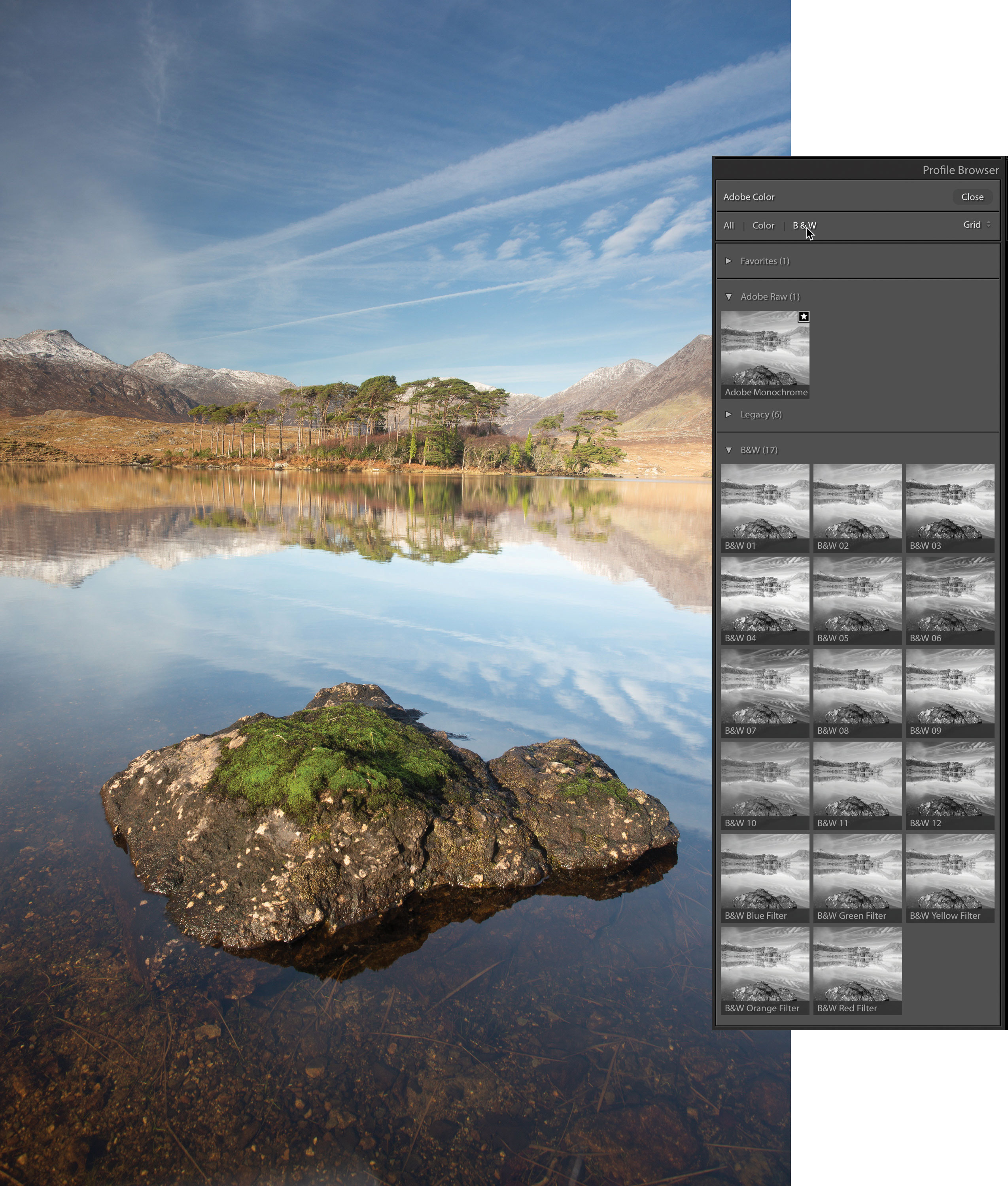
To get to the larger range of options, open the Profile Browser: either select Browse in the menu or click on the ‘four rectangles’ icon on the right. You can go a step further and click B&W near the top to restrict the view to just black-and-white profiles.
3. Compare Profiles
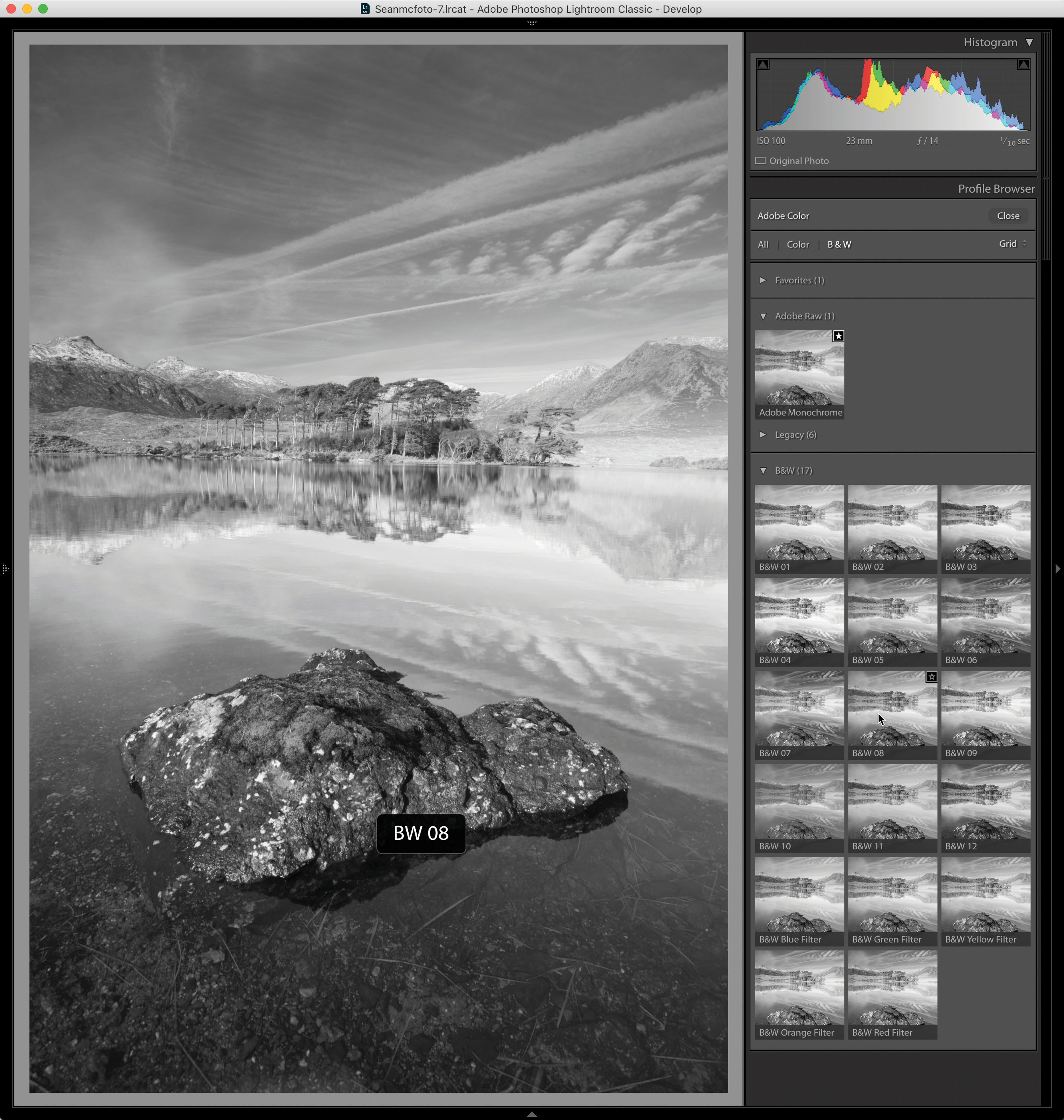
Select the B&W folder and hover over each thumbnail to see the how that profile looks on the main photo. Choose the one closest to the look you want. I’ve gone with B&W 08 for this particular photo.
4. Customise the look
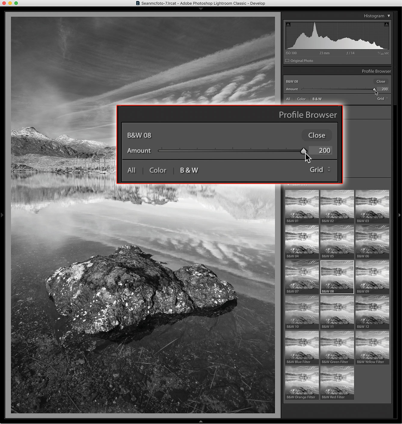
You’re not limited to this look as it stands right now. Once selected, you can use the slider at the top of the panel to reduce or intensify the effect. For this photo, intensifying it really brings depth to the sky. Click Close when you’re done.
5. Tweak the details
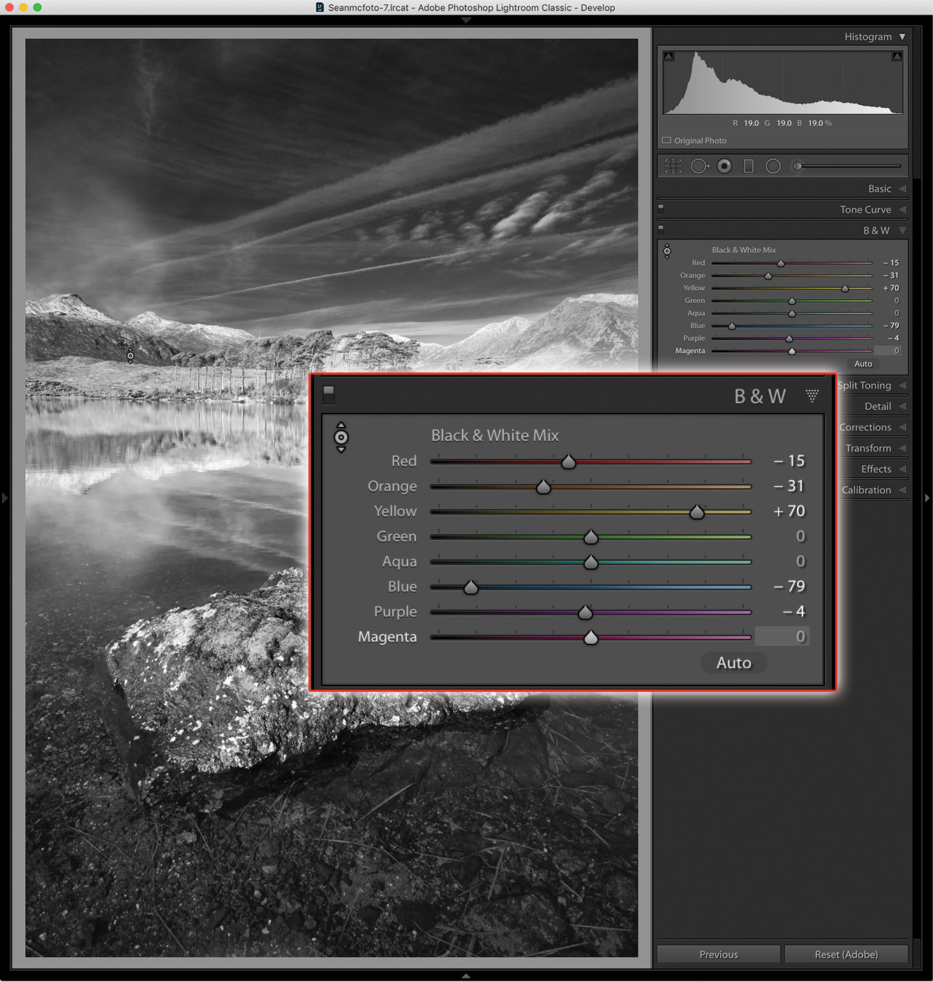
The HSL/Color panel has changed to be just the B&W panel. From here, use the sliders to change the luminosity of the underlying colours in the photo. For a more precise change to the colours, click on the target icon. Click and drag up or down anywhere on the photo to change the underlying colour with this Targeted Adjustment Tool.
6. Final effects
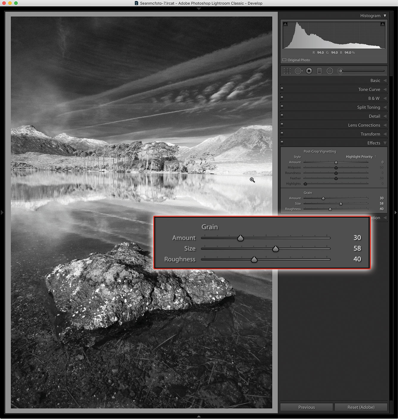
For that final B&W feel, jump to the Effects panel and go to Grain. Grain looks different at different zoom levels, so be sure to zoom in and out as you edit. Amount increases the quantity of grain in the photo; Size increases the size of the grain; and Roughness changes the uniformity, trying to achieve a more organic look.
Expert tip: Favorite your 'favorites'
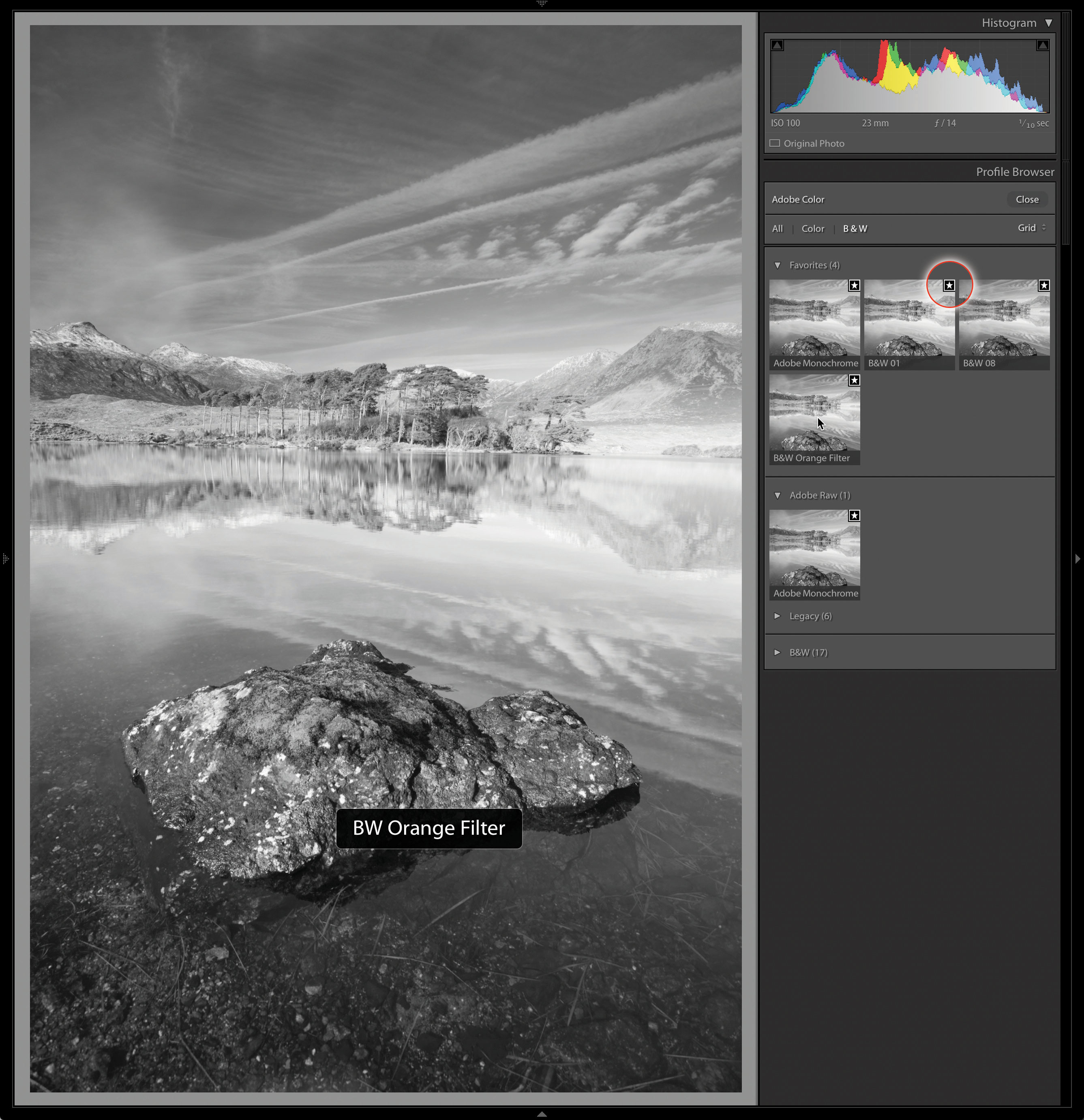
Because there are a lot of options in the B&W section of profiles, you may find that there are two or three that you want to compare more closely before you pick the best. You could create virtual copies and compare them in Survey, but then you’d need to delete the ones you don’t like as much. There is a better way. At the top right of every profile, a star appears as you hover. Click on this star to add the profile to the Favorites section. By adding all the profiles that you want to compare, you can quickly hover over them to find your preferred one. When you’ve made your final selection, you can remove them from Favorites – or leave your preferred profiles in Favorites for quick location the next time.
About Digital Camera magazine
This tutorial originally appeared in Digital Camera Magazine, the monthly newsstand magazine for all photographers. Why not subscribe to a print edition, and have the magazine delivered direct to your door every month?
Alternatively, we have a number of different digital options available, including:
• Apple app (for iPad or iPhone)
• Zinio app (multi-platform app for desktop or smartphone)
• PocketMags (multi-platform app ideal for Android devices)
• Readly (all-you-can-eat digital magazine subscription service)
If you wanted a printed version of any of our most recent issues we have a selection of back issues to choose from in our online store.
How to get Adobe Lightroom
Adobe Lightroom is available in two versions: the regular Adobe Lightroom Classic CC designed for desktop users, which is what we cover in this series, and a new cloud-based Adobe Lightroom CC, which stores your files online and offers a similar but reduced set of features. For regular desktop users we recommend Adobe Lightroom Classic CC.
Adobe offers three subscription based Photography Plans which you can click on below. We recommend either the regular Photography Plan, or the Photography Plan (1TB) which costs more but comes with 1TB online storage in case you decide to go with Lightroom CC.
For this set of tutorials and for anyone who likes to work on a single main computer, we recommend the regular Creative Cloud Photography Plan. This is the cheapest way to get started AND it comes with Photoshop CC too.
Read more:
• This is the best photo-editing software today
• These are the best laptops for photographers right now
• We help you choose the best desktop computers for photo editing
Get the Digital Camera World Newsletter
The best camera deals, reviews, product advice, and unmissable photography news, direct to your inbox!
Sean McCormack is a commercial, and editorial photographer, book author, and regular contributor to Digital Camera magazine based in Galway, Ireland. He has extensive experience with Lightroom, dating back to its original beta version, and has tried out just about every plugin and preset available. His latest book is Essential Development 3: 25 Tips for Lightroom Classic’s Develop Module.

