Lightroom series part 6: Draw viewers' attention with a vignette effect
Focus attention where it’s most needed by taking charge of tonal values using a simple Post-Crop Vignetting control
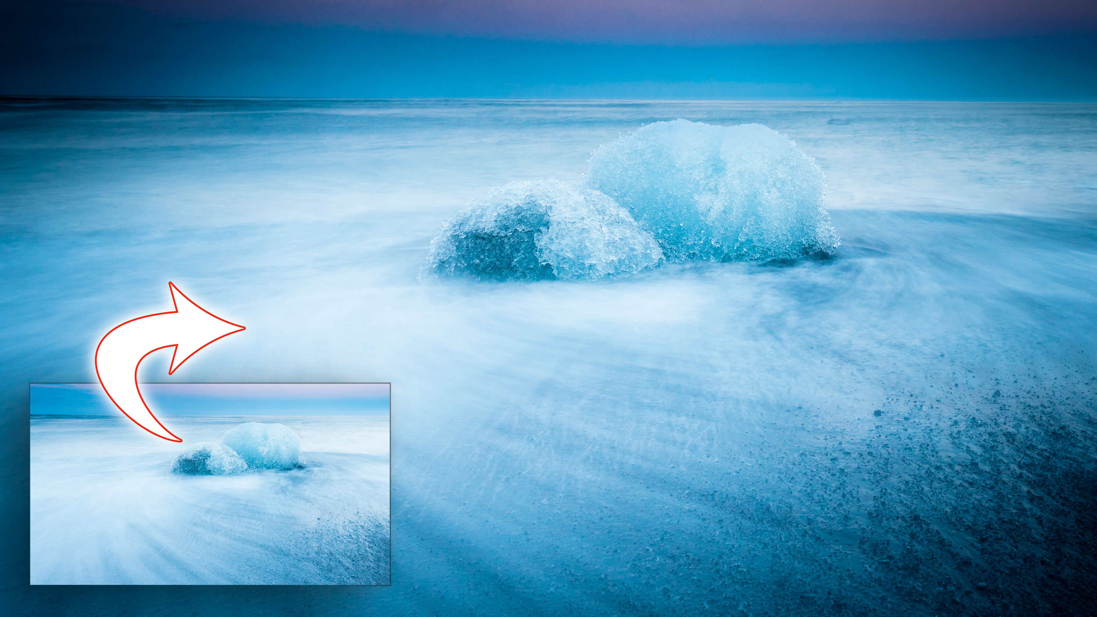
A simple vignette is a remarkably effective way to focus attention on your subject, subtly frame a scene and add a little contrast, and in Lightroom it's really easy to do.
Welcome to the sixth instalment of our Lightroom series, first published in Digital Camera magazine (see below for subscription offers). It's designed for anyone stuck indoors by the coronavirus crisis and looking for a practical and productive way to make the most of it.
If you are already a Lightroom user, you could discover some new tricks and processes you haven't tried yet. If you don't use Lightroom, then scroll down to the bottom where you'll discover how to get it and which Adobe Photography Plan is best.
Note: This article was written for Lightroom 6. The panels and control have changed since then, but the tools and the concepts are the same.
Vignetting is a form of lens distortion that darkens the corners of the image. Normally this is something you’d want to correct to have a perfectly exposed image: if you crop an image with this problem, you can end up with one side having dark corners, and the other being well exposed. You can simply apply a Lens Correction Profile in the Lightroom Lens Corrections panel to fix that.
But the presence of a vignette in a photo can also be useful. The eye is naturally drawn to the brightest part of the photo, so by darkening parts of the image, you can guide the eye towards a particular feature in any photo.
You can add your own vignette with the Post-Crop Vignetting control, which is found in the Effects panel in Develop. ‘Post-Crop’ means that if you use this control to apply
a vignette and then crop the image, the vignette will simply adjust itself automatically.
• See more Lightroom tutorials
1. Choose a style

There are three types of post-crop vignette: Highlight Priority, Color Priority and Paint Overlay. Highlight Priority protects highlights near the darkened edges at the expense of increased saturation in the area. Color Priority protects the colour at the edge: it’s more subtle than Highlight Priority. Paint Overlay is an outdated version of the effect and best avoided. Choose Highlight Priority generally.
2. See the outline
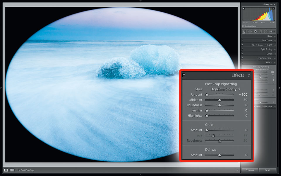
To see the precise outline of the vignette, set Feather to 0. Even at 0, there’s still a little softening at the edge. Using Amount, you can make the edges fully white at 100, or fully black at -100.
3. Set the shape
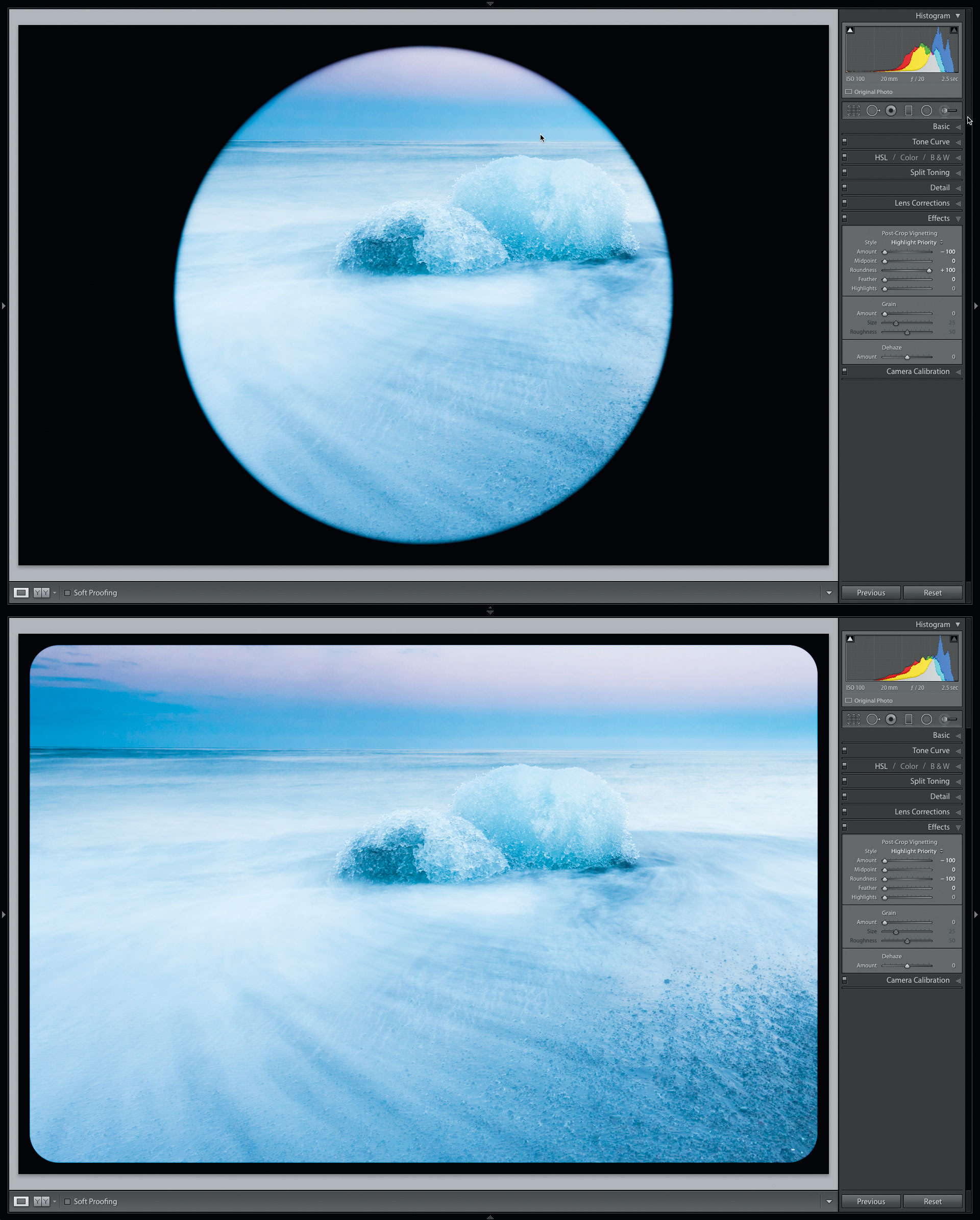
Use the Roundness control to change the shape of the vignette, shifting gradually from circular (below top) to a shape that’s practically rectangular, with slightly rounded edges (below bottom).
For the screenshots, we’ve changed Midpoint to 0 so that the shapes are more obvious. While it doesn’t make a very attractive vignette style, you could use this approach to add a basic frame to your shot.
4. Transition setting
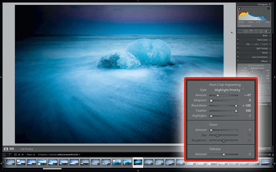
Go back to the Feather control to change the transition from the photo edge to the deepest part of the vignette. Here it’s set to 100, with Midpoint at 50.
5. Midpoint setting
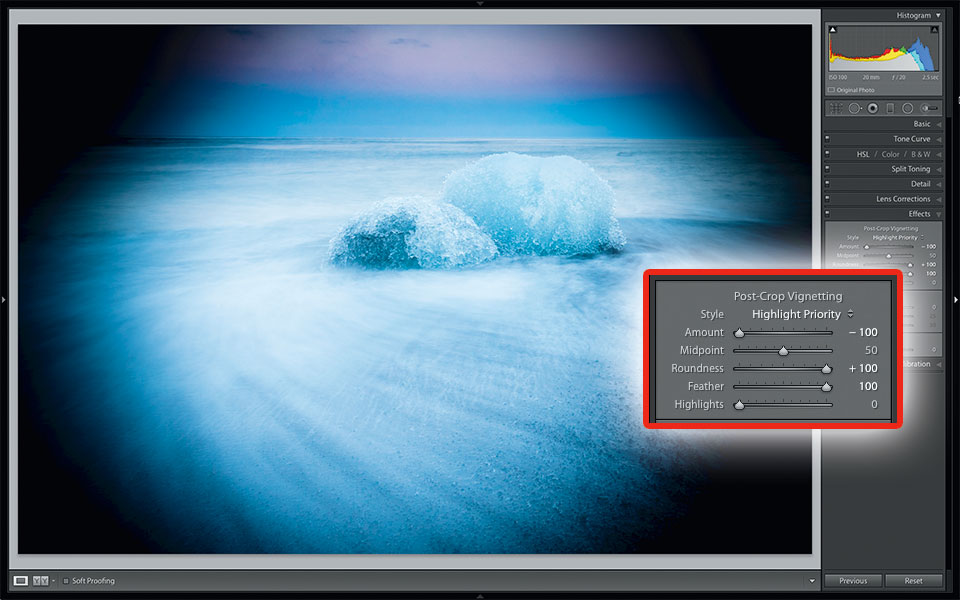
Use the Midpoint slider to bring in the vignette toward the centre of the photo. Note that this type of vignette is always based around the cropped centre of the photo.
6. Restore the highlights
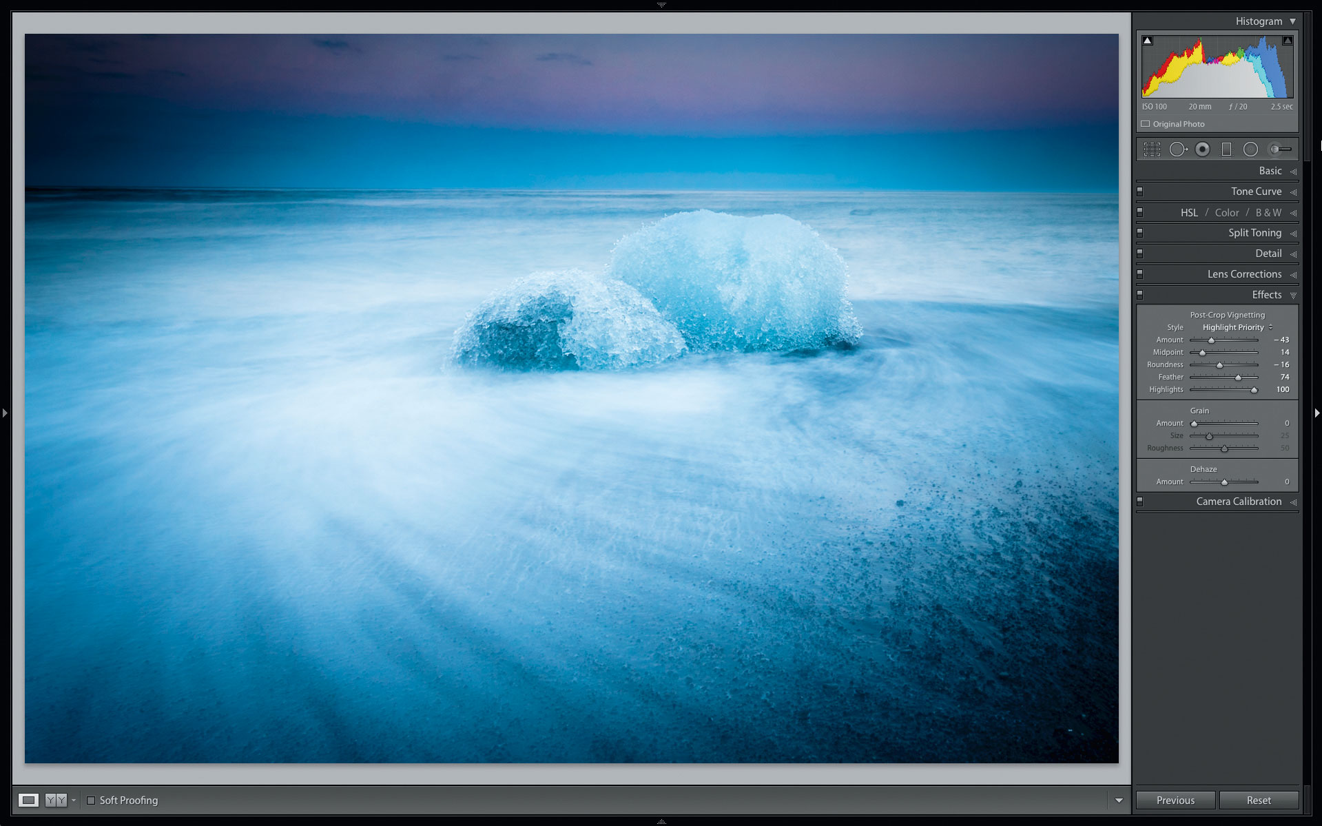
As a final step, you can further help to retain the brighter parts of the image by making use of the Highlights slider. This will greatly assist in bringing some much-needed brightness back to the edges of the image near the vignette, such as the surf in our example photo here. For the final look here, Amount is set to -43, Midpoint to 14, Roundness to -16, Feather to 74 and Highlights to 100.
Expert tip: How to make off-centre vignettes
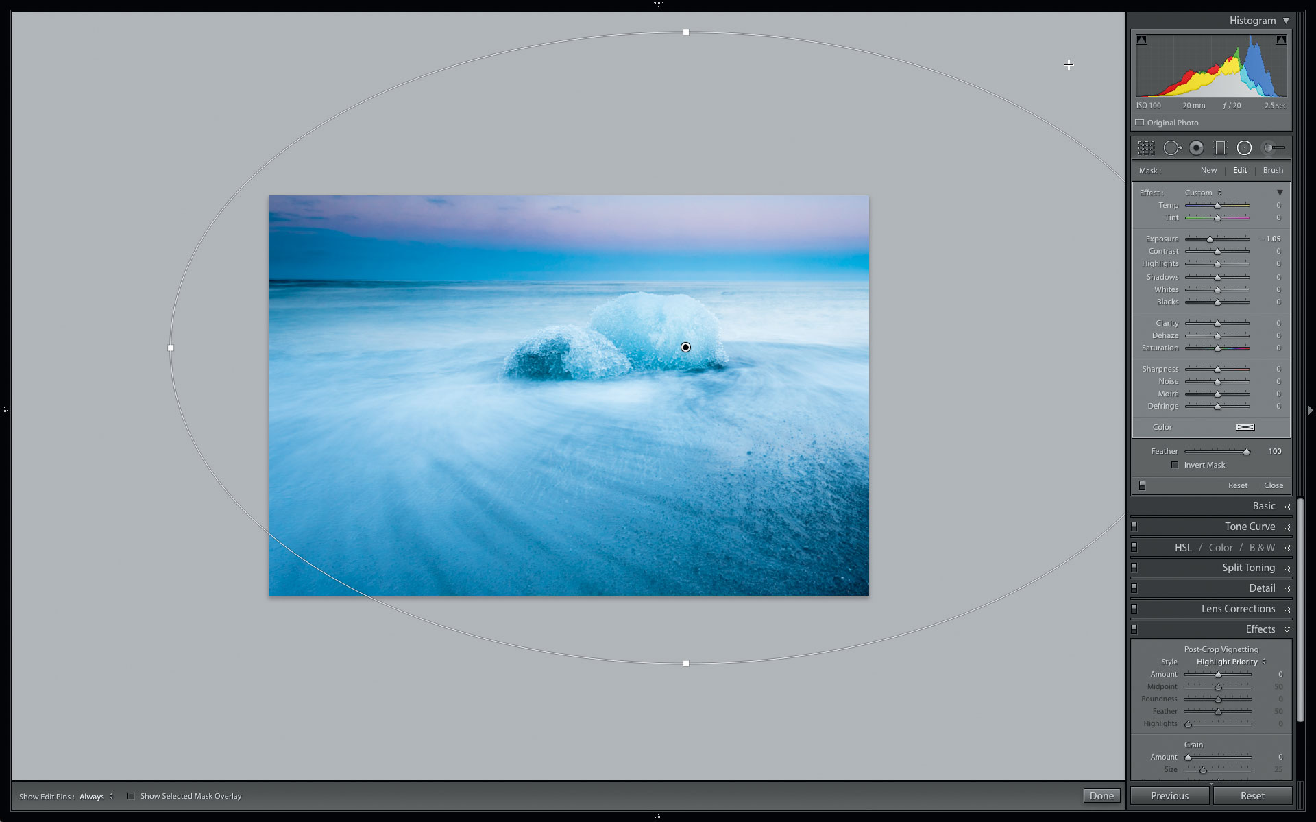
Post-Crop Vignetting forces you to use a centred vignette – but what if you want to highlight something that’s not in the middle? You need a different tool for that: situated in the Tool Strip, the Radial filter enables you to apply a whole series of controls in a circular or elliptical shape.
To begin, drag over the area in the photo you want to highlight to create an ellipse. Make sure that Invert Mask is off. Pull the Exposure slider down until you’re happy with the darkness of the edges. Use the Feather slider to control the transition to darkness.
Drag the filter around until you’re happy with the position, and drag any of the four handle points to change the size and shape of the filter. Make the image smaller in the Navigator if you need to pull outside the frame more.
About Digital Camera magazine
This tutorial originally appeared in Digital Camera Magazine, the monthly newsstand magazine for all photographers. Why not subscribe to a print edition, and have the magazine delivered direct to your door every month?
Alternatively, we have a number of different digital options available, including:
• Apple app (for iPad or iPhone)
• Zinio app (multi-platform app for desktop or smartphone)
• PocketMags (multi-platform app ideal for Android devices)
• Readly (all-you-can-eat digital magazine subscription service)
If you wanted a printed version of any of our most recent issues we have a selection of back issues to choose from in our online store.
How to get Adobe Lightroom
Adobe Lightroom is available in two versions: the regular Adobe Lightroom Classic CC designed for desktop users, which is what we cover in this series, and a new cloud-based Adobe Lightroom CC, which stores your files online and offers a similar but reduced set of features. For regular desktop users we recommend Adobe Lightroom Classic CC.
Adobe offers three subscription based Photography Plans which you can click on below. We recommend either the regular Photography Plan, or the Photography Plan (1TB) which costs more but comes with 1TB online storage in case you decide to go with Lightroom CC.
For this set of tutorials and for anyone who likes to work on a single main computer, we recommend the regular Creative Cloud Photography Plan. This is the cheapest way to get started AND it comes with Photoshop CC too.
Read more:
• This is the best photo-editing software today
• These are the best laptops for photographers right now
• We help you choose the best desktop computers for photo editing
Get the Digital Camera World Newsletter
The best camera deals, reviews, product advice, and unmissable photography news, direct to your inbox!
Sean McCormack is a commercial, and editorial photographer, book author, and regular contributor to Digital Camera magazine based in Galway, Ireland. He has extensive experience with Lightroom, dating back to its original beta version, and has tried out just about every plugin and preset available. His latest book is Essential Development 3: 25 Tips for Lightroom Classic’s Develop Module.

