Lightroom series part 8: Enhance a landscape photo in Lightroom
How to make the most of your landscape photos by using a series of different tools available in Lightroom
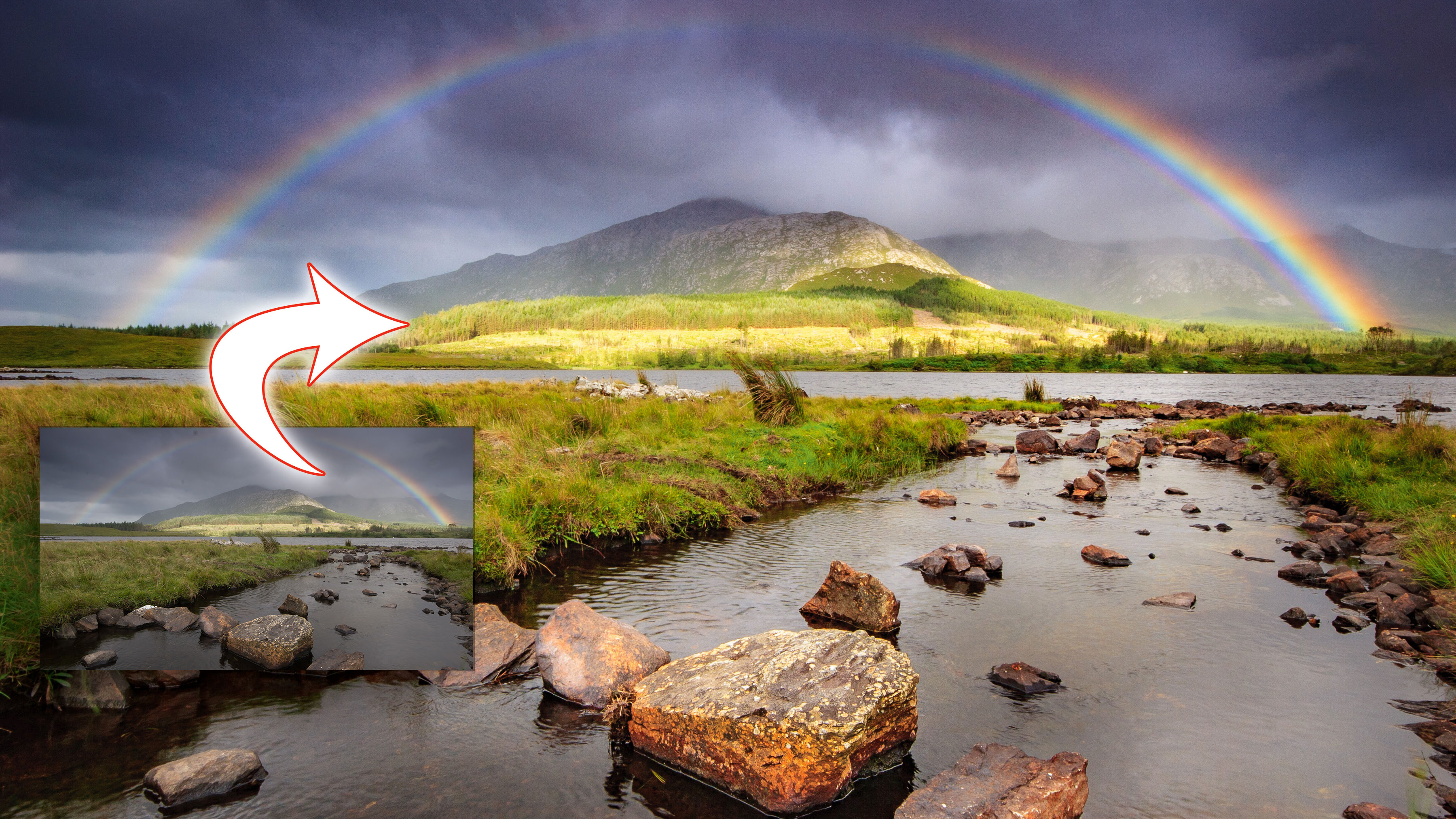
Landscape photography is probably the most popular subject amongst photographers, but what do you do if your image doesn't do justice to the scene you experienced at the time? Here's how to enhance a landscape in Lightroom.
Welcome to the eighth instalment of our Lightroom series, first published in Digital Camera magazine (see below for subscription offers).
If you are already a Lightroom user, you could discover some new tricks and processes you haven't tried yet. If you don't use Lightroom, then scroll down to the bottom where you'll discover how to get it and which Adobe Photography Plan is best.
Note: This article was written for Lightroom 6. The panels and control have changed since then, but the tools and the concepts are the same.
Anyone who’s ever picked up a camera has probably shot a landscape photo at some stage. We’re just drawn to the beauty around us. Sometimes the shot can be fantastic; other times, not so much. Using external accessories like graduated neutral-density filters can help get the shot looking really good in-camera, but most images will benefit from a little TLC in Lightroom’s Develop Module.
Rather than looking at just one Lightroom panel here, I’m going to jump around using a few different tools to bring out the best in our landscape photo. With each step done, don’t be afraid to go back and tweak previous ones to taste.
• See more Lightroom tutorials
1. Profiles
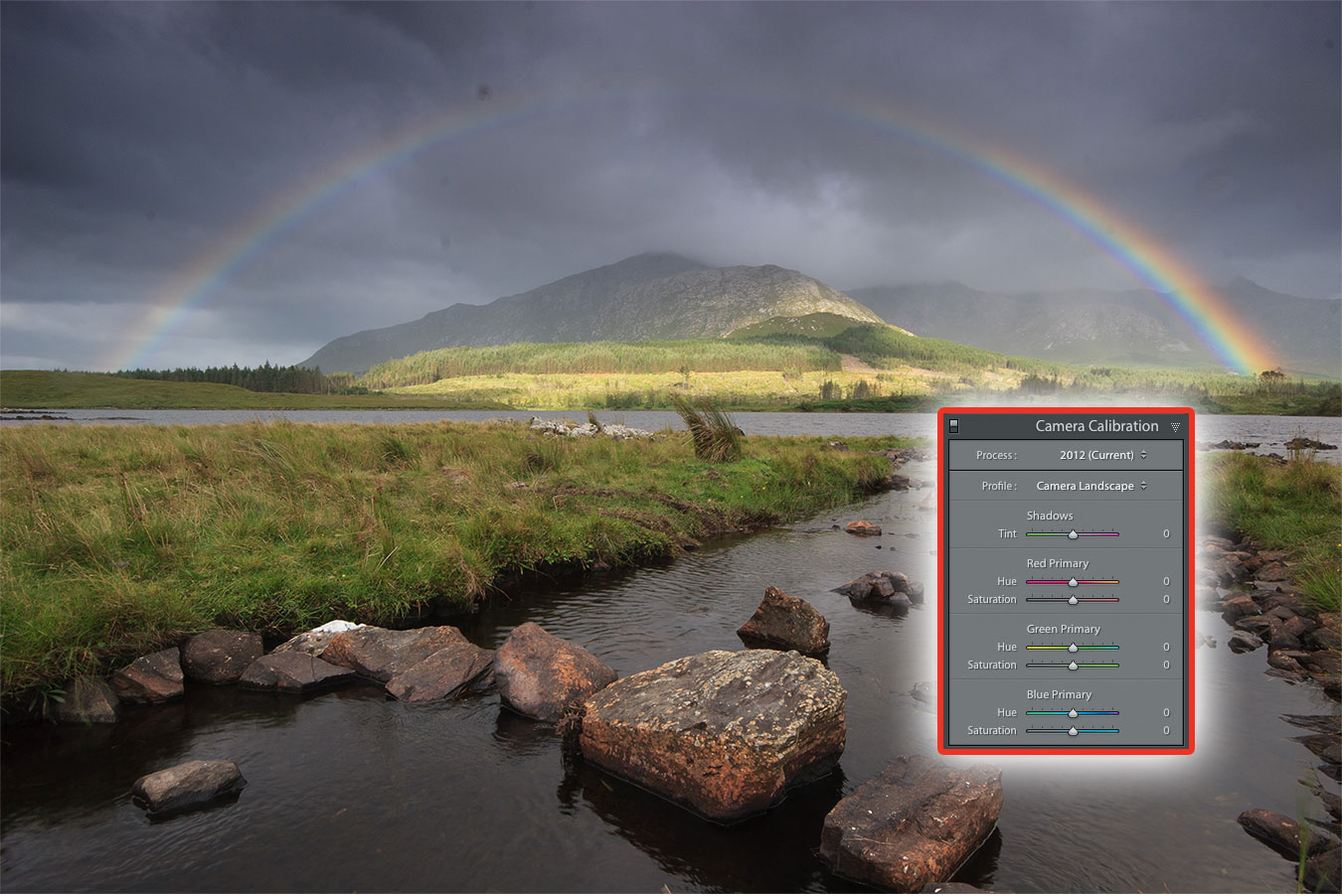
At the bottom of the Right Panel in Develop is Camera Calibration. Inside is the Profile section.
Note: In newer versions of Lightroom, Profiles have now become more prominent and have been relocated to the Basic panel.
Choose a new Profile instead of the default Adobe Standard. Depending on your
camera it might be called Camera Landscape, Vivid or Velvia, for example. This will boost saturation and contrast, giving immediate improvement.
2. Remove dust
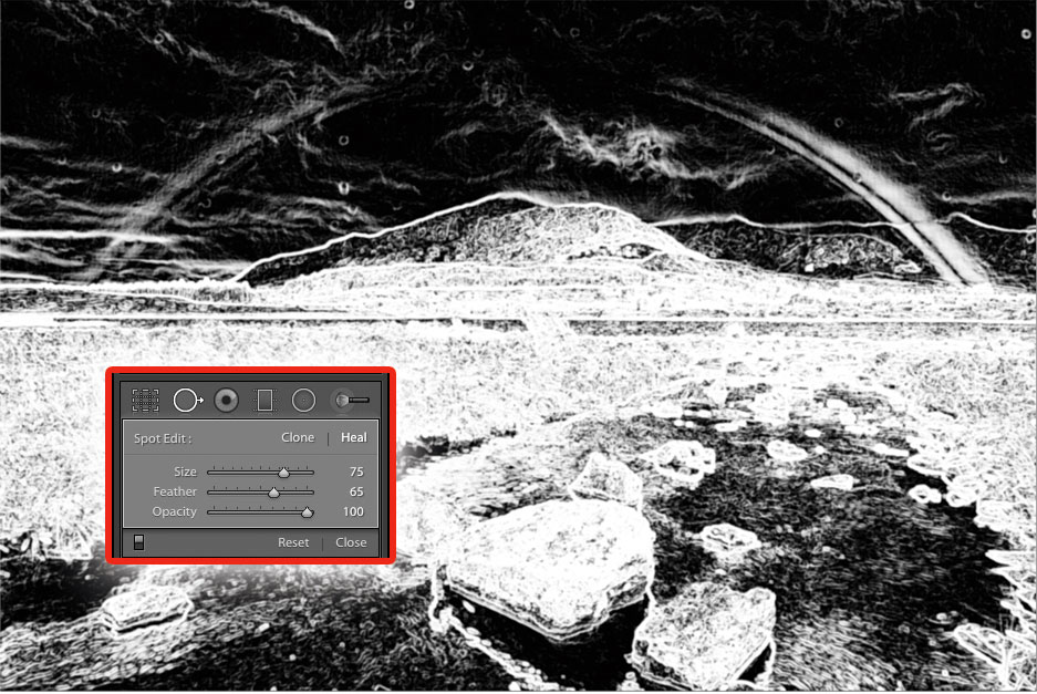
Sensor dust is something all interchangeable-lens cameras suffer from. Press Q to open Spot Removal. Next, press A to bring up an inverse overlay that makes spots easier to see. Choose Heal mode, and use Size and Feather to change the brush. You can dab on small spots or paint over larger areas.
3. Tone adjustment
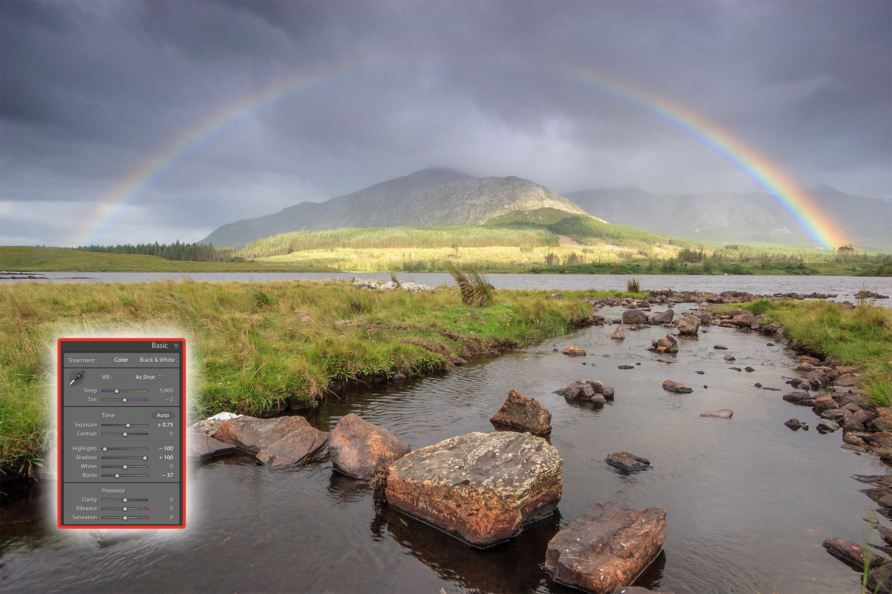
Lightroom’s Basic Panel allows a certain amount of recovery in shadows and highlights, in a similar way to how to tone mapping works for high-dynamic-range photos. Pull the Highlights slider to -100 and push the Shadows slider to +100. If that’s too much, reduce each to taste. With extreme Shadows settings, you’ll need to decrease Blacks. Set Exposure, Vibrance and Saturation if required, as they are needed for this photo.
4. Dehaze
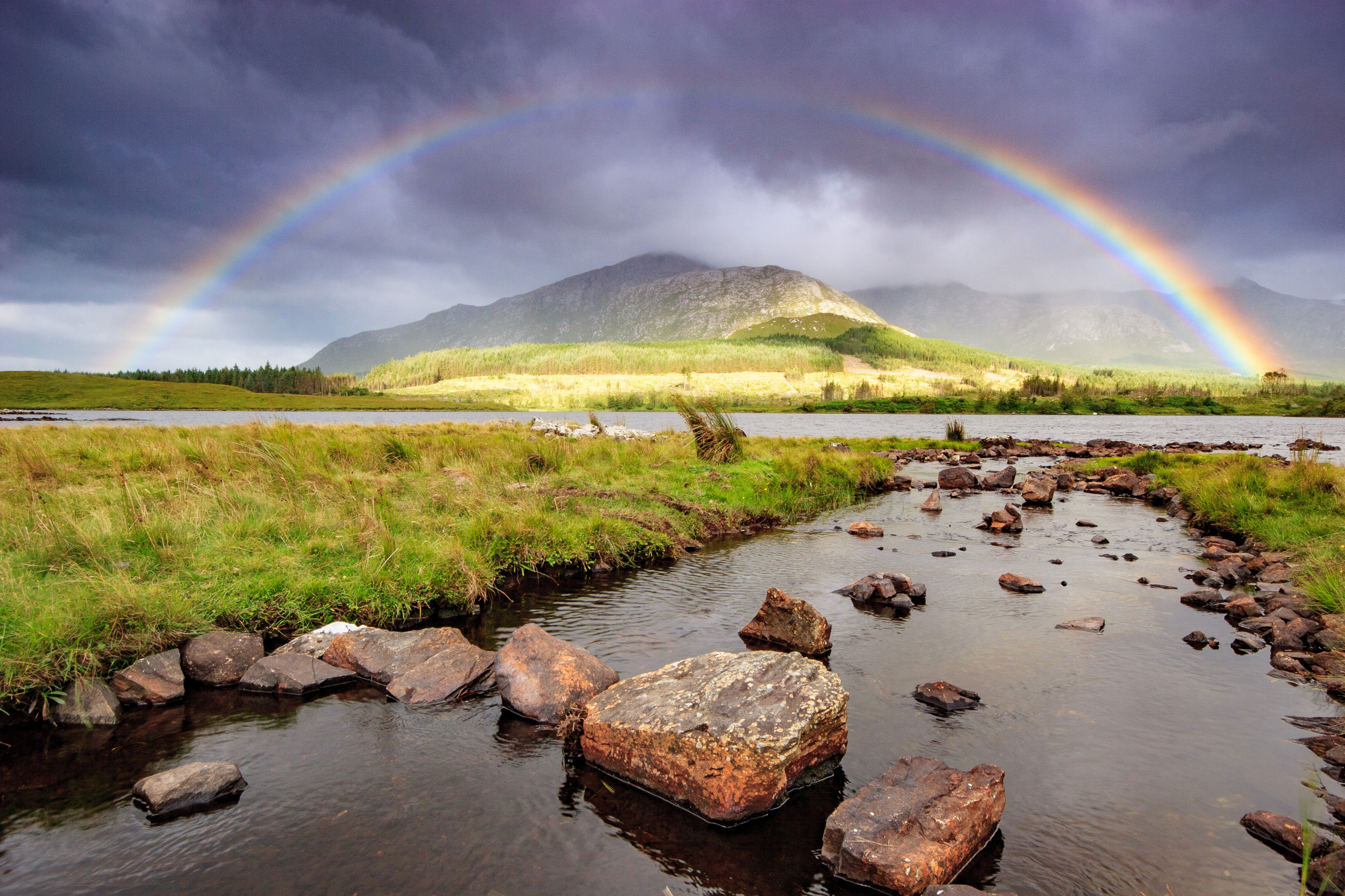
Even if you don’t have haze in the photo, Dehaze (in Effects here, but in the Basic panel in later versions) does something a little magical. Push it to the right to increase saturation and contrast. I find that Dehaze darkens the photo overall, so a little Exposure adjustment helps compensate for this.
5. Graduated Filter
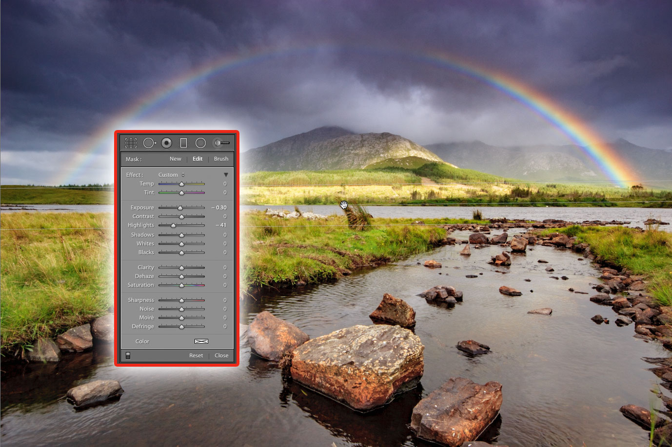
Generally, the land is darker than the sky in landscape photos, so to balance them better, use the Graduated Filter. Drag down from your start point above the horizon to below the horizon and release. Reduce Highlights and Exposure to darken, and add Contrast to taste.
6. Radial Filter
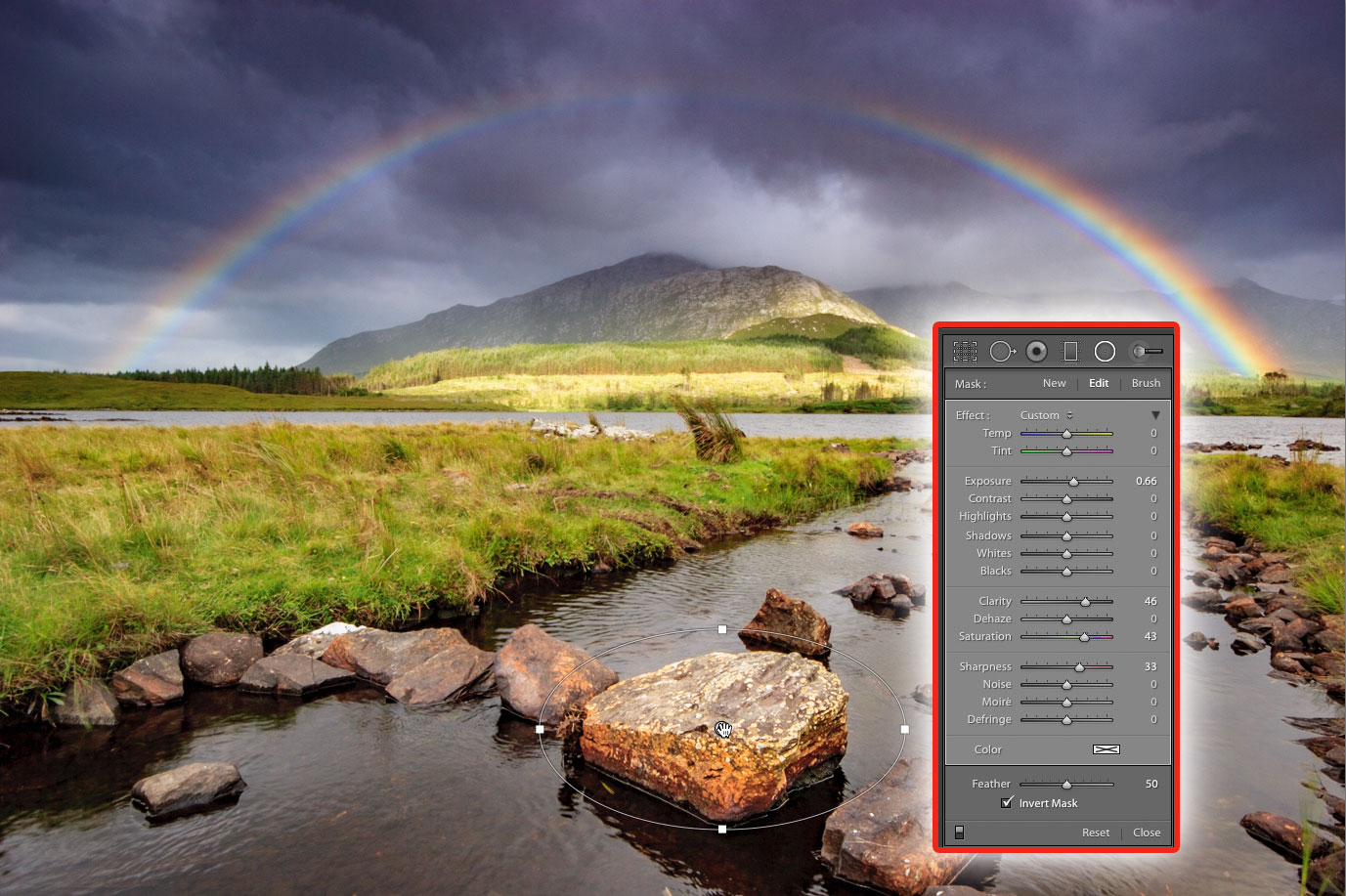
The Radial Filter is great for putting in little pockets of light. First click the Invert Mask button so the centre of ellipse is where the effect happens. Next, boost Exposure a little; 0.2 or 0.3 should be enough. Drag out where you want to add light.
Expert tip: dodging and burning
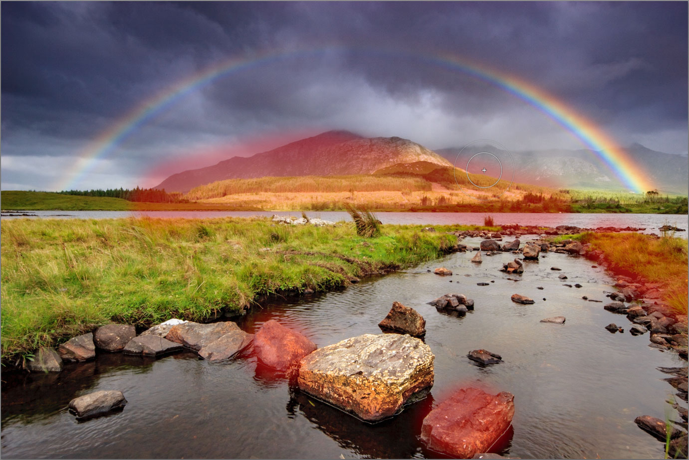
For more subtle and refined enhancement, the Adjustment Brush is great for precisely locating changes. To lighten (or dodge) an area, choose a soft brush with Exposure set to about 0.3. Paint until the area is covered. To check where you’ve painted, press O (the letter, not the number) to make a red overlay appear (you can see the red overlay over the hills in this image). Shift+O will cycle through other colours: green, white and black.
Press O again to turn it off. You can use the Erase Brush if you brush in the wrong places. To darken (or burn) an area like the edges of the photo, set Exposure to -0.5 (or lower) and paint that area. Dodge areas you want to draw attention to, and burn areas you want to take attention away from, as the eye goes to the brightest part of the photo first.
About Digital Camera magazine
This tutorial originally appeared in Digital Camera Magazine, the monthly newsstand magazine for all photographers. Why not subscribe to a print edition, and have the magazine delivered direct to your door every month?
Alternatively, we have a number of different digital options available, including:
• Apple app (for iPad or iPhone)
• Zinio app (multi-platform app for desktop or smartphone)
• PocketMags (multi-platform app ideal for Android devices)
• Readly (all-you-can-eat digital magazine subscription service)
If you wanted a printed version of any of our most recent issues we have a selection of back issues to choose from in our online store.
How to get Adobe Lightroom
Adobe Lightroom is available in two versions: the regular Adobe Lightroom Classic CC designed for desktop users, which is what we cover in this series, and a new cloud-based Adobe Lightroom CC, which stores your files online and offers a similar but reduced set of features. For regular desktop users we recommend Adobe Lightroom Classic CC.
Adobe offers three subscription based Photography Plans which you can click on below. We recommend either the regular Photography Plan, or the Photography Plan (1TB) which costs more but comes with 1TB online storage in case you decide to go with Lightroom CC.
For this set of tutorials and for anyone who likes to work on a single main computer, we recommend the regular Creative Cloud Photography Plan. This is the cheapest way to get started AND it comes with Photoshop CC too.
Read more:
• This is the best photo-editing software today
• These are the best laptops for photographers right now
• We help you choose the best desktop computers for photo editing
Get the Digital Camera World Newsletter
The best camera deals, reviews, product advice, and unmissable photography news, direct to your inbox!
Sean McCormack is a commercial, and editorial photographer, book author, and regular contributor to Digital Camera magazine based in Galway, Ireland. He has extensive experience with Lightroom, dating back to its original beta version, and has tried out just about every plugin and preset available. His latest book is Essential Development 3: 25 Tips for Lightroom Classic’s Develop Module.

