Make wonderful family portrait composites in Affinity Photo
Craft better balanced portrait compilations and create your own simple layouts in Affinity Photo
Watch video: Make a family photo compilation in Affinity Photo
One of the best ways to show off a series of photos is as a compilation. It works especially well for portraits, as it gives you the opportunity to show a range of expressions, crops and angles. Compilations are great for printing out large and displaying on the wall, too.
A series like ours will work well as a canvas or wooden block, but even if you plan to print out each photo individually and put in a multi-mount frame, the technique can still be valuable for working out the balance and cropping.
There’s real skill involved in building a balanced compilation. It’s about selecting photos that work well together, then arranging and cropping them into a harmonious whole.
Here, for example, the top-left and bottom-right images balance with one another, while the top-right and bottom-left horizontal frames have similar crops. It’s worth thinking about these things while shooting the portraits, as you can plan ahead as to which frames might fit with one another.
01 Create a document
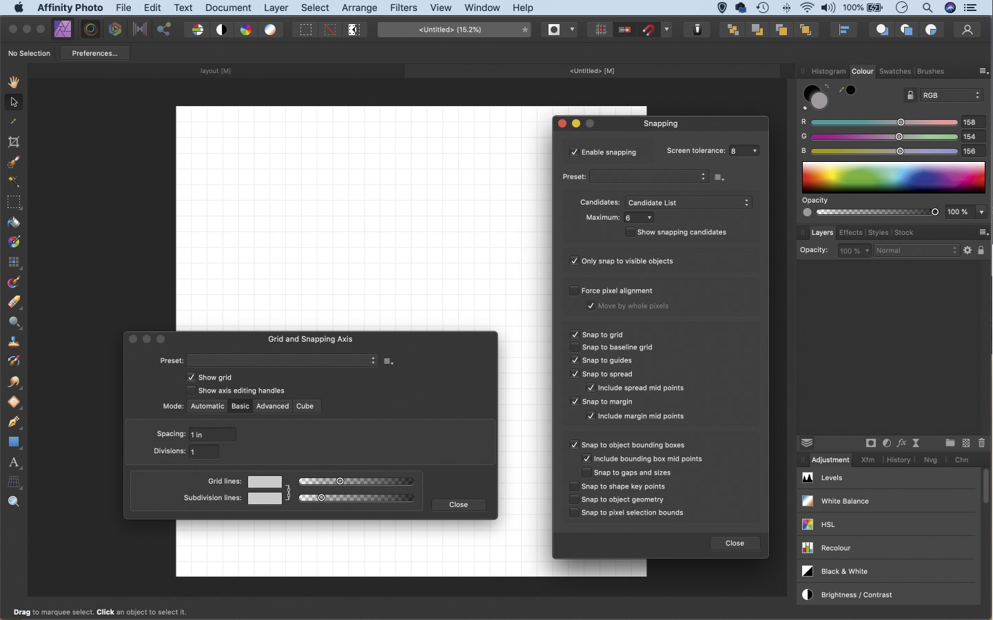
Go to File > New and use the Layout options to choose a size. We set a 30x30 inch square at 300 DPI. Go to View > Show Grid, then go to View > Grid and Axis Manager. Click Basic and set divisions to 1 inch. Go to View > Snapping Manager. Check Enable Snapping and Snap to Grid.
02 Build the outline
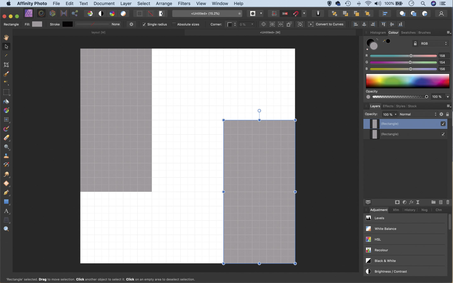
Grab the Rectangle tool from the toolbar. Drag a square that’s 10 inches by 20 inches. Get the Move tool. Hold Alt and drag the shape to make a copy. Reposition and resize it for a second window. Continue Alt-dragging to build a layout you like.
03 Add an outline
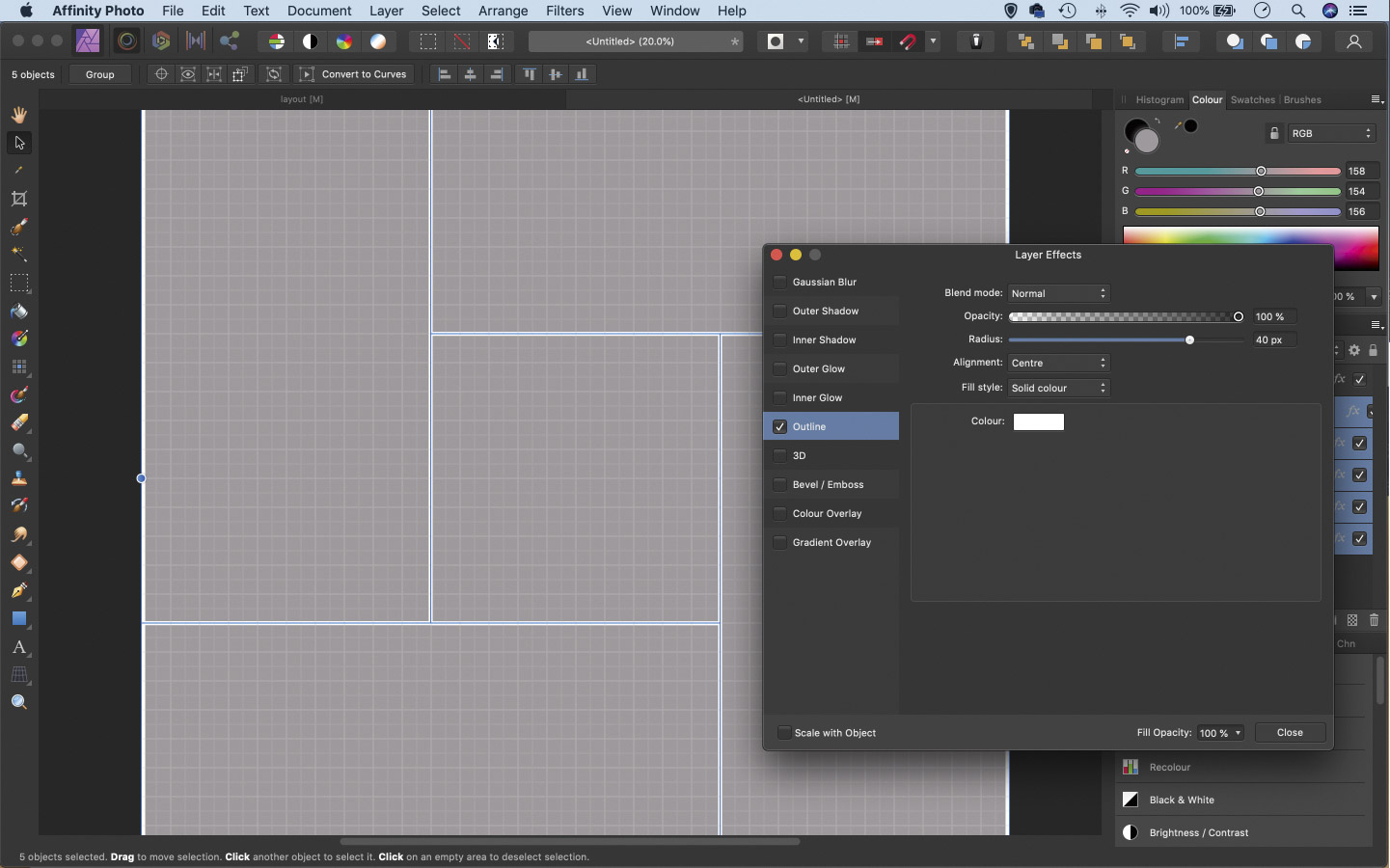
In the Layers panel Cmd/Ctrl + click to highlight all the shape layers. Click the FX icon and check Outline. Choose a color and radius for the outline. Make a rectangular shape layer to cover the frame. Click FX and choose the same outline settings. Set Alignment: Inside and Fill 0%.
04 Place your portraits
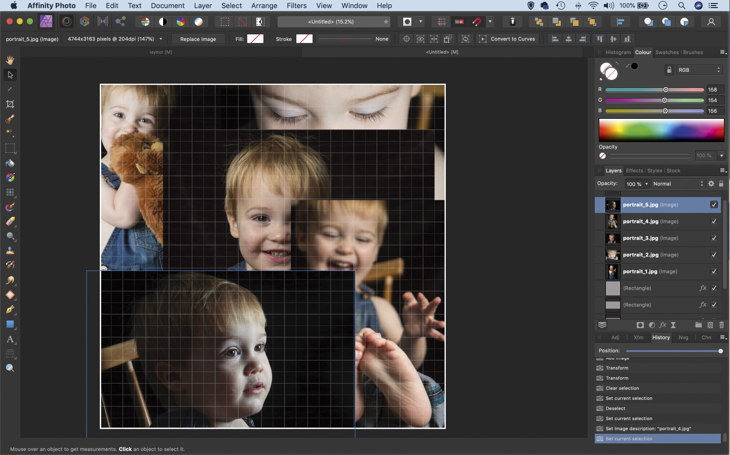
Go to File > Place, then navigate to a folder with your photographs (it’s a good idea to copy your chosen pictures to a new folder beforehand). Use the Place command to drag boxes over your layout and roughly place each image in the area where you’d like it to go.
05 Fill the boxes
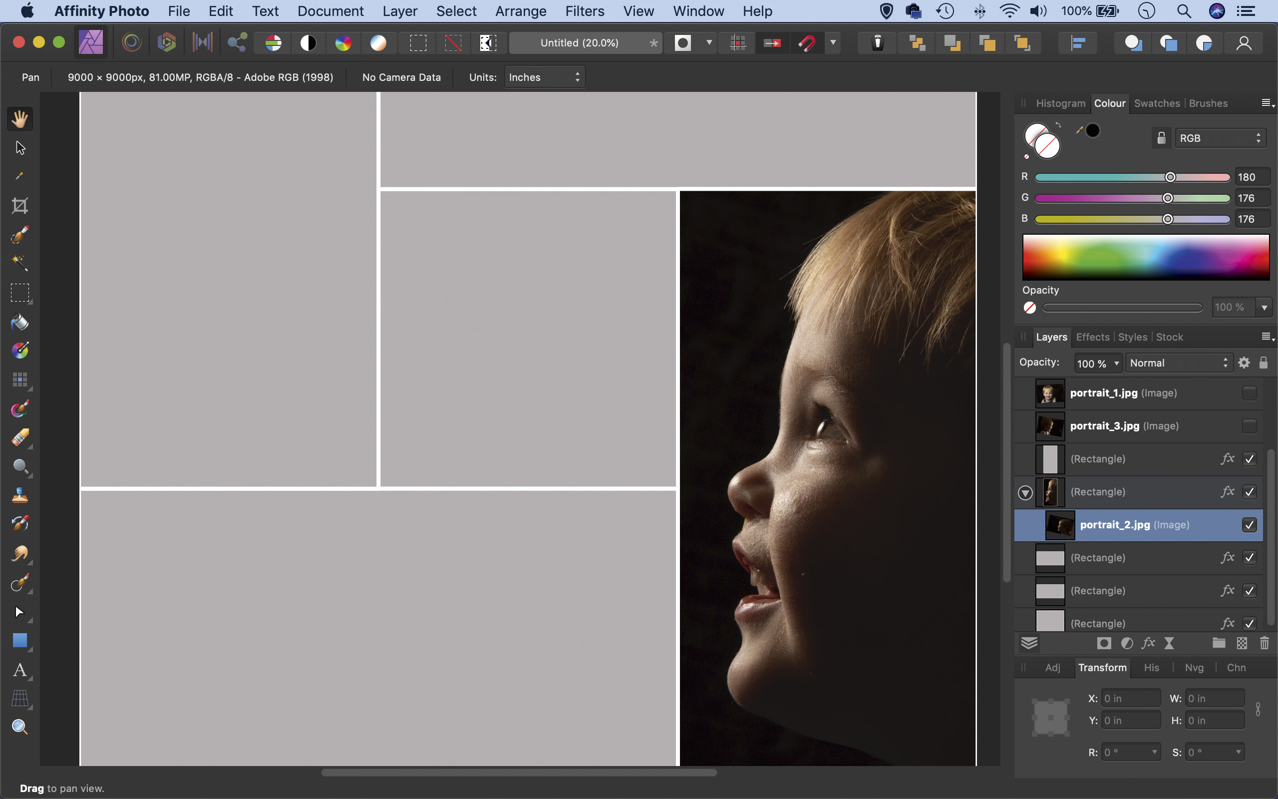
Go to the Layers panel and drag a photo layers on top of the shape layer you’d like it to fill. Drag it just below the shape layer until a faint blue rectangular overlay appears, then drag to the right so the overlay shifts right. This will put the image inside the shape layer.
06 Fine-tune the crops
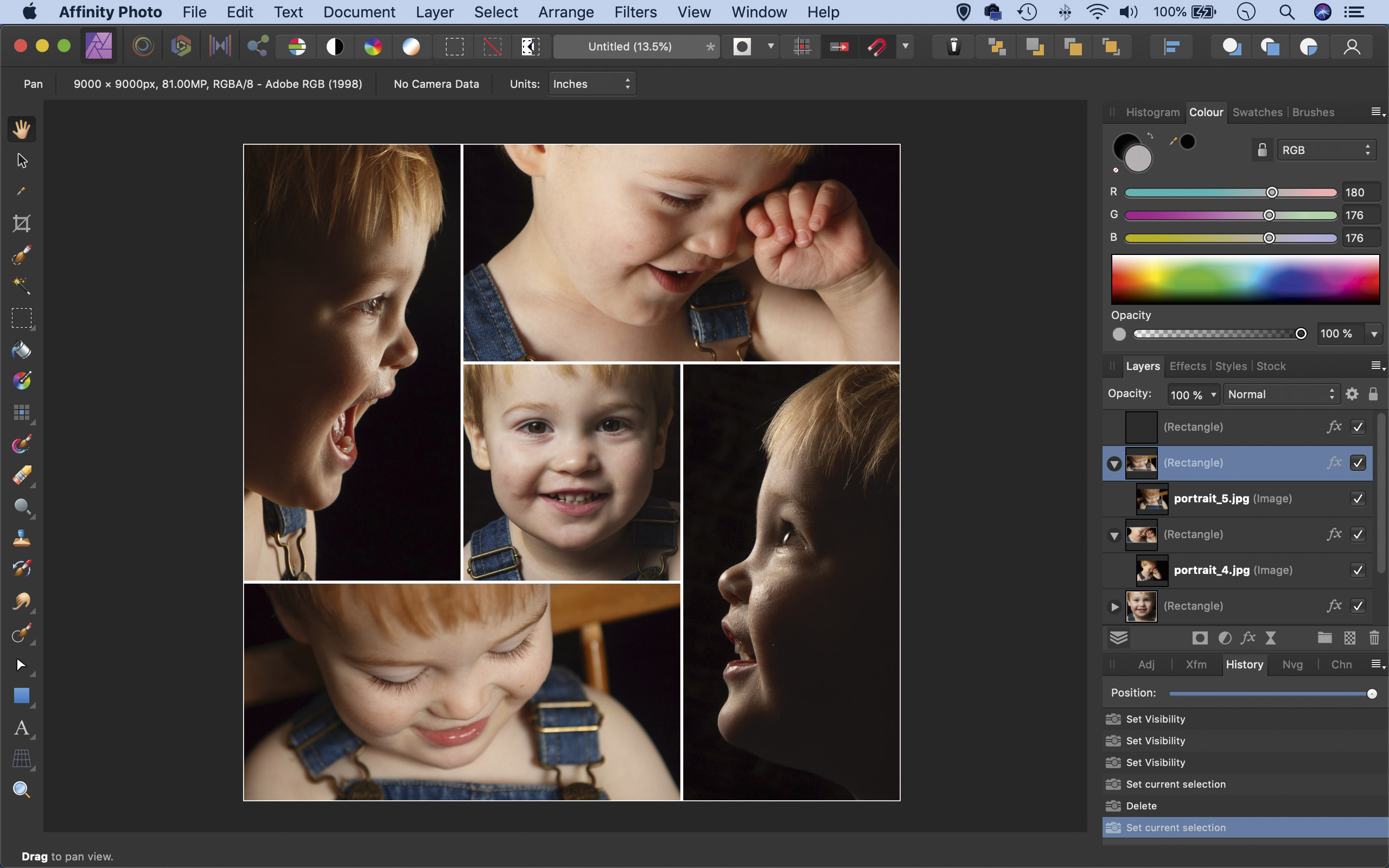
Repeat to add image layers below each of the shape layers. Once done, you can click on each layer and use the Move tool to fine-tune the positioning. If you like you can drag the layers to other shapes to change the order of your images.
PhotoPlus: The Canon Magazine is the world's only monthly newsstand title that's 100% devoted to Canon, so you can be sure the magazine is completely relevant to your system.
Read more:
Best photo-editing laptops
Best photo editing software
Best online photography courses
Get the Digital Camera World Newsletter
The best camera deals, reviews, product advice, and unmissable photography news, direct to your inbox!
The lead technique writer on Digital Camera Magazine, PhotoPlus: The Canon Magazine and N-Photo: The Nikon Magazine, James is a fantastic general practice photographer with an enviable array of skills across every genre of photography.
Whether it's flash photography techniques like stroboscopic portraits, astrophotography projects like photographing the Northern Lights, or turning sound into art by making paint dance on a set of speakers, James' tutorials and projects are as creative as they are enjoyable.
He's also a wizard at the dark arts of Photoshop, Lightroom and Affinity Photo, and is capable of some genuine black magic in the digital darkroom, making him one of the leading authorities on photo editing software and techniques.
