Photography cheat sheet: What is a Histogram?
A histogram is a graph that can tell you if an image is well-exposed and whether it has clipped tones – the diagram below shows you how to interpret it
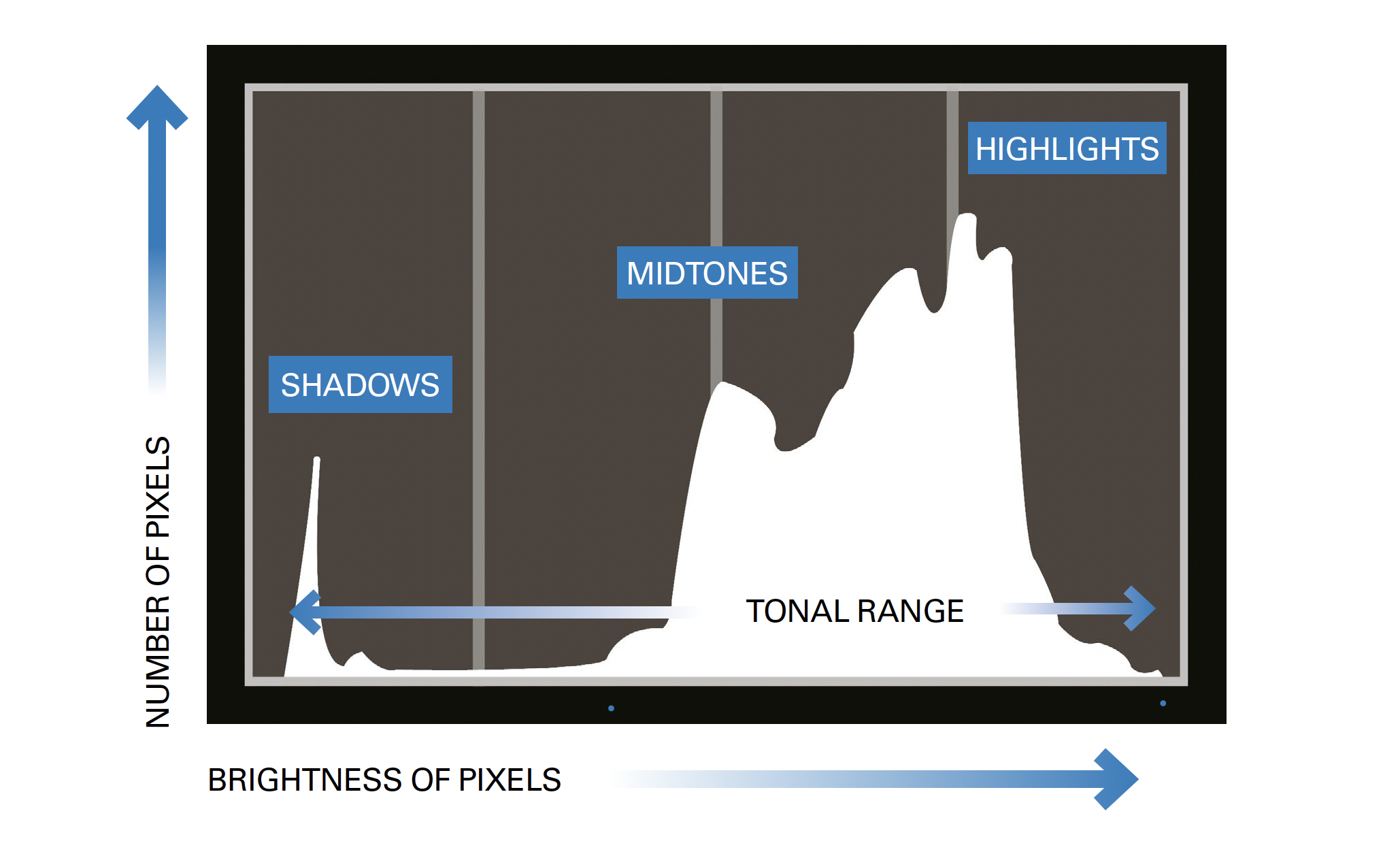
A brightness histogram is a graph that illustrates the range of tones in your image, from black on the far left to white on the far right with a mid-tone (18%) grey in the middle.
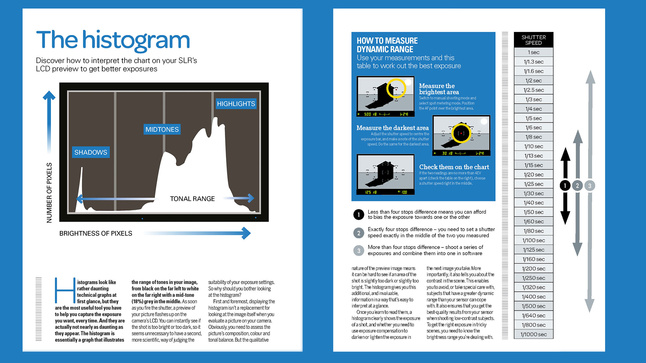
Histograms look like daunting technical graphs at first glance, but they are the most useful tool you have to help you capture the exposure you want, every time. And the best part is that they are simpler than they appear!
• What's the best light meter for photography?
If you use a Brightness Histogram, either when you're taking a photo or when you review it, you can make judgements on your exposure and decide whether you need to make adjustments to the settings.
Why should you bother looking at the histogram?
As soon as you fire the shutter, a preview of your picture flashes up on the camera’s LCD. You can instantly see if the shot is too bright or too dark, so it seems unnecessary to have a second, more scientific, way of judging the suitability of your exposure settings. Doesn't it?
Displaying the histogram isn’t a replacement for looking at the image itself when you evaluate a picture on your camera, as you still need to assess the picture’s composition, colour and tonal balance.
But the qualitative nature of the preview image means it can be hard to see if an area of the shot is slightly too dark or slightly too bright. The histogram gives you this additional, and invaluable, information in a way that’s easy to interpret at a glance.
Once you learn to read them, a histogram clearly shows the exposure of a shot, and whether you need to use exposure compensation to darken or lighten the exposure in the next image you take. More importantly, it also tells you about the contrast in the scene.
This enables you to avoid, or take special care with, subjects that have a greater dynamic range than your sensor can cope with. It also ensures that you get the best-quality results from your sensor when shooting low-contrast subjects.
To get the right exposure in tricky scenes, you need to know the brightness range you’re dealing with – cue the histogram.
How to display the histogram
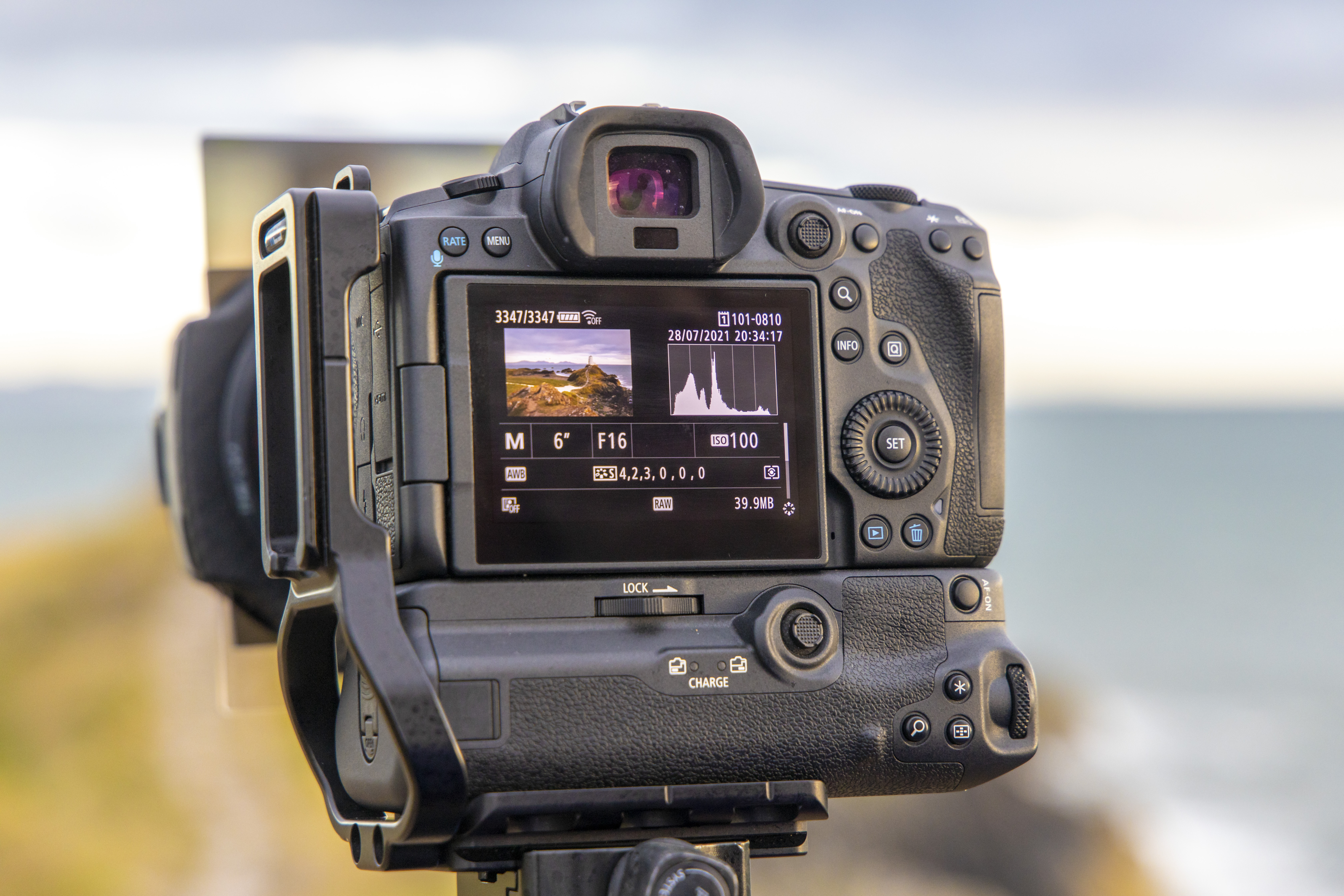
The best cameras for enthusiasts and upwards – those capable of manual exposure control – will have a histogram that you can display either on the shooting screen or playback screen.
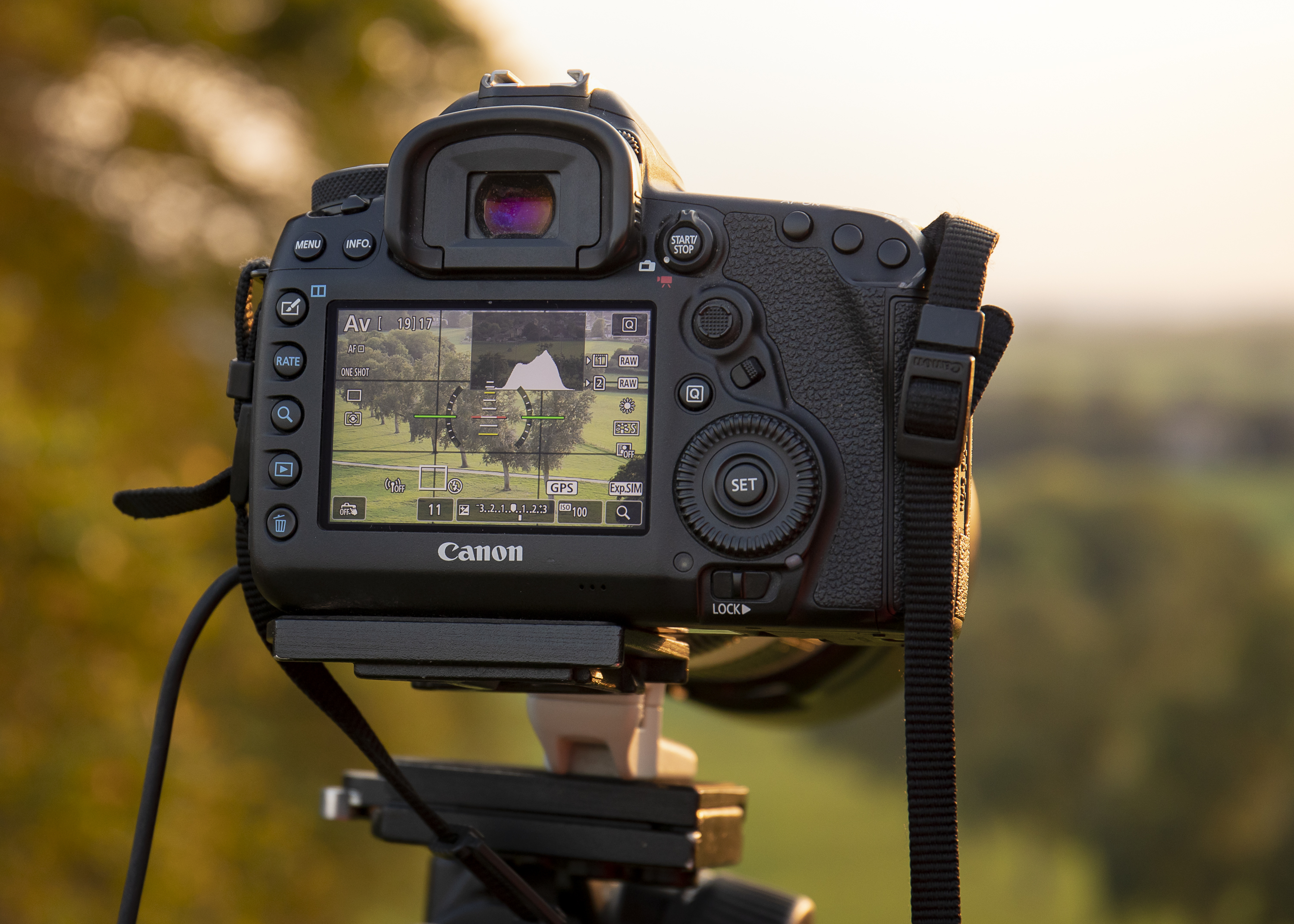
Each camera model is of course very different, but most will have an info button on the back, which you can press to select how much information is shown on the LCD screen. Keep pressing it to toggle through until the histogram appears on-screen.
For example, on most Sony cameras you need to press the DISP (Display Setting) button repeatedly, whereas on Canon cameras it is usually INFO. Check your camera manual if you're not sure where to find it!
When it comes to editing your images, you can also view the histogram in the most common and popular processing software.
How to read the histogram
The shape and position of a Brightness Histogram provides instant information about the exposure of the shot, and of the contrast of the scene.
The most important thing to understand is that when you look at a Brightness Histogram, the left of the graph shows the Shadows, the middle area the Mid-tones, and the right-hand side displays the Highlights.
Unfortunately there's no such thing as a perfectly-shaped histogram, and this is because exposure is an entirely creative choice. In other words, you might want a really dark or really bright shot (which could also be described as over or underexposed). Your scene may also be naturally darker or lighter than middle gray, which is what the histogram is measured against.
That said, if you're after a well-exposed or balanced image – for example a landscape – then the graph would ideally be spread across the entire histogram, from edge to edge – but without edge peaks, which indicate clipping (that you've not managed to record the tonal detail in either very bright highlights or dark shadows).
Histogram takeaways
- A histogram is a type of graph.
- In photography, a brightness histogram assign a value to every pixel in a photograph and uses that to produce a graph of tones.
- A histogram skewed to the left side means the image is underexposed – or just darker.
- When the graph touches the right, that indicated overexposure.
Use the handy cheat sheet above to see this all for yourself. And make sure to keep us bookmarked for more great photography cheat sheets.
Read more
How to read a histogram
How to understand histogram shapes
Photography tips
Get the Digital Camera World Newsletter
The best camera deals, reviews, product advice, and unmissable photography news, direct to your inbox!

Lauren is a writer, reviewer, and photographer with ten years of experience in the camera industry. She's the former Managing Editor of Digital Camera World, and previously served as Editor of Digital Photographer magazine, Technique editor for PhotoPlus: The Canon Magazine, and Deputy Editor of our sister publication, Digital Camera Magazine. An experienced journalist and freelance photographer, Lauren also has bylines at Tech Radar, Space.com, Canon Europe, PCGamesN, T3, Stuff, and British Airways' in-flight magazine. When she's not testing gear for DCW, she's probably in the kitchen testing yet another new curry recipe or walking in the Cotswolds with her Flat-coated Retriever.
