Portrait retouching workshop: Create dramatic backgrounds in Photoshop
Pro photographer Paul Wilkinson explains how to craft creative backgrounds with the help of the latest AI tools
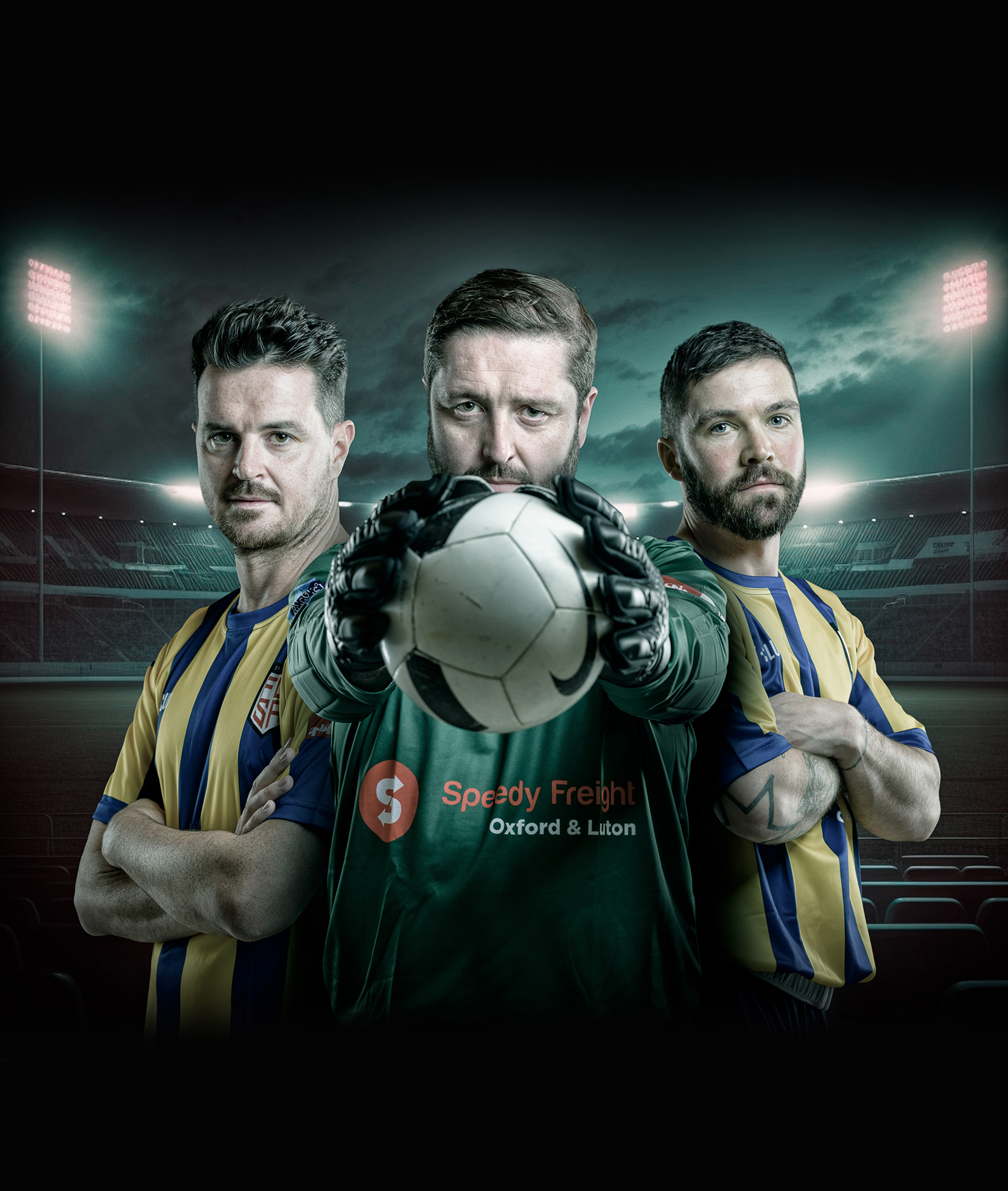
There are many reasons why you should add a dramatic backdrop to your portraits, whether you are working for a client or just making images for fun. And, if you follow a few simple steps, it’s easy to do. Firstly, rather than thinking of adding or replacing a backdrop, it’s better to think of pairing a portrait with a new background – they are two halves of the same picture, just as they would be if you had captured them together in the original shot. The lighting, the focusing and the geometry all must work together. Examine the lighting in particular and make sure it matches up – if the lighting is different for your subject than for the background, the believability is gone.
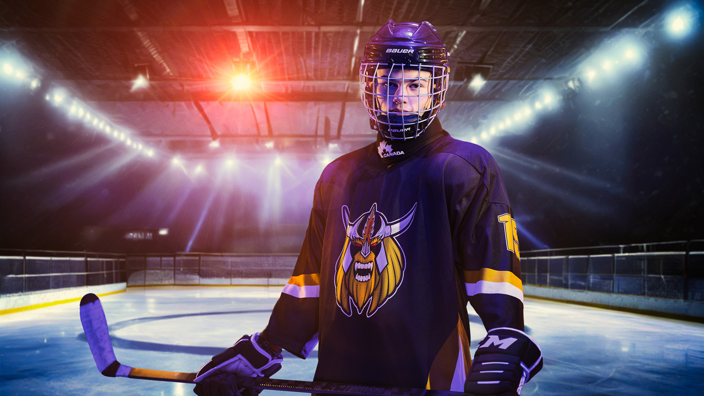
For this shot, I have chosen a recently created image of Kai in his ice hockey team kit. I would have loved to have taken the image of him on the ice, but that wasn’t possible, so I shot Kai in our studio.
Editing steps
Deftly blend your subject with new environments in software
1. Set the lighting
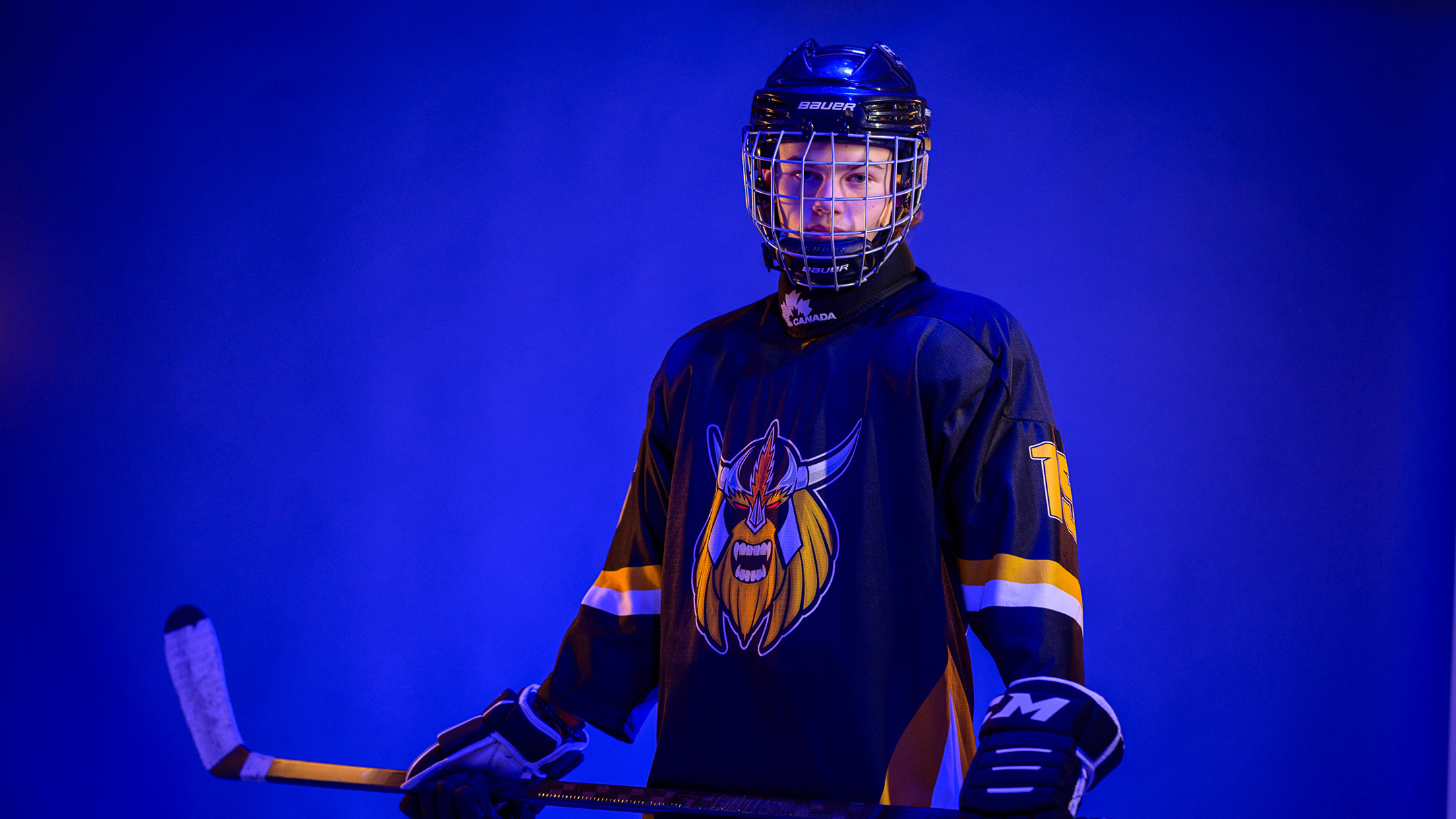
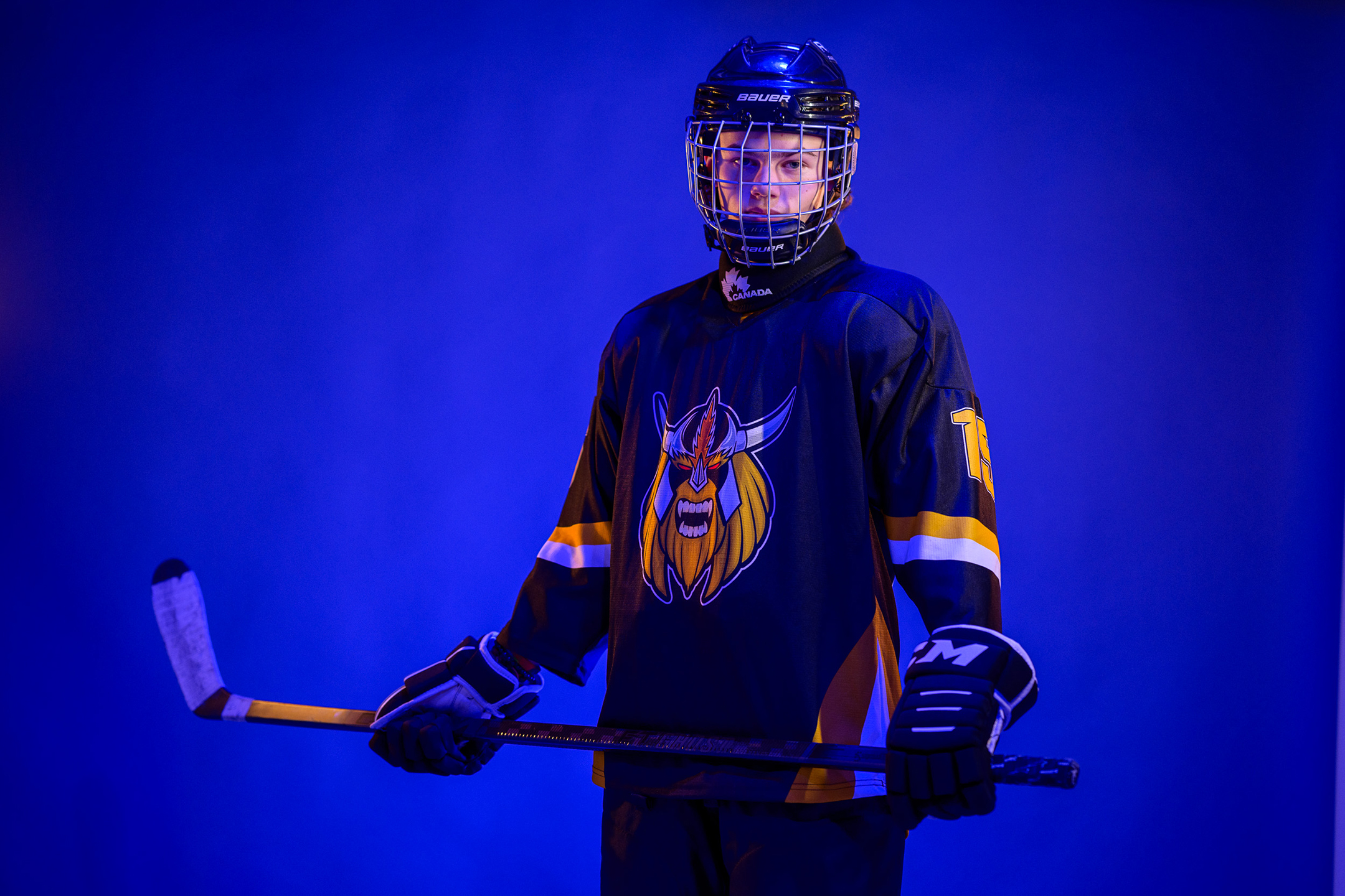
To create the original shot of the subject, we flooded the studio with blue lighting and lit Kai’s face with a daylight-balanced spotlight. Then, we added a pair of warm-white rim lights for added effect, visualising how the final blend might look.
2. Create the environment

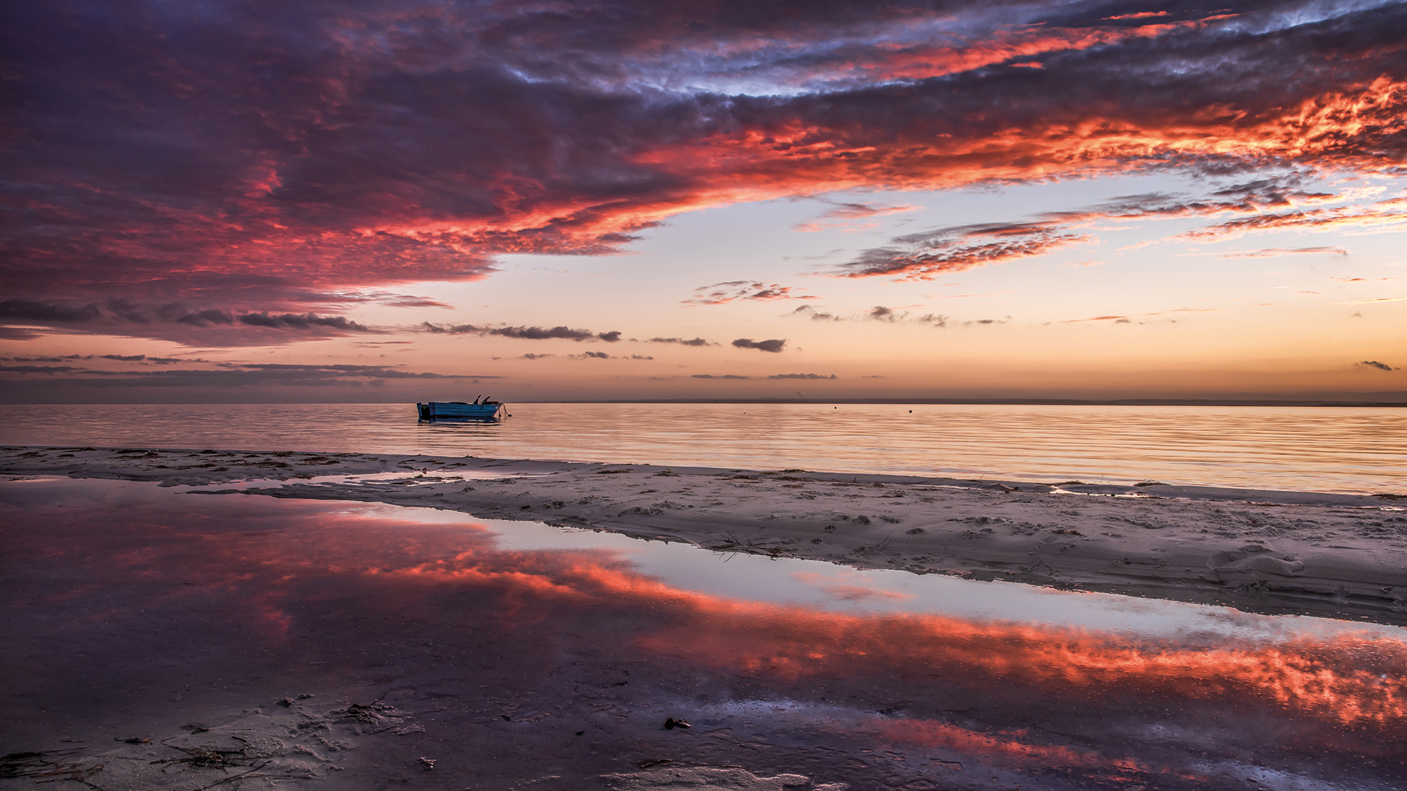
I didn’t have a suitable image of an ice rink, so for the backdrop, I used Adobe’s Firefly AI tool with the phrase “dark floodlit ice hockey rink with intense blue colour.” A few refreshes later, I had an image that could have created the lighting.
3. Select your subject
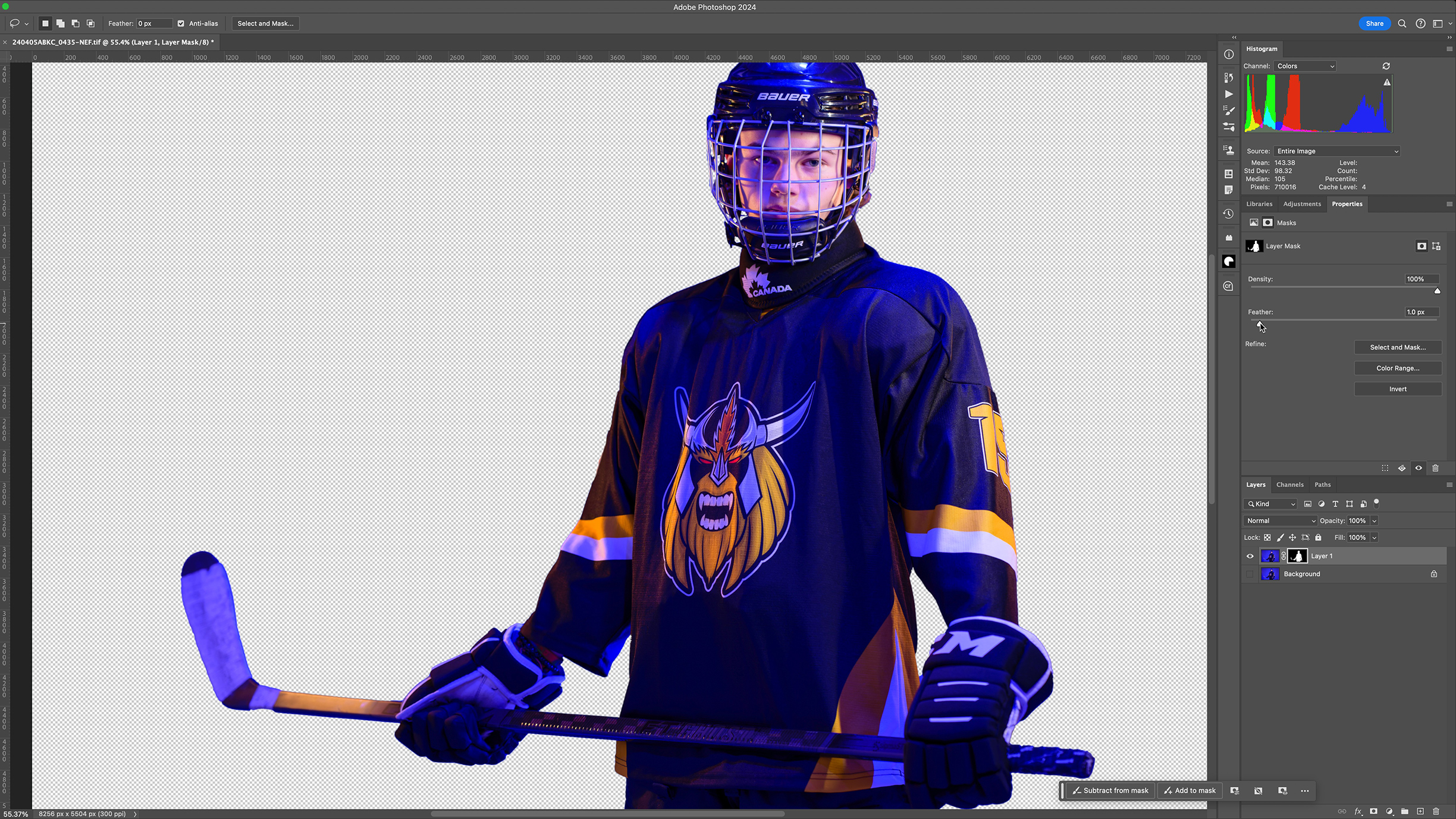
I opened the image of Kai and duplicated the background layer in case I had to go back to it. Then I clicked ‘Select Subject’ to generate a selection I could use as a mask and clicked the ‘Add Layer Mask’ option in the Layers palette.
4. Refine the mask

Masks generated like this are often a little ‘loose’ and leave bits of the original background showing. This can be reduced by selecting the mask and using a ‘Minimum’ filter with 4 or 5 pixels as its setting has increased the masked area a little.
5. Prepare the background
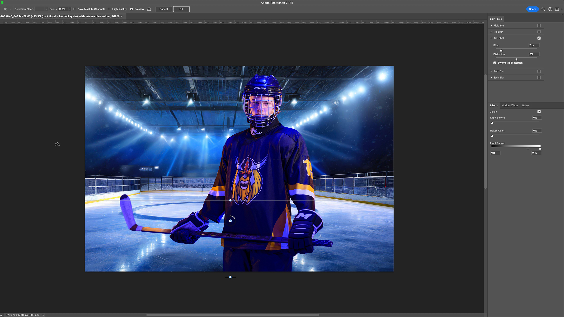
Use a couple of simple tricks to help bind the foreground to the background. Firstly, we must blur the background so it feels slightly out of focus, as in a real photo. I’ve used Field Blur for this, but you can use Gaussian. Tweak it to suit.
6. Add a vignette
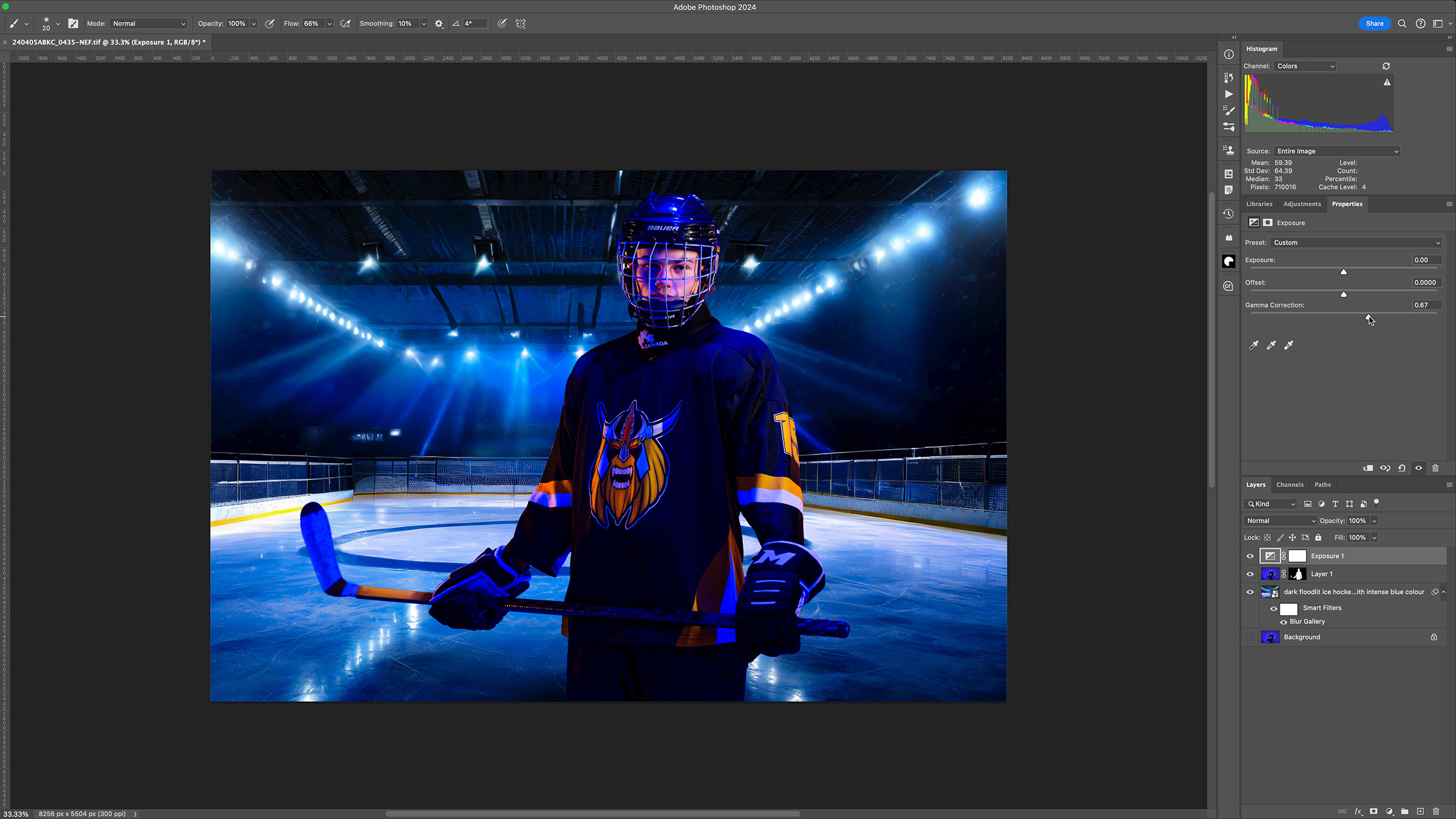
Add an Exposure Adjustment Layer and increase the slider to around 0.9 to darken the image. With a soft black brush, remove the effect from any areas you want to be brighter, this gives more realistic results than painting in dark areas.
7. Finalise the lighting
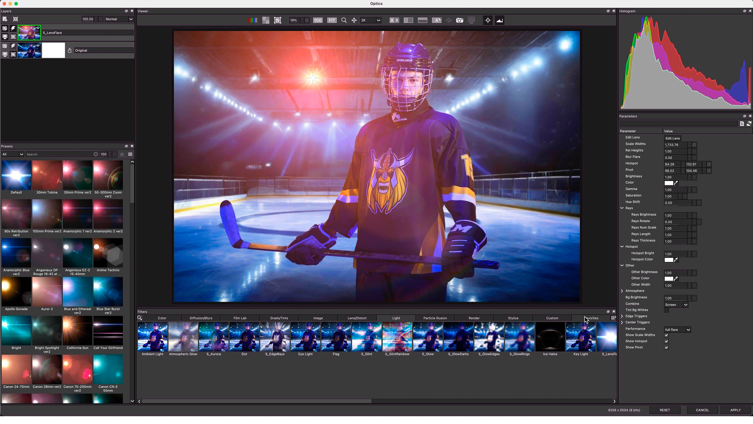
Finally, I added an orange light to one of the background spotlights to create a believable relationship between the backdrop and the light seen on Kai. I used the excellent BorisFX Optics plugin, but you can achieve this effect in many ways.
8. Global colour theme
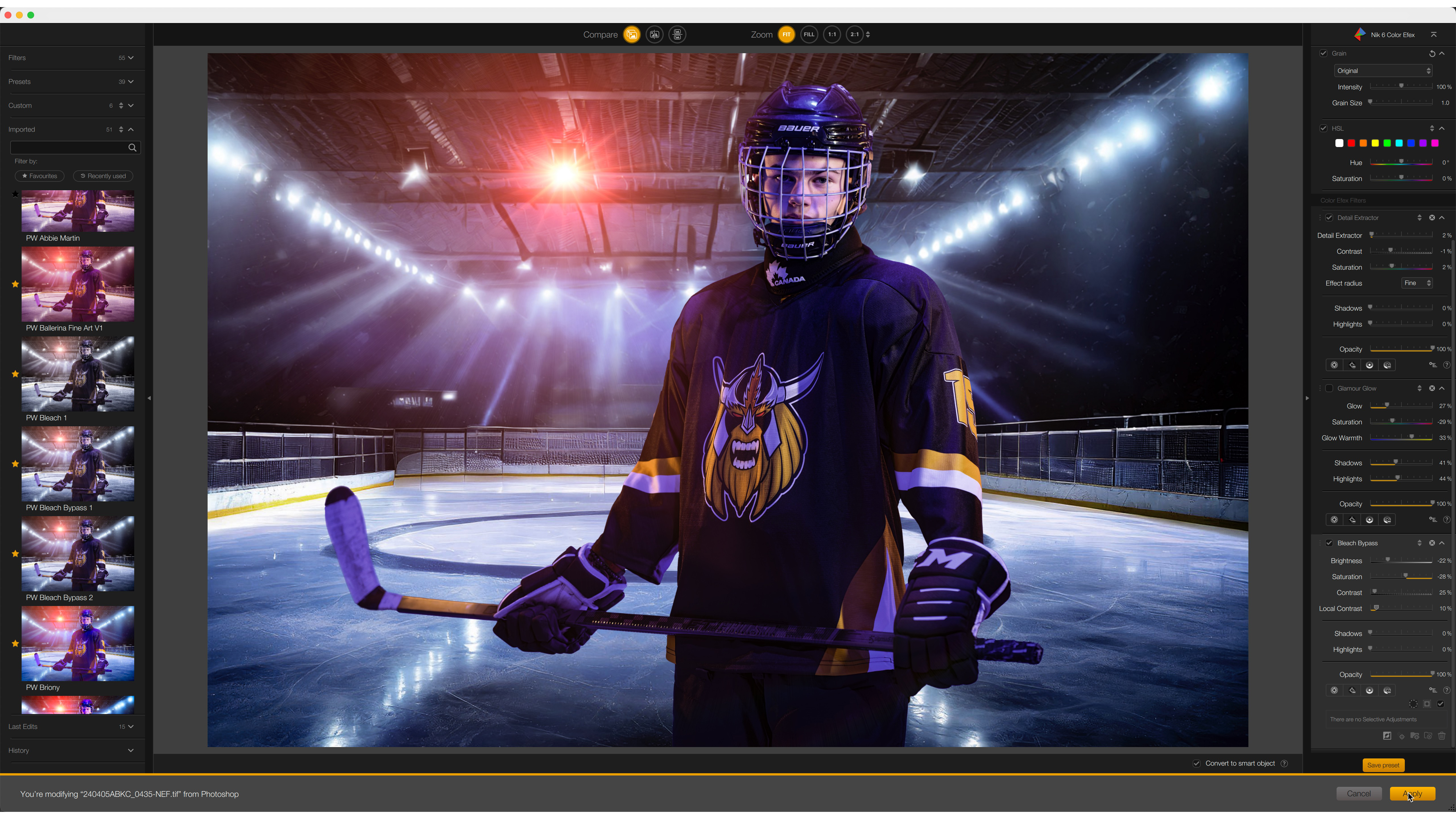
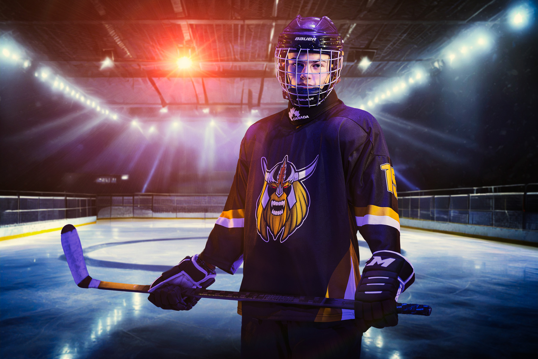
To finish, I added colour treatment using DxO’s Nik 6 Color Efex, which helped to pop the colours and tie everything together. Compositing is a simple process as long as you match the lighting – and it saved me slipping around on an ice rink.
Before and After
More tutorials
- Ditch your tripod – try handheld HDR instead!
- Freeze the motion in your images with this step-by-step tutorial
- Long exposure flash photography can give you mind blowing results
- Street photography: how to remove distracting elements with long exposures
This article originally appeared in Digital Photographer, a monthly magazine, and the kitbag essential for pros, enthusiasts, and amateurs alike!
Inside, you'll find practical guides, shooting tips, and techniques from working photographers, plus all the latest industry news.
Get the Digital Camera World Newsletter
The best camera deals, reviews, product advice, and unmissable photography news, direct to your inbox!
Paul Wilkinson FBIPP FSWPP is a multi-award-winning international photographer, an ambassador for Graphistudio, Elinchrom and Pixellu, as well as a trainer, speaker and author in the photography industry. He hosts the popular Mastering Portrait Photography podcast, where he chats about life, the universe and all things portrait photography.
