Six essential ways to improve your photo website
Increase page visits, audience engagement and image sales using these quick and easy but unmissable steps

A photography website is central to your online presence and brand identity. It therefore needs to be of significant quality to accurately represent the standard of your work, if it is to fullfill its role of driving images sales or shoot bookings. While there are a plethora of website building options available, resulting in the majority of enthusiasts and professional photographers curating one, the basic design and functionality may not be optimal.
Once you have decided on the fundamental design aspects, such as colour theme, gallery style and page layout, consider customizing features, to appeal to your target audience specifically. While most website building providers offer page templates, you will likely be able tailor parameters to taste, often without the need for coding knowledge. Ensuring your best images are visible and traceable across your network of online platforms, can increase revenue, while also improving the user experience.
Create pricing groups
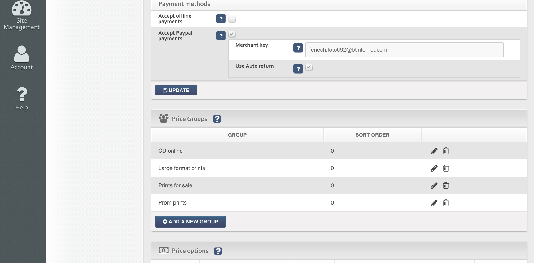
Benefitting both your ease of curation and the simplicity of the information at the front end of your site, assigning your images to pricing categories produces a uniformity that can encourage repeat sales. It also ensures all images are priced automatically and confirmed as up for sale.
Make a ‘favourites’ gallery
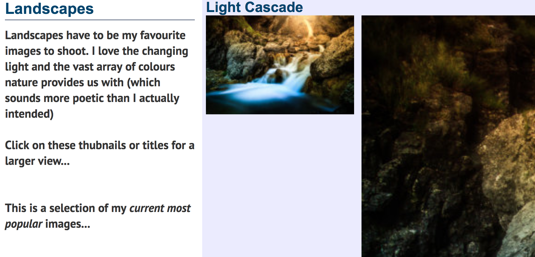
While keeping your site updated with your latest images is good practise, ensuring your most popular images remain visible to new visitors is also important. Many viewers to photography websites are directed by individual images that appeal to them, so keeping your ‘greatest hits’ in their own gallery will reduce the time it takes a prospective client to locate them. They may not be willing to spend long searching an unfamiliar site, so improve your chances of a sale by promoting your best sellers.
Make homepage images findable
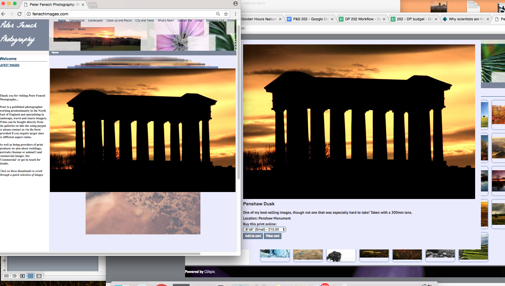
Similarly to placing your popular shots in plain sight, homepage images, which are also likely to be amongst those which garner the most attention, should also be easily accessible. When visitors land on your homepage, the images present provide their first impression of your portfolio and often produce the greatest reaction. Provide links to these files in your gallery or make them ‘clickable’, taking users directly to the correct image, for purchase.
Use image sliders
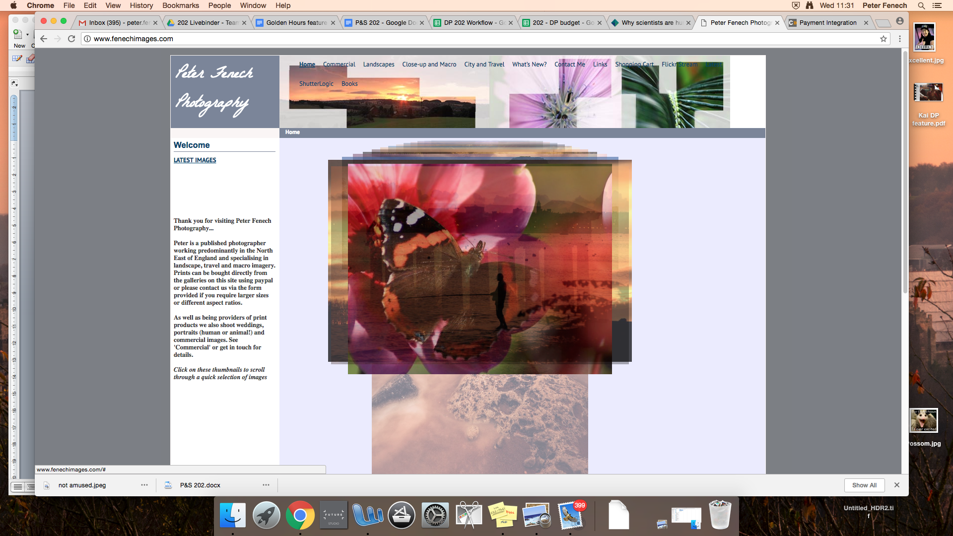
Adding carousels to your homepage or opening gallery pages, rather than static thumbnail grids, introduces an interactive element, that encourages audience engagement. If your viewer has control over the cycling through of images, they may be more tempted to explore your portfolio further.
Direct viewers to further galleries
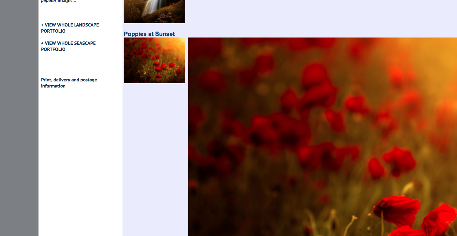
Add links or buttons to take viewers to other galleries, through which they may be interested to browse. This keeps users on your site for longer, increases page visits and potentially the number of images sold. It also gives the site itself a feeling of breadth.
Provide external links
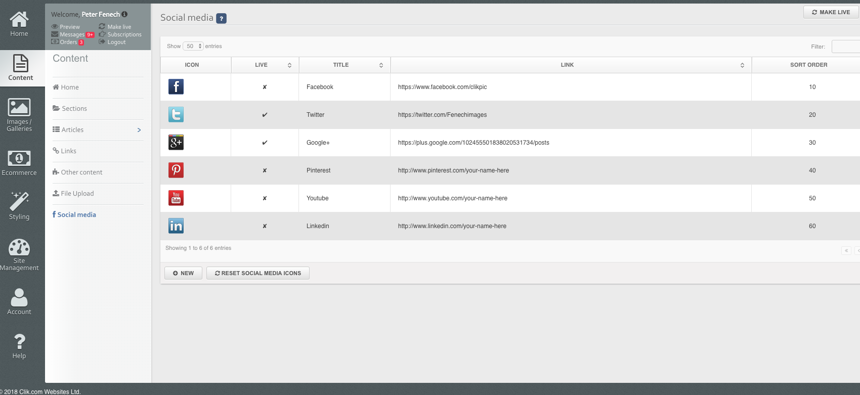
Connect images on your other platforms to pages where they can be bought on your site, to use these portfolios to advertise your main photography ‘shop’. Adding social buttons, for sharing on Facebook and Twitter can be useful for promoting individual images.
Conclusion
Think of your website as your ‘hub’, where your best images are kept and to which all of your other portfolios and blogs should direct visitors. Understanding that even amongst your best work, some shots are more valuable to you, will help you design a profitable website.
Read more
Create the perfect homepage for your photography website
Get the Digital Camera World Newsletter
The best camera deals, reviews, product advice, and unmissable photography news, direct to your inbox!
As the Editor for Digital Photographer magazine, Peter is a specialist in camera tutorials and creative projects to help you get the most out of your camera, lens, tripod, filters, gimbal, lighting and other imaging equipment.
After cutting his teeth working in retail for camera specialists like Jessops, he has spent 11 years as a photography journalist and freelance writer – and he is a Getty Images-registered photographer, to boot.
No matter what you want to shoot, Peter can help you sharpen your skills and elevate your ability, whether it’s taking portraits, capturing landscapes, shooting architecture, creating macro and still life, photographing action… he can help you learn and improve.
