Turn your photos into a vintage-inspired fashion contact sheet
Want to create a vintage, fashion-style contact sheet from your photographs? Here's how, with Affinity Photo
Watch video: Use Affinity to make a vintage-inspired contact sheet
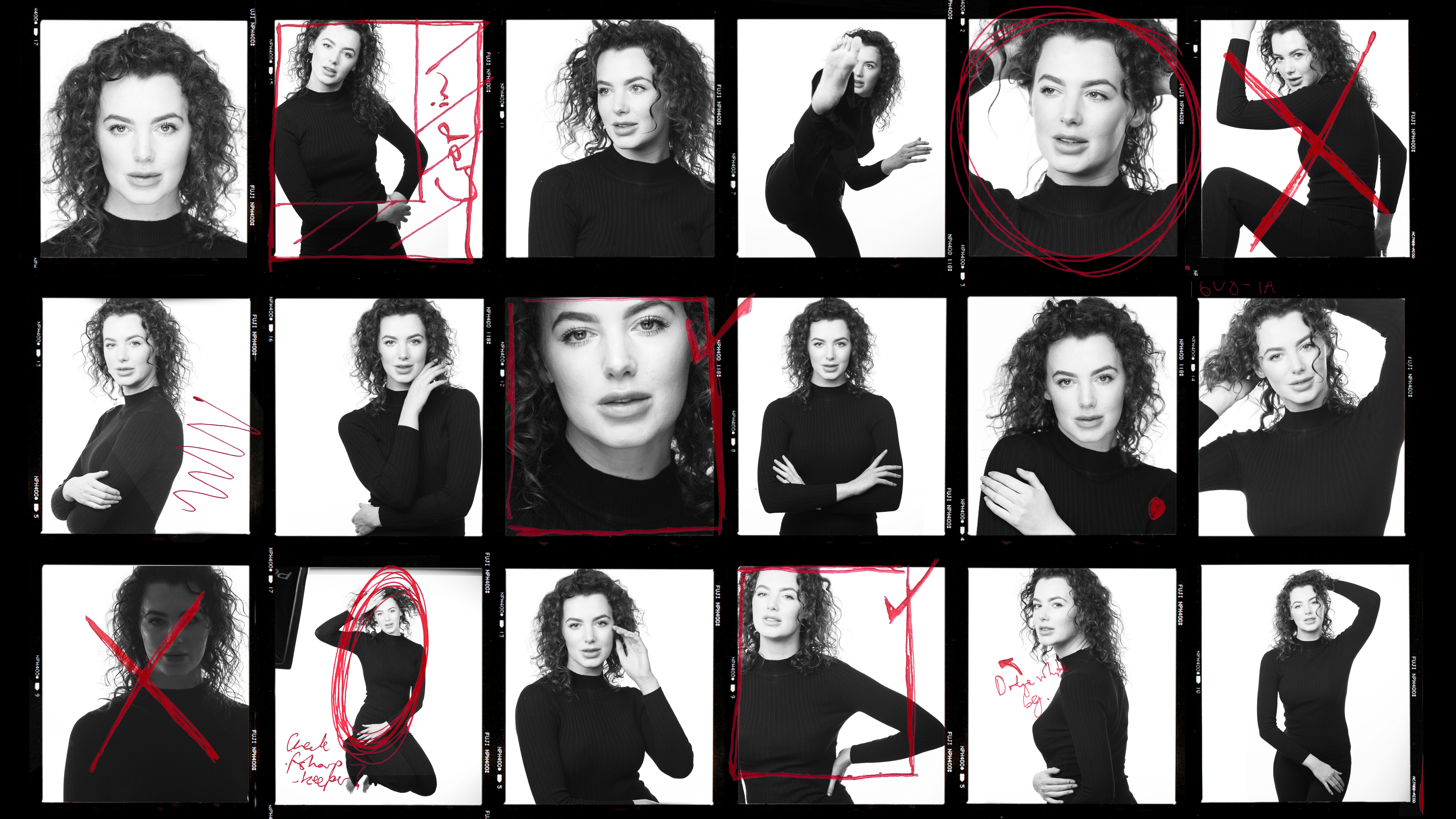
If you find it hard to choose your favorite shot from a series of similar images, then consider how this was even harder in the days of film. One of the methods used to check and compare shots back in the day was a contact sheet. This was a handy way of displaying an entire roll of film on a single sheet of paper, and in times gone by it was an important part of the creative process for photographers.
While it might be obsolete in practical terms, it’s still an interesting visual effect to try. Here we’ll pay homage to the contact sheet and show you how to recreate the look on a sequence of shots in Affinity Photo.
We’ve supplied a contact sheet template, (download here onto your computer), so you can fill it with images by making use of the parent-child feature of layers. We can create rectangles for each frame and then make our shots children of these rectangles, which enables us to crop each image however we like without any overlap between frames. To finish up, we’ll add a few notes and boost the tones to finish. Here's how…
01 Make a box
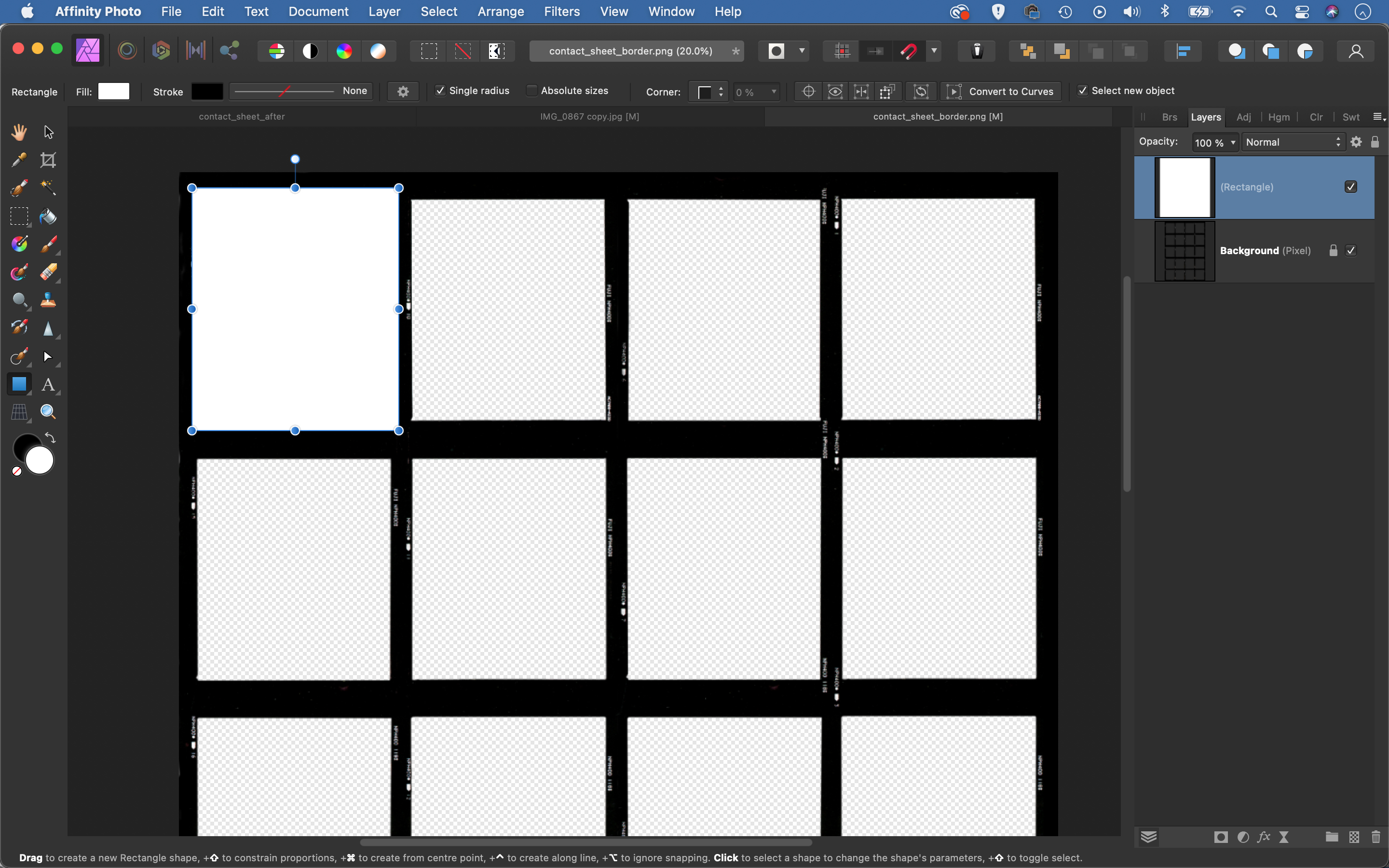
Open the supplied 'contact sheet' file into Affinity (download here), then go to Document > Rotate 90 degrees clockwise. Next, we’ll create frames to which to snap each of our images. Grab the Rectangle tool from the toolbar and drag a shape over the top-left frame.
02 Copy the rectangles
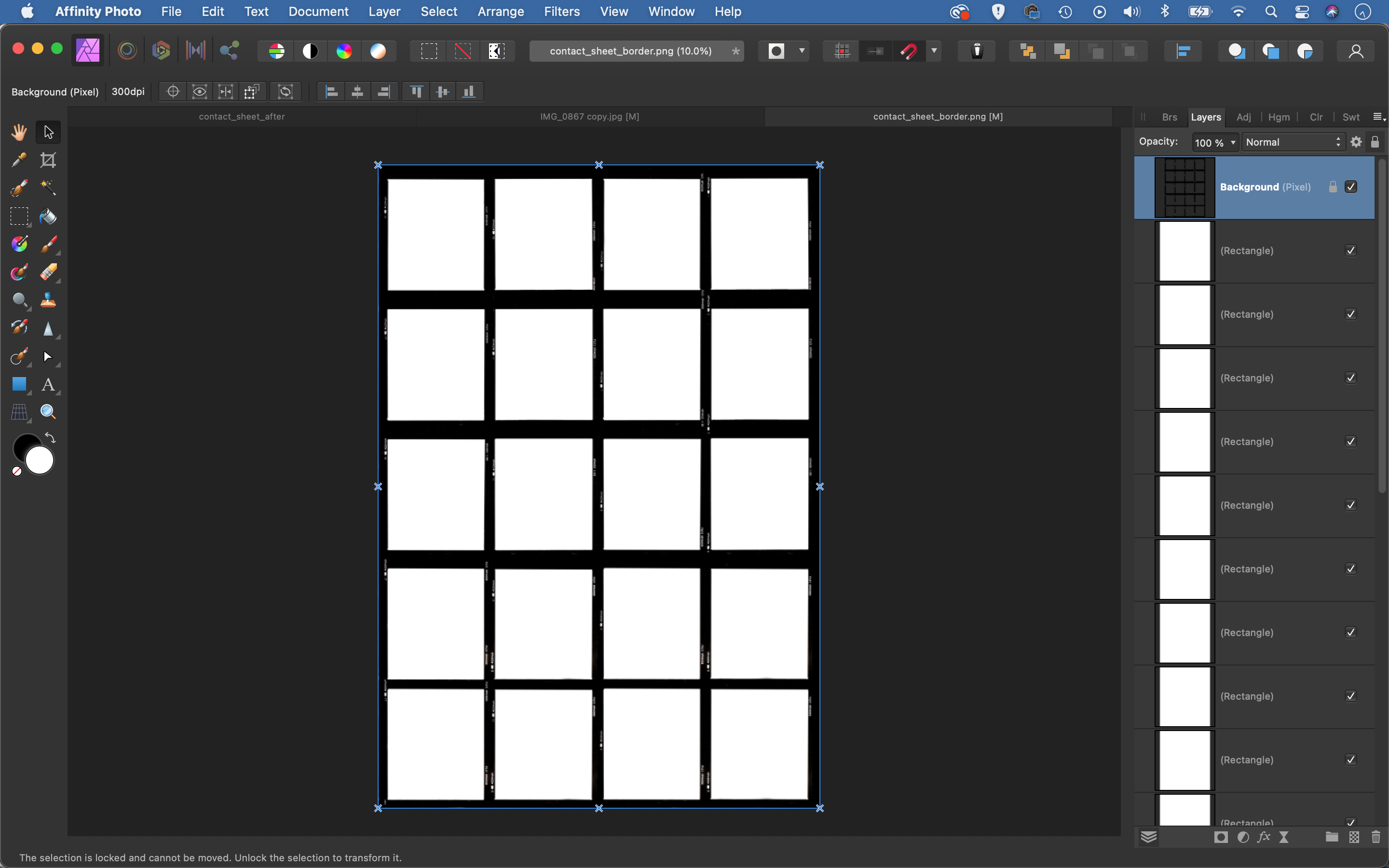
Get the Move tool, hold Alt and drag the rectangle to make a copy. Position this over the next frame. Keep Alt-dragging to make copies for each of the frames. After, drag the bottom layer to the top of the stack, so that the film border is in front of everything else.
03 Make a 'child'
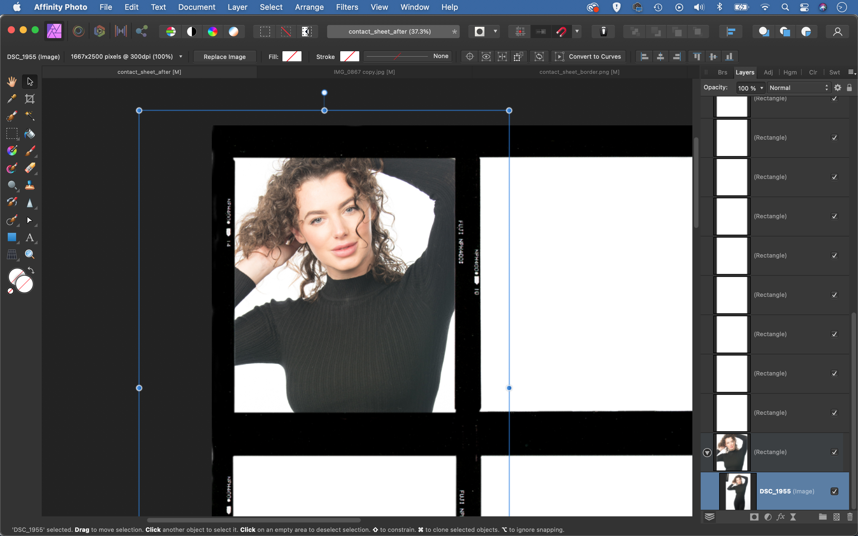
With the Move tool, click on the first frame to select the relevant layer. Pull a shot into Affinity. It’ll appear as a layer above the rectangle. Drag the image layer on top of the rectangle, then drag to the right – the shot will become a 'child' of the shape layer.
04 Fill the frames
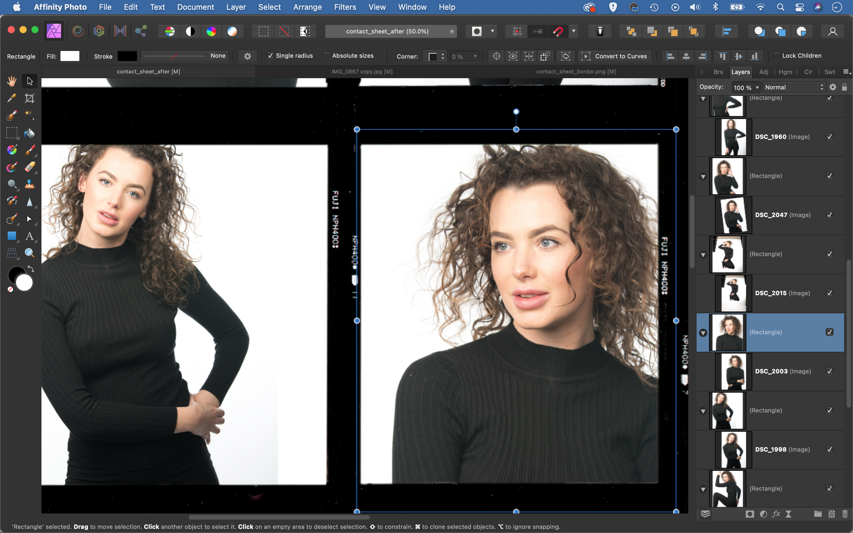
Now the image layer is confined to the rectangle, we can drag the bounding box to resize it to fit how we want. Highlight the next frame and drag in another shot – repeat. Continue in the same way to fill all the frames, varying the crops as you go.
05 Copy the note
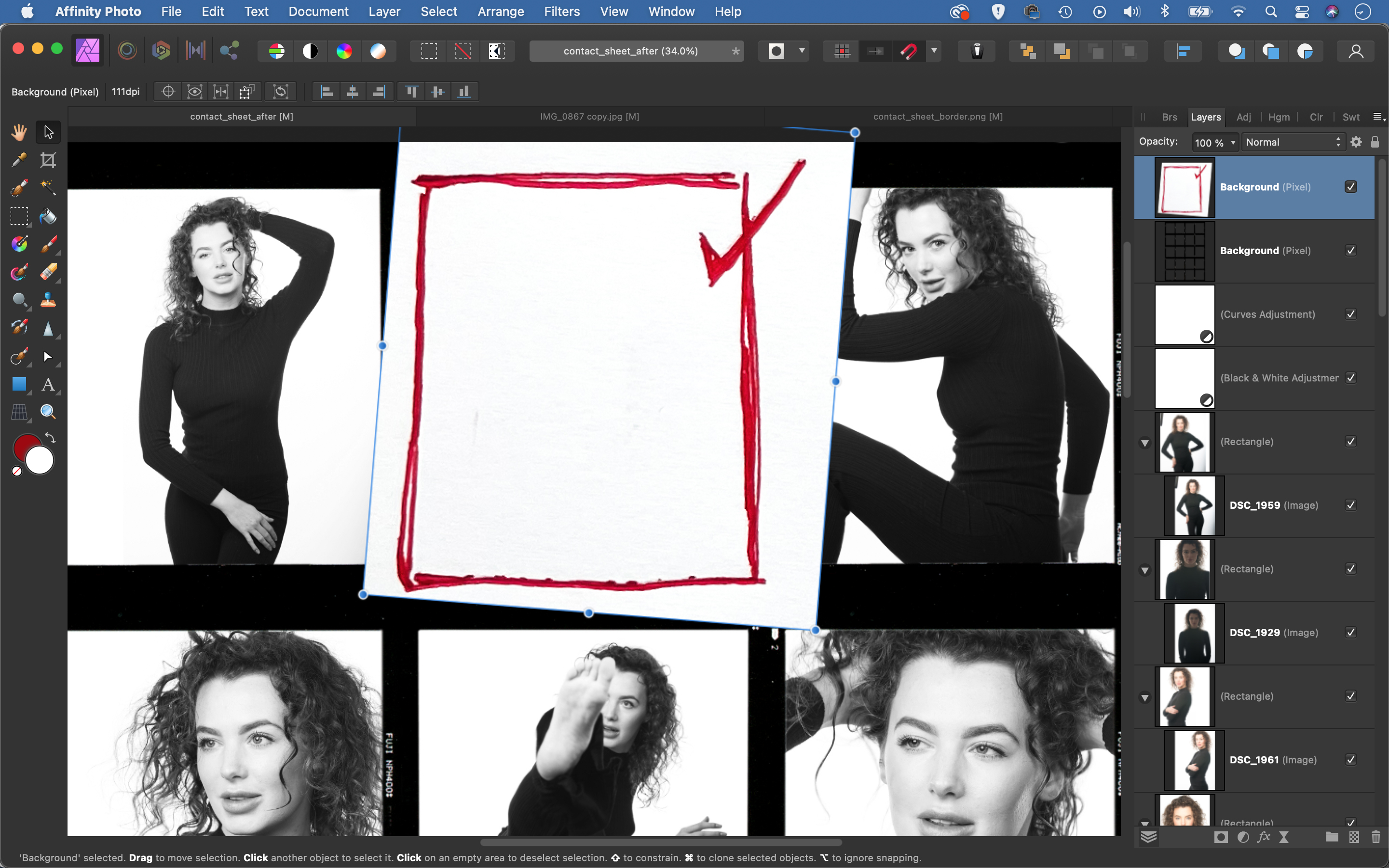
Highlight the top image layer, then click the Adjustment icon in the Layers panel and pick Black and White – adjust the colors to suit. Next, open 'contact sheet notes' image (download here). Use the Rectangular Marquee tool to select one of the shapes, then copy and paste it in.
06 Blend the note in
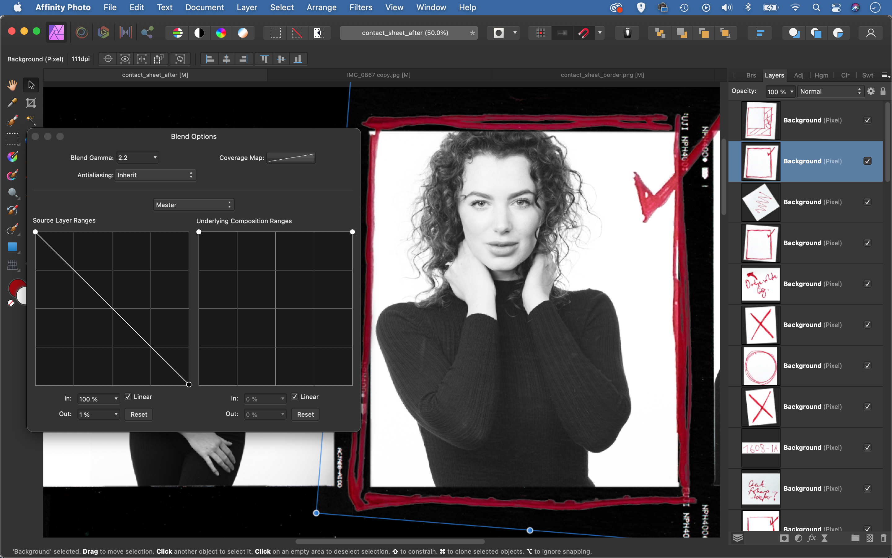
Use the Move tool to position and resize the note over frames, then click the cog icon to open the blending box. Drag the black point on the Source Layer Ranges down to the bottom to fade out the whites, leaving the red.
PhotoPlus: The Canon Magazine is the world's only monthly newsstand title that's 100% devoted to Canon, so you can be sure the magazine is completely relevant to your system.
Read more:
The best photo editing software: image editors for novices through to pros
The best photo-editing laptops: top laptops for photographers
10 best online photography courses – from beginner guides to masterclasses
Get the Digital Camera World Newsletter
The best camera deals, reviews, product advice, and unmissable photography news, direct to your inbox!
The lead technique writer on Digital Camera Magazine, PhotoPlus: The Canon Magazine and N-Photo: The Nikon Magazine, James is a fantastic general practice photographer with an enviable array of skills across every genre of photography.
Whether it's flash photography techniques like stroboscopic portraits, astrophotography projects like photographing the Northern Lights, or turning sound into art by making paint dance on a set of speakers, James' tutorials and projects are as creative as they are enjoyable.
He's also a wizard at the dark arts of Photoshop, Lightroom and Affinity Photo, and is capable of some genuine black magic in the digital darkroom, making him one of the leading authorities on photo editing software and techniques.
